For connecting IoT devices over the internet there are several network protocols available like ZigBee, Bluetooth, BLE, WiFi, LTE-M, NB-IoT, Z-Wave, LoRa and LoRaWAN. Each one serves its own purpose and brings its own feature combinations. In this blog post I go through a very interesting low power and long range protocol LoRaWAN.
Explaining the concepts
LoRa (Long Range) is a wireless radio modulation technology, originated from Chirp Spread Spectrum (CSS) technology. It encodes information on radio waves using frequency modulated chirp pulses. It is very ideal for transmitting data in small chunks, with low bit rates and at a longer range compared to WiFi, ZigBee or Bluetooth. Typical range is 2-8km depending on the network environment. It is a good fit for applications that need to operate in low power mode.
LoRaWAN is a wide area networking protocol built on top of the LoRa. It defines the bi-directional communication protocol, network system architecture, principles how devices connect to gateways and how gateways process the packets and how packets find their way to network servers. Whereas LoRa enables the physical network and enables the long-range communication link.
Taking a look at this from the OSI (Open Systems Interconnection) model of computer networking. LoRaWAN is a Media Access Control (MAC) protocol on OSI model layer 2, whereas LoRa defines the physical layer on the bottom layer, meaning transmitting of raw bits over a physical data link. LoRaWAN defines 3 device types, Class A, B and C for different power needs. Class A is suitable for bi-directional communication.
LoRa and LoRaWAN sitting on OSI model
Now when we understand LoRa and LoRaWAN differences we can take a look at typical network architecture. It consists of LoRaWAN enabled devices (sensors or actuators), which are connected wirelessly to the LoRaWAN network using LoRa. The Gateway receives LoRa RF messages and forwards those to the network server. All the network traffic can be bi-directional (depending on LoRaWAN device classification), so the Gateway can also deliver messages to the device. Devices are not associated with a specific gateway, Instead, the same sensor can be served by multiple gateways in the area.
The network server is responsible for managing the entire network. It forwards the payloads to application servers, queues payloads coming from the application server to connected devices and forwards join request- and accept-messages between devices and the join server. Application servers are responsible for securely handling, managing and interpreting device data and also generating payloads towards connected devices. Join server is responsible for the OTA (Over-The-Air) activation process for adding devices to the network.
Low power, long range and low cost connectivity are the top LoRaWAN benefits. These enable and make new use cases possible. Just to mention few
Asset tracking – Track the location and condition of business critical equipment like containers location or cargo temperature or other equipment condition.
Supply chain monitoring – For example monitor food, medicine and other goods that need to be stored in a certain temperature through the entire supply-chain from production to storage and delivery.
Smart Water and Energy management – Monitor water and energy consumption
Smart environment – Air condition, loudness, air pressure, space optimization, building security, failure prediction.
You can find the LoRaWAN network server as an open source product and deploy it to any cloud environment. But deploying, maintaining and operating the network server, join server and application servers can be a pain and not so easy to get started with.
Amazon hyperscaler can help with this. Amazon IoT Core has the LoRaWAN capability, which is a fully managed solution for connecting and managing LoRaWAN enabled devices with the AWS Cloud. With the IoT Core for LoraWAN you can set up a private network by connecting devices and gateways to the AWS Cloud, and there is no need for developing or operating the network server. By using the AWS technologies for LoRaWAN network the architecture looks like this:
Private LoraWAN network using AWS IoT Core
How about the real devices
For example for asset tracking there are plenty of devices available on the market. I recently bought a LoRaWAN capable GPS tracking device and indoor LoRaWAN gateway. The tracker is small pocket/keychain size and the gateway is easy to register to the AWS cloud.
LoRaWAN GPS tracker and gateway
The power of low power is powerful
LoRaWAN is not ideal in all environments, like where you need low latency, high bandwidth and continuous availability.
But if you need a low power environment, like battery powered for a few years, long range and cost efficient data transfer, then LoRaWAN might be your choice.
Check out our Connected Fleet Kickstart for boosting development for Fleet management and LoRaWAN:
In our recently published study [1], I and my Solitan colleagues Kari Antila and Vilma Jägerroos examined the possibility of predicting the burden of healthcare using machine learning methods. We used data on symptoms and past healthcare utilization collected in Finland. Our results show that COVID-19-related healthcare admissions can be predicted one week ahead with an average accuracy of 76% during the first wave of the pandemic. Similar symptom checkers could be used in other societies and for future epidemics, and they could provide an opportunity to collect data on symptom development very rapidly - and at a relatively low cost.
For this purpose, Solita developed a machine learning pipeline in the Finnish Institute for Health and Welfare’s (THL) computing environment for automated model training and comparison. The models created by Solita were retrained every week using time-series nested cross-validation, allowing them to adapt to the changes in the correlation of the symptom checker answers and the healthcare burden. The pipeline makes it easy to try new models and compare the results to previous experiments.
We decided to compare linear regression, a simple and traditional method, to XGBoost regression, a modern option with many hyperparameters that can be learned from the data. The best linear regression model and the best XGBoost model (shown in the figure) achieved mean absolute percentage error of 24% and 32%, respectively. Both models get more accurate over time, as they have more data to learn from when the pandemic progresses.
COVID-19–related admissions predicted by linear regression and XGBoost regression models, together with the true admission count during the first wave of the pandemic in 2020.
Our results show that a symptom checker is a useful tool for making short-term predictions on the health care burden due to the COVID-19 pandemic. Symptom checkers provide a cost-effective way to monitor the spread of a future epidemic nationwide and the data can be used for planning the personnel resource allocation in the coming weeks. The data collected with symptom checkers can be used to explore and verify the most significant factors (age groups of the users, severity of the symptoms) predicting the progression of the pandemic as well.
You can find more details in the publication [1]. The research was done in collaboration with University of Helsinki, Finnish Institute for Health and Welfare, Digifinland Oy, and IT Centre for Science, and we thank everyone involved.
If you have similar register data and would like to perform a similar analysis, get in touch with me or Solita Health and we can work on it together!
Joel Röntynen, Data Scientist, joel.rontynen@solita.fi
References
[1] Limingoja L, Antila K, Jormanainen V, Röntynen J, Jägerroos V, Soininen L, Nordlund H, Vepsäläinen K, Kaikkonen R, Lallukka T. Impact of a Conformité Européenne (CE) Certification–Marked Medical Software Sensor on COVID-19 Pandemic Progression Prediction: Register-Based Study Using Machine Learning Methods. JMIR Form Res 2022;6(3):e35181, doi: 10.2196/35181, PMID: 35179497
Neural networks are powerful tools in natural language processing (NLP). In addition, they can also learn the language of DNA and help in genome annotation. Annotated genes, in turn, play a key role in finding the causes and developing treatments for many diseases.
I have been finishing my studies while working at Solita and got the opportunity to do my master’s thesis in the ivves.eu research program in which Solita is participating. The topic of my thesis consisted of language, genomics and neural networks, and this is a story of how they all fit into the same picture.
When I studied Data Science at the University of Helsinki, courses in NLP were my favorites. In NLP, algorithms are taught to read, generate, and understand language, in both written and spoken forms. The task is difficult because of the characteristics of the language: words and sentences can have many interpretations depending on the context. Therefore, the language is far from accurate calculations and rules where the algorithms are good at. Of course, such challenges only make NLP more attractive!
Neural networks
This is where neural networks and deep learning come into play. When a computational network is allowed to process a large amount of text over and over again, the properties of the language will gradually settle into place, forming a language model. A good model seems to “understand” the nuances of language, although the definition of understanding can be argued, well, another time. Anyways, these language models taught with neural networks can be used for a wide variety of NLP problems. One example would be classifying movie reviews as positive or negative based on the content of the text. We will see later how the movie reviews can be used as a metaphor for genes.
In recent years, a neural network architecture called transformers has been widely used in NLP. It utilizes a method called attention, which is said to pay attention to emphases and connections of the text (see the figure below). This plays a key role in building the linguistic “understanding” for the model. Examples of famous transformers (other than Bumblebee et al.) include Google’s BERT and OpenAI’s GPT-3. Both are language models, but transformers are, well, transformable and can also be used with inputs other than natural language.
An example of how transformers self-attention “sees” the connections in a sentence. The difference of the last word completely changes what the word “it” most refers to.
DNA-language
And here DNA and genomes come into the picture (also literally in the picture below). You see, DNA has its own grammar, semantics, and other linguistic properties. At its simplest, genes can be thought of as positive movie reviews, and non-coding sequences between genes as negative reviews. However, because the genomes of organisms are part of nature, genes are a little more complex in reality. But this is just one more thing that language and genomics have in common: the rules do not always apply and there is room for interpretation.
Simplification of a genome and a gene. Genomic data is a long sequence of characters A, T, C, and G representing four nucleotide types. Genes are coding parts of the genome. At their simplest, they consist of start and end points and the characters between them.
Since both text and genomic data consist of letters, it is relatively straightforward to teach the transformer model with DNA sequences instead of text. Like the classification of movie reviews in an NLP-model, the DNA-model can be taught to identify different parts of the genome, such as genes. In this way, the model gains the understanding of the language of DNA.
In my thesis, I used DNABERT, a transformer model that has been pre-trained with a great amount of genomic data. I did my experiments with one of the most widely known genomes, E. coli bacterium, and fine-tuned the model to predict its gene locations.
Example of my experiments: the Receiver operating characteristic (ROC) curves helped me to find the most optimal input length for the genome data. Around 100 characters led to the highest curve and thus the best results, whilst 10 was obviously too short and 500 too long.
After finding the most optimal settings and network parameters, the results clearly showed the potential. Accuracy of 90.15% shows that the model makes “wise” decisions instead of just guessing the locations of the genes. Therefore the method has potential to assist in the basic task of bioinformatics: new genomes are sequenced at a rapid pace, but their annotation is slower and more laborious. Annotated genes are used, for example, to study the causes of diseases and to develop treatments tailored to them.
There are also other methods for finding genes and other markers in DNA sequences, but neural networks have some advantages over more traditional statistics and rule based systems. Rather than human expertise in genomics, the neural network based method relies on the knowledge gathered by the network itself, using a large amount of genomic data. This saves time and expert hours in the implementation of the neural network. The use of the pre-trained general DNA language model is also environmentally friendly. Such a model can be fine-tuned with the task-specific data and settings in just a few iterations, saving computational resources and energy.
There is a lot of potential in further developing the link between transformer networks and DNA to study what else the genome language has to tell us about the life around us. Could this technology contribute to the understanding of genetic traits, the study of evolution, the development of medicine or vaccines? These questions are closely related to the healthcare field, in which Solita has strong expertise, including in research. If you are interested in this type of research, I and other Solita experts will be happy to tell you more!
Three steps to be intentionally agnostic about tools. Reduce technical debt, increase stakeholder trust and make the objective clear. Build a machine learning system because it adds value, not because it is a hammer to problems.
As data enthusiasts we love to talk, read and hear about machine learning. It certainly delivers value to some businesses. However, it is worth taking a step back. Do we treat machine learning as a hammer to problems? Maybe a simple heuristic does the job with substantially lower technical debt than a machine learning system.
Do machine learning like the great engineer you are, not like the great machine learning expert you aren’t.
In this article, I look at a structured approach to choose the next data science project that aligns to business goals. It combines objective key results (OKR), value-feasibility and other suggestions to stay focused. It is especially useful for data science leads, business intelligence leads or data consultants.
Why data science projects require a structured approach
ML solves complex problems with data that has a predictive signal for the problem at hand. It does not create value by itself.
So, we love to talk about Machine learning (ML) and artificial intelligence (AI). On the one hand, decision makers get excited and make it a goal: “We need to have AI & ML”. On the other hand, the same goes for data scientists who claim: “We need to use a state-of-the-art method”. Being excited about technology has its upsides, but it is worth taking a step back for two reasons.
Choosing a complex solution without defining a goal creates more issues than it solves. Keep it simple, minimize technical debt. Make it easy for a future person to maintain it, because that person might be you.
A method without a clear goal fails to create business value and erodes trust. Beyond the hype around machine learning, we do data science to create business value. Ignoring this lets executives reduce funding for the next data project.
This is nothing new. But, it does not hurt to be reminded of it. If I read about an exciting method, I want to learn and apply it right away. What is great for personal development, might not be great for the business. Instead, start with what before thinking about how.
In the next section, I give some practical advice on how to structure the journey towards your next data project. The approach helps me to focus on what is next up for the business to solve instead of what ML method is in the news.
How to choose the next data science project
“Rule #1: Don’t be afraid to launch a product without machine learning.”
Imagine you draft the next data science cases at your company. What project to choose next? Here are three steps to structure the journey.
Photo by Leah Kelley from Pexels
Step 1: Write data science project cards
The data science project card helps to focus on business value and lets you be intentionally agnostic about methodologies in the early stage
Summarize each idea in a data science project card which includes some kind of OKR, data requirements, value-feasibility and possible extensions. It covers five parts which contain all you need to structure project ideas, namely an objective (what), its key results (how), ideal and available data (needs), the value-feasibility diagram (impact) and possible extension. What works for me is to imagine the end-product/solution to a business need/problem before I put it into a project card.
I summarize the data science project in five parts.
An objective addresses a specific problem that links to a strategic goal/mission/vision, for example: “Enable data-driven marketing to get ahead of competitors”, “Automate fraud detection for affiliate programs to make marketing focusing on core tasks” or “Build automated monthly demand forecast to safeguard company expansion”.
Key results list measurable outcomes that mark progress towards achieving the objective, for example: “80% of marketing team use a dashboard daily”, “Cover 75% of affiliate fraud compared to previous 3 month average” or “Cut ‘out-of-stock’ warnings by 50%, compared to previous year average”.
Data describes properties of the ideal or available dataset, for example: “Transaction-level data of the last 2 years with details, such as timestamp, ip and user agent” or “Product-level sales including metadata, such as location, store details, receipt id or customer id”.
Extensions explores follow-up projects, for example: “Apply demand forecast to other product categories” or “Take insights from basket analysis to inform procurement.”
The value-feasibility diagram puts the project into a business perspective by visualizing value, feasibility and uncertainties around it. The smaller the area, the more certain is the project’s value or feasibility.
To provide details, I describe a practical example how I use these parts for exploring data science projects. The journey starts by meeting the marketing team to hear about their work, needs and challenges. If a need can be addressed with data, they become the end-users and project target group. Already here, I try to sketch the outcome and ask the team about how valuable it is which estimates the value.
Next, I take the company’s strategic goals and formulate an objective that links to them following OKR principles. This aligns the project with mid-term business goals, makes it part of the strategy and increases buy-in from top-level managers. Then I get back to the marketing team to define key results that let us reach the objective.
A draft of an ideal dataset gets compared to what is available with data owners or the marketing team itself. That helps to get a sense for feasibility. If I am uncertain about value and feasibility, I increase the area in the diagram. It is less about being precise, but about being able to compare projects with each other.
Step 2: Sort projects along value and feasibility
Value-feasibility helps to prioritize projects, takes a business perspective and increases stakeholder buy-in.
Ranking each project along value and feasibility makes it easier to see which one to prioritize. The areas visualize uncertainties on value and feasibility. The larger they stretch along an axis, the less certain I am about either value or feasibility. If they are more dot-shaped, I am confident about a project’s value and its feasibility.
Projects with their estimated value and feasibility
Note that some frameworks evaluate adaptation and desirability separately to value and feasibility. But you get low value when you score low on either adaptation or desirability. So, I estimate the value with business value, adaptation and desirability in my mind without explicitly mentioning it.
Data science projects tend to be long-term with low feasibility today and uncertain, but potentially high future value. Breaking down visionary, less feasible projects into parts that add value in themselves could produce a data science roadmap. For example, project C which has uncertain value and not feasible as of today, requires project B to be completed. Still, the valuable and feasible project A should be prioritized now. Thereafter, aim for B on your way to C. Overall, this overview helps to link projects and build a mid-term data science roadmap.
Related data science projects combined to a roadmap
Here is an example of a roadmap that starts with descriptive data science cases and progresses towards more advanced analytics such as forecasting. That gives a prioritization and helps to draft a budget.
Step 3: Iterate around the objective, method, data and value-feasibility
Be intentionally agnostic about the method first, then opt for the simplest one, check the data and implement. Fail fast, log rigorously and aim for the key results.
Implementing data science projects has so many degrees of freedom that it is beyond the scope of this article to provide an exhaustive review. Nevertheless, I collected some statements that can help through the project.
Don’t be afraid to launch a product without machine learning. And do machine learning like the great engineer you are, not like the great machine learning expert you aren’t. (Google developers. Rules of ML.)
Keep the first model simple and get the infrastructure right. Any heuristic or model that gives quick feedback suits at early project stages. For example, start with linear regression or a heuristic that predicts the majority class for imbalanced datasets. Build and test the infrastructure around those components and replace them when the surrounding pipelines work (Google developers. Rules of ML. Mark Tenenholtz, 2022. 6 steps to train a model.)
Hold the model fixed and iteratively improve the data. Embrace a data-centric view where data consistency is paramount. This means, reduce the noise in your labels and features such that an existing predictive signal gets carved out for any model (Andrew Ng, 2021. MLOps: From model-centric to data-centric AI).
Each added component also adds a potential for failure. Therefore, expect failures and log any moving part in your system.
There are many more best practices to follow and they might work differently for each of us. I am curious to hear yours!
Conclusion
In this article, I outlined a structured approach for data science projects. It helps me to channel efforts into projects that fit business goals and choose appropriate methods. Applying complex methods like machine learning independent of business goals risks accruing technical debt and at worst jeopardizes investments.
I propose three steps to take action:
Write a project card that summarizes the objective of a data science case and employs goal-setting tools like OKR to engage business-oriented stakeholders.
Sort projects along value and feasibility to reasonably prioritize.
Iterate around the objective, method, data and value-feasibility and follow some guiding industry principles that emerged over the last years.
The goal is to translate data science use cases into something more tangible, bridging the gap between business and tech. I hope that these techniques empower you for your next journey in data science.
Happy to hear your thoughts!
Materials for download
Download the data science project template, structure and generic roadmap as Power Point slides here. You can also find a markdown of a project template here.
In the spirit of Valentine’s Day this post is to celebrate my love of Data Governance, and it is also a teaser to a future series of Data Governance related blog posts by me and other members of Solita data Governance team.
I will be copying the trend of using sports analogies, but rather than focusing on explaining the basics I want to explain what Data Governance brings to the game – why Data Governance is something for organisations to embrace, not to fear.
Data Governance can seem scary and to be all about oversight and control, but the aim of governance is never to be constricting without a purpose!
Data Governance is established for the people and is done by people.
Think about the football players on field during the game, they should all be aware of the goal, and their individual roles. But can they also pass the ball to each other efficiently? Do they even know why they are playing all the games, and are they running around without a plan?
Data Governance as the Backroom staff
In football it is rarely the case that players would run around aimlessly, because the team spends a lot of time not just playing, but training, strategizing, going through tactics, game plays etc. All that work done outside the actual game is just as important. Team has a manager, a coach, trainers – the Backroom staff. The staff and players work together as a team to achieve progress.
In organisations Data Management should have Data Governance as their Backroom staff to help get their “game” better.
A playbook exists to make sure the players have guidance needed to perform to their optimal level. In the playbook there are stated the rules that need to be followed. Some might be the general laws from outside, then there are the game rules and there are detail level rules for the team itself. Players need to learn their playbook, and understand it.
The Playing field
Before getting to the roles and playbook, think about: Who needs a playbook? Where to start? Did you think “from the area where there are most issues“? Unfortunately that is the road most are forced take, because the wake up call to start building governance is when big issues already appear.
Don’t wait for trouble and take the easy road first.
Instead of getting yourself into trouble by choosing the problematic areas, think about a team or function of which you can already say: These are the players on that field. This is the common goal for them. And even better if you know the owner of the team and the captain of the team, since then you already have the people who can already start working on the playbook.
If you are now thinking about the players as the people just in IT and data functions – think again! Data management is done also by people in Business processes who handle, modify, add to the data.Once there is a running governance in at least part of the organisation, you can take that as an example, and take the lessons learned to start widening the scope to problematic areas.
Conclusion
Organisations are doing data management and perhaps already doing data governance, but how good is their Data Management depends on their governance.
Data Management without governance is like playing in the minors not in the major leagues.
In the next posts on this theme, we will dive into figuring out who is the coach, and other members of the Backroom staff, and what are their responsibilities. We will have a closer look on the content of the playbook, and how you can start building a playbook, that is the right fit for your organisation. Let the journey to the major leagues begin!
We have seen how cloud based manufacturing has taken a huge step forward and you can find insights listed in our blog post The Industrial Revolution 6.0. Cloud based manufacturing is already here and extends IoT to the production floor. You could define a connected factory as a manufacturing facility that uses digital technology to allow seamless sharing of information between people, machines, and sensors.
if you haven’t read it yet there is great articleGlobalisation and digitalisation converge to transform the industrial landscape.
There is still much more than factories. Looking around you will notice a lot of smart products such as smart TVs, elevators, traffic light control systems, fitness trackers, smart waste bins and electric bikes. In order to control and monitor the fleet of devices we need rock solid fleet management capabilities that we will cover in another blog post.
This movement towards digital technologies, autonomous systems and robotics will require the most advanced semiconductors to come up with even more high-performance, low power consumption, low-cost, microcontrollers in order to carry complicated actions and operations at Edge. Rise in the Internet of Things and growing demand for automation across end-user industries is fueling growth in the global microcontroller market.
As Software has eaten the world and every product is a data product there will only be SaaS Companies.
Devices at the field must be robust to connectivity issues, in some cases withdraw -30 ~ 70°C operating temperatures, build on resilience and be able to work in isolation most of the time. Data is secured on device, it stays there and only relevant information is ingested to other systems. Machine-to-machine is a crucial part of the solutions and it’s nothing new like explained in blog post M2M has been here for decades.
Microchip powered smart products
Very fine example of world class engineering is Oura Ring. On this scale it’s typical to have Dual-core arm-processor: ARM Cortex based ultra low power MCU with limited memory to store data up to 6 weeks. Even at this size it’s packed with sensors such as infrared PPG (Photoplethysmography) sensor, body temperature sensor, 3D accelerometer and gyroscope.
Smart watches are using e.g. Exynos W920, a wearable processor made with the 5nm node, will pack two Arm Cortex-A55 cores and an Arm Mali-G68 GPU. Even on this small size it includes 4G LTE modem and a GNSS L1 sensor to track speed, distance, and elevation when watch wearers are outdoors.
Taking a mobile phone from your pocket it can be powered by the Qualcomm Snapdragon 888 capable of producing 1.8 – 3 GHz 8 cores with 3 MB Cortex-X1.
Another example is Tesla famous of having Self-Driving Chip for autonomous driving chip designed by Tesla the FSD Chip incorporates 3 quad-core Cortex-A72 clusters for a total of 12 CPUs operating at 2.2 GHz, a Mali G71 MP12 GPU operating 1 GHz, 2 neural processing units operating at 2 GHz, and various other hardware accelerators. infotainment systems can be built on the seriously powerful AMD Ryzen APU powered by RDNA2 graphics so you play The Witcher 3 and Cyberpunk 2077 when waiting inside of your car.
Artificial Intelligence – where machines are smarter
Just a few years ago, to be able to execute machine learning models at Edge on a fleet of devices was a tricky job due to lack of processing power, hardware restrictions and just pure amount of software work to be done. Very often the imitation is the amount of flash and ram available to store more complex models on a particular device. Running AI algorithms locally on a hardware device using edge computing where the AI algorithms are based on the data that are created on the device without requiring any connection is a clear bonus. This allows you to process data with the device in less than a few milliseconds which gives you real-time information.
Figure 1. Illustrative comparison how many ‘cycles’ a microprocessor can do (MHz)
The pure power of computing power is always a factor of many things like the Apple M1 demonstrated how to make it much cheaper and still gain the same performance compared to other choices. So far, it’s the most powerful mobile CPU in existence so long as your software runs natively on its ARM-based architecture. Depending on the AI application and device category, there are various hardware options for performing AI edge processing like CPUs, GPUs, ASICs, FPGAs and SoC accelerators.
Price range for microcontroller board with flexible digital interfaces will start around 4$ with very limited ML cabalities . Nowadays mobile phones are actually very powerful to run heavy compute operations thanks to purpose designed super boosted microchips.
GPU-Accelerated Cloud Services
Amazon Elastic Cloud Compute (EC2) is a great example where P4d instances AWS is paving the way for another bold decade of accelerated computing powered with the latest NVIDIA A100 Tensor Core GPU. The p4d comes with dual socket Intel Cascade Lake 8275CL processors totaling 96 vCPUs at 3.0 GHz with 1.1 TB of RAM and 8 TB of NVMe local storage. P4d also comes with 8 x 40 GB NVIDIA Tesla A100 GPUs with NVSwitch and 400 Gbps Elastic Fabric Adapter (EFA) enabled networking. In practice this means you do not have to take coffee breaks so much and wait for nothing when executing Machine Learning (ML), High Performance Computing (HPC), and analytics. You can find more on P4d from AWS.
Top 3 benefits of using Edge for computing
There are clear benefits why you should be aware of Edge computing:
1. Reduced costs where costs for data communication and bandwidth costs will be reduced as fewer data will be transmitted.
2. Improved security when you are processing data locally, the problem can be avoided with streaming without uploading a lot of data to the cloud.
3. Highly responsive where devices are able to process data really fast compared to centralized IoT models.
Convergence of AI and Industrial IoT Solutions
According to a Gartner report, “By 2027, machine learning in the form of deep learning will be included in over 65 percent of edge use cases, up from less than 10 percent in 2021.” Typically these solutions have not fallen into Enterprise IT – at least not yet. It’s expected Edge Management becomes an IT focus by utilizing IT resources to optimize cost.
Take a look on Solita AI Masterclass for Executives how we can help you to bring business cases in life and you might be interested taking control of your fleet with our kickstart. Let’s stay fresh minded !
In this blogpost I continue discussion around Industrial Connected Fleets from the M2M (machine-to-machine) point-of-view.
M2M and IoT. Can you do one without another?
M2M machine-to-machine refers to an environment where networked machines communicate with each other without human intervention.
Traffic control is one example of an M2M application. There multiple sensing devices collect traffic volume and speed data around the city and send the data to an application that controls the traffic lights. The intelligence of this application makes traffic more fluent and opens bottlenecks and helps traffic flow from city areas to another. No human intervention is needed.
Another example is the Auto industry, where cars can communicate with each other and with infrastructure around them. Cars create a network and enable the application to notify drivers about the road or weather conditions. Also in-car systems are using M2M for example rain detectors together with windshield wiper control.
There are lots of examples where M2M can be used. In addition to the above, it is worth mentioning the Smart Home and Office applications, where for example one device measures direct sunlight near the window and notifies the window blind controller to close the blinds when brightness threshold value is crossed. Another very interesting M2M areas are robotics and logistics.
M2M sounds a lot like IoT. What’s the difference? Difference is in network architecture. On M2M Internet connectivity is not a must. Devices and device networks can communicate without it. M2M is point-to-point communication and typically targets single devices to use short-range communication (wired or wireless). Whereas IoT enables devices to communicate with cloud platforms over the internet and gives cloud computing and networking capabilities. The data collected by IoT devices are typically shared with other functions, processes and digital services whereas M2M communication does not share the data.
I can say that IoT extends the capabilities of M2M.
Networking in M2M
M2M does not necessarily mean point-to-point communication. It can be point-to-multiple as well. Communication can be wired or wireless and network topology can be ring, mesh, star, line, tree, bus, or something else which serves the application best, as M2M systems are typically built to be task or device specific.
Figure 1. Network topology
For distributed M2M networks there are a number of wireless technologies like Wifi, ZigBee, Bluetooth, BLE, 5G, WiMax. These can also be implemented in hardware products for M2M communication. Of course one option is to build a network with wired technology as well.
There are few very interesting protocols for M2M communication, which I go through at a high level. These are DDS, MQTT, CoAP and ZeroMQ.
The Data Distribution Service DDS is for real-time distributed applications. It is a decentralized publish/subscribe protocol without a broker. Data is organized to topics and each topic can be configured uniquely for required QoS. Topic describes the data and publishers and subscribers send and receive data only for the topics they are interested in. DDS supports automatic discovery for publishers and subscribers, which is amazing! This makes it easy to extend the system and add new devices automatically in plug-and-play fashion.
MQTT is a lightweight publish subscribe messaging protocol. This protocol relies on the broker to which publishers and subscribers connect to and all communication routes through the broker (Centralized). Messages are published to topics. Subscribers can decide which topic to listen to and receive the messages. Automatic discovery is not supported on MQTT.
CoAP (Constrained Application Protocol) is for low power electronic devices “nodes”. It uses an HTTP REST-like model where servers make resources available under URL. Clients can access resources using GET, PUT, POST and DELETE methods. CoAP is designed for use between devices on the same network, between devices and nodes on the Internet, and between devices on different networks both joined by an internet. It provides a way to discover node properties from the network.
ZeroMQ is a lightweight socket-like sender-to-receiver message queuing layer. It does not require a broker, instead devices can communicate directly with each other. Subscribers can connect to the publisher they need and start subscribing messages from their interest area. Subscriber can also be a publisher, which makes it possible to build complex topology as well. ZeroMq does not support Automatic discovery.
As you can see there is a variety of these protocols with features. Choose the right one based on your system requirements.
Make Fleet of Robots work together with AWS
DDS is great for distributed M2M networks. For robotics there is the open-source framework ROS (Robot Operating System). The version 2 (ROS2) is built on top of DDS. With the help of DDS, ROS nodes can communicate easily within one robot or between multiple robots. For example 3D visualization for distributed robotics systems is one of ROS enabled features.
Figure 2. Robot and ROS
I recommend you check AWS IoT RoboRunner service. It makes it easier to build and deploy applications that help fleets of robots work together. With the RoboRunner, you can connect your robots and work management systems. This enables you to orchestrate work across your operation through a single system view. Applications you build in AWS RoboMaker are based on ROS. With the RoboMaker you can simulate first without a need for real robotics hardware.
Our tips for you
It’s very clear that M2M communication brings advantages like:
Minimum latency, higher throughput and lower energy consumption
It is for mobile and fixed networks (indoors and outdoors)
Smart device communication requires no human intervention
Private networks brings extra security
And together with IoT, the advantages are at the next level.
Supercharge your system with a distributed M2M network and make it planet scaled with AWS IoT services. The technology is supporting very complex M2M networks where you can have distributed intelligence spread across tiny low power devices.
Check out our Connected Fleet Kickstart for boosting development for Fleet management and M2M:
We have a miniseries before Christmas coming where we talk S-Q-L, /ˈsiːkwəl/ “sequel”. Yes, the 47 years old domain-specific language used in programming and designed for managing data. It’s very nice to see how old faithful SQL is going stronger than ever for stream processing as well the original relational database management purposes.
We will show you how to query and manipulate data across different solutions using the same SQL programming language.
The Solita Developer survey has become a tradition here at Solita and please check out the latest survey. It’s easy to see how SQL is dominating in a pool of many cool programming languages. It might take an average learner about two to three weeks to master the basic concepts of SQL and this is exactly what we will do with you.
Data modeling and real-time data
Operative technology (OT) solution have been real time from day one despite it’s also a question of illusion of real-time when it comes to IT systems. We could say that having network latency 5-15 ms towards Cloud and data processing with single-digit millisecond latency irrespective of the scale is considered near real time. This is important for Santa Claus and Industry 4.0 where autonomous fleet, robots and real-time processing in automation and control is a must have. Imagine situation where Santa’s autonomous sleigh with smart safety systems boosted computer vision (CV) able bypass airplanes and make smart decisions would have time of unit seconds or minutes – that would be a nightmare.
A data model is an abstract model that organizes elements of data and standardizes how they relate to one another and to the properties of real-world entities.
It’s easy to identify at least conceptual, logical and physical data models, where from the last one we are interested the most in this exercise to store and query data.
Back to the Future
Dimensional modelheavily development by Ralph Kimball was breakthrough 1996 and had concepts like fact tables, dimension and ultimately creating a star schema. Challenge of this modeling is to keep conformed dimensions across the data warehouse and data processing can create unnecessary complexity.
One of the main driving factors behind using Data Vaultis for both audit and historical tracking purposes. This methodology was developed by Daniel (Dan) Linstedt in early 2000. It has gain a lot of attraction being able to support especially modern cloud platform with massive parallel processing (MPP) of data loading and not to worry so much of which entity should be loaded first. Possibility even create data warehouse from scratch and just loading data in is pretty powerful when designing an idempotent system.
Quite typical data flow looks like picture above and like you already noticed this will have impact on how fast data is landed into applications and users. Theses for Successful Modern Data Warehousing are useful to read when you have time.
Data Mesh ultimate promise is to eliminate the friction to deliver quality data for producers and enable consumers to discover, understand and use the data at rapid speed. You could imagine this as data products in own sandboxes with some common control plane and governance. In any case to be successful you need expertise from different areas such as business, domain and data. End of the day Data Mesh does not take a strong position on data modeling.
Wide Tables / One Big Table (OBT) that is basically nested and denormalized tables is one modeling that is perhaps the mostly controversy. Shuffling data between compute instances when executing joins will have negative impact on performance (yes, you can e.g. replicate dimensional data to nodes and keep fact table distributed which will improve performance) and very often operational data structures produced by micro-services and exchanged over API are closer to this “nested” structure. Having same structure and logic for batch SQL as streaming SQL will ease your work.
Breaking down the OT data items to multiple different sub optimal data strictures inside IT systems will loose the single, atomic data entity. Having said this it’s possible to ingest e.g. Avro files to MPP, keeping the structure same as original file as and using evolving schemas to discovery new attributes. That can be then use as baseline to load target layers such as Data Vault.
One interesting concept called Activity Schema that is sold us as being designed to make data modeling and analysis substantially simpler, faster.
Contextualize data
For our industrial Santa Claus case one very important thing is how to create inventory and contextualize data. One very promising path is an augmented data catalog that will cover a bit later. For some reason there is material out there explaining how IoT data has no structure which is just incorrect. The only reason I can think is that kind of data asset was not fit to traditional data warehouse thinking.
Something to take a look is Apache Avro that is a language-neutral data serialization system, developed by Doug Cutting, the father of Hadoop. The other one is JSON is an open standard file format and data interchange format that uses human-readable text to store and transmit data objects consisting of attribute–value pairs and arrays. This is not solution for data modeling even more you will notice later on this blog post how those are very valuable on steaming data and having schema compared to other formats like CSV.
Business case for Santa
Like always everything starts with Why and solution discovery phase, what we actual want to build and would that have a business value. At Christmas time our business is around gifts and how to deliver those on time. Our model is a bit more simplified and will include operational technology systems such as assets (Santa’s workshop) and fleet (sleighs) operations. There might always be something broken so few maintenance needs are pushed to technicians (elfs). Distributed data platform is used for supply chain and logistics analytics to remove bottlenecks so business owners can be satisfied (Santa Claus and the team) and all gifts will be delivered to the right address just in time.
Case Santa’s workshop
We can later use OEE to calculate that workshop performance in order to produce high quality nice gifts. Data is ingested real time and contextualized so once a while Santa and the team will check how we are doing. In this specific case we know that using Athena we can find relevant production line data just querying the S3 bucket where all raw data is stored already.
Day 1 – creating a Santa’s table for time series data
Let’s create a very basic table to capture all data from Santa’s factory floor. You will notice there are different data types like bigint and string. You can even add comments to help others to later find what kind of data field should include. In this case raw data is Avro but you do not have to worry about that so let’s go.
Now we have a table and how to query that one ? That is easy with SELECT and taking all fields using asterix. It’s even possible to limit that to 10 rows which is always a good practice.
SELECT * FROM "sitewise_out"."raw" limit 10;
Day 3 – Creating a view from query
View is a virtual presentation of data that will help to organize assets more efficiently. One golden rule is still now to create many views on top of other views and keep the solution simple. You will notice that CREATE VIEW works nicely and now we have timeinseconds and actual factory floor value (doublevalue) captured. You can even drop the view using DROP command.
CREATE OR REPLACE VIEW "v_santa_data"

AS SELECT timeinseconds, doublevalue FROM "sitewise_out"."raw" limit 10;
Day 4 – Using functions to format dates to Santa
You noticed that timeinseconds is in Epoch so let’s use functions to have more human readable output. So we add a small from_unixtime function and combine that with date_format to have formatted output like we want. Perfect, now we know from which data Santa Claus manufacturing data originated.
SELECT date_format(from_unixtime(timeinseconds),'%Y-%m-%dT%H:%i:%sZ') , doublevalue FROM "sitewise_out"."raw" limit 10;
Day 5 – CTAS creating a table
Using CTAS (CREATE TABLE AS SELECT) you can even create a new physical table easily. You will notice that Athena specific format has been added that you do not need on relational databases.
CREATE TABLE IF NOT EXISTS new_table_name

WITH (format='Avro') AS

SELECT timeinseconds , doublevalue FROM "sitewise_out"."raw" limit 10;
Day 6 – Limit the result sets
Now I want to limit the results to only those where the quality is Good.Adding a WHERE clause I can have only those rows printed to my output – that is cool!
SELECT * FROM "sitewise_out"."raw" where quality='GOOD' limit 10;
Case Santa’s fleet
Now we jump into Santa’s fleet meaning sleights and there is few attribute we are interested like SleightD , IsSmartLock, LastGPSTime , SleightStateID , Latitude and Longitude. This data is time series that is ingested into our platform near real-time. Let’s use AWS Timestream service which is fast, scalable, and serverless time series database service for IoT and operational applications. A time series is a data set that tracks a sample over time.
Day 7 – creating a table for fleet
You will notice very quickly that data model looks different than on relational database cases. There is no need beforehand to define table structure just executing CreateTable is enough.
Day 8- query the latest record
You can override time field using e.g. LastGPSTime, in this example we use time when data was ingested in, so getting the last movement of sleigh would be like this.
SELECT * FROM movementdb.tbl_movement
ORDER BY time DESC
LIMIT 1
Day 9- let’s check the last 24 hours movement
We can use time to filter our results and ordering on descending same time.
SELECT *
FROM "movementdb"."tbl_movement"
WHERE time > ago(24h)
ORDER BY time DESC
Day 10- latitude and longitude
We can find out latitude and longitude information easily and please note we are using IN operator to bet both to query result.
SELECT measure_name,measure_value::double,time
FROM "movementdb"."tbl_movement"
WHERE time > ago(24h)
and measure_name in ('Longitude','Latitude')
ORDER BY time DESC LIMIT 10
Day 11- last connectivity info
Now we use 2 things so we group data based on sleigh id and find the maximum value. This will tell when sleigh was connected and sending data to our platform. There are plenty of functions to choose from so please check documentation.
SELECT greatest (time) as last_time, sleighId
FROM "movementdb"."tbl_movement"
WHERE time > ago(24h)
and measure_name = ('LastGPSTime')
group by sleighId,greatest (time)
Day 12- using conditions for smart lock data
CASE is very powerful to manipulate the query results so in this example we use that do indicate better if sleigh had smart lock.
SELECT time, measure_name,
CASE
WHEN measure_value::boolean = true THEN 'Yes we have a smart lock'
ELSE 'No we do not that kind of fancy locks'
END AS smart_lock_info
FROM "movementdb"."tbl_movement"
WHERE time between ago(1d) and now()
and measure_name='IsSmartLock'
Day 13- finding the latest battery level on each fleet equipment
This would be a bit more complex so we have one query to find max value of battery level and then we later join that to base data so on each record we know the latest battery level in the past 24 hours. Please notice we are using INNER join in this example.
WITH latest_battery_time as (
select
d_sleighIdentifier,
max(time) as latest_time
FROM
"movementdb"."tbl_movement"
WHERE
time between ago(1d)
and now()
and measure_name = 'Battery'
group by
d_sleighIdentifier
)
SELECT
b.d_sleighIdentifier,
b.measure_value :: double as last_battery_level
FROM
latest_battery_time a
inner join "movementdb"."tbl_movement" b on a.d_sleighIdentifier = b.d_sleighIdentifier
and b.time = a.latest_time
WHERE
b.time between ago(1d)
and now()
and b.measure_name = 'Battery'
Day 14- distinct values
The SELECT DISTINCT statement is used to return only distinct (different) values. This is so create and also very misused when removing duplicates etc. when actual problem can be on JOIN conditions.
SELECT
DISTINCT (d_sleighIdentifier)
FROM
"movementdb"."tbl_movement"
Day 15- partition by is almost magic
The PARTITION BY clause is a subclause of the OVER clause. The PARTITION BY clause divides a query’s result set into partitions. The window function is operated on each partition separately and recalculate for each partition. This is almost a magic and that can be used in several ways like in this example identify last sleigh Id.
select
d_sleighIdentifier,
SUM(1) as total,
from
(
SELECT
*,
first_value(d_sleighIdentifier) over (
partition by d_sleighTypeName
order by
time desc
) lastaction
FROM
"movementdb"."tbl_movement"
WHERE
time between ago(1d)
and now()
)
GROUP BY
d_sleighIdentifier,
lastaction
Day 16- interpolation (values of missing data points)
Timestream and few other IoT services supports linear interpolation, enabling to estimate and retrieve the values of missing data points in their time series data. This will come very handy when our fleet is not connected all the time, in this example we used it for our smart sleight battery level.
WITH rawseries as (
select
measure_value :: bigint as value,
time as d_time
from
"movementdb"."tbl_movement"
where
measure_name = 'Battery'
),
interpolate as (
SELECT
INTERPOLATE_LINEAR(
CREATE_TIME_SERIES(d_time, value),
SEQUENCE(
min(d_time),
max(d_time),
1s
)
) AS linear_ts
FROM
rawseries
)
SELECT
time,
value
FROM
interpolate CROSS
JOIN UNNEST(linear_ts)
Case Santa’s master data
Now we jump into Master Data when factory and fleet is up are covered. In this very complex supply chain system customer data is very typical transactional data and in this exercise we keep it very atomic having stored only very basic info into DynamoDB that is a fully managed, serverless, key-value NoSQL database designed to run high-performance applications at any scale. We use this data to on IoT data streams for join, filtering and other purposes in fast manner. Good to remember that DynamoDB is not build for complex query patterns so it’s best on it’s original key=value data query pattern.
Day 17- adding master data
We upload our customer data into DynamoDB so called “items” based om the list received from Santa.
Amazon DynamoDB supports PartiQL, a SQL-compatible query language, to select, insert, update, and delete data in Amazon DynamoDB. That is something we will use too speed up things. Let’s first query one customer data asset.
SELECT * FROM "tbl_customer" where customer_id='AJUUUUIIIOS'
Day 18- update kids information
Using the same PartiQL you can update item to have new attributes with one go.
UPDATE "tbl_customer"
SET kids='2 kids and one dog'
where customer_id='AJUUUUIIIOS'
Day 19- contains function
Now we can easily check that form marketing data who was interested on Health using CONTAINS. Many moderns database engines have native support for semi-structured data, including: Flexible-schema data types for loading semi-structured data without transformation. If you are not already familiar please take a look on AWS Redshift and Snowflake.
SELECT * FROM "tbl_customer" where contains("market_stringset", 'Health')
Day 20- inserting a new customer
Using familiar SQL like it’s very straightforward to add one new item.
INSERT INTO "tbl_customer" value {'name' : 'name here','customer_id' : 'A784738H'}
Day 21- missing data
Using a special MISSING you can find those where some attribute is not present easily.
SELECT * FROM "tbl_customer" WHERE "kids" is MISSING
Day 22- export data into s3
With one command you can export data from DynamoDB to S3 so let’s do that one based on documentation. AWS and others do have support for something called Federated Query where you can run SQL queries across data stored in relational, non-relational, object, and custom data sources. This federated feature we will cover later with You.
Day 23- using S3 select feature
Now you have data stored to S3 bucket and there is holder called /data so you can even use SQL to query S3 stored data. This will find relevant information for customer_id.
Select s.Item.customer_id from S3Object s
Day 24- s3 select to find right customer
You can even use customer Id to restrict data returned to you.
Select s.Item.customer_id from S3Object s where s.Item.customer_id.S ='AJUUUUIIIOS'
That’s all, I hope you get some glimpse how useful SQL is even you have different services and you might first think this will never be possible to use same kind of language of choice. Please do remember when some day You might be building next generation artificial intelligence and analysis platform with us knowing few data modeling techniques and SQL is a very good start.
The European Commission has taken a very active role to define Industry 5.0 and it complements Industry 4.0 for transformation of sustainable, human-centric and resilient European industry.
Finnish industry is affected by the pandemic, the fragmentation global supply chains and dependency of suppliers all around the world. Finnish have something called “sisu”. It’s a Finnish term that can be roughly translated into English as strength of will, determination, perseverance, and acting rationally in the face of adversity. That might be one reason why in Finland group of people are already defining Industry 6.0 and also one of the reasons we wanted to share our ideas using blog posts such as:
It’s not well defined where the boundaries on each industrial revolution really are. We can argue that first Industry 1.0 was around 1760 when transition to new manufacturing processes using water and steam was happening. Roughly 1840 the second industrial revolution was referred to as “The Technological Revolution” where one component was superior electrical technology which allowed for even greater production. Industry 3.0 introduced more automated systems onto the assembly line to perform human tasks, i.e. using Programmable Logic Controllers (PLC).
Present
The Fourth Industrial Revolution (Industry 4.0) will incorporate storage systems and production facilities that can autonomously exchange information. How to deliverer and purchase any service or product will have on these 3 dimensions two categories: physical and digital.
IoT has a bit of inflation as a word and the few biggest hype cycles are past life- which is a good thing. The Internet of things (IoT) plays very important role to enable smart connected devices and extend the possibility to Cloud computing. Companies are already creating cyber-physical systems where machine learning (ML) is built into product-centered thinking. Few of the companies have a digital twin that serves as the real-time digital counterpart of a physical object or process.
In Finland with a long history of factory, process and manufacturing companies this is reality and bigger companies are targeting for faster time to market, quality and efficiency. Rigid SAP processes combined with yearly budgets are not blocking future looking products and services – we are past that time. There are great initiatives for sensor networks and edge computing for environment analysis. Software enabled intelligent products, new better offerings based on real usage and how to differentiate on market is everyday business to many of us in the industrial domain.
Future
“When something is important enough, you do it even if the odds are not in your favor.” – Elon Musk
World events have pushed industry to rethink how to build and grow business in a sustainable manner. Industry 5.0 is being said to be the revolution in which man and machine reconcile and find ways to work together to improve the means and efficiency of production. Being on stage or watching your fellow colleagues you can hear words like human-machine co-creative resilience, mass-customization, sustainability and circular economy. Product complexity is increasing at the same time with ever-increasing customer expectations.
Industry 6.0 exists only in whitepapers but that does not mean that “customer driven virtualized antifragile manufacturing” could be real some day. Hyperconnected factories and dynamic supply chains would most probably benefit all of us. Some are referring to industrial change same way as hyperscalers such as AWS are doing for selling cloud capacity. There are challenges for sure like “Lot Size One” to be economically feasible. One thing is for sure that all models and things will merge, blur and convergence.
Building the builders
“My biggest mistake is probably weighing too much on someone’s talent and not someone’s personality. I think it matters whether someone has a good heart.” – Elon Musk
One fact is that industrial life is not super interesting for millennials. It looks old fashioned so to have a future professional is a must have. Factory floor might not be as interesting as it was a few decades ago. Technology possibilities and cloud computing will boost to have more different people to have interest towards industrial solutions. A lot of ecosystems exist with little collaboration and we think it’s time to change that by reinventing business models, solutions and onboarding more fresh minded people for industrial solutions.
That is one reason we have packaged kickstarts to our customers and anyone interested can grow with us.
Last time my colleague Ripa and I discussed about industrial UX and productivity. This time I focus on factory security especially in situations when factories will be connected to the cloud.
Historical habits
As we know for a long time manufacturing OT workloads were separated from IT workloads. Digitalization, IoT and edge computing enabled IT/OT convergence and made it possible to take advantage of cloud services.
Security model at manufacturing factories has been based on isolation where the OT workload could be isolated and even fully air-gapped from the company’s other private clouds. I recommend you to take a look at the Purdue model back from the 1990s, which was and still is the basis for many factories for giving guidance for industrial communications and integration points. It was so popular and accepted that it became the basis for the ISA-95 standard (the triangle I drew in a blog post).
Now with new possibilities with the adoption of cloud, IoT, digitalization and enhanced security we need to think:
Is the Purdue model still valid and is it just slowing down moving towards smart and connected factories?
Purdue model presentation aligned to industrial control system
Especially now that edge computing (manufacturing cloud) is becoming more sensible, we can process the data already at level 1 and send the data to the cloud using existing secured network topology.
Is the Purdue model slow down new thinking ? Should we have Industrial Edge computing platform that can connect to all layers?
Well architected
Thinking about the technology stack from factory floor up to AWS cloud data warehouses or visualizations, it is huge! It’s not so straightforward to take into account all the possible security principles to all levels of your stack. It might even be that the whole stack is developed during the last 20 years, so there will be legacy systems and technology dept, which will slow down applying modern security principles.
In the following I summarize 4 main security principles you can use in hybrid manufacturing environments:
Is data secured in transit and at rest ?
Use encryption and if possible enforce it. Use key and certificate management with scheduled rotation. Enforce access control to data, including backups and versions as well. For hardware, use Trusted Platform Module (TPM) to store keys and certificates.
Are all the communications secured ?
Use TLS or IPsec to authenticate all network communication. Implement network segmentation to make networks smaller and tighten trust boundaries. Use industrial protocols like OPC-UA.
Is security taken in use in all layers ?
Go through all layers of your stack and verify that you cover all layers with proper security control.
Do we have traceability ?
Collect log and metric data from hardware and software, network, access requests and implement monitoring, alerting, and auditing for actions and changes to the environment in real time.
Secured data flow
Following picture is a very simplified version of the Purdue model aligned to manufacturing control hierarchy and adopting AWS cloud services. It focuses on how manufacturing machinery data can connect to the cloud securely. Most important thing to note from the picture is that network traffic from on-prem to cloud is private and encrypted. There is no reason to route this traffic through the public internet.
Purdue model aligned to manufacturing control hierarchy adopting AWS cloud
You can establish a secure connection between the factory and AWS cloud by using AWS Direct Connect or AWS Site-to-Site VPN. In addition to this I recommend using VPC endpoints so you can connect to AWS services without a public IP address. Many AWS services support VPC endpoints, including AWS Sitewise and IoT Core.
Manufacturing machinery is on layers 0-2. Depending on the equipment trust levels it’s a good principle to divide the whole machinery into cells / sub networks to tighten trust boundaries. Machinery with different trust levels can be categorized in its own cells. Using industrial protocols, like OPC-UA, brings authentication and encryption capabilities near the machinery. I’m very excited about the possibility to do server initiated connections (reverse connect) on OPC-UA, which makes it possible for clients to communicate with server without firewall inbound port opening.
As you can see from the picture, data is routed through all layers of and looks like layers IDMZ (Industrial Demilitarized Zone), 4 and 5 are almost empty. As discussed earlier, only for connecting machinery to the cloud via secure tunneling we could bypass some layers. But for other use cases the layers are still needed. If for some reason we need to route factory network traffic to AWS Cloud through the public internet, we need a TLS proxy on IDMZ to encrypt the traffic and protect the factory from DDoS attacks (Distributed Denial of Service attack).
The edge computing unit on Layer 3 is a AWS Greengrass device which ingests data from factory machinery, processes the data with ML and sends only the necessary data to the cloud. The unit can also discuss and ingest data from Supervisory Control and Data Acquisition (SCADA), and Distributed Control System (DCS) and other systems from manufacturing factories. AWS Greengrass uses x509 certificate based authentication to AWS cloud. Idea is that the private key will not leave from the device and is protected and stored in the device’s TPM module. All the certificates are stored to AWS IoT Core and can be integrated to custom PKI. For storing your custom CA’s (Certificate Authority) you can use AWS ACM. I strongly recommend to design and build certificate lifecycle policies and enforce certificate rotation for reaching a good security level.
One great way of auditing your cloud IoT security configuration is to audit it with AWS IoT Device Defender. Also you can analyse the factory traffic real-time, find anomalies and trigger security incidents automatically when needed.
Stay tuned
Security is our best friend, you don’t need to be afraid of it.
Build it to all layers, from bottom to top in as early a phase as possible. AWS has the security capabilities to connect private networks to the cloud and do edge computing and data ingesting in a secure way.
Stay tuned for next posts and check out our Connected Factory Kickstart if you haven’t yet
Real-time business intelligence is a concept describing the process of delivering business intelligence or information about business operations as they occur. Real time means near to zero latency and access to information whenever it is required.
We all remember those nightly batch loads and preprocessing data – waiting a few hours before data is ready for reports. Someone is looking if sales numbers are dropped and the manager will ask quality reports from production. Report is evidence to some other team what is happening in our business.
Let’s go back to the definition that says “information whenever it is required” so actually for some of the team(s) even one week or day can be realtime. Business processes and humans are not software robots so taking action based on any data will take more than a few milliseconds so where is this real time requirement coming from ?
Marko had a nice article related to OT systems and Factory Floor and Edge computing. Any factory issue can be a major pain and downtime is not an option and explained how most of the data assets like metrics and logs must be available immediately in order to recover and understand the root cause.
Hyperscalers and real time computing
In March 2005, Google acquired the web statistics analysis program Urchin, later known as Google Analytics. That was one of the customer facing solutions to gather massive amount of data. Industrial protocols like Modbus from 1970 was designed to work real time on that time and era. Generally speaking real time computing has three categories:
Hard – missing a deadline is a total system failure.
Firm – infrequent deadline misses are tolerable, but may degrade the system’s quality of service. The usefulness of a result is zero after its deadline.
Soft – the usefulness of a result degrades after its deadline, thereby degrading the system’s quality of service.
So it’s easy to understand that airplane turbine and rolling 12 months sales forecast have different requirements. .
What is the cost of (data) delay ?
“A small boat that sails the river is better than a large ship that sinks in the sea.”― Matshona Dhliwayo
We can simply estimate the value a specific feature would bring in after its launch and multiply this value with the time it will take to build. That will tell the economic impact that postponing a task will have.
High performing teams can do cost of delay estimation to understand which task should take first. Can we calculate and understand the cost of delayed data? How much that will cost to your organization if service or product must be postponed because you are missing data or you can not use it.
Start defining real-time
You can easily start discussing what kind of data is needed to improve customer experience. Real time requirements might be different for each use case and that is totally fine. It’s a good practice to specify near real time requirements in factual numbers and few examples. It’s good to remember that end to end can have totally different meanings. Working with OT systems for example the term First Mile is used when protect and connect OT systems with IT.
Any equipment failure must be visible to technicians at site in less than 60 seconds. ― Customer requirement
Understand team topologies
Incorrect team topology can block any near real time use cases. That means that adding each component and team deliverable to work together might end up having unexpected data delays. Or in the worst case scenario a team is built too much around one product / feature that will have come a bottleneck later when building more new services.
Data as a product refers to an idea where the job of the data team is to provide the data that the company needs. Data as a Service team partners with stakeholders and have more functional experience and are responsible for providing insight as opposed to rows and columns. Data Mesh is about the logical and physical interconnections of the data from producers through to consumers.
Team topologies will have a huge impact on how data driven services are built and can data land to business case purposes just on the right time.
Enable Edge streaming and APIs capabilities
On cloud services like AWS Kinesis is great, it is a scalable and durable real-time data streaming service that can continuously capture gigabytes of data per second. Apache Kafka is a framework implementation of a software bus using stream-processing. Apache Spark is an open-source unified analytics engine for large-scale data processing.
I am sure that at least one of these you are already familiar with. In order to control data flow we have two parameters: amount of messages and time. Which will come first will se served.
Is your data solution idempotent and able to handle data delays ? ― Customer requirement
Modern purpose-built databases have capability to process streaming data. Any extra layer of data modeling will add a delay for data consumption. On Edge we typically run purpose-built robust database services in order to capture all factory floor events with industry standard data models.
Site and Cloud API is a contact between different parties and will improve connectivity and collaboration. API calls on Edge works nicely and you can have data available in less than 70-300ms from Cloud endpoint (example below). Same data is available on Edge endpoint where client response is even faster so building factory floor applications is easy.
Quite many databases has built-in Data API. It’s still good to remember that underlying engine, data model and many factors will determine how scalable solution really is.
AWS GreenGrass StreamManager is a component that enables you to process data streams to transfer to the AWS Cloud from Greengrass core devices. Other services like Firehose is supported using specific aws.greengrass.KinesisFirehose component. These components will support also building Machine Learning (ML) features on Edge as well.
Conclusion
Business case will define the requirement of real time. Build your near real time capabilities according to your future proof architecture – adding real time capabilities later might come almost impossible.
The Tableau Conference 2021 is over and yet again it was a lot of fun with all the not-so-serious music performances, great informative sessions, excellent Iron Viz competition, and of course demonstrations of many new features coming in the future releases. In general my first thoughts about the new capabilities revealed in TC21 are very positive. Obviously some of the details are still a bit blurry but the overall topics seem to be in a good balance: There are very interesting improvements coming for visual analytics, data management and content consumption in different channels, but in my opinion the most interesting area was augmented analytics and capabilities for citizen data scientists.
It’s been 2 years since Salesforce announced the acquisition of Tableau. After acquisitions and mergers, it’s always interesting to see how it affects the product roadmap and development. Now I really feel the pace for Tableau is getting faster and also the scope is getting more extensive. Tableau is not only fine tuning the current offering, but creating a more comprehensive analytics platform with autoML, easier collaboration & embedding, and action triggers that extend beyond the Tableau.
Note: All the pictures are created using screenshots from the TC21 Devs on Stage and TC21 Opening Keynote sessions. You can watch the sessions at any time on Tableau site.
Let’s dive into workbook authoring first. It is still the core of Tableau and I’m very pleased to see there is still room for improvement. For the workbook authoring the biggest announcement was thevisualization extensions. This means you can more easily develop and use new custom visualization types (for example sunburst and flower). The feature makes it possible to adjust visualization details with mark designer and to share these custom visualizations with others. Another very nice feature was dynamic dashboard layouts, you can use parameters and field values to dynamically toggle the visibility of dashboard components (visualizations and containers). This gives so much more power to flexibly show and hide visualizations on the dashboard.
There is also a redesigned UI to view underlying data with options to select the desired columns, reorder columns and sort data, export data etc. For map analysis the possibility to use data from multiple data sources in spatial layers is a very nice feature. Using workbook optimizer you can view tips to improve performance when publishing the workbook. In general it also seems the full web authoring for both data source and visualization authoring isn’t very far away anymore.
Visualization Extensions (2022 H2): Custom mark types, mark designer to fine tune the visualization details, share custom viz types.
Dynamic Dashboard Layouts (2022 H1): Use parameters & field values to show/hide layout containers and visualizations.
Multi Data Source Spatial Layers (2021.4): Use data from different data sources in different layers of a single map visualization.
Redesigned View Data (2022 H1): View/hide columns, reorder columns, sort data, etc.
Workbook Optimizer (2021.4): Suggest performance improvements when publishing a workbook.
Visualization Extensions. Create more complex visualizations (like sunburst) with ease.
Augmented Analytics & Citizen Data Science
This topic has been in the Gartner’s hype cycle for some time. In Tableau we have already seen the first capabilities related to augmented analytics and autoML, but this area is really getting a lot more power in the future. Data change radar will automatically detect new outliers or anomalies in the data, and alert and visualize those to the user. Then users can apply the explain data feature to automatically get insights and explanations about the data, what has happened and why. Explain the viz feature will not explain only one data point but the whole visualization or dashboard and show descriptive information about the data. All this happens automatically behind the scenes and it can really speed up the analysis to get these insights out-of-the-box. There were also a bunch of smaller improvements in the Ask Data feature for example to adjust the behavior and to embed the ask data functionality.
One of the biggest new upcoming features was the possibility to create and deploy predictive models within Tableau with Tableau Model Builder. This means citizen data scientists can create autoML type of predictive models and deploy those inside Tableau to get new insights about the data. The user interface for this seemed to be a lot like Tableau Prep. Another very interesting feature was Scenario Planning, which is currently under development in Tableau Labs. This feature gives the possibility to view how changes in certain variables would affect defined target variables and compare different scenarios to each other. Another use case for scenarios would be finding different ways to achieve a certain target. For me the scenario planning seemed to be a bit disconnected from the core capabilities of Tableau, but it is under development and for sure there could be some very nice use cases for this type of functionality.
Data Change Radar (2022 H1): Alert and show details about meaningful data changes, detect new outliers or anomalies, alert and explain these.
Explain the Viz (2022 H2): Show outliers and anomalies in the data, explain changes, explain mark etc.
Multiple Smaller Improvements in Ask Data (2022 H1): Contact Lens author, Personal pinning, Phrase builder, Lens lineage in Catalog, Embed Ask Data.
Tableau Model Builder: Use autoML to build and deploy predictive models within Tableau.
Scenario Planning: View how changes in certain variables affect target variables and how certain targets could be achieved.
Explain Data side pane with data changes and explain change drill down path.
Collaborate, embed and act
The Tableau Slack integration is getting better and more versatile. With the 2021.4 version you can use Tableau search, Explain Data and Ask Data features directly in Slack. As it was said in the event: “it’s like having data as your Slack member“. In the future also Tableau Prep notifications can be viewed via Slack. It was also suggested that later on similar integration will be possible for example with MS Teams.
There were many new capabilities related to embedding contents to external services. With Connected Apps feature admins can define trusted applications (secure handshake) to make embedding more easy. Tableau Broadcast can be used in Tableau Online to share content via external public facing sites for everyone (for unauthenticated users). There was also a mention about 3rd party identity and access provider support which was not very precise but in my opinion it suggests the possibility to more easily leverage identities and access management from outside Tableau. Embeddable web authoring makes it possible to create and edit contents directly within the service where contents are embedded using the web edit, so no need to use Tableau Desktop.
One big announcement was the Tableau Actions. Tableau dashboards already have great actions to create interactions between the user and the data, but this is something more. With Tableau Actions you can trigger actions outside Tableau directly from a dashboard. You could for example trigger Salesforce Flow tasks by clicking a button in the dashboard. And in the future also other workflow engines will be supported. This will provide much more powerful interactivity options for the user.
Tableau search, Explain Data and Ask Data in Slack (2021.4)
Tableau Prep notifications in Slack (2022 H1)
Connected Apps (2021.4): More easily embed to external apps, create secure handshake between Tableau and other apps.
Tableau Broadcast (2022 H2): Share contest via external public facing site to give access to unauthenticated users, only Tableau Online.
3rd party Identity & Access Providers: Better capabilities to manage users externally outside Tableau.
Embeddable Web Authoring: No need for desktop when creating & editing embedded contents, full embedded visual analytics.
Embeddable Ask Data
Tableau Actions: Trigger actions outside Tableau, for example Salesforce Flow actions, later on support for other workflow engines.
Creating new Tableau Action to trigger Salesforce Flow to escalate case.
Data management & data preparation
Virtual Connections have already been introduced earlier and those seem to be very powerful functionality to centrally manage data connections and create centralized row level security rules. These functionalities and possible new future features build around them can really boost end-to-end self-service analytics in the future. The only downside is that this is part of the data management add-on. Data Catalog Integration will bring the possibility to sync metadata from external data catalog services, like Collibra and Alation.
Related to the data preparation there will be new Tableau Prep Extensions so you can get more power to the prep workflows as a custom step. These new steps can be for example sentiment analysis, geocoding, feature engineering etc. Other new functionality in Tableau Prep is the possibility to use parameters in the Prep workflows. It was also said that in the future you can use Tableau Public to publish and share Tableau Prep flows. This might mean there is also a Public version coming for Tableau Prep. It wasn’t mentioned in the event, but it would be great.
Virtual Connections (2021.4): Centrally managed and reusable access points to source data with single point to define security policy and data standards.
Centralized row level security (2021.4): Centralized RLS and data management for virtual connections.
Data Catalog Integration: Sync external metadata to Tableau (from Collibra, Alation, & Informatica).
Tableau Prep Extensions: Leverage and build extension for Tableau Prep (sentiment analysis, OCR, geocoding, feature engineering etc.).
Parameters in Tableau Prep (2021.4): Leverage parameters in Tableau Prep workflows.
Content of a virtual connection and related security policies.
Server Management
Even though SaaS options like Tableau Online are getting more popular all the time there was still a bunch of new Tableau Server specific features. New improved resource monitoring capabilities as well as time stamped log file zip generation were mentioned. Backgrounder resource limits can limit the amount of resources consumed by backgrounder processes and auto-scaling for backgrounders for containerized deployments can help the environment to adjust for different workloads during different times of the day.
Resource Monitoring Improvements (2022 H1): Show view load requests, establish new baseline etc.
Time Stamped log Zips (2021.4)
Backgrounder resource limits (2022 H1): Set limits for backgrounder resource consumption.
Auto-scaling for backgrounder (2022 H1): Set backgrounder auto-scaling for container deployments.
Tableau Ecosystem & Tableau Public
Tableau is building Tableau Public to better serve the data family in different ways. There is already a possibility to create visualizations in Tableau Public using the web edit. There is also redesigned search and better general user interface to structure and view contents as channels. Tableau Public will also have Slack integration and more data connectors for example to Dropbox and OneDrive. As already mentioned, Tableau Prep flows can be published to Tableau Public in the future and that might also mean a release of Tableau Prep Public, who knows.
In the keynote there was also mention that Tableau exchange would contain all the different kinds of extensions, connectors, datasets and accelerators in the future. The other contents are already there but the datasets will be a very interesting addition. This would mean companies could publish, use and possibly sell and buy analysis ready data contents. The accelerators are dashboard starters for certain use cases or source data.
Tableau Public Slack Integration (2022 H1)
More connectors to Tableau Public (2022 H1): Box, Dropbox, OneDrive.
Publish Prep flows to Tableau Public: Will there be a Public version for Tableau Prep?
Tableau Public custom Channels (2022 H1): Custom channels around certain topics.
Tableau exchange: Search and leverage shared extensions, connectors, datasets and accelerators.
Accelerators: Dashboard starters for certain use cases and source data (e.g. call center analysis, Marketo data, Salesforce data etc.).
One of the first cloud services was S3 launched in 2006. AWS Hadoop based Amazon SimpleDB was released in 2007 and after that there have been many nice cloud database products from multiple cloud hyperscalers. Database as a service (DBaaS) has been a prominent service when customers are looking for scaling, simplicity and taking advantage of the ecosystem. It has been estimated that the Cloud database and DBaaS market was estimated to be USD 12,540 Million by 2020, so no wonder there is a lot of activity. Looking from a customer point of view this is excellent news when the cloud database service race is on and new features are popping up and same time usage costs are getting lower. I can not remember the time when creating a global solution backed by a database would be so cost efficient as it is now.
Why should I move data assets to the Cloud ?
There are few obvious reasons like rapid setup, cost efficiency, scaling solutions and integration to other Cloud services. That will give nice security enforcement in many cases where old school username and password is not used like in some on premises systems still do.
“No need to maintain private data centers”, “No need to guess capacity”
Cloud computing instead typical on premises setup is distributed by nature, so computing and storage are separated. Data replication to other regions is supported out of the box in many solutions, so data can be stored as close as possible to end users for best in class user experience.
In the last few years even more database service can work seamlessly with on premises and cloud. Almost all data related cases have aspects of machine learning nowadays and Cloud empowers teams to enable machine learning in several different ways: in built into database services, purpose-built services or using native integrations. Just using the same development environment and using industry standard SQL you can do all ML phases easily. Database integrated AutoML aims to empower developers to create sophisticated ML models without having to deal with all the phases of ML – that is a great opportunity for any Citizen data scientist !
Purpose build databases to support diverse data models
Beauty of cloud comes rapidly with flexibility and pay as you go model with very real time cost monitoring. You can cherry pick the best purpose-built database (relational, key-value, document, in-memory, graph, time series, wide column, and ledger databases.) to suit your use case, data models and avoid building one big monolithic solution.
Snowflake is one of the few enterprise-ready cloud data warehouses that brings simplicity without sacrificing features and can be operated on any major cloud platform. Amazon Relational Database Service (Amazon RDS) makes it easy to set up, operate, and scale to any relational database in the cloud. Amazon Timestream is a nice option for serverless, super fast time series processing and near real time solutions. You might have a Hadoop system or running a non-scalable relational database on premises and think about how to get started on a journey for improved customer experience and digital services?
Success for your cloud data migration
We have worked with our customers to build a Data Migration strategy. That will help in understanding the migration options, create a plan and also validate future proof architecture.
Today we share with you here a few tips that might help you when planning data migrations.
Employee experience – embrace your team, new possibilities and replace pure technical approach to include commitment from your team developers. Domain knowledge of data assets and applications is very important and building a trust to new solutions from day one.
Challenge your partner of choice. There is more than lift and shift or creating all from scratch options. It might be that all data assets are not needed or useful anymore. Our team is working on a vertical slicing approach where the elephant is splitted to manageable pieces. Using state of the art accelerator solutions we can make an inventory using real life metrics. Let’s make sure that you can avoid the big bang and current systems can operate without impact even when building new systems.
Bad design and technical debt of legacy systems. It’s very typical that old systems’ performance and design can be broken already. That is something which is not visible to all stakeholders and when doing the first Cloud transformation all that will come visible will pop up. Prepare yourself for surprises – take that as an opportunity to build more robust architecture. Do not try to fix all problems at once !
Automation to the bones. In order to be able to try and replay data make sure everything is fully automated including database, data loading and integrations. So, making a change is fun and not something to be careful of. It’s very hard to build DataOps to on premises systems because of the nature of operating models, contracts and hardware limitations. In Cloud those are not the blockers anymore.
Define workloads and scope ( no low hanging fruits only) . Taking one database and moving that to the Cloud can not be used as any baseline when you have hundreds of databases. Metrics from the first one should not be used as a matrix multiplied by the amount of databases when thinking about the whole project scope. Take a variety of different workloads and solutions, some even the hard one to first sprint. It’s better to start immediately and not wait for any target systems because on Cloud that is totally redundant.
Welcome Ops model improvement. On Cloud database metrics of performance (and any other kind) and audit trails are all visible so creating a more proactive and risk free ops model is at your fingertips. My advice is not to copy the existing Ops model with the current SLA as it is. High availability and recovery are different things – so do not mix those.
Going for meta driven DW. In some cases choosing state of the art automated warehouse like Solita Agile Data Engine (ADE) will boost your business goals when you are ready to take a next step.
Let’s kick the Cloud Data transformation ongoing !
The last post was about data contextualisation and today on this video blog post we talk about the Importance of User Experience in an Industrial Environment.
UX versus employee experience
User Experience (UX) design is the process design teams use to create products that provide meaningful and relevant experiences to users.
Employee experience is a worker’s perceptions about his or her journey through all the touchpoints at a particular company, starting with job candidacy through to the exit from the company.
Using modern, digital tools and platforms can support employee experience and create competitive advantage. Especially working on factory systems and remote locations it’s important to keep good productivity and one option is cloud based manufacturing.
Stay tuned for more and check our Connected Factory kickstart:
SageMaker Pipelines is a machine learning pipeline creation SDK designed to make deploying machine learning models to production fast and easy. I recently got to use the service in an edge ML project and here are my thoughts about its pros and cons. (For more about the said project refer to Solita data blog series about IIoT and connected factories https://data.solita.fi/factory-floor-and-edge-computing/)
First, there were statistics then came the emperor’s new clothes – machine learning, a rebranding of old methods accompanied with new ones emerged. Fast forward to today and we’re all the time talking about this thing called “AI”, the hype is real, it’s palpable because of products like Siri and Amazon Alexa.
But from a Data Scientist point of view, what does it take to develop such a model? Or even a simpler model, say a binary classifier? The amount of work is quite large, and this is only the tip of the iceberg. How much more work is needed to put that model into the continuous development and delivery cycle?
For a Data Scientist, it can be hard to visualize what kind of systems you need to automate everything your model needs to perform its task. Data ETL, feature engineering, model training, inference, hyperparameter optimization, performance monitoring etc. Sounds like a lot to automate?
(Hidden technical debt in machine learning https://proceedings.neurips.cc/paper/2015/file/86df7dcfd896fcaf2674f757a2463eba-Paper.pdf)
Building an MLOps infrastructure is one thing but learning to use it fluently is also a task of its own. For a Data Scientist at the beginning of his/her career, it could seem too much to learn how to use cloud infrastructure as well as learn how to develop Python code that is “production” ready. A Jupyter notebook outputting predictions to a CSV file simply isn’t enough at this stage of the machine learning revolution.
(The “first” standard on MLOps, Uber Michelangelo Platform https://eng.uber.com/michelangelo-machine-learning-platform/)
A Jupyter notebook outputting predictions to a CSV file simply isn’t enough at this stage of the machine learning revolution.
Usually, companies that have a long track record of Data Science projects have a few DevOps, Data Engineer/Machine Learning Engineer roles working closely with their Data Scientists teams to distribute the different tasks of production machine learning deployment. Maybe they even have built the tooling and the infrastructure needed to deploy models into production more easily. But there are still quite a few Data Science teams and data-driven companies figuring out how to do this MLOps thing.
Why should you try SageMaker Pipelines?
AWS is the biggest cloud provider ATM so it has all the tooling imaginable that you’d need to build a system like this. They are also heavily invested in Data Science with their SageMaker product and new features are popping up constantly. The problem so far has been that there are perhaps too many different ways of building a system like this.
AWS tries to tackle some of the problems with the technical debt involving production machine learning with their SageMaker Pipelines product. I’ve recently been involved in project building and deploying an MLOps pipeline for edge devices using SageMaker Pipelines and I’ll try to provide some insight on why it is good and what is lacking compared to a completely custom-built MLOps pipeline.
The SageMaker Pipelines approach is an ambitious one. What if, Data Scientists, instead of having to learn to use this complex cloud infrastructure, you could deploy to production just by learning how to use a single Python SDK (https://github.com/aws/sagemaker-python-sdk)? You don’t even need the AWS cloud to get started, it also runs locally (to a point).
SageMaker Pipelines aims at making MLOps easy for Data Scientists. You can define your whole MLOps pipeline in f.ex. A Jupyter Notebook and automate the whole process. There are a lot of prebuilt containers for data engineering, model training and model monitoring that have been custom-built for AWS. If these are not enough you can use your containers enabling you to do anything that is not supported out of the box. There are also a couple of very niche features like out-of-network training where your model will be trained in an instance that has no access to the internet mitigating the risk of somebody from the outside trying to influence your model training with f.ex. Altered training data.
You can version your models via the model registry. If you have multiple different use cases for the same model architectures with differences being in the datasets used for training it’s easy to select the suitable version from SageMaker UI or the python SDK and refactor the pipeline to suit your needs. With this approach, the aim is that each MLOps pipeline has a lot of components that are reusable in the next project. This enables faster development cycles and the time to production is reduced.
SageMaker Pipelines logs every step of the workflow from training instance sizes to model hyperparameters automatically. You can seamlessly deploy your model to the SageMaker Endpoint (a separate service) and after deployment, you can also automatically monitor your model for concept drifts in the data or f.ex. latencies in your API. You can even deploy multiple versions of your models and do A/B testing to select which one is proving to be the best.
And if you want to deploy your model to the edge, be it a fleet of RaspberryPi4s or something else, SageMaker provides tooling for that also and it seamlessly integrates with Pipelines.
You can recompile your models for a specific device type using SageMaker Neo Compilation jobs (basically if you’re deploying to an ARM etc. device you need to do certain conversions for everything to work as it should) and deploy to your fleet using SageMaker fleet management.
Considerations before choosing SageMaker Pipelines
By combining all of these features to a single service usable through SDK and UI, Amazon has managed to automate a lot of the CI/CD work needed for deploying machine learning models into production at scale with agile project development methodologies. You can also leverage all of the other SageMaker products f.ex. Feature Store or Forekaster if you happen to need them. If you’re already invested in using AWS you should give this a try.
Be it a great product to get started with machine learning pipelines it isn’t without its flaws. It is quite capable for batch learning settings but there is no support as of yet for streaming/online learning tasks.
And for the so-called Citizen Data Scientist, this is not the right product since you need to be somewhat fluent in Python. Citizen Data Scientists are better off with BI products like Tableau or Qlik (which use SageMaker Autopilot as their backend for ML) or perhaps with products like DataRobot.
And in a time where software products are high availability and high usage the SageMaker EndPoints model API deployment scenario where you have to pre-decide the number of machines serving your model isn’t quite enough.
In e-commerce applications, you could run into situations where your API is receiving so much traffic that it can’t handle all the requests because you didn’t select a big enough cluster to serve the model with. The only way to increase the cluster size in SageMaker Pipelines is to redeploy a new revision within a bigger cluster. It is pretty much a no brainer to use a Kubernetes cluster with horizontal scaling if you want to be able to serve your model as the traffic to the API keeps increasing.
Overall it is a very nicely packaged product with a lot of good features. The problem with MLOps in AWS has been that there are too many ways of doing the same thing and SageMaker Pipelines is an effort for trying to streamline and package all those different methodologies together for machine learning pipeline creation.
It’s a great fit if you work with batch learning models and want to create machine learning pipelines really fast. If you’re working with online learning or reinforcement models you’ll need a custom solution. And if you are adamant that you need autoscaling then you need to do the API deployments yourself, SageMaker endpoints aren’t quite there yet. For references to a “complete” architecture refer to the AWS blog https://aws.amazon.com/blogs/machine-learning/automate-model-retraining-with-amazon-sagemaker-pipelines-when-drift-is-detected/
My colleague and good friend Marko had interesting thought on Smart and Connected factories and how to get data out of the complex factory floor systems and enable machine learning capabilities on Edge and Cloud . In this blog post I will try to open a bit more on data modeling and how to overcome a few typical pitfalls – that are not always only data related.
Creating super powers
Research and development (R&D) include activities that companies undertake to innovate and introduce new products and services. In many cases if company is big enough R&D is separate from other units and in some cases R is separated from D as well. We could call this as separation of concerns – so every unit can 100% focus on their goals.
What separates R&D and Business unit ? Let’s first pause and think about what business is doing. A business unit is an organizational structure such as a department or team that produces revenues and is responsible for costs. Perfect so now we have company wide functions (R&D, business) to support being innovative and produce revenue.
Hmmm, something is still missing – how to scale digital solutions in a cost efficient way so we can have profit (row80) in good shape ? Way back in 1978 information technology (IT) was used first time. The Merriam-Webster Dictionary defines information technology as “the technology involving the development, maintenance, and use of computer systems, software, and networks for the processing and distribution of data.” One the IT functions is to provide services with cost efficiency on global scale.
Combine these super powers: business, R&D and IT we should produce revenue, be innovative and have the latest IT systems up and running to support company goals – in real life this is much more complex, welcome to the era of data driven product and services.
Understanding your organization structure
To be data driven, the first thing is to actually look around in which maturity level my team and company is. There are so many nice models to choose from: functional, divisional, matrix, team, and networking. Organizational structure can easily become a blocker in how to get new ideas to market quickly enough. Quite many times Conway’s law kicks in and software or automated systems end up “shaped like” the organizational structure they are designed in or designed for.
One example of Conway’s law in action, identified back in 1999 by UX expert Nigel Bevan, is corporate website design: Companies tend to create websites with structure and content that mirror the company’s internal concerns
When you look at your car dashboard, company web sites or circuit board of embedded systems, quite many times you can see Conway’s law in action. Feature teams, tribes, platform teams, enabler team or a component team – I am sure you have at least one of these to somehow try to tackle the problem of how an organization should be able to produce good enough products and services to market on time. Calling same thing with Squad(s) will not solve the core issue. Neither to copy one top-down driven model from Netflix to your industrial landscape.
Why does data contextualization matter?
Based on facts mentioned above, creating industrial data driven services is not easy. Imagine you push a product out to the market that is not able to gather data from usage. Other team is building a subscription based service for the same customers. Maybe someone already started to sell that to customers. This solution will not work because now we have a product out and not able to invoice customers from usage. Refactoring of organizations, code and platforms is needed to accomplish common goals together. A new Data Platform as such is not improving the speed of development automatically or making customers more engaged.
Contextualization means adding related information to any data in order to make it more useful. That does not mean data lake, our new CRM or MES. Industrial data is not just another data source on slides, creating contextual data enables to have the same language between different parties such as business and IT.
A great solution will help you understand better what we have or how things work, it’s like a car you have never driven and still you feel that this is exactly how it should be even if it’s not close to your old vehicle at all. Industrial data assets are modeled in a certain way and that will enable common data models from floor to cloud, enabling scalable machine learning without varying data schema changes.
Our industrial AWS SiteWise data models for example are 100% compatible with modern data warehousing platforms like Solita Agile Data Engine out of the box. General blueprints of data models have failed in this industry many times, so please always look at your use case also from bottom up and not only the other way round.
Curiosity and open minded
I have been working on data for the last 20 years and on the industrial landscape half of that time. Now it’s great to see how Nordics companies are embracing company culture change, talking about competence based organization, asking from consultants more than just a pair of hands and creating teams of superpowers.
How to get started on data contextualization ?
Gather your team and check how much of time it will take to have one idea to customer (production) – is our current organization model supporting it ?
Look models and approach that you might find useful like intro for data mesh or a deep dive – the new paradigm you might want to mess with (and remember that what works for someone else might not be perfect to you)
We can help with with AWS SiteWise for data contextualization. That specific service is used to create virtual representations of your industrial operation with AWS IoT SiteWise assets.
I have been working on all major cloud platforms and focusing on AWS. Stay tuned for the next Blog post explaining how SiteWise is used for data contextualization. Let’s keep in touch and stay fresh minded.
Our Industrial data contextualization at scale Kickstart
In the first part of this blog series I discussed the industry 4.0 phenomenon: Smart and Connected Factory, what benefits it brings, what is IT/OT convergence and gave a short intro about Solita’s Connected Factory Kickstart.
This part is more focused on the data at Factory floor and how AWS services can help in ingesting the data from factory machinery.
Access the data and gain benefits from Edge computing
So what is the data at the Factory floor? It is generated by machinery systems using many sensors and actuators. See the following picture where on the left there is a traditional ISA-95 pyramid for factory data integrating each layer with the next. The right side represents new thinking where we can ingest data from each layer and take advantage of IT/OT convergence using AWS edge and cloud services.
PLC (Programmable Logic Controller) typically has dedicated modules for inputs and dedicated modules for outputs. An input module can detect the status of input signals like switches and an output module controls devices such as relays and motors.
Sensors are typically connected to PLC’s. To access the data and use it in other systems, PLC’s can be connected to an OPC-UA server. The server can provide access to the data. One traditional use case is to connect PLC to factory SCADA systems for high level supervision of machines and processes. OPC-UA defines a generic object model and each object can be associated with data type, timestamp, data quality and current value and they can have a hierarchy. Every kind of device, function, and system information can be described using this meta model.
AWS services that ease data access at the factory
AWS Greengrass is an open source edge software which integrates to AWS Cloud. It enables local processing, messaging, Machine Learning (ML) inference, device mesh and many pre-baked software components for speed up application development.
AWS Sitewise is a cloud service for collecting and analyzing data from factory environments. It provides Greengrass compatible edge components for example for data collection from OPC-UA server and for streaming data to AWS Sitewise. Sitewise has a built in time-series database, data modeling capabilities, API layer and portal, which can be deployed and run at the edge as well (which is amazing!).
The AWS Sitewise asset and data modeling is for making a virtual presentation of industrial equipment or process. Data model supports hierarchies, metrics and real time calculations, for example for calculating OEE (Overall Equipment Effectiveness). Each asset is enforced to use data mode that validates incoming data and schema.
Why industrial use cases with AWS?
I prefer more hands-on work than reading Gartner papers; anyhow AWS has been named as a Leader for the eleventh consecutive year and has secured the highest and furthest position on the ability to execute and completeness of vision axes in the 2021 Magic Quadrant for Cloud Infrastructure and Platform Services. It’s very nice to see how AWS is taking industrial solutions seriously and packaging those to a model that is easy to take in use for building digital services to the factory floor and cloud.
1. AWS Sitewise – The power of data model, ingest, analyze and visualize
Sitewise packages nice features which I feel are the greatest are the data and asset modeling, near real time metric calculations (even on edge), visualization and build in time series database. Sitewise is nicely supported by CloudFormation, so you can automate the deployment and even build data models according to your OPC-UA data model automatically (Meta driven Industry standard data model). The Fact that there are edge processing and monitoring capabilities with a portal available makes the Sitewise a really competitive package.
2. AWS Greengrass – Edge computing and secure cloud integration
Speeds up edge application development with public components, like the OPC-UA collector, StreamManager and Kinesis Firehose publisher. The latest Greengrass version 2.x has evolved and has lots of great features. You can provision and run a solution on real hardware or simulate on an EC2 instance or Docker, as you wish. One way to provision Greengrass devices to AWS cloud is to use IoT Fleet Provisioning, where certificates for the device are created on the first connection attempt to the cloud. Applications are easy to deploy from cloud IoT Core to edge Greengrass instances. You can also run serverless AWS Lambdas at the edge, which is really superb! All in all, the complete Greengrass 2.0 package will speed up development.
3. Cloud and Edge – Extra layer of Security
SItewise and Greengrass use AWS IoT Core security features, like certificate based authentication, IoT policies, TLS 1.2 on transport and device defender, which brings the security to a new level. It’s also possible to use custom Certificate Authorities (CA) to issue edge device certificates. Custom CA’s can be stored in AWS CloudHSM and AWS Certificate Manager. Now I can really say that security is our best friend.
4. Agile integration to other solutions
Easy way for integrating data to other solutions is to use Sitewise Edge and Cloud APIs. If you deploy Sitewise to the edge the API is usable there as well, and you can use the data for other factory systems, like MES (Manufacturing Execution System). At least I think this will combine the IT and OT worlds like never before.
5. AutoML for Edge computing
AutoML is for people like me and citizen data scientists, something that will speed up business insights when creating a lot of notebooks or python code is not needed anymore.
These AutoML services are used to organize, track and compare Machine Learning training. When auto deploy is turned on the best model from the experiment is deployed to the endpoint and the best model is automatically selected using the Bandit algorithm. Besides these Amazon SageMaker model monitor will continuously monitor the quality of your machine learning models in real time and I can focus on talking with people and not only machines.
Stay tuned for more
I think that AWS is making it easier to combine cloud workloads with edge computing. Stay tuned for the next blog post where we dig more into the cloud side of this, including Sitewise, Asset and data model, visualization and alarms. And please take a look at the “Predictive maintenance data kickstart” if you haven’t yet:
It’s another morning. Senior Developer Taavi wakes up and tears the sleep out of his eyes. Long-lasting own project was finished by late night. “What a python god I am”, he thinks. Taavi makes coffee, puts his old seedy college pants on and starts a new work day. Half-eaten frozen pizza lies on the desk. Smell of empty energy drink cans wafts on his nose. Fatigue hits, but no can do. Same old tool set is opened: DevOps, Git, VSCode, terminal, CI/CD. First meeting begins. Proudly he showcases his project to colleagues and all current topics are discussed. A new junior software developer Ville has just started in the project, and Taavi is forced to be his mentor. He doesn’t really bother helping Ville. “I’d do that in a couple hours, as for Ville it takes a week”, Taavi angers and opens up a new can of energy drink. There seems to be no end to the day as Ville’s is making new problems all the time and those need to be solved. Deployment to production is in a week. “Why we gotta have those juniors, it just causes costs, deadlines aren’t met, customer satisfaction decreases and quality sinks”, Taavi thinks.
Young and fresh minds to boost culture
Sounds familiar? Well, luckily that is not the case in Solita. We want to break those prejudices related to people working in the IT industry. At Solita, we think that the young and fresh minds have the ability to become industry-leading gurus and develop new work methods while also taking care of others in its various aspects: mentally, technically, physically. No one is ready in their early years, we admit that, nor will they ever be. Life is continuous learning and developing. We fail, we learn, we iterate. Until certain goals are met.
Well-being and motivation
Each Solitan also commits to our core values, and even within project team members we develop our co-operation, interaction and soft skills. One team can quarterly organize team days where focus is on mental development and well-being in and outside work life. Ways to handle tough situations and recover. Another team can have a different model so we are very flexible to try out and find what works best for you, for the team and for the company.
Now we would like to invite YOU to join us in our team day! Yes, you read correctly. Forget the letters of application, CVs, transcripts of records and come along with us to have discussions about motivation, development and self-leading what, and find out what kind of a company Solita is and how we work. If you are interested in joining our growing team, join us in an event organized by Solita in Toijala on Friday 19.11.2021 15:00-17:00 . Maybe you are passionate about data, or you have already been the employee of the month, and willing to face new meaningful challenges? Or you are a former Taavi, and you have a fresh attitude towards new success?
Just fill up your contact information and we will be in touch! Only 5 people will get a place at the event where you meet a few Solita seniors and youngsters as well. Location and agenda will be informed to participants by email.
Rough event agenda
Introduction and welcoming
Training and sweating together to get our brains working (60 min)
Small break and snacks
Individuals in the work community – Motivation – Growth attitude – Self-management – Focus (60 min)
We offer you a different approach to the IT industry and are keen to hear what would make your time in Solita the best time of your life! Check out some stuff about what our team is doing currently with connected factories. Making this story no senior or junior developers were harmed.
Connected Factories utilizes machinery automation systems and additional sensors to collect data from manufacturing devices and processes. The data can be analyzed and processed on site at the factory, before being sent to the cloud platforms for historical and real time data analysis. Connected factory enables a holistic view for data over all customer factories. Connectivity is a key enabler of IT/OT convergence.
Operational Technology (OT) consists of software and hardware systems that control and execute processes at the factory floor. Typically these are MES (Manufacturing Execution System), SCADA (Supervisory Control And Data Acquisition) and PLCs (Programmable Logic Controllers) at manufacturing factories.
Whereas Information Technology (IT) refers to the information infrastructure covering network, software and hardware components for storing, processing, securing and exchanging data. IT consists of laptops and servers, software, enterprise systems software like ERPs, CRMs, inventory management programs, and other business related tools.
Historically OT is separated from IT. In recent years industrial digitalization, connectivity and cloud computing have made it possible for OT and IT systems to join and share data with each other. On IT/OT data convergence factory floor OT data is combined with IT data:
IT/OT Convergence
When IT and OT collide we need to align things like “How to handle different networks and control the boundaries between them”. IT and OT networks are totally for different purposes and they have different security, availability and maintainability principles. IT/OT convergence can definitely be beneficial for the company but at the same time it might pop up new challenges for the traditional OT world, like “How often and what kind of data should we upload to the cloud?” and “What are the key attributes to combine different data assets?”. Here are few examples where IT/OT is converged:
Welding station monitoring with laboratory data. Combining with IT data we can improve customer specific welding quality.
Getting OT data from equipment and merging that with customer contract data we can start upselling predictive maintenance solutions.
Getting real time metrics it is also possible to create subscription based billing. For this we need asset basic information and CRM customer contract information.
Creating a Digital service book is easy when you have full traceability based on OT data joint to IT product lifecycle data.
I think that in order to combine IT and OT together is nowadays much easier than just a few years ago thanks to hyper scalers like AWS and others. Now we can see in action how Cloud can enable smart manufacturing using purpose built components like AWS Greengrass and SiteWise. Stay tuned for next blog posts where I will explain basics on Edge computing in a harsh factory environment.
Kickstart towards smart and connected factory
Solita has made a kickstart for companies to start a risk free journey. We package pre-baked components for edge data ingestion, edge ML, AWS Sitewise data modelling, visualization, data integration API and MLOps in one deliverable using only 4 weeks time.
Power BI is the self-service business intelligence platform of Microsoft. Power BI Service came to life in 2015 with an ambitious vision: to bring analytics to the business, where the data is. Since then, Power BI has not stopped bringing new reporting capabilities to both users and developers. Today there are plenty of new visuals, connections, AI features, licensing options or infrastructure solutions and indeed, one of the preferred platforms in the market.
This is the third post in our Solita’s blog series about self-service business intelligence (BI). Our first post, “Business Intelligence in the 21st century”, describes the evolution of BI for the last 20 years. This first blog introduces us to the modern BI world. More than ever, business talks about data. And although the discussions are generally dominated by big data, AI and machine learning, modern BI still has a lot to say. Thus, we aim to do a deep dive into all main BI solutions in the market. You can already find our blogpost about Tableau. Tableau is one of the leader platforms and can be considered the pioneer of the modern self-service BI.
This blogpost will focus on Power BI. We will deep into its history, functionalities, components, licensing, and more. We don’t aim to rewrite Microsoft’s own documentation. Most probably we are missing to mention specific Power BI components, features and other facts. But we aim to awaken your interest in learning about this passionate area of self-service reporting and Power BI. If this is the case, please contact us for more detailed evaluation or a demo.
From SSRS to self-service BI
Pointing out an exact date for the launch of Power BI might be rather difficult and somewhat daring. Power BI is not a single BI tool but the combination of multiple reporting and data warehousing solutions. Most probably Power BI developers can notice the legacy from 15 years of continuous development. Thus, Power BI was born with each of those independent solutions.
Some of these components are from 2004. In this year, Microsoft launched Reporting Services as an add-on of SQL Server 2000. This developed further into SQL Server Reporting Services (SSRS), a server-based reporting solution today part of the suite of Microsoft SQL Server Services. Within this decade, development projects Gemini and Crescent would lead to Power Pivot and Power View. Power Pivot was available as an Excel add-in in 2009. Power View was released in 2012 as part of SharePoint. And Data Explorer, which was launched in 2013, set the start of Power Query. This same year, all these components and Power Map, a 3D data visualization tool, were combined under the umbrella name of Power BI. Power BI became part of the Office 365 package.
Each component was performing very different tasks within the BI domain. But all of them had in common one to fulfil a big business need: ”Data is where the business lives so data definitely has a story to tell about it”. These tools were born with this idea in mind, at times when Tableau was the novelty among the business users of the 2010s. In 2015 Power BI Service was finally launched. This enabled Power BI users to share their reports and to add the first steps towards a complete self-service analytics solution.
What does Power BI mean?
Power BI was born with the goal of eliminating obstacles for business users to do data analysis and visualization. It is clearly targeted to the business world, which is becoming more data driven. For those non-technical fellows manipulating data might be rather intimidating. Power BI makes easy connecting to data sources and is a playground for business to give shape and meaning to data.
Power BI can be defined as a collection of tools that connects unrelated sources of data and brings insights through dynamic and interactive visualizations. For several reasons, Power BI is one of the leader self-service reporting products.
Ready available connections: Power BI supports data connections of all kinds, Whether data is On-Premise or Cloud, structured or unstructured datasets, within a Microsoft data warehouse or any other from top industry leaders, IoT and real time data streams, your favourite services…
Beautiful visualizations: Since visualization is the core of Power BI, users can find multiple plug & play types of visuals such as Line chart, Bar chart, Scatter chart, Pie chart, Matrix table, and so on. For the most exigent users, Microsoft platform provides third parties visualizations. And for the brave ones, Power BI provides the options to build your own visuals with Python or R.
Storytelling: Developers can build their own stories. Power BI brings flexibility with dashboards that combine tiles and reports, built on same or different datasets. The canvas and pages support pixel-based designs. All are integrated to deliver wonderful stories with buttons, tooltips and drill-through features.
Share it: Share reports and dashboards with people from inside and outside the organization. This is administered through a Power BI portal and Azure Active Directory. The range of possibilities is very wide, from sharing within workspaces, to sharing through power BI apps or embedding reports in a company’s website.
DAX & M: Data Analysis Expressions (DAX) is a language developed by Microsoft for data processing not only in Power BI but also PowerPivot and SSAS tabular models. It supports more than 200 functions, many having similarities to the well known Excel formulas. M is the language used in Power Query. This functional language is very powerful when transforming and loading the data so that it is ready for business analysts.
Backed by Azure: The BI platform is built on top of Azure. Thus, all security and performance concerns rely on azure capabilities. This is no small feat, considering that Azure is one of the most reliable and extended cloud computing solutions in the world. But Power BI benefits from Azure don’t end here. Power BI developers can enjoy a broad range of functionalities such as Azure Machine Learning and Cognitive service.
Be ready for some challenges
Power BI is continuously evolving. Its users are probably already familiar with its strict monthly releases. Actually, users can vote for improvements to be included in future releases. Despite being a market leader, the users have observed areas where Microsoft could put some development efforts.
One commonly criticized aspect is that product functionality depends on many factors. For instance, the Power BI SaaS options include functions not available in On-premises solutions, and vice versa. Developers might encounter that reporting is limited to some functionalities depending on the connection mode, or the data source. Or even different scripting languages (M and DAX) might be used for different purposes. Thus the starting point might result in being slightly overwhelming for new developers. Additionally, these wide variability of options might add complexity for developers to decide about how to build their very specific use cases.
Another common discussion is the strong dependency on Azure. There are specific tools functionality such as user admin, building data flows or security that are integrated partially to Azure. This can cause some problems to companies not using Azure as their cloud platform. To fully deploy a new Power BI platform would force them to add Azure competencies to their teams.
When talking about Power BI challenges, it is impossible to avoid talking about DAX. Although it clearly is a very powerful analytical language, it is also hard to learn. New developers usually avoid getting fluent on it because it is still possible to build nice reports using Power BI implicit measures (automatic calculations). However, sooner or later, developers will need to master DAX to deploy more complex requests from the consumers of the reports.
In addition, challenges might be found in content governance. This is quite a challenge in self-service reporting platforms in general. It is common to find datasets growing out of control, poor utilization of licensing and capacity, or the lack of strategy for designing workspaces, apps and templates. Managing this platform requires data expertise. This complexity is sometimes underestimated by adopters since Power BI announces to be a self-service reporting platform.
The Power BI family
The main components
Power BI mainly consists of 3 components: Power BI Desktop, Power BI Service and Power BI Mobile. A typical workflow would start with Power BI Desktop, which is a desktop application dedicated specifically to data modelling and report development. This is the main tool for Power BI developers, since it enables building queries with Power Query, modelling relationships between those queries and calculating measures for visuals.
Once the report is built, next step on the workflow is to publish it into Power BI Service, which is Microsoft online SaaS offering for Power BI. Power BI Service adds a collaboration layer where both report developers and consumers interact. Power BI Service is organized mainly in workspaces where both report developers and consumers share, test, develop further and consume reports, dashboards, and datasets.
The last of the components is Power BI Mobile. With the mobile app, consumers can be always connected to their favourite reports and dashboards.
In addition to these core 3 components, Power BI features 2 other ones: Power BI Report Builder and Power BI Report Server. The first one is a desktop app to design and deploy paginated reports. These reports are different from the ones developers can build with Power BI Desktop. The main difference is that paginated reports are usually designed to be printed and formatted to fit on an A4 page. So for instance, all the rows in a table are fully displayed independently of its length.
The second component, Power BI Report Server, is an on-premises report server with its own web portal. It offers reporting features similar to Power BI Services and server management similar to what users can achieve with SQL Server Reporting Services. This is what Microsoft has to offer to those who must keep their BI platform within their own infrastructure.
Building blocks
The already mentioned Power BI components are built around 3 major blocks: datasets, reports, and dashboards. These blocks are all organized by workspaces, which at the same time are created on shared or dedicated capacities. Let’s talk about all of these important Power BI elements more in depth.
Building blocks in Power BI and common workflow
Capacities are the resources that host and deliver Power BI content. They can be either shared or dedicated. By default workspaces are created on shared capacity. This means that your Power BI content shares the capacity provided by Microsoft with other Power BI customers. On the other hand, a dedicated capacity is fully reserved to a specific customer. This will require special licensing.
Workspaces are collaboration spaces that contain, among others, dashboards, reports, and datasets. As a workspace admin, you can add new co-workers and set roles to define how they can interact with the workspace content. There is one requirement: all the members need at least a Power BI Pro license, or the workspace must be placed to a dedicated Premium capacity.
Closely related to workspaces are apps. Apps are containerized within workspaces so that an app makes use of the workspace content. This is the most common and recommended way to share information at an enterprise level. Its consumers can interact with its visuals but cannot edit the content. Apps are also the best medium to share dashboards and reports outside the limits of your organization.
When describing Power BI it is important to write about datasets. A dataset is a collection of data (from a single or multiple sources) associated with one workspace. The dataset not only includes the data but also the tables, relationships, measures and connections to the data source.
Connecting to data sources can happen on three different connectivity modes depending on the data source. The most common one is import mode. Importing data means to load a copy of data to Power BI. This mode allows users to utilize full functionality of Power BI and to achieve maximum calculation speed. However, loads are limited by hardware. Another connectivity mode is DirectQuery. In this mode data remains within the data source and Power BI only stores metadata. A third mode is available: Live Connection. This is a similar connection than DirectQuery with the advantage of using the engine of SQL Server Analysis Services Tabular.
In recent years, Power BI has enabled connection to streaming datasets for real-time reporting. There are several options on how to connect to data streams but they all have their own limitations: some restricts the size of the query, others suffer from limited visual functionality. As a particularity, connecting to streaming dataset is only possible at a dashboard level, so developers need to use Power BI Service.
Independently of the connection mode, the user needs to use source credentials to create the connection. If data is located on-premises or behind a firewall in general, Power BI Gateway can be used to create a connection between the data and Power BI Service without creating any inbound rules to the firewall.
Nowadays these connection modes can be combined within the same dataset. These recent development have had a big impact on BI since companies can share standardized datasets between workspaces. Reports can connect to multiple type of source and to existing Power BI datasets.
A Power BI report is probably the most well known building block by both readers and editors. It consists of pages where data comes to live through all kinds of charts, maps and interactive buttons. All these visualizations are called visuals and their size and location can be defined at a pixel level. The reports can be created from scratch with Power BI Desktop. But also you can import them from shared reports or to bring them from other platforms such as Excel. Reports have two view modes: Reading and Editing view. You might have access to both modes of the reports, depending on what role has been assigned to you when sharing it. By default, reports always open in reading mode.
But reports are not the only way to communicate your insights. In Power BI we can do that also through dashboards. These are canvas in which to find tiles and widgets. Tiles are the main visuals. They can connect to real time stream dataset, visuals in a report, other dashboards or Q&A reports. Compared to reports, dashboards are commonly used to monitor, at glance, the most relevant KPIs for a business, and they can only be built directly in Power BI Service. By linking them to reports, the dashboard gives flexibility in storytelling of your data.
According to Gartner and Forrester
Market and technology advisors such as Gartner and Forrester agree that Microsoft Power BI is a leader player among the BI platforms. In 2021 Gartner published “Critical Capabilities for analytics and BI” report and rated Power BI above average in 11 out of 12 critical BI capabilities. Gartner recognizes Power BI as a Magic Quadrant leader once more in 2021, repeating position for the last 14 consecutive years. The same result is obtained from the Forrester Wave: Augmented BI Platforms (Q3 2021)
Both organizations have clear what are the strengths of Power BI in the current market. Its leader position is the result of the large market reach of Microsoft and Power BI’s ambitious roadmap. Power BI inclusion in O365 E5 SKUs and integrations with Microsoft Teams enable Power BI access to tens of millions of users around the world. Thus it becomes a clear option for those companies that choose Azure as their preferred cloud platform.
Additionally, Gartner suggests that Power BI has impacted the price of its competitors, reducing the price of BI tools without limiting its own capabilities. Actually, as Gartner mentions, the Power BI new releases happen every month. Among the latest releases, both technical advisors appreciate Microsoft’s efforts and ambition towards increasing augmented BI capabilities with new AI services such as smart narratives and anomaly detection capabilities. Also Power BI is supporting developers with guided ML and new ML-driven automatic optimization to autotune query performance.
However, Gartner’s and Forrester’s report make a call for actions around not as popular aspects of the solution. Both organizations find functional gaps in on-premises versions of Power BI. Some of the functionalities of Power BI Service such as streaming analytics and natural language Q&A (question and answer) are still not available for on-premises offerings. The lack of flexibility for customers to use a different IaaS than Azure is also spotted by both technology advisors despite Azure’s wide reach globally. Finally, Gartner highlights what many users have complained about: self-service reporting governance capabilities. Power BI’s investment has not yet brought the result of better management for Power BI environments. And the catalog capability is still behind the market offering. Forrester also gives voice to consumers who complain about the inconsistency of Q&A features.
An Infrastructure for Security
Security is at the forefront of data concerns. Microsoft has built solutions trying to cover the security needs of its customers. As we have mentioned, Power BI can be offered as SaaS with both shared and dedicated capacity, but also as an on-premises solution for companies to govern its own IaaS.
Power BI Service is SaaS built on Azure. For security reasons, its architecture is divided into 2 clusters: the web front end (WFE) and the back-end. The WFE cluster manages the connections and authentication to Power BI Service. Authentication is managed by Azure Active Directory (AAD). And connection set with Azure Traffic Manager (ATM) and Azure Content Delivery Network (CDN). Once the client is authenticated and connected, the back-end cluster handles all user interactions. This cluster manages the data storage using Azure BLOB, and metadata using Azure SQL Database.
For those with higher security restrictions, Microsoft offers an on-premise BI platform alternative. Companies can build their BI capabilities on top of an on-premise report server branded as Power BI Report Server. The main developer tool is still Power BI Desktop. But the platform governance and report visualization resides in Power BI Report Server. Power BI Report Server is a web portal that recalls SSRS with additional functionalities for hosting .pbix files. The reports are published into folders and consumed through the web or across mobile devices.
In this case the company has total control over the IaaS. And consequently the security depends on the companies decisions. You will need to configure the web service, the database, the web portal, the connections…and manage security. Power BI Report Server supports this aspect enabling 3 different security layers. The first one is the portal itself, where you can define who has access to the web service. The next security layer you can configure consists of folders. And finally security can be managed at report level.
Licensing Options – A Hard Decision
Independently of the licensing options, Power BI Desktop is always free. You can connect to any data (when given right access), compute analysis, build your own datasets, use available visuals and format your reports for free. The limitations come in the next step, when sharing your reports with the rest of the world. You can always send the .pbix file by email, but you cannot use the Power BI Service to share it and build a company BI platform.
Once you have decided that Power BI is the right platform for your company, it is time to decide about how to roll it out for your users. Microsoft licensing is very flexible offering a large range of possibilities. But this sometimes makes the decision rather complicated. All licensing options can be bought through Microsoft 365 Admin Portal. The Power BI admin assigns them either to users or to capacities.
User-based Licensing
We can find three licensing options that are assigned directly to users. From the most standard option to the most comprehensive, we can find Power BI Free licenses, then Power BI Pro license and finally Power BI Premium Per User license. Every user within an organization can own a free license unless the organization disables this possibility. Free license gives you just access to Power BI Service but no sharing capabilities. However this becomes relevant when consuming reports running on Power BI Premium capacity.
The next step would be Power BI Pro license. This license is relevant for both developers and consumers. Developers can create workspaces in Power BI Service and to share their reports with small audiences or for other collaborative practices. At the same time, consumers need the license to read the reports either directly from the workspace or from a workspace app. Additionally, the pro license has multiple features such as Analysis with Excel, use of dataflows, 1GB dataset, 8 automatic refreshes per day, App sharing, and more. Power BI Pro is included with Microsoft 365 E5 enterprise license. For those with other Microsoft 365 plans, Power BI Pro licensing can be bought for 8,40 €. This license mode is crucial when deciding to build a self-service BI platform in your organization.
If you wish to increase the reporting capabilities with features such as paginated reports, AI, higher refresh rate and model size limit, application lifecycle management, and others, then you need Power BI Premium Per User. Same way than with Power BI Pro, both developers and content consumers need to have the same licensing options. And in contrast to Power BI Pro, the licensing is also assigned to a specific workspace. This is the lowest entry-point for Power BI Premium features.
Capacity-based licensing
Next step would require from you to buy capacity-based license options, so Power BI Premium or Power BI Embedded. With these licensing options developers, consumers and admins have access to the same features as Power BI Premium Per User and more. They benefit from dedicated capacity for a greater scale and more steady performance of the BI platform. And this option enables on-premises BI with the use of Power BI Report Server.
Power BI Premium includes features that your data engineers and data scientists will enjoy such as enhanced dataflows, broader range of storage solutions and AI cognitive services. Power BI Premium is available in two SKU (Stock-Keeping Unit) families: P SKUs and EM SKUs. The first one is for embedding and enterprise features, and requires monthly or yearly commitment. EM SKU is for organizational embedding, so to enable access to the through internal collaboration tools such as SharePoint or Teams. EM SKUs require yearly commitment. Pricing depends on the selected SKU and it starts at around 4.200 € per month (price by October 2021).
Power BI Embedded is a capacity-based licensing option too. This licensing option is designed for those developers who want to embed visuals into their applications. This is shipped with an A SKU, which doesn’t require any commitment and can be billed hourly. This introduces flexibility for scaling up or down as well as to pause or resume your solutions. Pricing depends on the selected SKU. You can find more details in the following table.
Now that you know all the licensing possibilities, you might have clear what license to buy. Or most probably you just have more doubts. This is a quite criticized aspect on the adoption of Power BI, especially when deciding what premium capacity license to buy. Estimating what SKU is the most suitable for the solution you have in mind is very hard. There is no other way than testing. Thus, now that you have a basic idea of licensing, our recommendation is always the same: start with small PoCs and keep on upgrading until finding the right SKU for your report.
So, How do we start?
If you have already made the decision and Power BI is your BI companion, how do you start? Start testing! And Power BI makes it easy because Power BI Desktop is free. You just need to download the last version and install it on your machine. Build your first reports. There are plenty of things to learn at this stage. Go through Power BI basic documentations. Why not try some Power BI paths and modules from Microsoft Learn. And learn the power of DAX!
Next natural step would be to start setting up your own Power BI platform. At this stage you will probably need to buy your first Power BI Pro licenses, create workspaces and start sharing your reports. Solita can help you take these first steps. We can give you support with the roll out of your new platform, provide licensing consulting and training at different levels. Our specialist can help you design your first use cases and implement them. And for those first successes, we can offer maintenance and further support. In short, we are happy to be your companion on this trip towards building your own enterprise Power BI platform.
Transforming to a successful data-driven enterprise remains as one of the key strategic goals for modern companies. Data mesh entered the data industry as a paradigm shift to manage analytical data more efficiently. In this blog post, we explore data mesh through a case study.
We dove into the rapidly developing world of data engineering and dug a little deeper into a trendy topic called data mesh. For the first time, data mesh was introduced in 2019 by Zhamak Dehghani on a highly appreciated blog site by Martin Fowler.
Data lakes and similar monolithic data architectures have been the most common place for organizations to store data. Over time, these have demonstrated their limitations when it comes to scalability and cost [1]. Data engineering usually comes few years after its bigger brother – software engineering. It may just be that the data industry follows the path to abandon monolithic architectures, thus creating new decentralized data architectures to scale with.
Figure 1: Data Mesh is about recognizing and defining data domains in an organization.
To break the ice, we will briefly go through the basic concept around data mesh. Data mesh builds its existence on four principles, and these principles aim to explain the core standpoint. These principles gather together domain-oriented data ownership and architecture, data as a product thinking, data as platform capabilities in a self-service solution, and federated computational governance model keeping decision making as domain specified as possible. These principles embrace the change towards distributed data architecture, where domain teams can scale while developing services and data products. It is important to understand that data mesh is not a technological transformation [1]. Data mesh challenges the organizational and cultural operating models.
Tackling the issues:
Data mesh consists in the implementation of an architecture where data is intentionally distributed among several mesh nodes, in such a way that there are no chaos or data silos to block rapid scaling. Figure 2 shows us the basic concept of a distributed architecture, similar to the popular microservices represented in the software world. However, this requires high data literacy, clear domain definitions, and a good understanding of data ownership to scale your data business even further. We took a closer look at our case organizations and their capabilities to apply the decentralized model.
Figure 2. Data Mesh as a Software Architecture. Adapted, Zhamak Dehghani, 2020.
Data mesh and its almost revolutionary suggestions towards data management and monolithic solutions challenge the traditional standpoints. Professionals who have worked within data management, analytics, and data systems may find these suggestions bold. Highlighting the distributed camp, hear me out first, and then decide which camp is for you, or maybe even something between them.
A social technical approach that interests me
Writing a thesis together with an organization is a massive opportunity.
I personally learned a lot and grew as a professional during our research journey. Thanks to my supervisors, this research was tackled with a courageous attitude and a passion for new things in the world of data.
The research itself:
Data mesh is a new thing, based on many battle-tested concepts from the development world, but it’s not studied in any formal context. We wanted to understand to what kind of organizations it is a good fit for and what could be blocking its adaptation. We did this by interviewing 7 different size companies from different domains and backgrounds.
A total of seven interviews were conducted for the implementation of the research. These case companies represent a wide scale of different industries that have a significant impact in Finland. Case organizations represent the following industries: Wood/Forest industry, Telecommunications, Oil refining & Renewable products, Energy generation, Waste recycling, and Construction industry. The variety of different industries and data management solutions formed a strong scheme to create insights on the suitability of the data mesh framework.
These major Finnish companies with a great view into their own industry and data-driven thinking were chosen for the theme interview process. They all are challenging their industry to develop further, as well as their own ways of working with data. All these companies have a specific way of demanding, producing, and consuming the available data. Case organizations were asked a set of questions including topics such as domain definition, ways of working, maturity level, data ownership, and data as a product.
Now we can dive a little deeper into the interviews. Two out of seven organizations already had decentralized data architecture and they described their journey with distribution in the following fashion:
“We are currently fully decentralized. A common so-called “data handbook” is required for multiple data teams across domains. Business areas have benefitted directly from having decentralized teams. There must be an opportunity to make creative solutions”. (Case Organization 3).
“Decentralization has brought data closer to business. As a result, responsibility is given to business data experts. Our operations are more streamlined, and you don’t have to ask every single thing from a centralized data unit.” (Case Organization 5).
These answers tie up some evidence that distributed data teams and architecture benefits organizations throughout their journey to more efficient data utilization. All seven organizations agreed that distributed architecture would increase their maturity level across the organization, and they would be able to create more straightforward processes for data product development. In most case organizations, data ownership seemed to be a common question mark and data mesh could be one solution for more explicit ownership across all the domains.
Distribution isn’t a new thing for enterprises to optimize their functions. Human resources and IT departments are classic instances of commonly distributed units. Data teams are overall very agile and adaptive towards new trends and features to advance ways of working.
“Data mesh is not a new model; it is now rebranded” (Case Organization 3).
While reading articles, blogs, or whitepapers about data mesh and distributed architecture, you can always see someone saying that their organization has done things this way and adapted certain methods years ago. Organizations doing this previously might be true, but data mesh includes precisely designed patterns that must match.
According to this research, organizations struggle with different data management challenges. Bottlenecks are a typical way to describe a part of the process which slows down the production line. Different bottlenecks pointed out during our interviews were: Slow development, amount of data sources (or lack of them), data teams, the complexity of substance systems, huge amount of raw data, data quality, and workload (backlog challenges). These bottlenecks are a good example of organizations having a variety of different roadblocks. Data mesh aims to solve at least a few of them [2].
Graph 1 ties together key points that challenge the use of data mesh. Having a clear domain definition ended up being one of the most important aspects of this research. All of the case organizations recognized the importance of a clear domain definition. Ambiguous domain understanding can block the distribution that data mesh requires.
Graph 1: Factors blocking data mesh adaptation.
Key takeaways
Overall, multidimensional organization models and higher complexity of data domains seem to create a better breathing ground for data mesh principles and implementation.
Even before this research, we had some insight that larger organizations with complex domains would fit data mesh better. Our results most definitely support this finding, and we can safely say that data mesh has certain organizational standards it requires to be completely efficient. However, data mesh is still looking for its litmus test to prove the full potential behind it [2].
Although, this doesn’t prevent organizations with a few questions marks lying around to be unsuitable for data mesh principles. This research gathered together a few points that should be taken into consideration before moving towards data mesh.
Hence, we can state that data mesh has a stormy future ahead, and it should not be disregarded by any organization willing to scale with data. This new data paradigm shift could just be the one for your organization.
Lastly, I would like to express my greatest appreciations to the wonderful people from Solita I had the privilege to work with during my master’s thesis journey, Vesa Hammarberg, Antti Loukiala, and Lasse Girs.
If you are interested in data mesh solutions in Solita, please feel free to contact simo.hokkanen@solita.fi.
References:
[1] Dehghani Zhamak, Data Mesh principles and Logical Architecture. Martin Fowler’s Blog, 2020 https://martinfowler.com/articles/data-mesh-principles.html as of February 15th, 2021.
[2] Hokkanen Simo, Utilization of Data Mesh Framework as a Part of Organization’s Data Management. University of Eastern Finland, Master’s Thesis, 2021.
Tableau can rightly be called a pioneer of modern data visualisation and self-service BI. Founded in 2003, the company launched the first version of its visual analytics product back in 2004. The basic principles of the tool, the way it’s used to analyze data and create visualisations, have remained similar ever since. Tableau still stands out from other tools especially in the flexibility of building visualisations and interactions, as well as the versatility of out-of-the-box map visualisations and geospatial capabilities. In addition to visualisations, Tableau is a fully-fledged analytic solution – to understand and act on data.
This is the second post in the blog series about BI tools. The first post was about the evolution of business intelligence in the 21st century. This time we delve into one of the leading tools in the market. We will describe what differentiates Tableau from key competitors, what the platform consists of, what the licensing options are and much more. We will try to be as comprehensive as possible, but all the features can’t be considered or even mentioned. Describing a BI tool thoroughly in a blog post is extremely challenging. Contact us if you need a more detailed evaluation or want to see Tableau in action with real-life data contents.
This is what Tableau mentions as their mission: to help people see and understand their data. Tableau aims to be easy to use so everybody can utilize it and derive usable insights out of their data. Tableau was originally built based on data visualisation research done at Stanford University; how to optimally support people’s natural ability to think visually and to intuitively understand certain graphical presentations.
Tableau Desktop did a very good job in the era of Enterprise BI dinosaurs to make data analytics easier and even fun (read the previous blog post for reference about dinosaurs). The success and market penetration with the Tableau Desktop meant the platform needed to be expanded. Tableau Server, Online, Public, Mobile and Prep have been released since then. Nowadays the Tableau offering is a comprehensive analytical platform with a certain twist compared to competitors.
The Tableau twist
Quickly and easily to insights In general it is very fast to get from source data to valuable insights with Tableau. Analysing data and creating visuals and dashboards is mostly very easy and smooth. There are out-of-the-box time hierarchies available, drag and drop analytical templates to use and a good amount of easy to create calculations (running totals, moving averages, share of total, rank etc.). Ease of use also goes to data preparation and modeling. Both of those can be done without deep technical knowledge and coding skills. Perhaps what I’m most grateful for in this area is how new features are published and old ones deprecated: in a way it just works. For example when the new in-memory extract storage replaced the old technology in 2018 it was done with minimal effect and maintenance work to the users. Same thing happened in 2020 when a new semantic data model layer was introduced, and again, no laborious migrations from old to new, everything just worked.
Extraordinary creativity Tableau was originally a tool for data visualisation and visual analytics, and for that it remains extremely strong. Tableau uniquely enables user creativity and ingenuity when analyzing data and developing content. What does this mean? In other tools you usually first select the desired outcome you are looking for (the visualisation type e.g. line, area, bar, pie, etc.) and then assign the fields to the roles the visualisation type supports (e.g. values, legend, axis, tooltip, etc.). If the visualisation doesn’t support something you would need (e.g. size or small-multiples) then there isn’t much you can do.
Tableau works very differently: you can drag and drop fields to the canvas and Tableau will visualize the data in a suitable way. Certain properties of a field can be changed on the fly: dimensions can be changed to measures, discrete fields converted to continuous, and vice versa. Almost any field can be assigned into any role, and different types of visualisations can be combined. This approach is more flexible than in any other tool I have used. However, this can seem complicated at first. Fortunately, Tableau has a Show Me menu to help you to create different visualisations and to understand how the tool works. Once you get the hang of it, you can do powerful visual analytics like never before.
A bunch of different Tableau dashboards and visualisations. All of these are available in Tableau Public.
Maps and spatial capabilities As mentioned earlier, the different types of visualisations are very diverse and flexible in Tableau, but especially maps and spatial analytics are top notch. Here’s a short list of what makes Tableau’s spatial capabilities so great:
Tableau is able to read spatial data from many different data sources. Point, line and polygon geometries can be used directly from Snowflake, SQL Server, PostgreSQL and Oracle databases. Spatial data can also be ingested from different files, like GeoJSON, KML, TopoJSON, Esri Shapefile etc.
An unlimited number of layers can be defined to the same Tableau map. Different layers can display various kinds of data and geometries. And users can toggle layer visibility on/off.
Data on a single layer can be visualised in various ways: as points (symbols) , lines, polygons (filled areas), heatmaps, pies, paths etc.
Tableau supports geocoding (transforming location related attributes to a location on a map). Attributes that can be geocoded are for example: country, state, city and postal code.
Tableau supports spatial joins and functions. These enable location based data joins and calculations for example to make lines between points, calculate the distance between points, recognize if lines intersect or if a point is inside a polygon etc.
WMS (Web Map Service) maps and Mapbox are supported as background maps.
There is no limit to the number of data points on the maps in Tableau. Many tools can have a limit of 3500 or 10000 points, but Tableau can visualize hundreds of thousands of points with good performance.
With map tools, the user can interact with the map in many ways, e.g., zoom in/out, measure distance, calculate areas, select points, toggle layer visibility, search locations, and more.
All of this mentioned above is available out-of-the-box, no additional components required.
Detailed city centre map with street map as a background, building layer containing dark grey polygons on the bottom and point layer on the top showing floor area (size) & heating fuel (color).
Interactions between user and visualisations The third strength of Tableau is the abilities for the user to interact with visualisations and the ability for the developer to precisely define where and how these interactions take place. Interactions can be used, for example, to filter data, highlight data, show and hide layout objects, show tooltips, define values for parameters and set objects, drill up and down, drill through to another dashboard or to an external url. Interactions can enable especially non-technical business users who consume pre-made content to get more information and insights from a single dashboard without the need to create multiple dashboards or going full self-service mode.
Flexibility of infrastructure and governance Tableau is exactly the same tool regardless of how and where you choose to deploy it (on-premise, public cloud or SaaS). You can use Windows or Linux servers (or containers) and Windows and Mac computers for the desktop. You can use different authentication options, user directories and data sources without any mandatory dependencies to any cloud vendor whatsoever.
Same flexibility is there when creating the content. Data models can be created with exactly the same way and functionalities whether it’s in extract or live mode. And you can also combine extract and live mode contents on the same dashboard. The same scripting language is used when preparing the data and building the visualisations. And it is quite a powerful, yet easy and straightforward language to use. The flexibility carries on when publishing the content to Server/Online. You can structure the contents to folders exactly as you like and apply security policies on the detail level you need.
Active and passionate user community The Tableau user community is more active and passionate compared to other corporate tool user communities. For example, Tableau Public has more than 3.7 million published visualisations from more than 1.5 million users. Anyone can browse and use these visualisations to learn about the data and how to use Tableau. The community supports and helps with issues and problems related to the tool, but I personally appreciate the work they do to spread data understanding and share best visualisation practices and examples.
Main functionalities & workflow
Tableau contains everything that a modern analytics platform can be expected to contain. There are no major deficiencies, but obviously there are some areas for improvements especially related to the newer features. Tableau can be used to master the whole visual analytics pipeline, from the data preparation to various ways of consumption, across multiple channels. This is how Tableau workflow usually goes.
Tableau platform core functionalities, components and related user roles.
Data Preparation If you need data preparation capabilities Tableau offers this within Tableau Prep. This tool can be used as a desktop client or directly within Tableau Server or Online. Tableau Prep is built around the same easy to use mentality as the other components in the platform. Creating data manipulation steps and the whole workflow is very visual, the process is easy to understand and it’s easy to see what’s happening to the data along the way. Tableau Prep offers standard data wrangling capabilities to join, union, pivot, clean and aggregate data. You can also add new rows to the data and use custom R or Python scripts to calculate new insights. The result dataset can be pushed to a file, to a database or as a Tableau data extract. Already made data preparation workflows can be shared and reused, and the scheduling and execution can be monitored via the Prep Conductor add-on.
Data modeling Most commonly data modeling is done using the Tableau Desktop client. Exceptions are, if you use Tableau Prep or some external tool with Tableau API to create and refresh the data extracts. With Tableau Desktop you connect to the data sources, select the objects you want and define joins and relationships between the objects. Nowadays Tableau data models include two layers: physical layer and logical (semantic) layer. The separation of the two makes it possible to reuse the same Tableau data model for different purposes. Logical layer functionality was published with version 2020.2 and it is a crucial update to the data model.
While modeling the data you selected whether to use live connection or extract data to Tableau’s columnar in-memory data storage. Whatever you choose, you have the exact same functionalities and capabilities in use and you can also change the connection type later on. One possibility is also to use incremental refresh so only new rows are inserted to the data extract. The best practice is to verify and define all field’s data type, default formatting & aggregation, geographical role etc. directly when modeling the data even though these can be altered later on while doing visual analytics. Row-level security filters can also be added to the data model to define different data visibility for different groups. While doing the data model you usually create the first visualizations in parallel to better understand the data and to make sure it is what you are expecting. When the data model is ready you can publish it to Tableau Server/Online to enable reusability.
Visual analytics Then we get to the fun part, doing visual analytics. This and the following steps can be done either with Tableau Desktop or via Tableau Server/Online using the browser. There are so many ways to do this. You can drag and drop the fields to the canvas and let Tableau pick the proper visualisation type. Or drag and drop the fields to the exact roles and define the exact settings, filters and parameters you want.
When you get insights from the data and new questions arise you just modify the visualisation to also get the new questions answered. Perhaps create quick table calculations or various types of other calculations to get new insights. Sometimes it’s a good idea to try the Show Me menu to get some new perspectives. Or use the Ask Data functionality to write the questions you have and let Tableau build the vizzes. As previously mentioned, this is where Tableau truly shines. When you have individual visualisations ready you can start building a dashboard.
Dashboards If you want you can create the dashboard very quickly: just drag and drop the visualisations to the canvas, enable visual filtering, show filter selections, legends and some descriptive headers, and you are ready. On the other hand, you can also plan and finetune the layout and interactions to great detail. Create objects with conditional visibility controlled via show/hide buttons or selections in other visualisations, add multiple tabs and drill-throughs to other contents etc.
Nowadays you can even have fully customizable objects via Tableau Extensions, for example new types of visualisations, predictive analytics, interactions, write-back, etc. If the dashboard will be consumed via different devices you can define distinct layouts and contents tailored to for example tablets and phones. In addition to dashboards, users can also create stories with multiple steps/slides containing different visualisations and comments, a bit like PowerPoint presentations with interactive visuals.
Example screenshot of Tableau Dashboard Extensions offering.
Metrics (KPI’s) You can create many kinds of KPIs and metrics within a dashboard, but there is also a distinct Metrics feature in Tableau. Metrics objects can be created in Tableau Server/Online folders to view the most important figures already while navigating the contents. Metrics are a nice way to gather key figures from different dashboards to a single place in a very easy way. And if there’s a date field available in the data the metric can also contain a small trend graph.
Other ways to consume contents There are still many ways in Tableau to consume the contents that I haven’t yet written about. Dashboard users can subscribe to the content, set alarms to get notifications when thresholds are exceeded, save filter & parameter combinations as bookmarks, export data, comment and discuss about the dashboards etc. In addition to Tableau Server/Online, content can be consumed with mobile apps (also offline possibility), integrated to Slack or embedded to external services.
With Ask Data functionality Tableau data models can be queried using written questions. Someone might ask for “top 20 customers in Europe by sales in 2021”, and Tableau would show the answer as a graph. A few years ago I was very sceptical about this kind of feature, thinking it wouldn’t work. But after using it a couple of times during this year I think it is actually quite neat, although I still have my doubts for more complex use cases. Another nice automated insights type of feature is Explain Data which can show fairly basic info about the selected datapoint from statistical perspective.
Administration and Governance
One crucial part of the workflow is governance and monitoring. Most of the governance definitions are created before the development work even starts. Administrator sets up the authentication and creates appropriate user groups either manually or from the user directory. Administrators can mandate domain owners to control their contents but still have visibility to the contents in the platform. Administrators have a variety of tools to monitor and govern the environment, also to a very detailed level if needed.
There are also a few add-on components available to enhance the use of Tableau Server/Online. Tableau Data Management add-on contains Tableau Prep Conductor to orchestrate and monitor Tableau Prep workflows and Tableau Catalog to view more details about the contents, data lineage and impact analysis. Tableau Server Manager add-on gives more power managing Tableau Server environment, to enhance performance, scalability, content migration, resource usage etc.
Also several API’s are available to control and use Tableau programmatically. These include ways to manage Tableau Server environments via code, connect to data, create and use Tableau data sources, use external analytical capabilities like R and Python, create and use dashboard extensions and embed Tableau content to external services and mobile apps.
Room for improvements
Even though Tableau data models nowadays contain a semantic layer and are way more versatile than before, there is still something to improve. Better multifact support, possibility for secondary relationships and refined incremental refresh would be nice, but of course those might sometimes complicate the models quite a lot. The good thing about the current state is that models are still easy to understand and use. A bigger data model related improvement would be the ability to reuse existing data models when creating new ones, a bit of what you already can do with the data flows in Tableau Prep. This would really improve the ability to do end-to-end bimodal BI on the data model layer. Most important data models could be built centrally and then decentralised content development could add their own data to their own models without duplicating the model and the data of the centralised model.
Some augmented analytics or autoML features have been released during this year, but those still feel very basic and a bit disconnected from the core platform. This capability somewhat relies on Salesforce Einstein Analytics capabilities and is not (at least yet) fully built-in to Tableau platform. The current Explain Data feature is able to show basic details about the selected datapoint, but I would like it to emphasize the most interesting data points and related insights (anomalies & trends etc.) automatically.
The history of being originally a desktop tool is still quite visible. Contents are somewhat workbook and visualisation oriented. This is not necessarily bad, because it can help to structure the contents in a logical way, but there are few things to improve. I would really love to be able to more easily create dashboard navigation and drill through between contents in distinct workbooks. Within the same workbook it’s very easy, but among different workbooks it gets a bit clunky.
Desktop tooling can create pressure for IT or whoever needs to maintain, deliver and update the client software on a regular basis. Keeping up with major updates (4 times a year) and possible minor updates can be a hassle. Tableau is moving towards a browser based approach but for now some of the functionalities are still only available via Tableau Desktop client installed on users’ laptops.
Building the visualisation and doing visual analytics is a somewhat manual process in Tableau. After all, it wouldn’t be visual analytics if the outcome would just appear, without the journey to see different viewpoints and learning the insights along the way. Ask Data and Explain Data features are one way of making visualisations faster and in a more automated manner, but I would also like to see more code driven options to build and manage the contents. This would make it possible to use the visual power of Tableau in a more data ops oriented way. To build visualisations and dashboards on the fly already in the data pipelines and to deploy the contents automatically to different environments.
Then I have to mention the pricing, even though the importance of the licence price is commonly exaggerated over the other components affecting the total cost of ownership (TCO). What I do like about Tableau pricing is the fact there are no hidden costs to be discovered later. With the default price you get the capabilities and there rarely is a need to buy something more expensive later on. You just buy more licenses if you want to increase the number of users. And here lies the criticism I have. Normally you use per user licensing when the number of users is rather small (something like 10-300 users). With Tableau Server you can switch to core based licensing when the number of users gets bigger or you want to enable guest access etc. But when using Tableau Online there is no possibility to select core or node based licensing, you just have to stick with the user based license model. Of course Tableau might offer you some discounts if you have a lot of users within the Tableau Online, but that’s just something I really don’t know nor can’t promise.
Greetings from Gartner and Forrester
Gartner has placed Tableau as a leader already for 9 consecutive years in the Magic Quadrant for Analytics and Business Intelligence. In the latest report Gartner recognizes the analytics user experience, and the very strong community and customer’s fan-like attitude towards the product as a core strengths of Tableau. Gartner also mentions the potential with the Salesforce product family to integrate Tableau more tightly to different solutions and to easily embed Tableau visualisation with the Tableau Viz Lightning web component. As a caution, Gartner mentions Tableau’s non-cloud native history and install base as well as premium pricing and possible integration challenges with Salesforce products.
Tableau 2021 position and path in the Gartner MQ for Analytics and Business intelligence. Check out the visualisation in Tableau Public.
In the Critical Capabilities for Analytics and Business Intelligence Platform 2021 report Gartner focuses more on the actual capabilities and functionalities. In the report Gartner rates Tableau as excellent in data preparation, which is simple and visual to use and easy to publish, schedule and monitor. Also more complex tasks can be executed via R & Python scripts. Gartner also praises the Tableau governance capabilities to promote and certify contents as well as control the workflows and view data lineage to better understand data assets. Gartner says Tableau is the clear leader in the area of data visualisation, but there are things to improve in the augmented analytics area, partly because of the lack of integration with Einstein Analytics. This however has improved since the publication of the Gartner report with the Einstein Discovery Extension and other functionalities.
The Forrester Wave for Augmented BI Platforms Q3 2021 names Tableau (Salesforce in the report) as a leader. Forrester recognizes visual and geospatial analytics as core strengths. The Forrester report, being published later than the two Gartner reports, rates Tableau much better in augmented analytics. Forrester mentions the Einstein Discovery functionality and out-of-the-box ML models that significantly boost Tableau capabilities beyond descriptive and diagnostic analytics towards guided ML. Forrester sees room for improvement among business application connectors.
Infrastructure options
Tableau offers a wide variety of options in how to be deployed in organisations and Tableau doesn’t favor any cloud or infra provider. Tableau Desktop is available for both Mac and Windows. It is used to connect to data in databases, services or files and to visualise that data in charts and dashboards. Tableau also offers a web authoring mode where no software installation is required.
In order to share visualisations with a wider audience, Tableau Server is used. Tableau Server is available as a server application and a cloud service (Tableau Online). If you want to host your own server, you can do it as an on premise server, in a private cloud or house it in a public cloud such as AWS, Azure or GCP. Tableau Server can be installed on Windows or Linux operating systems and for Linux, it is also available to run inside a Linux Docker container.
In its basic form Tableau Server can be installed on a single node. For more complex solutions, the installation can be scaled out for specific scenarios such as high availability or high performance. Using your own server allows for total control over settings and customisations of the server, but then of course you have the extra effort to maintain and monitor the environment and take care of the infrastructure costs.
Tableau Online is the software-as-a-service offering for those not hosting their own servers. The Online service is divided into pods located all over the world and customers can select which pod that should house their Tableau site. Tableau Online obviously doesn’t provide so much control over the environment, but instead it’s much more straightforward to use and deploy. Accessing the portal in Tableau Server or Online can be done using all major browsers. There are also mobile viewer apps for iOS and Android.
Licensing and publicly available pricing
The default way of licensing Tableau is a per user subscription model. Additionally there is a core based licensing option available for Tableau Server (but not for Tableau Online) and possibility to license to a specific embedding use case with a discounted price. Tableau licenses can be purchased from Tableau partners, Solita can help you to find the optimal license combination, get the licenses, and everything else you might need.
Tableau licensing is divided by the usage roles for Creator, Explorer and Viewer. Capabilities depend on the role and Creators are the most capable of the lot. They can connect to data sources, prepare and model data, create visualisations and publish both visualisations and data models to Server/Online. Explorers can do visual analytics and use existing data models and reports to build and extend visualisations and dashboards. Viewers can browse and interact with content. All roles can and set up favourites, subscriptions and alerts to personalise their experience in the service.
All three roles are available for both Tableau Server and Tableau Online. Subscriptions are priced in USD per month. License fees are billed yearly. You can use the license price calculator in the Tableau Public to calculate total price for certain role combinations (notice: calculator contains only publicly available pricing information): Data Viz tool license pricing
Tableau Online (Oct/2021, per user per month)
Creator: $70
Explorer: $42
Viewer: $15
Tableau Server (Oct/2021, per user per month)
Creator: $70
Explorer: $35
Viewer: $12
Add-on modules (custom pricing from Tableau)
Data Management
Server Management
Einstein Discovery
Server licenses are also offered as license type Tableau Embedded Analytics with a 25% reduction on licenses, when organisations want to offer Tableau content as an analysis service to external parties.
For students and academic institutions there is a possibility to get a free 1-year license and access to eLearning contents.
There’s also a free version called Tableau Public. Tableau Public offers Tableau visual analytics power and possibility to save and share the results only via Tableau Public service. It is used by visualisation enthusiasts all over the world and is an excellent source to find creative ways to use Tableau. But be sure not to publish any non-public data to Tableau Public service since the contents can be found via url, even when the content is not searchable or listed within your profile.
Sometimes you might also hear about a tool called Tableau CRM. Tableau CRM is actually rebranded Salesforce Einstein Analytics. That is not originally part of Tableau platform, but Salesforce has plans to tighten the integration between the two in the future.
How to test and start with Tableau
Tableau Desktop trial: 14-days trial to try the capabilities in the Tableau Desktop.
Download and install the product from the Tableau site
Fill in your email when launching the tool for the first time
Tableau Online trial: Test the Tableau Online capabilities to share and analyse information.
Thanks for reading and scrolling down here. In the next post for the series we will take a look at what Microsoft and Power BI has to offer. If you have questions or any kind of consulting needs about Tableau, you can contact us:
Tero Honko, Senior Data Consultant, Finland
tero.honko@solita.fi
Phone +358 40 5878359
It's been interesting to follow and live the evolution of the business intelligence and data visualisation tools over the last 20 years. Leading vendors have changed, a lot of acquisitions have taken place, cloud became de-facto, big data hype came and went, self-service became possible, and the data culture & processes are evolving – little by little.
We are starting a blog series to go through the BI and data visualisation market. We will uncover each leading vendor in detail, take a look at the key challengers and anticipate where the market is going in the future. In this first post, we are going to delve into the world of business intelligence tools in the 21st century, and review the market and product changes over time.
Occasionally, this blog series tackles our personal experiences and views in relation to tools. Still, the actual assessments have been made objectively and technology agnostically – just like tool assessments are supposed to. If you wish to go through the interactive visualisation based on the content of “Gartner Magic Quadrant for Analytics & BI”, from where the attached figures have been taken, you can do so at Tableau Public: Gartner MQ for Analytics & BI visualisation
Current kings of the hill
For a long time now, the leaders in the data visualisation tool market have been Tableau, Microsoft, and Qlik. These vendors entered Gartner’s Magic Quadrant Leader section in 2008 (Microsoft), 2011 (Qlik), and 2013 (Tableau). And they have held their position ever since. Tableau and Qlik have remained quite stable within a small area, whereas Microsoft has bounced around the quadrant (possibly due to their transfer from the old SSRS/SSAS stack to Power BI).
“Gartner Magic Quadrant for Analytics & BI” 2021 and the paths of current market leaders.
These tools have gained a stable market position, and each of them has their own strengths and users. Various rivals are regularly knocking on the door in the hope of attending the party, but, for the moment, they have always come away disappointed and been forced to gain new momentum in other quadrants. Before going into more detail about these kings of the hill, let’s review how the current situation has come about in terms of vendors and tool evolution.
Acquisitions and Bitcoins
Previous kings of the hill, i.e., vendors in the leaders quadrant, were IBM/Cognos, SAP/BusinessObject, Oracle/Hyperion, SAS and MicroStrategy. During the first decade of the 21st century, especially in 2007, BI reporting market was consolidating fast. The IT giants of that time acquired the long-term market leaders: Oracle announced its acquisition of Hyperion in March 2007; SAP announced its acquisition of BusinessObjects in October 2007; and IBM announced its acquisition of Cognos in November 2007. The acquired market leaders were previously themselves purchasing industry rivals and minor companies (such as Crystal Decision, Applix and Acta Technologies).
Based on Gartner’s Magic Quadrant, the leaders were still going strong about four years after these acquisitions. But then they started to slip down the slippery slope. Well, to be precise, SAP/BusinessObjects started its decline a bit earlier. Maybe the strong identification with the SAP family did not promote success. I cannot say whether the decline of the leaders was more due to the uncertainty caused by these business acquisitions: difficulty to integrate the organisations and the products, or due to the fact that renewal is always hard for market leaders. Development stalls because companies don’t want to cannibalise their own market, and when customers abandon the ship and start rooting for more innovative rivals, companies complicate their licensing model and push up the prices. And this really gets the rest of the customers going!
Prior market leaders positions in Gartner MQ over the years, based on Gartner Magic Quadrant for Analytics & BI data from 2006–2021.
MicroStrategy and SAS didn’t immerse themselves as much in business acquisitions, but still they shared the same fate with their rivals ruling the market at the turn of the 2010s. The offering stalled, at least in the area of data visualisation, and MicroStrategy is probably more famous today for its Bitcoins than its product offering.
OLAP-cubes
Let’s forget the vendors for a moment and start looking at product evolution. The first BI tools emerged at the end of 1980s, but they started to flourish in the 1990s. Data warehouses were rare in those days, and most BI tools included features that allowed users to obtain data directly from operative systems and download it into the tool’s own data model. One popular data storage was OLAP-cubes that were easy to use and view from different perspectives by filtering into the most interesting slice of information.
The most popular presentations were crosstabs and various pixel perfect listings, so the content was still not that visual. The users were mostly from finance departments, so for the end users, this numeric presentation was surely just the perfect one. Some example products from the 1990s worth mentioning include Cognos PowerPlay Transformer, Crystal Reports, and Oracle Discoverer. Qlikview also has its roots in the ‘90s, but let’s not go there yet.
OLAP-cube and report-centred solutions built directly on top of operative systems were often quite fragmented. Different departments could have made their own solutions in which each separate cube or report might have had its own data models and data refresh tasks straining the source database. This made the solution complex to maintain and caused unnecessary load to data sources. Partially due to these reasons, data warehouses increased in popularity and there was a demand for more centralised reporting solutions.
From a novelty to a dinosaur in 10 years
In early 21st century, comprehensive Enterprise BI systems started to emerge in the market. They enabled the creation of extensive solutions covering various departments and functions. The development work often required very specific competence, and it mostly focused on a BI competence centre under IT or finance departments. In the competence centre, or as subcontractors, BI developers tried their best to understand the needs of the end users and created metamodels, built OLAP-cubes, and produced reports. More graphs and KPI indicators started to appear in the solutions. Some even created dashboards containing the most essential data. In those times, graphic elements included speed gauge charts, 3D effects, gradient colors, pie charts, and other “fantastic” visual presentations. It’s not really surprising that users often wanted numeric data and these early graphs were not a hit.
New functionalities were added to these Enterprise BI tools as vendors acquired other companies and their products were integrated into existing systems. Existing components or functionalities were rarely discontinued and these newly integrated functionalities often seemed to be flimsy stick-and-bubble-gum contraptions. Over the years, Enterprise BI solutions became so fragmented and complicated that even experienced specialists struggled to make out what each component or “studio” was for (or maybe it was just me who didn’t always understand this).
Visual self-service
The clumsiness and difficulty of a centralised BI organisation and Enterprise tools accelerated the agile and easy-to-use self-service BI and data visualisation. At the turn of the 2010s, Tableau – established almost ten years earlier – started to gain a reputation as a new kind of visual analytics tool that could be used for data analysis even by people without much technical knowledge. Tableau wasn’t marketed to IT departments but directly to business operations. It didn’t try to replace existing Enterprise BI tools in companies but positioned itself alongside them directly in the business units, which now had the chance to create their own reporting content either without or partially with a data warehouse.
Gradually, other similar tools started to appear on the market: Microsoft Power BI, Qlik Sense, SAP Lumira, Oracle Data Visualisation Desktop etc. Also enterprise BI vendors started to include more features directed at business users in their solutions. In an evaluation of self-service BI tools I did a few years ago, already 13 different tools were included, so there were plenty of tools available at the time. However, when the tools were examined in detail, it was clear that some of them had resorted to shortcuts or had taken the easy way out. Most of these tools haven’t become hugely popular, and some might even be discontinued by now.
A glimpse to the Self-service BI tools evaluation a few years back.
New rivals
In the early 2010s, brand new start-ups were aiming to enter the data visualisation market with slightly different approaches. The big data hype brought along a bunch of Hadoop-based platforms, such as Platfora, Datameer and Zoomdata. Another trend was SaaS (Software as a Service) type reporting and visualisation services offered only in the cloud. These services included Clearstory Data, GoodData, Chartio, Domo, and Bime. The third trend was AI- and search-based solutions in which the user could analyse and retrieve data in a very automated manner, a bit like using a Google search. Some examples include Beyondcore and ThoughtSpot. Some new tools were very heavily relying on the performance of cloud databases, and they didn’t offer the possibility to extract and store data within the tool. A lighter version of this approach is Periscope Data, while a more versatile version is Looker.
Guess what has happened to most of these new rivals? Around 70% of the tools mentioned above are already acquired by another company. So again, consolidation lives strong in the market. The biggest business acquisitions in the industry in recent years have been Salesforce’s acquisition of Tableau ($15,7B) and Google’s acquisition of Looker ($2,6B). Both of these acquisitions were announced in June 2019.
A union between decentralised and centralised
Perhaps the biggest problem of self-service tools has been the limited possibilities to control and monitor the environment and the published content in a centralised manner. On several occasions, I’ve seen how a self-service environment has been filled with hundreds of data sets and thousands of reports and no one has had a clear visibility of which content is relevant and which is not. As governance is not enforced in the tools, they have to be created and implemented separately for each organisation. Luckily, the self-service BI tools of today are already offering better features to centrally control and monitor the environment and contents.
Another important aspect to consider when self-service tools and centrally controlled solutions are approaching each other is bimodal BI. This means that both centrally controlled content (often predefined and stable) and more agile self-service content (often more exploratory) can be flexibly developed and utilised in parallel. Current BI tools mostly support both of these modes but there are still gaps in how different types of contents can be infused together. A bigger challenge, however, is how to change the data culture, processes and governance practicalities to make the bimodal way of working easier and more flexible.
The death of data warehouses and dashboards
In the past ten years, it has been repeatedly predicted that data warehouses are dying. A ton of Qlikview solutions that are based on a strong internal data storage have been implemented without use of a data warehouse, and this might be well justified on a smaller scale. Virtualisation, Hadoop, data lakes and the like have been killing data warehouses in turns but it is still going strong. This is more marketing hype rather than reality. It is true that building data warehouses has changed irrevocably. The ETL tools leading the market 10 to 15 years ago as well as the manual and slow way of building data warehouses has died. There have never been as many ways to implement and use a data warehouse as today. So data warehouses are alive and kicking. But don’t get me wrong – they are not and never will be the solution for everything.
Some people are predicting a similar fate for dashboards. The most provocative example might be the ad by ThoughtSpot which proclaims: “Dashboards are dead”. Machine learning and AI based visualisation and data search solutions predict hard times for dashboards and traditional BI. Data science platforms have been implying the same. Most of this is purely a marketing gimmick. Or course the tools themselves and our ways of using them are constantly changing and developing. One direction for development is certainly machine learning and NLP (Natural Language Processing), and the convergence of different kinds of tools.
It will be interesting to see how the current market leaders will act when new functionalities are developed and diversified into tools. Will companies discontinue existing functionalities or parts of the tools when replacements are launched. Or will existing tools again turn into dinosaurs left to be trampled on by new rivals? Or will the giant vendors integrate their other offerings too tightly with their BI tools so that they won’t be viable options in environments already using competitors’ tech stack?
Thanks and stay tuned
In the following posts of this series, each of the key market-leading tools are covered one by one. A bit later we’ll also review some smaller rivals in detail. Leave us a comment or send an email if you want to read about a certain tool or aspect. We’ll also examine later where the Business Intelligence & data analysis tool market is going and what we can expect in the future. A preliminary schedule for the blog series is as follows:
Business intelligence in the 21st century (this post)
If you are interested in data visualisation solutions or tools, please feel free to contact tero.honko@solita.fi. And finally a big thank you for reading the post!
New composite models capability is not just an ordinary monthly Power BI update. It is the beginning of new ways to do self-service reporting. In this blog post we explore a real-time BI solution using Excel as a dancing partner of Power BI.
Most Power BI users probably know how to get data in from Excel. This is usually how everyone starts using Power BI and possibly the most used connection for building self-service reports. However, you might not be all familiar to the reversed process: getting data in Excel from a Power BI dataset. This sounds like a trip back to the 90’s of BI. Why would I dare to write about it?
Excel is perhaps the most well-known self-service analytical tool. Its success resides on the simplicity of getting value out of data even for non-technical fellows. After the release of Power BI, some of us thought it came to replace the king of the analytical tools. I might accept I was wrong. Excel can still do something that Power BI can’t: to act on data.
Surprisingly, this is a very common request by Power BI users. They often might ask for changing a forecasted value in a report to see its impact on the results. There are some new solutions in Microsoft for solving this type of requests, such as Power Apps. But these tools are still not that well known, and their implementation requires developers to acquire specific training. Hence, I believe that these two, Power BI and Excel, are still going to be dancing together for some time.
A New Era after Composite Models
Not only they are good dancers, now the music sounds fantastic too. Good tunes are played since December 2020, when Microsoft announced Power BI composite models. This seems to be a great achievement in the BI world. Sincerely, I am just a beginner, so I did not see this to come. But if Alberto Ferrari says it publicly, then we must believe that this is the beginning of new BI era.
“We got used to monthly updates with Power BI, but not all the months are the same. Guys, the December 2020 version of Power BI is an historical milestone in the development of Business Intelligence. Historical. Milestone. I am not saying this lightly; I am old enough to have seen many things happen in the Business Intelligence world. Some were nice, some were cool… this is neither nice nor cool: this is huge: finally, can seal the marriage between self-service and corporate BI” – Alberto Ferrari
With composite models, Power Bi developers connect datasets located in the cloud with new datasets saved locally in their computer. Datasets define the analytical power of our reports. But now with composite models, developers expand the limits of their data models, and consequently their analytical power too. As Alberto said, this is a great opportunity for making self-service BI more self-service and to start doing real-time analysis. Indeed, we, as modelers, are now the obstacle for this transformation to happen.
Hints on Analysing Power BI Datasets in Excel
Accordingly, I believe that a brief refresh on how to bring data from Power BI to Excel would be beneficial.
Copy table. As easy as it reads. The user copies data from Power BI Desktop to Excel with a right click on the desired table. This method might be useful for a quick analysis and only if the user has access to the .pbix file.
Export data. This is a fast way to get data from a specific visual in Power BI. You might export data to Excel when performing own analysis on numerical values behind a visual. These are usually one-use type of analysis. The data is not connected to the Power BI dataset and any new update requires of manual work. For detailed description of the feature, visit the link https://docs.microsoft.com/en-us/power-bi/visuals/power-bi-visualization-export-data
Analyse in Excel. This option creates a pivot table connected to the Power BI dataset. Due to the existing live connection, Excel has access to the full Power BI data set, without row limitations, secured by Microsoft account credentials and row level security. For the same result, only available with some specific Office SKUs, Excel users click Get Data feature to connect to their available Power BI datasets. For more specific info, check Microsoft documentation in https://docs.microsoft.com/en-gb/power-bi/collaborate-share/service-analyze-in-excel
All these possibilities might be considered in your future use case. However, among all of them, I find the last option very relevant when seeking for real-time BI. Featured tables and Data Types allow developers to combine manually input and Power BI data in the same Excel table. Together with composite models, companies can enrich existing enterprise data models. I would rather show you how with a current customer use case.
Use Case: Leveraging CMDB in M&A Projects
The Business Case
Company A is large and international enterprise and as such, it is involved in several mergers and acquisitions (M&A) cases at a time. It seeks for leveraging the utilization of their existing configuration management database (CMDB) in their M&A projects. They aim to build a resilient virtual data room (VDR) and vendor due diligence (VDD) process. So, the company needs up-to-date reporting and multiple sources connections.
The lifecycle of the reports is long enough to fulfil the needs of the M&A project, from several months to few years. During this time, project scope and IT entities (i.e applications and workstations) change continuously. And these changes are not shown in the spreadsheets that product managers and analyst work with. Currently, these Excel files are manually updated every now and then. In addition to CMDB data, the Power BI reports include the manually input data from these Excel files. With the existing capabilities, data changes pass unnoticed, analysis are never 100% certain, and manual work slows down processes.
Company A wants to increase their capacity to do analysis on actual data while speeding up the process. This way, the company aims not only to report about individual projects, but to unify the analysis and get overall conclusions from all ongoing M&A projects.
Solution architecture
Step 1: Golden Dataset
The first step has been to build a golden dataset with all available data from an on-premises database. Generally, direct access to the on-premises data has required specific IT knowledge and skill, only available in the IT department. With golden datasets, Company A lowers the barriers for business departments to have access to relevant and secured enterprise data. To build a working architecture, we have followed Matt Allington’s fabulous post https://exceleratorbi.com.au/new-power-bi-reports-golden-dataset/
Step 2: Export to Excel
The second step is to facilitate project managers with tools to set up the project scope. Within the golden dataset workspace, project managers have now reports to support project scoping. Project managers don’t have rights to modify the on-premises data. So they need always to communicate their changes to IT department for database updates. They use Excel to export a list of the IT elements in scope. For this, they use the Export to Excel feature actionable through the visuals in the reports.
Step 3: Setting the Workspace
Next step is about setting a new workspace for the new project. This way we restrict access to project information only to the project contributors. Only them has access to this specific workspace, which uses Teams as a collaboration environment. In this workspace, they can save their analysis tools such as Excel workbooks with their standardize tables. Additionally, they can find ready-made reports connected to the golden dataset.
Step 4: Power BI Reports
The last step is to build the Power BI reports. The reports combine data from the golden dataset and manually input data in Excel files. This is only possible due to composite models capability. The developer uses Get Data to connect to the golden dataset (Power BI dataset). And the same way to connect to the Excel shared in Teams (SharePoint folder). Power BI does the rest to establish a live and secured connection. Now the reports are ready, but not automatically up-to-date.
Bonus Step: Featured Table and Excel Data Type
For an optimally automated solution, we need to make use of Power BI featured tables. The team needs up-to-date data from the golden dataset. They want to perform their analysis without having to open many windows. Consequently they want to have the actual data available in their standardized Excel tables. Here is when new Data Type feature of Excel comes to use. They just need to include the row ID from the featured table. Finally, the rest of the data automatically appears on the dedicated columns within the Excel table.
Now always up-to-date reports are ready. The project contributors can conduct their analysis, modify the values in the Excel and see the real-time impact in the Power BI reports.
Main Take Away
As Alberto Ferrari has mentioned, composite models enable the future of real time analysis in BI. Additionally, connecting Excel tables to golden datasets brings companies enormous flexibility for building future self-service BI reports. Although not necessary, the new Power BI featured table capability was missing to obtain automated end-to-end processes. This is key to increase the speed and, more importantly, the integrity of the data.
This real case includes many new features, still in preview, so we must be still careful about their impact. But do not hesitate, try it and let’s keep learning.
And why not learning together. Have you tried to build something similar? Dis you find a better solution? What did work to you? Is there a step you wish to know more about? Please, feel free to contact us.
There are more than 117000 unique Twitch users following at least one of four Finnish esports channels: ElisaViihdeSport, Pelaajatcom, TES_csgo, or yleeurheilu. In this series of blog posts, I'm studying these channels and their users using data gained from Twitch API.
In the first part of this blog series, we discovered how many followers four Finnish esports channels share on Twitch. We also learned about Twitch as a platform and esports as a growing industry. If you haven’t read it, I recommend you to at least check the quick summary at the end of it, before reading this one.
In this part, we use Twitch API data to find out which Twitch channels “the average Finnish esports viewers” are following. Also, which esports channels were followed first before others were found and followed. Finally, we’ll see some top days for gaining new followers for Finnish esports channels.
Finnish esports channels that were studied in this series. Follower data fetched 2.8.2021.
Channel
Owner
Created
Followers
ElisaViihdeSport
Elisa Oyj
5.4.2018
69456
Pelaajatcom
Pelaajatcom esports Oy
17.9.2018
67973
TES_csgo
Telia Finland Oyj
29.3.2019
32879
yleeurheilu
Yleisradio
16.1.2019
20325
At the time of the last post (data fetched 22.6.2021), four Finnish esports channels (ElisaViihdeSport, Pelaajatcom, TES_csgo, and yleeurheilu) had a total of 117049 unique followers. In this post, we are using a little bit more updated dataset, as data was fetched 2.8.2021. Just like last time, I’ll refer to channels as following: ElisaViihdeSport as Elisa, Pelaajatcom as Pelaajat, TES_csgo as Telia, and yleeurheilu as YLE.
Numbers didn’t change much during the summer as there were little to no broadcasts for any studied channels. This time we’re studying 117285 Twitch users, meaning that the dataset is practically the same.
Distribution of follows per studied channels among 117285 users following at least 1 of 4 of them. Users following only one channel (so called “dedicated followers”) were studied more in the previous part.
The average user among this group still follows only 1.62 of the four studied channels. As mentioned in the previous blog post, Finnish esports broadcasters compete more with international broadcasts instead of their Finnish competitors. Therefore, it would benefit them if they managed to share their followers, boosting everyone’s numbers.
Widening the scope
Using Twitch API, we can find out which are the most popular Twitch channels among our esports follower group of 117000 Twitch users. With that knowledge, we can draw a bigger picture of interests they might have. Of course, a follow doesn’t necessarily mean that they are intensely watching that channel, but at least they want to know if the channel is live.
For our broadcasters, it’s important to know their audience and recognize potential channels for marketing campaigns and other types of co-operations. Influencer marketing can be an effective tool to gain new followers and data helps to find the most suitable influencers.
Top 10 channels for our Finnish esports follower group
#
Channel
Followers
% of 117285
1
ElisaViihdeSport
69424
59.2
2
pelaajatcom
67860
57.9
3
ESL_CSGO
61827
52.7
4
OfficialAndyPyro
41860
35.7
5
shroud
35156
30.0
6
Aleeksi
34198
29.2
7
DreamHackCS
33308
28.4
8
TES_csgo
32864
28.0
9
BLASTPremier
31513
26.9
10
ESL_CSGOb
30883
26.3
Top 20 most followed channels by followers of Elisa, Pelaajat, Telia, and YLE. YLE placed #21 with 20317 followers (17.3 % portion). Dark blue represents international CS:GO broadcasters, pink represents active professional esports players and yellow represents influencers.
As we already knew, followers of these accounts are – obviously, duh – interested in esports content, especially around CS:GO. The most popular channels feature international CS:GO tournament organizers such as ESL (ESL_CSGO and ESL_CSGOb), DreamHack (DreamHackCS), and BLAST (BLASTPremier). At the same time, there are a lot of active esports professionals, for example Aleksi “Aleksib” Virolainen (Aleeksi), Elias “Jamppi” Olkkonen (superjamppi) and Oleksandr “s1mple” Kostyliev (s1mple).
While it might be difficult to get these esports superstars to promote other Twitch channels than their own, the list contains many Finnish influencers, who could help to reach new audiences. There are already good examples, as Anssi “AndyPyro” Huovinen (OfficialAndyPyro) was part of Pelaajat.com bingo broadcast and Joonas-Peter “Lärvinen” Järvinen (Larvinen12) played Telia’s “aim challenge map” on his stream.
🎈 Osallistu Vappubingoon ja voita pelikone! – Lähetyksessä mukana AndyPyro 🎉
And why do these matter? Because as we take a closer look at channels that Pelaajat followers are following, we’ll see that AndyPyro’s channel is the third most popular channel with more than 30000 shared followers. Staggering 45 % of Pelaajat followers follow his channel too.
Top 10 channels for Pelaajat followers
#
Channel
Followers
% of 67860
1
ESL_CSGO
41593
61.3
2
ElisaViihdeSport
32076
47.3
3
OfficialAndyPyro
30564
45.0
4
Aleeksi
28123
41.4
5
DreamHackCS
23104
34.0
6
TES_csgo
22495
33.1
7
superjamppi
22387
33.0
8
BLASTPremier
21995
32.4
9
ESL_CSGOb
21810
32.1
10
shroud
20897
30.8
Top followed channels for followers of Pelaajat. Dark blue represents international CS:GO broadcasters, pink represents active professional esports players and yellow represents influencers.
There are only two channels with more “related followers”. Both of them are their competitors, as ESL_CSGO is the main channel of tournament organizer ESL and ElisaViihdeSport is, as you already know, a Finnish competitor. The content of AndyPyro resonates with followers of Pelaajat, meaning that his follower base contains potential followers for them.
Telia’s co-operation with Mr. Lärvinen isn’t just about numbers, as he has been a part of their other esports broadcasts as a commentator. But the numbers should be a major factor as well. He is one of the most followed influencers among Telia followers, which we can see from this top 15 list:
Top 15 channels for Telia followers
#
Channel
Followers
% of 32864
1
pelaajatcom
22497
68.4
2
ElisaViihdeSport
21300
64.8
3
ESL_CSGO
20967
63.8
4
Aleeksi
16335
49.7
5
OfficialAndyPyro
15750
47.9
6
superjamppi
14202
43.2
7
DreamHackCS
11854
36.1
8
ESL_CSGOb
11599
35.3
9
BLASTPremier
11447
34.8
10
eeddspeaks
11142
33.9
11
allub
10465
31.8
12
yleeurheilu
10261
31.2
13
Larvinen12
10181
31.0
14
TeliaEsportsFI
9625
29.3
15
StarLadder_cs_en
9219
28.0
Top followed channels for followers of Telia. Dark blue represents international CS:GO broadcasters, pink represents active professional esports players and yellow represents influencers.
If we dug deeper within the realms of Twitch API, we could make some kind of estimations of how many follows were influenced by these co-operations. Unfortunately, that’s something we have to leave out of this scope. The data is available for free, so broadcasting companies should take a look to find potential channels for campaigns like these and check how well they worked.
Has there been “following influence” from one esports channel to another?
Before we can check who followed who first, we should take a look at how many followers these channels share. As we learned from the previous post, “dedicated followers” are the biggest chunk with more than 70000 followers, but luckily for us, there are still more than 40000 Twitch users following 2-4 Finnish esports channels we’re studying here.
It was important to have no more than four channels to study because now we can check all the possible combinations – six pairs, four trios, and one quartet – of shared followers.
Important reminder: Twitch API numbers aren’t the absolute truth, as a follow gets wiped out of history books when user unfollows the channel. For example: If someone has found and followed a channel three years ago, unfollowed later and followed again two weeks ago, only the latter follow is in the books.
All the possible pairs of channels and their shared followers
Elisa and Pelaajat created their channels one year earlier and have way more followers than Telia and YLE, so it was expected that their followers would have followed other channels more than the other way around. The following orders between their shared followers were pretty close, as the split went 51-49 in favor of Elisa.
All the possible trios of channels and their shared followers
No surprises there either, as Elisa and Pelaajat have been the most common “gateways” to follow other channels. Finally, all 24 combinations of how 8907 users have ended up following all four channels:
Five users have followed some channels simultaneously, which causes them to be excluded from this graphic.
There are 24 different possibilities of how a user might have followed all four channels. If we check how 8907 four-channel-followers have ended in their positions, 46 % of them have had Elisa and Pelaajat as their first and second channels. Only 22 % had neither Elisa nor Pelaajat as the first channel they followed out of these four.
Twitch has established some kinds of channel recommendations for its new users during the account creation phase as some users have followed two or more of these channels at the same second. For existing users, Twitch has algorithms to recommend new channels at all times. These recommendations can be seen automatically and they can be browsed manually too.
Twitch Android app has a separate Discover section for recommended channels. Following section shows some recommendations too.
Whether it happens through these algorithms or by other social media channels, Twitch broadcasters can and will find new followers from other channels with similar content. Even if Elisa and Pelaajat have gained significantly fewer followers from Telia and YLE than the other way around, it’s still important to “convert” all the potential followers they can. Compared to international numbers, the Finnish esports audience is relatively small, and as we’ll see in the next chapter, one-dimensional.
Finding recipes for success
Follower numbers have been great for all these channels, especially Elisa and Pelaajat. However, it’s important to remember that those numbers were reached with free-to-watch content. Pelaajat has hundreds of monthly subscribers on Twitch, but it’s a completely optional supporting fee. They need advertisement revenue too.
🎮 “Arvotaan avoauto” – Katso Pelaajatcom SUBGOAL palkinnot ja tue uutta studiota! 🤩
Tutustu aiheeseen tarkemmin Pelaajatcomin sivuilla 💬
There’s a long way to go to make esports broadcasts sustainable, let alone profitable. YLE is the only one without any financial pressure to grow, as it’s funded by the government. Of course, usage of taxpayers’ money needs to be justified now and then, so healthy follower numbers are useful for them too.
As it was shown, all these channels can grow whether or not they can attract completely new viewers to watch their esports content. Co-operation with different influencers is one way to gain more followers, but finding the right content is the most important one. One thing is certain, you can’t just buy these followers to yourself, you’ll need some luck too.
That luck could be described as “having broadcasting rights for a tournament with a CS:GO team that draws interest from Finnish followers”.
All four channels have gained most of their “new follower spikes” by broadcasting CS:GO tournaments. It’s no coincidence that the biggest gains have happened during CS:GO matches featuring Finnish teams of Finnish esports organizations ENCE and HAVU Gaming. Starting from the beginning of 2019, all broadcasters have benefited a lot from successful periods of Finnish Counter-Strike teams.
Top days for gaining new followers according to Twitch API data 2.8.2021. Exceptions for “the ENCE CS:GO rule”: 1377 new followers for ElisaViihdeSport during 2020 April 27 were influenced by a PUBG tournament instead of CS:GO. ENCE’s PUBG team was part of that tournament though. All the other Top 15 days had ENCE CS:GO playing. Both days of 2021 (March 12 and March 28) featured ENCE vs. HAVU match-up. Telia’s best day brought them 1015 new followers on 29th of August 2019.
Conclusions
Finnish esports channels have grown their numbers during the last few years, and hopefully, they keep on growing. As broadcasts are free and rarely done simultaneously, it’s possible to get followers from competitors without hurting their business. It would be a whole new ball game if broadcasters had to constantly fight for the same concurrent viewers. It’s bound to happen sometimes with some open qualifiers, but it’s not that common because of exclusive broadcasting rights.
Different channels have different styles and it’s impossible to please everyone. Nevertheless, it’s possible to find followers from competitors, and as you saw from the previous chapters, it has already happened a lot. As their average Twitch follower follows tens of other channels, Finnish esports broadcasters compete for attention against international broadcasts and other Twitch streamers rather than each other.
If esports broadcasts weren’t free to watch, would their Twitch followers watch other, more casual Twitch streamers instead of “buying the ticket” for esports tournaments? Even if someone follows a channel, how likely is it that they watch it regularly, instead of all the other 40+ different channels on their list? Even if they watch, are they really watching and paying attention to advertised products?
Getting lots of followers is only the beginning. Hopefully, this series provided some insights on that part. Monetizing esports followers is for someone else to figure out.
Thank you for reading, I’ll gladly answer questions on Twitter or LinkedIn if anything comes to your mind!
(Cover photo: Unsplashed)
Summary of this post
For those of you in a hurry, I’ll try to sum up key points of this post:
Which channels Finnish esports audience follow on Twitch
International tournament organizers
Active and retired esports professionals
Finnish and international influencers
Following patterns for “shared followers” of Finnish esports channels
Most have followed either Elisa or Pelaajat first, before following others
The content that produces the biggest “new follower spikes”
CSGO tournaments featuring a team that draws interest for Finnish audience, especially ENCE
Summary of the series
In this series, Finnish esports channels were used as examples of Twitch channels with similar content and follower base. While we learned about 117000 Twitch users following them, we learned about different Twitch API data use cases along the way.
Different use cases for Twitch API data:
Finding how many followers are “shared” between channels of similar content to define the potential size of follower base
Discovering other interests of current followers
Determining the most suitable influencers to do marketing campaigns
Studying patterns in how users have followed different channels of similar content
Identifying which types of content produce the most new followers
There are more than 117000 unique Twitch users following at least one of four Finnish esports channels: ElisaViihdeSport, Pelaajatcom, TES_csgo, or yleeurheilu. In this series of blog posts, I'm studying these channels and their users using data gained from Twitch API.
Twitch, also known as “Twitch.tv”, is a live streaming platform where anyone can stream their live content to a worldwide audience. It’s mostly known for different types of gaming content, although non-gaming content has also gained a whole lot of popularity during the last few years. This series of blog posts focuses on gaming content – more specifically esports content – by analyzing the four biggest Finnish esports broadcasting channels on the platform: ElisaViihdeSport, Pelaajatcom, TES_csgo and yleeurheilu.
“Oh geez, that’s a lot of stuff to go through, why should I bother reading all of it?”
In this series, I’m trying to make interesting points about the most popular Finnish esports channels and their follower base. I’ll show that all those channels have a lot of room to grow, whether they keep broadcasting for a Finnish audience or expand to an international audience, which is naturally a lot bigger.
Hopefully, you’ll learn something new about esports and the broadcasting side of it, whether you have prior knowledge or not. I can assure you that I found things that I didn’t expect, even though I’m a former professional in the field. In any case, you’ll get to watch some numbers and graphs, not just a wall of text. Enjoy!
As an important disclaimer, I’ve had the pleasure to work with many of these broadcasters during my few years as an esports journalist. These channels were chosen because they consist of four different companies, they have more than 20000 followers and – to be frank – I had to narrow it down somewhere, so I ended up with these four channels. I have no strings attached to these channels and/or companies anymore, and they have not influenced anything in this text, except for doing esports broadcasts for the Finnish audience.
Before jumping to Finnish esports, it’s important to understand some things about Twitch and esports in general. This first post of the series focuses more on introducing these topics to someone, who hasn’t been that familiar with them.
What is Twitch and why should I care about it?
Twitch is one of the most popular live streaming platforms. According to them, seven million Twitch streamers go live every month, and there are users from over 230 countries. TwitchTracker data states that the all-time maximum number of concurrent viewers on Twitch was more than 6.5 million in January 2021. It’s a huge platform globally, but it’s really popular for Finnish viewers and Finnish content too. Twitchtracker data states that there are thousands of Finnish channels broadcasting every month.
Metaphorically speaking, it has replaced television for younger generations. While browsing Twitch at any time of day, there’s always live content to watch. You can switch effortlessly between different channels, but since the vast majority of content is completely free, you need to watch advertisements in between changing channels and sometimes during broadcasts.
Just like many other social media platforms, users of Twitch can “follow” other users, to get notified when their broadcast begins. At the moment, every Twitch user can follow 0-2000 channels. In addition to getting notifications, users can check manually which of their followed channels are live.
Screenshot of Twitch Android application. Live channels are sorted by concurrent viewers.
The more followers, the more people see that channel is live, hopefully luring them to watch it. The more concurrent viewers, the better for the broadcaster, because they appear higher in their followers’ list of live channels. The competition for viewers is fierce, and bigger channels tend to gain more views.
As expected, Twitch users are mostly just watching and chatting, instead of streaming to their channel. There are three types of accounts in Twitch:
Regular: Every account is a regular account at first.
Affiliate: First upgrade from a regular account after reaching specific milestones of streamed content and viewing numbers. Can receive money from monthly subscriptions and donations made using Twitch’s own “Bits” currency.
Partner: The most wanted account status. Upgrade from Affiliate status, as the user gets “Verified” status and more perks than an affiliated user.
Analyzing user types and view counts of approximately 117000 Twitch users, that follow 1-4 channels of ElisaViihdeSport, Pelaajatcom, tes_csgo and yleeurheilu.
As a glance to 117000 Twitch users following ElisaViihdeSport, Pelaajatcom, TES_csgo or yleeurheilu: more than 95 % are regular users, about 4 % are affiliates and less than 0.5 % are partners. Nevertheless, if we sum the view counts of all their channels, more than 80 % consist of partners’ views, 14.5 % of affiliate channel views, and less than 4 % of the views were for regular accounts.
View count isn’t the best and most accurate metric for measuring a channel’s success, but it’s the only view-specific metric you’ll find from Twitch API. Luckily, it’s good enough to prove that views are heavily condensed towards partner accounts on Twitch, at least for this sample of users we are studying.
And why do we concentrate on just Twitch instead of Youtube or other live streaming platforms? Because Twitch is so popular for esports content, it’s almost like it has a monopoly of being “the esports broadcasting platform”.
What is esports and why should I care about it?
Finnish esports scene has grown a lot during the last few years. Photo: Tubecon 2019, SEUL ry / Arttu Kokkonen
As a short introduction, esports is the concept of playing video games competitively. To add more details, esports consists of video games of all types, but the most important ones are competitive multiplayer games played with personal computers, gaming consoles and mobile devices.
Just like in traditional sports, some games are played individually (one versus one), some as teams of different sizes. The most popular esports titles like League of Legends and Counter-Strike: Global Offensive are team sports, played as five versus five, similarly to many traditional ball games. Esports tournaments and leagues are broadcasted like traditional sports, as they share many competitive aspects.
As a spectator sport, esports has huge business potential. According to Sponsor Insight, in the Spring of 2019 esports was “the most interesting sport” among Finnish men between ages of 18 and 29. In my opinion, the result might be a bit too flattering, because all different esports titles were combined and compared to single sports titles like football and ice hockey, but it’s still a sign of growing interest. Esports has a lot of potential, but there is still one huge puzzle to solve: monetization.
In traditional sports – at least for the most popular ones – viewers usually have some kind of monthly subscription to be able to watch live broadcasts. They are used to paying about tens of euros per month for watching their favorite sport. As it’s a monthly subscription, they watch when they have the time for it.
Even if they can’t watch everything, they are still paying customers. The viewing statistics aren’t neglected by broadcasting companies, but at the end of the day, the amount of paying customers is more important than the highest number of concurrent viewers. Of course, traditional sports need advertisement money too, but compared to esports, it’s a whole different ball game.
Esports section of Twitch.
For esports broadcasts, the viewer numbers are everything, because all broadcasts are free to watch, and there are no signs for that to change in the future. Just like mentioned in the previous chapter, the more followers, the more concurrent viewers. The more concurrent viewers, the more money to be made from advertisements.
Some channels accept different types of optional donations (Twitch terms: “Subscriptions” and “Bits”), but at the moment they are not used as mandatory payments. Therefore, broadcasts are usually funded by partner companies who want attention for their products and services. There’s a long way to go to monetize esports broadcasts, but this blog series isn’t about that, so let’s not dig too deep into it.
One more thing to note about the competition between esports broadcasters. One could think that broadcasting companies of the same nationality would be the biggest competitors for each other. However, in the esports context, national channels battle most with the main broadcast of a tournament. As opposed to traditional sports, viewers can choose between multiple broadcasts and languages of the same tournament, even if the broadcasting company has bought exclusive rights for country or language.
Main channels – ESL_CSGO, BLASTPremier and DreamHackCS to name a few for a video game called Counter-Strike: Global Offensive or CS:GO – have more or less one million followers, and they tend to be highlighted on Twitch during their tournaments. None of the Finnish esports channels have reached even the milestone of 100,000 followers, meaning that many potential Finnish Twitch users might select English broadcasts purely because they are recommended, while Finnish channels need to be searched manually.
This blog series analyzes data about followers of the four biggest broadcasters of Finnish esports: Elisa, Pelaajatcom, Telia and YLE. Only one Twitch channel was analyzed for each of them, even though some of them have more than 10000 followers for their secondary channels too.
Honorable mentions that weren’t in the mix, but who would deserve some analyzing: Finnish Esports League, PUBG Finland and Kanaliiga.
The major players of Finnish esports broadcasting
First of all, it’s not just these four esports channels that have had remarkable Twitch numbers in Finland, but these four are the most interesting ones in my opinion. All of them have built most of their follower base using the success and popularity of Finnish CS:GO teams, especially ENCE during 2019-2020.
Three of four channels – ElisaViihdeSport, Pelaajatcom and TES_csgo – are owned by commercial companies, while yleeurheilu is run by Finland’s national public service media company Yleisradio Oy.
Pelaajatcom ownership is under a consulting company called North Empire Oy. ElisaViihdeSport and TES_csgo are in another league, as their owners are telecommunication giants Elisa Oyj and Telia Finland Oyj.
Channel
Owner
Created
Followers
ElisaViihdeSport
Elisa Oyj
5.4.2018
69341
Pelaajatcom
North Empire Oy
17.9.2018
67819
TES_csgo
Telia Finland Oyj
29.3.2019
32684
yleeurheilu
Yleisradio
16.1.2019
20377
Data for all graphs in this post was fetched from Twitch API 22.6.2021.
To make the text more readable, I’ll ignore the actual and factual channel names and refer to ElisaViihdeSport as Elisa, pelaajatcom as Pelaajat, TES_csgo as Telia and yleeurheilu as YLE.
All the numbers in this series have been fetched from Twitch API, if not presented otherwise. It’s a public API that allows registered users to make 800 requests per minute for their endpoints. It’s important to note that a “follow” is wiped out of the Twitch database – or at least API – if a user unfollows a channel. What this means is that historical Twitch API data might be missing some follows here or there, because some followers have unfollowed the channel afterward.
Twitch API data is not the absolute truth about follower statistics, but it provides good insights about the content that makes Finnish Twitch users press that purple Follow button.
Glossary
Quick little glossary to clear up some of these terms:
User: Twitch account made for a person or company.
Can stream on own channel, follow other users and chat during Twitch broadcasts. In this post, users aren’t considered as broadcasters or channels, even if they technically are those too.
Channel: Twitch account of a broadcasting company
Technically every user is also a channel and vice versa. In this text, I’ll present four broadcaster users as channels, while users that are following them, are presented as followers.
Follower: In the context of this post: Twitch User that follows 1-4 of esports channels that are studied. Not all users are followers, but all followers are users. One user can follow up to 2000 channels on Twitch but usually follows less than 50 channels.
Dedicated follower: A completely made-up term by myself. It represents a user, who follows only one of four channels that are studied in this blog post. In other words, a dedicated follower might follow up to 2000 channels on Twitch, but only one of them is either Elisa, Pelaajat, Telia or YLE. In other words, no “dedication” needed, might be just pure coincidence.
Digging into user data – looking for new followers
Firstly, an important note to remember with all these numbers flying around: This chapter studies the following numbers of Twitch users that follow one to four Finnish esports channels. All other Twitch users are excluded, and on the other hand, all those four specific channels are studied, not just followers of one or two.
There are 117049 Twitch users that have followed at least one of these four channels. And most of them have followed only one. On average, these users follow 1.62 channels out of four.
In total, these channels had 117049 unique Twitch users as their followers, when data was fetched from Twitch API 22.6.2021. Less than 9000 users (7.6 %) followed all four channels. Almost two thirds, 74783 users (63.9 %), followed only one of these four channels.
These numbers surprised me a lot. After all, at least in my perspective, all these channels have broadcasted similar esports content. In other words, all these channels have broadcasted both Finnish and international CS:GO tournaments featuring Finnish top teams.
Counter-Strike: Global Offensive is one of the most popular first-person shooter video games in the world. Teams of five players try to win rounds by either eliminating the enemy team or finishing their objective. Photo: Seul ry / Pekka Nummela, Vectorama 2019
If we take a closer look at this huge chunk of users following only one of four channels, we’ll find that they are mostly following either Elisa or Pelaajat. For the sake of clarity, I’ll call these users “dedicated followers”, since they aren’t following any of the other three channels that are inspected.
Distribution of “dedicated” followers and users who follow other studied channels as well. For example: 36000 followers of Elisa are also following Pelaajat, Telia or YLE. However, more than 33000 Elisa followers aren’t following any of those three.
Not only Finnish CS:GO content draws followers
Some growth has been made with other than Finnish CSGO teams’ success. For Elisa, part of their dedicated followers seems to be gained through their broadcasts of PUBG esports tournaments.
Playerunknown’s Battlegrounds, PUBG, is a first-person shooter battle royale game. In esports tournaments, it’s played with 16 teams fielding four players. Photo: PUBG
Almost none of these followers have followed Pelaajat, Telia or YLE in addition to Elisa, which is most likely influenced by these two things:
They followed during a PUBG tournament. Other channels aren’t broadcasting this video game that much.
They followed the channel when the broadcast was made in English instead of Finnish. Other broadcasters have their productions only in Finnish.
Top 10 days for gaining dedicated followers for Elisa. Two days with significantly more non-dedicated followers (30.4.2020 and 11.5.2019) were CSGO broadcasts that featured ENCE. All other days were PUBG broadcasts with English-speaking production.
Day
New dedicated followers
New other followers
New followers (Total)
Share of dedicated (%)
27/04/20
1361
20
1381
98.6
14/05/20
703
16
719
97.8
12/05/20
703
18
721
97.5
30/04/20
700
1237
1937
36.1
19/05/20
698
16
714
97.8
11/05/19
614
987
1601
38.4
20/05/20
576
13
589
97.8
21/05/20
476
14
490
97.1
20/04/20
410
31
441
93.0
20/09/20
390
8
398
98.0
Of course, the definition of “English-speaking esports broadcasts” is not that simple when we take a look at history books of Finnish esports broadcasting. If you’ve been following the scene for a while, you’re probably already asking: “But what about the 2019 Berlin Major rally English broadcasts by Pelaajat.com?”.
And that is definitely something we should inspect more closely.
Hämmentävä episodi CS-majorissa: Suomalainen selostus vaiennettiin, tilalle rallienglanti – siitä vasta riemu repesi https://t.co/onIErC58BM#esportsfi
Pelaajat couldn’t do their broadcasts in Finnish, because Telia owned exclusive rights for the Berlin Major 2019 tournament’s Finnish production. Pelaajat found a loophole around the exclusive broadcasting rights by making their broadcasts using broken English, as English broadcasts were not controlled as strictly as Finnish. They became a viral hit during the tournament and “rally English” made them known outside of Finland too.
Yes, Pelaajat gained thousands of followers during ‘rally English broadcasts, but not just dedicated followers. Almost 5000 followers of those 12 days have stayed as dedicated followers, but in addition to them, more than 4000 new followers have followed other Finnish esports channels as well.
Pelaajat grew its follower count massively during Berlin Major 2019 tournament. About half of these “Rally English” followers have followed other Finnish esports channels as well. Off-days of the tournament (2-4.9.2021) were left out of this graph, but Pelaajat gained more than 200 new followers during those days too, thanks to social media hype.
Day
New dedicated followers
New other followers
New followers (Total)
Share of dedicated (%)
28/08/19
534
628
1162
46.0
29/08/19
1200
1162
2362
50.8
30/08/19
888
747
1635
54.3
31/08/19
691
448
1139
60.7
01/09/19
476
348
824
57.8
02/09/19
45
36
81
55.6
03/09/19
63
73
136
46.3
04/09/19
17
20
37
45.9
05/09/19
744
681
1425
52.2
06/09/19
74
62
136
54.4
07/09/19
86
59
145
59.3
08/09/19
92
61
153
60.1
Total
4910
4325
9235
53.2
For comparison, here are the all-time top 10 days for gaining new dedicated followers for Pelaajat. Rally English was part of four top 10 broadcasts, but most of their top-follower-gaining broadcasts were made in Finnish, and approximately half of these new followers have found other Finnish esports channels as well.
Top 10 new dedicated followers per day for Pelaajat. The battle between CS:GO teams ENCE and HAVU on 12.3.2021 broke all kinds of records for Finnish esports broadcasting, new followers per day being one of them.
Day
New dedicated followers
New other followers
New followers (Total)
Share of dedicated (%)
12/03/21
1835
1411
3246
56.5
29/08/19
1200
1162
2362
50.8
01/02/20
1119
1597
2716
41.2
03/03/19
1077
600
1677
64.2
28/02/19
911
812
1723
52.9
30/08/19
888
747
1635
54.3
02/03/19
873
654
1527
57.2
05/09/19
744
681
1425
52.2
31/08/19
691
448
1139
60.7
23/02/19
615
792
1407
43.7
Certainly, some dedicated users won’t be following other Finnish esports channels in the future. If one follows a channel for PUBG content spoken in English, it’s not going to happen for any other channel than Elisa. However, a lot of potential followers can be found from dedicated users who have followed because of “traditional” Finnish CSGO broadcasts.
Plenty of space for follows
Twitch users can follow a maximum of 2000 channels with their accounts. If we take a look at how many channels these dedicated users are currently following, we’ll find that there is a lot of room left. Half of them follow less than 40 Twitch channels. Not following any other than one of four Finnish esports channels is not about the limits of Twitch, it’s about something else.
When we widen our sights to all 117049 users following 1-4 Finnish Esports channels, the median mark is at 46 followed channels. In other words, half of the users (50.1 % and 58688 users to be precise) follow 46 channels or less, while the other half is following 47 to 2000 channels. More than one third (39286 users, 34 %) of all users follow less than 25 channels.
Followed channels per user, grouped. For most of the users studied in this research, there’s plenty of room to follow more channels, as 2000 is the limit. The amount of users following less than 50 channels is bigger than all the other groups combined.
The average number of followed channels is 87.3, but that is heavily influenced by users following more than 1000 channels. There are only 386 users (0.3 %) with that amount of followed channels. One could (and probably should) question if these are legitimate users at all, but with this sample size, their impact is irrelevant.
Fun fact: Six users have somehow managed to break the barrier of 2000 followed channels by getting to 2001, 2002 or even 2003.
The “following amount numbers” could be a study of its own. I’m part of this group of 117000 Twitch users and I’m currently following 231 channels on Twitch. It sounds like a big number after studying these numbers, but somehow it’s still possible that the only live channel on my Twitch is a rerun of some random ESL tournament.
Conclusions
This was the first blog post about Twitch API data of Finnish esports broadcasters and I hope you learned something new. In the next part, I’ll dig deeper into the follower data of these four channels.
If you somehow managed to skip all the content and stop right here, I’ll try to summarize the key points and findings of this first part:
Twitch is one of the most popular platforms for live streaming, especially for esports tournaments.
Esports is a growing industry that needs to figure out its monetization.
Esports broadcasters need good follower numbers on Twitch to even have a chance to succeed financially.
These four studied Twitch channels (ElisaViihdeSport, Pelaajatcom, TES_csgo and yleeurheilu) have about 117000 unique followers in total
Almost two thirds of these Twitch users follow only one of these four channels that were studied
They are (usually) potential followers for other channels.
Most of them follow either Elisa or Pelaajat.
Half of these users follow 1-46 channels on Twitch, so it’s not about the limits of Twitch, which is 2000 followed channels per Twitch user.
The second part will be published after the summer holidays. If you have any questions about anything in this post, you can drop me a DM on Twitter or LinkedIn!
dbt has gained a lot of traction, and we’ve seen some projects and offers, where dbt is already chosen as the tool. But what dbt actually is? Where can you position it in the data tooling landscape? What does it actually do, what it sort-of does, and what it doesn’t do?
There’s a lot of buzz going around the data build tool, or dbt. It has gained a lot of traction. We’ve seen some projects and offers, where dbt is already chosen as the tool to be used. But what dbt actually is? Where can you position it in the data tooling landscape? What does it actually do, what it sort-of does, and what it doesn’t do? This blog post focuses on how to position dbt, what are its strengths and weaknesses, and how you should compare it to other tools in the market.
What is data build tool?
Data build tool, dbt for short, is a tool to manage and, to an extent, orchestrate the transformations inside a database. It’s an open source command line tool written in Python. Every entity is defined as a “SELECT”-statement in SQL with the possibility to use Jinja templating. Configurations are written in yml files. It’s a “unixey” command line tool designed to do one task, “Transformations” of “ETL”, do them well, and provide easy integrations to other parts of your data toolbox.
dbt, fully supports modern cloud data warehouses: Snowflake, Redshift and BigQuery. Azure Synapse (and Azure SQL Server for that matter) is supported by community created plugins. The full list of supported databases is listed at: https://docs.getdbt.com/docs/supported-databases/
dbt comes in two flavors: “dbt core” which is the open source cli tool, and a paid “dbt cloud”. We will focus on the free open source cli version. dbt cloud offers for example ci/cd pipelines and a browser-based IDE, but runs using the same dbt core. We’ll create our own pipelines, environments and a production ready setup in a later post.
Data build tool really focuses on doing one thing and doing it well straight from the command line. In that sense, it can be seen sort of an “Unixey” tool to do transformations inside a data warehouse. But there’s much more of what dbt does well than just being a nice cli tool.
The already mentioned data transformations are at the heart of dbt. Data is transformed step by step by simply writing the required SQL statements as “SELECT nnn, from <a reference syntax to another dbt entity>”. There is no DDL needed as dbt takes care of that based on configuration. Different SQL statements are stored in a project structure, one file per one database entity. The project and file structure is pretty much freeform, and there obviously are some design considerations to make here. More on the project structure in a later post about creating a production worthy dbt environment.
As mentioned, dbt is a command line interface tool. Its setup on your own machine is really as simple as brew install dbt. Of course, you might want to run it in a virtual environment, but that’s not the point. The point is that getting dbt up and running is really simple and fast:
Install dbt
Setup project structure
Setup your database connection in yml profile
Write familiar SQL in files
dbt run
git commit
In addition to the entities.sql files in the project, there are .yml configurations. These provide a great way to have wide yet granular configurations on all aspects of your project. It is easy to tell staging entities to be tables in “staging” schema, transformations to be views in “transform” schema, and publish layer to be incremental loads in “publish” layer. And then, as the project progresses, you can just as easily make exceptions to these.
To make things better, the SQL used to write the transformations is spiced with Jinja-templating language. You use special syntax to reference your source tables, you can do for-loops, and what makes it especially useful, you can create macros. Macros and different packages really extend what the basic dbt can do out-of-the-box. More about packages in dbt (data build tool) – Explore Packages (getdbt.com). As an example, there’s a really nice small macro to do a “select * expect a and b columns”, which then evaluates to include all the named columns without a and b. On the other end of the spectrum, there’s a package called dbtvault, which contains plenty of macros to aid in creating a Data Vault in Snowflake using dbt.
Besides transformation, dbt does data testing. As with the transformations, you can write your own SQL or use ready-made statements like “unique” or “not_null” to test for those properties in any table/column.
Last thing dbt does really well is the documentation. There’s a built-in documentation generation, which documents the current project and SQLs as a static webpage, which can then be viewed either locally or put up on a simple Blob Storage or S3 (since it’s a static webpage).
To put it short, dbt really shines in doing the transformations. The transformation capabilities are greatly enhanced with Jinja templating, macros and hooks (different times to fire a macro or SQL, like “before a table” or “at the end of a run”). To top it off, built-in testing capabilities and the documentation generation make it really easy to start building a data warehouse.
What dbt sort-of does
In addition to the transformations, there are some other capabilities data build tool can do, but you might find them quite lacking quite quickly: Orchestration and SQL generation.
The orchestration here is a bit of a mixed bag. dbt can do “runs” against a target database, running all the transformations you tell it to run using a pretty simple syntax or the whole project. But any more fine grained workflow orchestration requires a lot more work and moving parts than just dbt. Say you want to run one source system data on an hourly schedule, the rest daily, and do the runs going “run stage -> test stage -> run transform -> test transform -> run publish -> test publish -> switch to new publish”. Pretty basic need for a larger setup, but pretty difficult, if not impossible, to achieve with (the current version) of dbt. That is not to say you can’t use dbt to orchestrate your runs, you can and probably should start with it. But you should be aware of the limitations when the business requirements come.
The other lacking part is the SQL generation. This has partly to do with the SQL, Jinja, macros and packages. They do expand on the capabilities, but out-of-the-box, dbt doesn’t contain any SQL generation capabilities besides DDL. Say you want to have a common structure and metadata columns for all staging and publish tables: you either need to find a package for it, or create your own macro. Of course this is a double edged sword: dbt is really expandable in this way, but limited out-of-the-box.
What dbt doesn’t do
Data build tool is not an integration tool. Its only focus is managing things inside a data warehouse. What this means is that you should manage your data loads from storage to the database somewhere else, and you should also account for your persistent staging somehow.
dbt is built on the assumption that you can always completely rebuild your data warehouse from the source data. This comes up here and there when you get to the details of running a dbt project, but perhaps the biggest thing to note here, together with the lack of integrations, is how to account for persistent staging.
This means that not only you need to have a persistent staging available for dbt to rebuild the database, you also need to manage it outside dbt since you really can’t run integrations with it. This comes down to managing landing tables and populating those tables with some other tool, and possibly integrating that other tool with dbt for seamless scheduling.
As stated earlier, dbt is a cli tool using file based project structure to manage your data warehouse. What this means is that dbt in itself doesn’t contain any way to manage deployments to different environments or anything. For this, you need to build your version control and ci/cd pipelines. This, again, is something for the next part of this blog.
Things to consider
Then there are things you need to consider in your project and in the environment in which you develop. Not the dev/qa/prod environments, but the size, number and capabilities of developers and so on. As a “Unixey” tool with pretty much no guidance, there are some aspects which come in to play in different sized projects and different environments.
For larger projects and large and/or multiple teams, using dbt can have it’s own problems. For larger projects, you will need to design your project structure in a way that it supports your development. Having a huge all-in-one dbt project has its own pros and cons: consistent way of using dbt, common packages and macros, managing a huge repository, deploying consistently working versions and dbt performance (as of writing this blog post). Splitting a data warehouse project into multiple dbt projects again has its own problems: not having all of the entities available for simple ref-syntax, managing packages and macros among projects, deploying consistently working versions to name a few.
Another thing to consider is the fact that dbt works straight on top of the target database. There are no abstraction layers between. At first, this might seem like not a big deal, but what this means is that you need to have some understanding of the underlying database when using dbt: even if you are writing the SQL with Jinja, what you type is what you get. There are no abstractions, no SQL generators based on the target database engine. Out-of-the-box. Again, you can create your own macros and use packages. Your SQL files are the entities, there are no more abstract models and the relations between them: it’s “select nn from aa”.
So when to use dbt?
As presented above, dbt shines in doing (mostly) one thing and one thing only: managing the SQL transformations on your data. It’s fast to set up, excels at creating transformations and a data lineage based load ordering is easy. You can write data quality tests. And you even have a way to execute those runs and tests.
Equally important are the parts that dbt doesn’t do anything about: it doesn’t do integrations. It doesn’t do load orchestration.
And you should also know the pitfalls: you should plan and divide your dbt project in advance. Manage testing and releasing new builds. How to keep scaling and making sure that all isn’t behind “the-one-dev-that-set-it-all-up and knows everything about dbt”?
So in conclusion, dbt really is a “Unixey” tool. It does transformations and their management from the command line and provides integration points for tools before and tools after it in the load chain. To have a working DataOps toolbox in addition to just the cli dbt you would require at least:
Version control and the processes surrounding it
Managing different versions in different target environments
Source data integrations and data loads
Creating and managing data load workflows
But this is not all bad. As with all projects and business cases, you want to slice them up into smaller and more manageable parts: in a sense, dbt does just that with focusing on being only one tool in the toolbox.
This also means that you can’t easily compare just dbt to tools like Fivetran, Matillion, WhereScape, Airflow, Azure Data Factory or Solita Agile Data Engine. You need to know what are the capabilities that are missing from your data project toolbox, what capabilities different tools bring to the table, and what the benefits and drawbacks of each are. And if you don’t know what capabilities you should have, go check out Vesa’s nice post about DataOps platforms: What to look for in a DataOps platform? – Solita Data
Tableau has removed minimum purchase requirement from their licenses. The change has enabled Tableau to be deployed at very low cost and with exactly the number of users needed for each organisation.
In February 2021, Tableau announced that they will remove minimum user amount restrictions from their licensing. For example, earlier the Viewer license had a minimum sales volume of 100 users. The change has enabled Tableau to be deployed at very low cost and with exactly the number of users needed for each organisation.
The Tableau Creator license is intended for individuals who prepare data for their own or others’ use and publish content. With this license, user can take advantage of all Tableau’s capabilities from preparation, analysis, visualisation and publishing.
With the Tableau Explorer license, the user can create visualisations based on ready-made data models with a browser.
With the Tableau Viewer license, you can view and use published visualisations and dashboards interactively in a variety of ways based on given permissions.
At Solita, we see Tableau as a visualisation platform that gives our customers the best visibility into their data. We are the gold level partner of Tableau and through Solita you get licenses, commissioning, training, design and implementation work at a scale that suits your needs!
We will be happy to tell you more about Tableau and together we can build a solution that is the most suitable size for your organisation!
Contact:
Suvi Korhonen, Tableau Partnership Manager in Solita Finland /
Data Consultant
suvi.korhonen@solita.fi +358503096268
Tero Honko, Data Consultant
tero.honko@solita.fi
Phone +358405878359
Jenni Linna, Data Consultant / People Lead
jenni.linna@solita.fi
Phone +358440601244


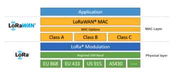
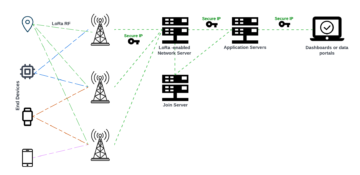
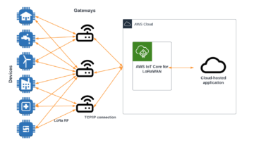


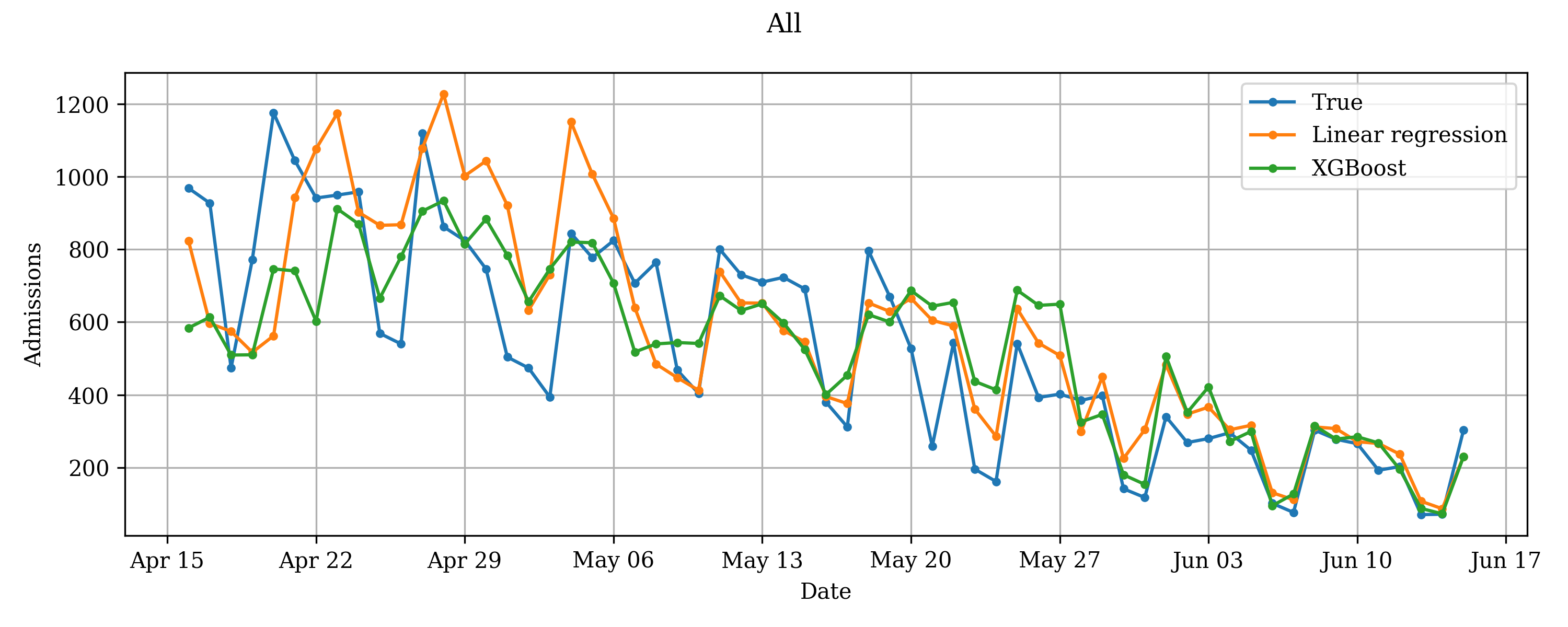


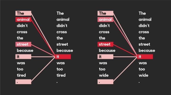
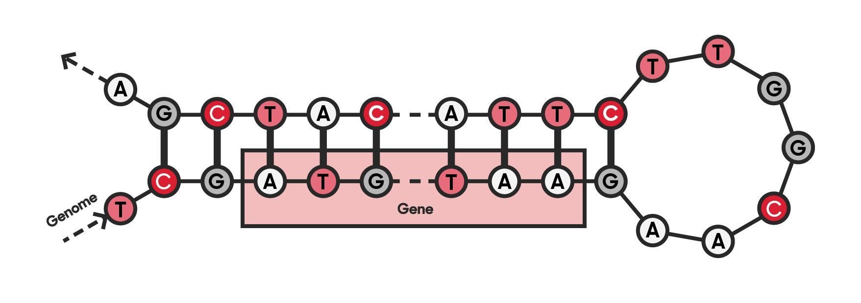


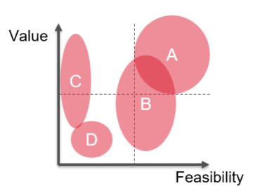
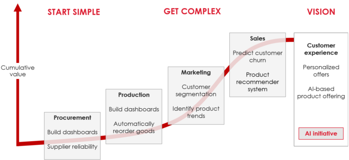


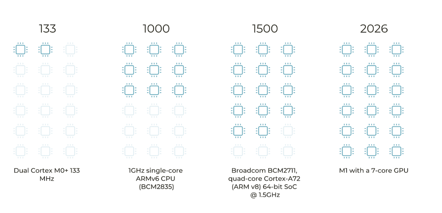


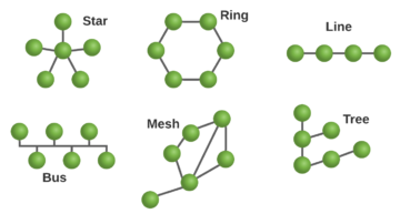


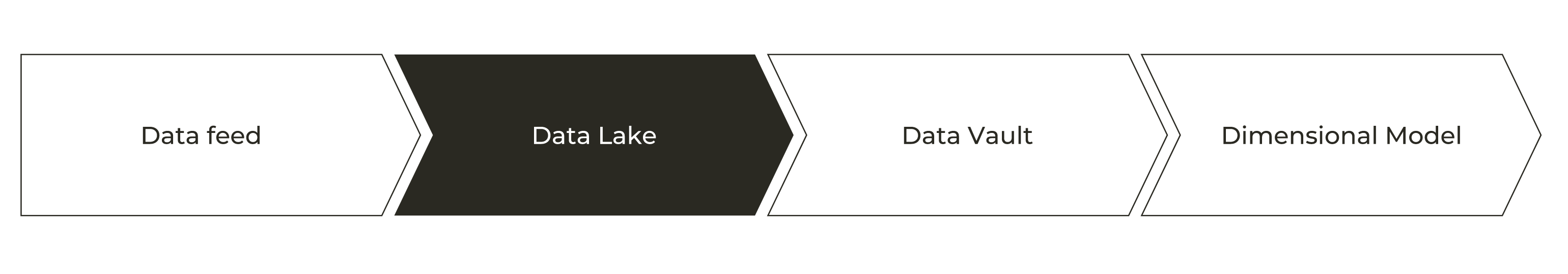


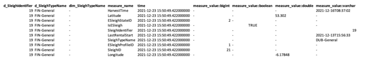
 Now we jump into Master Data when factory and fleet is up are covered. In this very complex supply chain system customer data is very typical transactional data and in this exercise we keep it very atomic having stored only very basic info into DynamoDB that

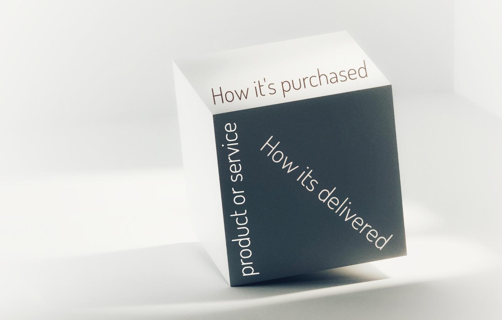


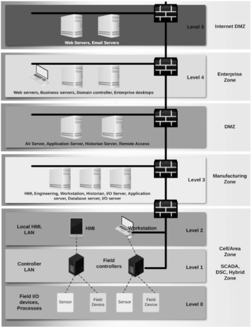


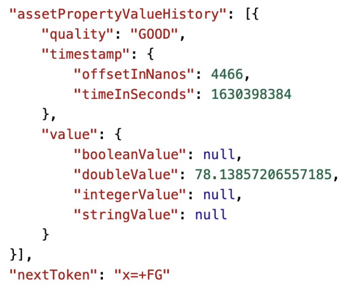


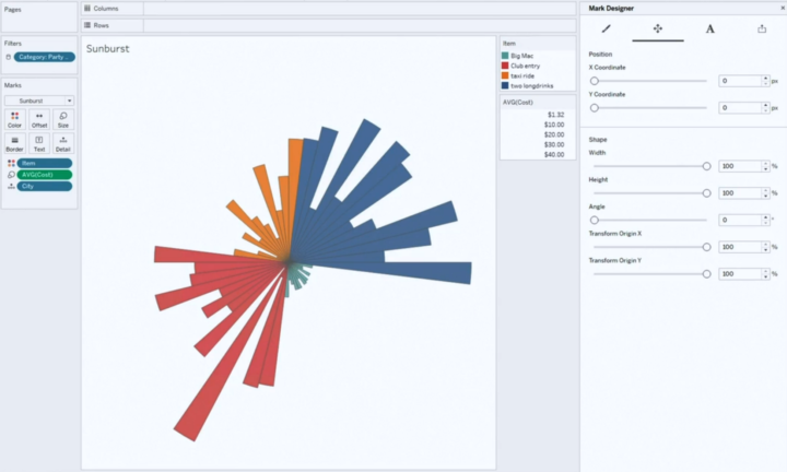


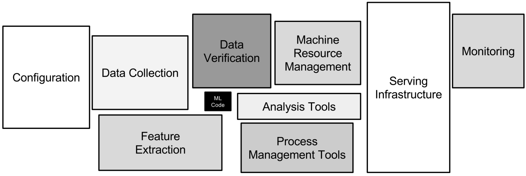
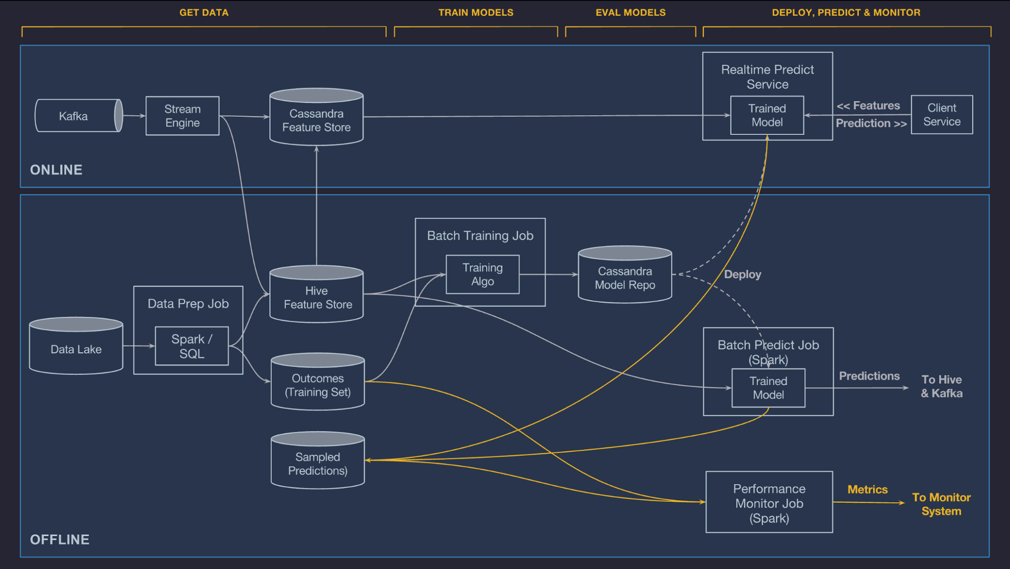


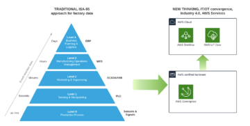
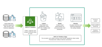


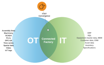


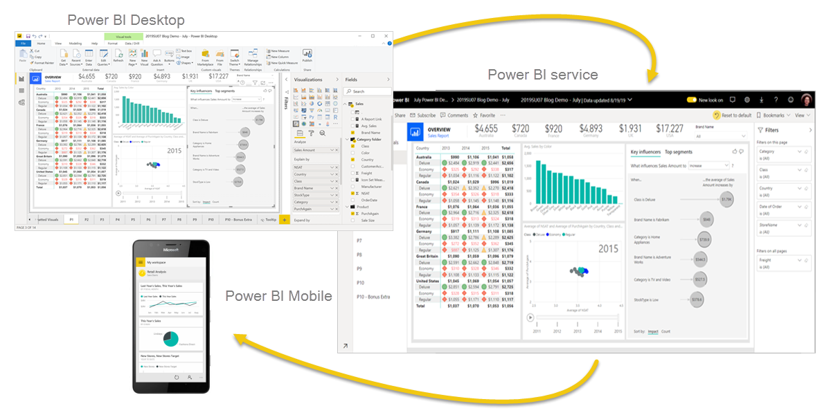
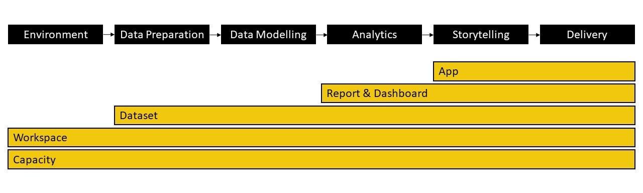
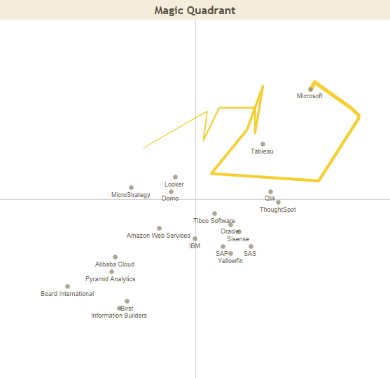
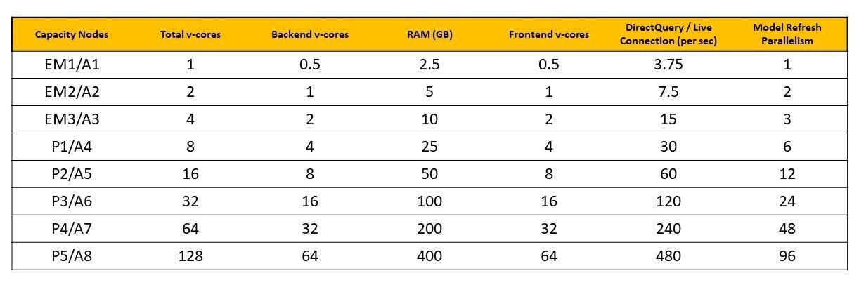


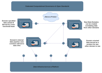
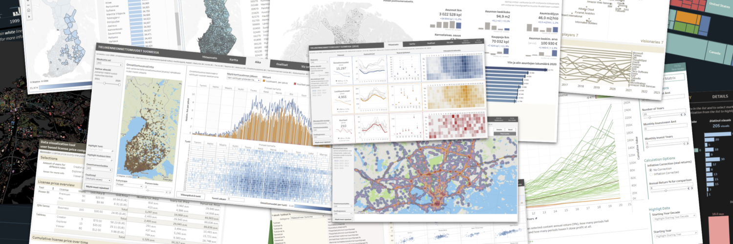

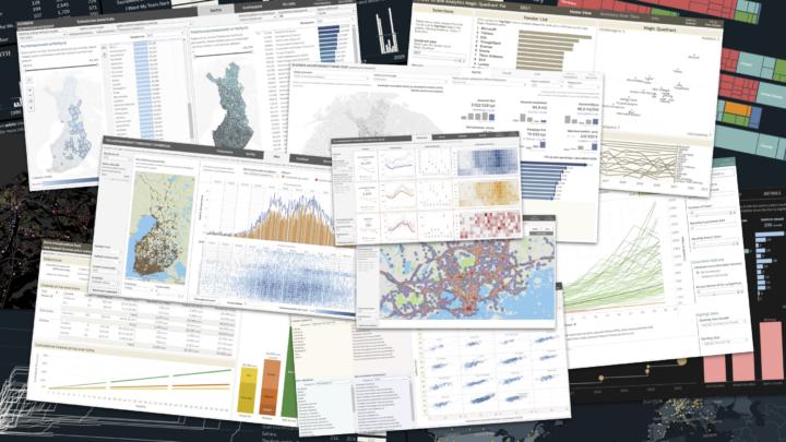
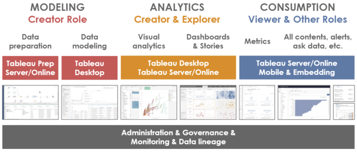
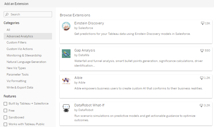
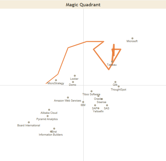

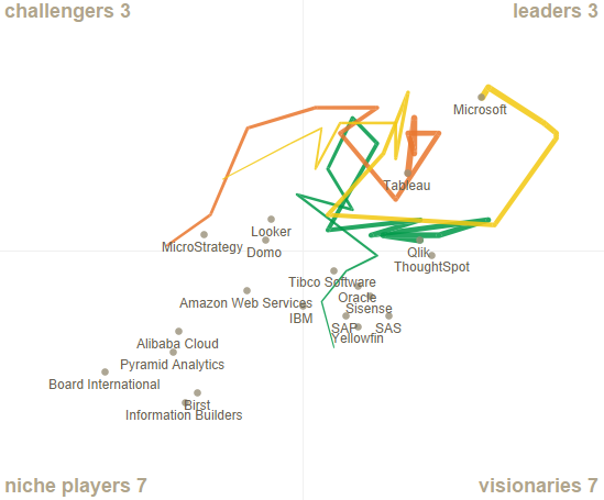


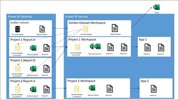


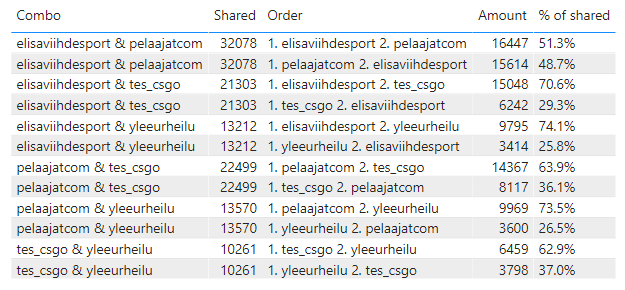
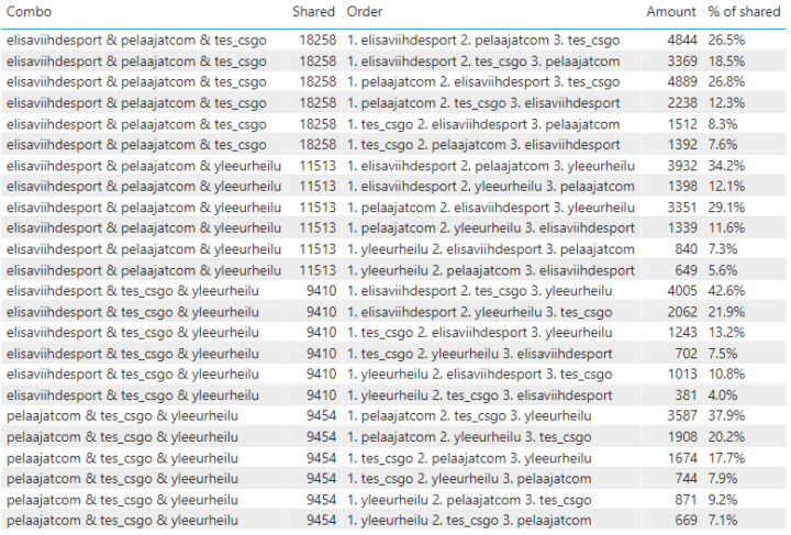
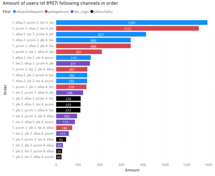

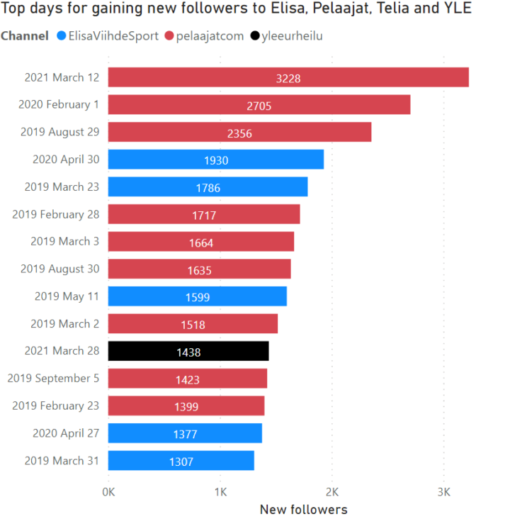

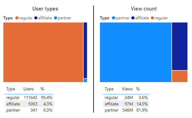

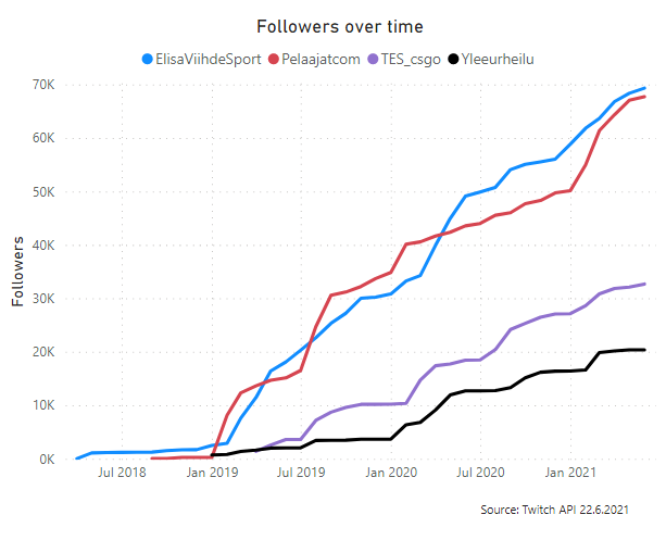
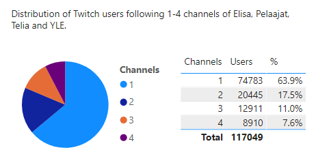

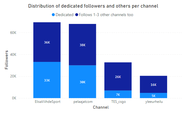

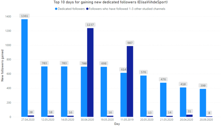
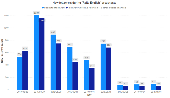
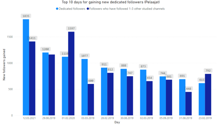


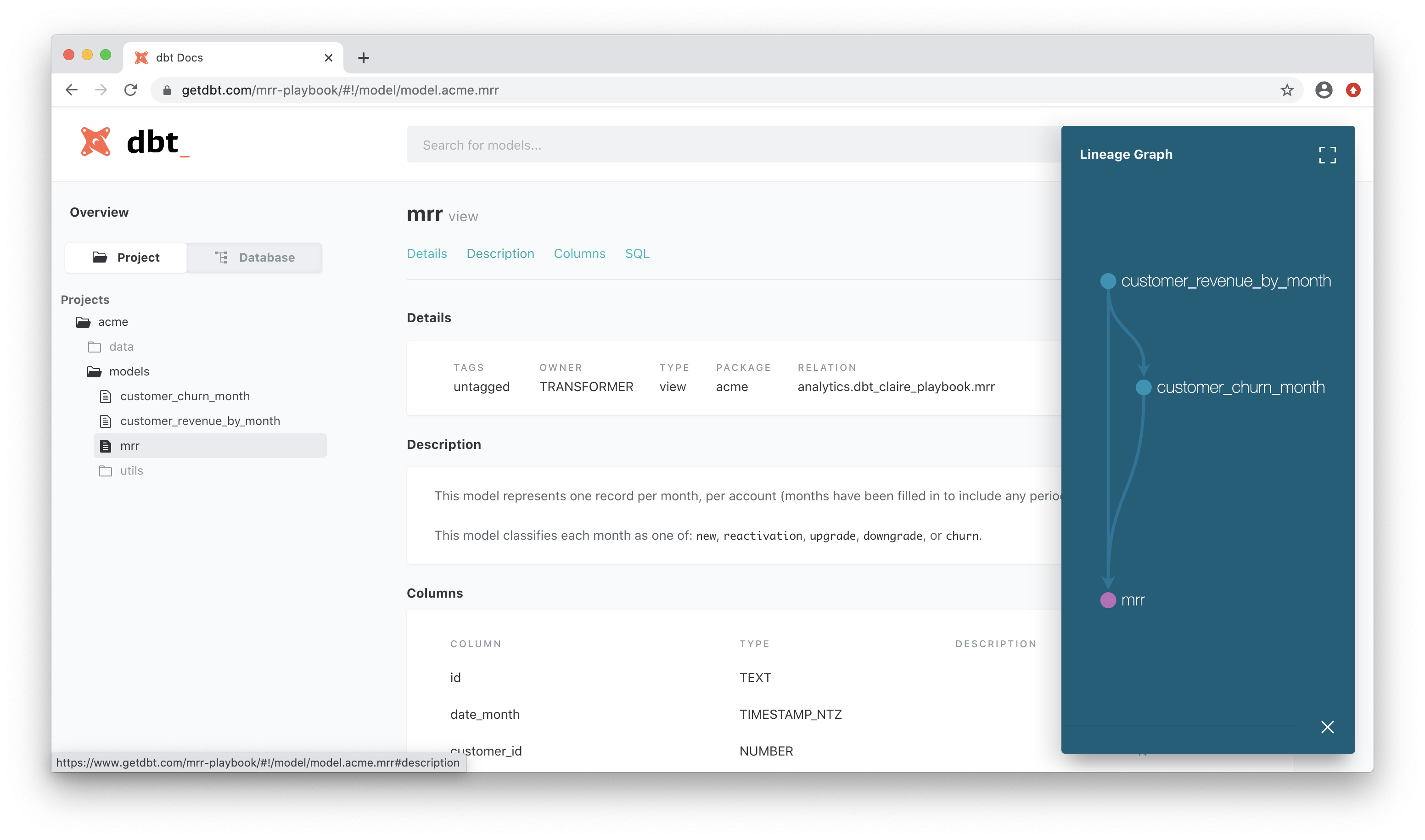


 In February 2021, Tableau announced that they will remove minimum user amount restrictions from their licensing. For example, earlier the Viewer license had a minimum sales volume of 100 users. The change has enabled Tableau to be deployed at very low cost and with exactly the number of users needed for each organisation.