Testing is always a crucial part of any Power BI development. When developing content to be embedded there are some different test angles to consider like what type of test users are needed, how RLS works in UI or what might look different after embedding. Testing is also something that needs to be done after go live and you need to have clear understanding with other stakeholders about the production release process.
In my blog seriespart 1 I described some experiences from my embed projects and issues to consider, like how to identify restrictions in Power BI to meet customer brand and functionalities not supported when content is embedded, to be prepared to manage expectations and agree what areas in the solution are developed with Power BI. The part 2 was dedicated to describe collaboration with stakeholders. This last part includes my experiences from testing and some production use considerations.
Testing, testing, testing
I am always a bit surprised how much time testing takes. When developed content to be embedded, noticed that I needed to reserve even more time for testing because testing need to be done in three different places:
Power BI desktop: data validation, functionalities, layout, performance (use also DAX Studio)
Power BI Service: gateway (if needed) and connections, monitor data refresh, Service principal access rights
UI/customer portal DEV and/or TEST environments: Same kind of testing needed as in Desktop as you might find some differences in positions or how e.g Header Icons are positioned or if there appear scroll bars need to be removed etc. If your solution will have a lot of users, then one big part of the testing is performance and load testing. Testing just mentioned requires other stakeholders input.
In “traditional” Power BI development you would do testing in the Desktop and then in the Power BI Service and maybe a bit less time is needed.
Noticed that testing needs to be done using different test users with different access rights. I asked for the different type test users and this way was able to make documentation including the information which features, reports and data each user should see. So, ensure you have all needed test users available to test different use cases.
As in traditional Power BI content development I needed to test the reports thoroughly to ensure that they work correctly and meet the user’s and brand requirements. In my projects I was able to use real production data, but of course sample test data can be used as well. With my test users I was able to simulate different scenarios and test the report’s performance under different conditions. And of course customer testers were also doing their part in the testing.
RLS testing
In my experience one of the most time consuming testing was access/visibility. Row Level Security (RLS) setup needs special attention and needs to be tested first in the Desktop and after this with many different users in the UI. This type of testing is different from the traditional Power BI Service testing/functionalities.
I also experienced that in these type solutions the RLS needs seem to change during the project. And as needs changed, I needed to do testing again for something that was already once approved.
Ways of working in testing
In my projects the Test manager/coordinator enabled a more effective adoption of testing practices. For Power BI developers working together with a Test manager/coordinator will probably mean that you are able to concentrate more on development and changes rather than sitting in testing sessions. Ensure that you have smooth communication with the Test manager/coordinator. Also consume time to show how testing should be done and what is relevant for you in test findings/notes.
Would say that consider carefully if it is useful to let the Testers do testing in Power BI Service. End user experience will not be the same in UI and testers might report wrong results. In my experience the better approach was to enable in the project a testing UI environment as soon as possible. And it is also important to get the Testers to do testing during the development phase and not just at the end of the project. This way I was able to get feedback from the tester in the early phase of the report development.
I noticed that the change and correction need to be reported in a structured way. This way I was able to see the “big picture” and plan the order and the time of the changes with other Power BI developers and UI developers. So, ensure to use clear versioning practicalities and communication channels. Otherwise you might end-up in a situation where another developer is overwriting a version and some changes are lost. The Deployment Pipeline feature could help to monitor the situation (and coming Git integration within Fabric might give even better results).
Experiences during the testing
Gathered some of my experiences from testing in my projects. Maybe these help you to tackle some obstacles beforehand.
Testing was divided into three areas: data validation, visual layout and Power BI functionalities and UI related report functionalities. I spent most of my time doing data validation like investigating source transactions and exception handling with DAX and testing different DAX solutions to meet business calculation requirements. Also gathering business logic for the calculations from different business and data owners took time.
During report development and testing, the Business owners realized there are more requirements to restrict data visibility to different types of users. RLS definitions changed many times and caused more development work and re-testing.
Noticed that the Testers needed some time to learn how testing is done and especially how to report findings. Learned that it was a good practice to have testing findings in small / many tickets rather than one huge one.
Sometimes the Testers forgot the scope of the project. So, I needed to actively ask the Business owner and Project manager what findings will be fixed and what can be added to future development lists.
The Test manager/coordinator checked frequently with the Testers and Business owner the status of test findings. We also had weekly sessions to check with the Business owner the situation and this way minimized risk of misunderstandings. Would recommend this type of way of working.
Before the Testers started the testing of a new report, we had a demo session. This way I was able to demo Power BI features/functionalities they were not so familiar with. In my experience this type of session is good to have also in the beginning of UAT testing.
Last learning for me was that having a UX Designer in the project helped to notice mistakes in layouts, colors, fonts etc.
Performance and load testing
One big part of testing might be performance testing and load testing. In many cases your reports probably work ok and the memory and CPU available within Premium capacity is enough. But if embed project reports are used by many users (thousands), data amounts are large, there are complex calculations and/or many visuals on one report page, you need to start planning the performance and load testing. Questions to the Business owner
How many users will there be?
Are there some peak moments when there are many concurrent users?
How much history data is needed on the reports?
Is it possible to reduce the amount of visuals in a report page?
Could you provide detailed level information about the business logic calculation needs?
The Business owner might not be able to answer these questions right away, but if you have heard any hints that some of the previous issues are relevant, it is best to include the performance and load testing to the project.
Production use considerations
As in all projects, you need to plan go live tasks and times. In my experience in these types of projects, it is worth considering phased production use start or if a certain pilot user group could be used. This way both customer and development team can get new improvement proposals from new users before a wide audience starts to use the reports.
You also need to discuss with the Business owner and Power BI Admin who is taking the ownership of support and alerts. If you are using e.g., dev, test and prod, maybe the support can be divided like this:
First hand support for end-users, inhouse or outsourced support team takes care
Support requests like user right problems
Owner of prod environment
Probably there is a separate tool in use within the customer to handle support tickets
“Deeper level” support where support team can contact Power BI developers
Support request requiring deep understanding about Power BI development, model, source tables etc.
Owner of dev and test environments
Probably you have your own organization support ticket tool
This is just one proposal and companies might have very different support models.
Testing in production
Another angle in production use is testing the changes and corrections. Remember to agree how future development and release is done. Consider following:
What is the timetable for releases?
Who is involved in testing? How do testers report results?
Where, how and who should be informed about the new features, reports, error corrections etc.?
How are changes documented?
Noticed that the planning of production use required many parties and many sessions. My role was more to give insights about the technical possibilities but my Project managers, Power BI admins and Business owners were dealing with other stuff like agreements.
Key takeaways
We were able to resolve complicated RLS needs where the authentication tool was not Microsoft Azure AD. This proved that Power BI is a suitable product to be used in solutions where the goal is to embed reports to your customer portal.
With ensuring enough time for testing these type of projects succeed.
Most important key takeaway was to understand how collaboration with other stakeholders ensures the best end results. Having a team around you with many skills, helps to resolve problems. Luckily in my company I was able to work with different kinds of talented people.
Development work for a customer portal is not something you can do alone. You need a project team with many skills to achieve the best result. When Power BI content is developed to be embedded, you need to collaborate with Power Service or UX designer, BI admin, Software developer, Business owner, Solution architect, Data Engineer, Project manager and Test manager.
In my blog series part 1 I described some experiences from my embed projects and issues to consider like how to identify restrictions in Power BI to meet customer brand and functionalities not supported when content is embedded, to be prepared to manage expectations and agree on what areas in the solution are developed with Power BI. This second part I dedicated to collaboration as I see it being one of the most important areas in a project where Power BI reports are embedded in a customer portal.
Tight collaboration with stakeholders
This type of development work is not done by individuals. You need to collaborate tightly with different stakeholders. Collaboration with different stakeholders can be very intensive in different phases of the project.
For example, with a UX designer, you need to use more time at the beginning of the project to plan and test layouts, json file etc. Later you will need her/his advice or opinions randomly in smaller details occurring in agile development work of individual reports. And then for example with Power BI admin your collaboration is tight in the beginning to get all accesses, connections etc. and then again at the end of the project when planning go-live and support processes.
How to make use of Service/UX designers expertise and feedback
Make sure you understand Service/UX designers’ drafts (if available) and ensure these issues are discussed:
Discuss with her/him about possible problems you recognize, like some planned layout plans are hard to accomplish in Power BI.
If a customer portal will be used via mobile phone, check and test together what is possible and what might be hard to achieve within Power BI.
Together test in Power BI different solutions to meet the brand requirements, but keep in mind also the usability and accessibility point of view.
Together use the time to create a json -theme file and test the import.
During the agile report development, I collaborated with Service/UX designer to get feedback or suggestions to resolve smaller problems in visual positions, sizes or text sizes. After I had published a report for testing, the Service/UX designer looked at it “with fresh eyes” and usually noticed something I had missed.
What insight you need from Power BI admin
Ask from customer Power BI admin the options and possible boundaries, like
How are they using Power BI Service?
What license model is in use?
Who can create gateway connections if needed?
Who can create Workspaces?
Does the customer allow custom visuals?
Is it ok to use the deployment pipeline process?
Will there be a dedicated premium tenant available?
Where should backup .pbit files be stored?
Overall make sure you inform the Power BI admin about the progress of the development and ask for help well in advance. I also included my Solution Architect in these discussions.
In the end part of the project, I involved the Power BI admin to plan and decide on go-live tasks and support processes.
How to pair work with Software Developer
As Power BI content, report page/pages or individual visuals will be embedded in a UI/customer portal you need to test and try different solutions together with Software developers doing the embedding. Consider these:
Clearly communicate the requirements for the Power BI embedded report to the software designer. Discuss the design and branding requirements, as well as any technical specifications, such as data sources and performance requirements.
Agree on the storage location for Power BI reports and visual’s IDs and ensure a clear communication process of updates.
Check how the report page fits into the UI and what is the best Page View option to be used.
Ensure you use the correct canvas size according to brand, but also verify that it is the best from the point of view of the report users.
Decide what areas are implemented in UI and what in Power BI. For example, a report header might be easier to maintain on the UI side if changes occur, Power BI page/sheet names need to be hidden in UI or some pre-selections in a date range are easier to do in UI.
If a customer portal will be used via mobile phone, check and test together the best Mobile layout for each report.
Review the report with the software designer and iterate based on testers’ feedback, both the technical and design aspects of the report.
During the testing phase, I noticed that sometimes for testers it was hard to recognize if the “bug” was related to Power BI or to UI. It helped to have weekly sessions with Business owner and testers. With the Software designer, I was able to smoothly discuss these in our daily sessions and/or in other communications tools.
How to ensure communication flow with Business owner
With the Business owner ensure the following:
You both understand report requirements and specifications are clear.
Reserve enough time and sessions with the customer to explore the old solution/customer portal.
Show the first draft of the new report version in the early phase to get feedback.
Ensure to have a communication channel open to ask questions and clarifications. Many times business owners forget to tell all the needed functionalities and during the development, you need to get more insights.
In my experience, it was a good practice to have the demo sessions for each report during the whole development phase in the project. In the testing phase, weekly sessions with the Business owner helped to keep track of the test results, “bug” reports and corrections.
Keep in mind other stakeholders
Some stakeholder cooperation is quite typical in all reporting-related development projects, so just briefly mentioning these:
Make sure you have a solid communication channel with the Customers data owner/developer, who understands the database, data source structure and business logic. If you are able to utilize a data warehouse, you have more possibilities to discuss with e.g., the Data Engineer which calculation could be done there or what to include in the source views.
If an old customer portal exists make sure you have contact persons to investigate and ask about the calculations logic done with the old tool. Sometimes contact can be a customer internal employee or another vendor’s representative.
Make sure to keep the Project manager and Solution architect aware of the technical obstacles you are facing or problems with testing resources. These stakeholders usually take care of the communication with other stakeholders like the customer’s management or testers.
Have recognized two other stakeholders, the Test manager/coordinator and Tester, but explain some insight related to them in the last part of my blog series.
I’ve collaborated with all stakeholders described above in my projects but this is not a complete list. For example, your customer organization model affects the number of stakeholders you need to collaborate with.
In the last part of my blog series I will tell you about my experiences in testing and support process planning for this type of solution.
Nowadays many companies are providing services where their B2B customers can investigate and monitor their data in a customer portal. Data could be related to purchases, product quality, delivery times, invoices etc. This type of data and content can be provided to the customer portal B2B users with BI tools, one of them Power BI.
Developing content for this type of solution includes several topics to consider as with “traditional” Power BI development to be shared via Power BI Service. First you need to identify user requirements. Then you spend time understanding data and identifying the data sources, the relationships between them, and the types of data your working with. After this you’re able to clean and transform the data to ensure that it is accurate, complete, and consistent. Next you need to design a model that is optimized for performance, scalability, and usability. This involves creating the necessary tables, columns, relationships, hierarchies, and calculations to support your analysis.
When data and data model is ready, you can choose appropriate visualizations, create interactive elements such as drill-downs and filters, optimize the report layout and ensure accessibility. Finally you need to use time to test your model and visualizations to ensure that they are working correctly and meeting requirements. During the whole process you remember to document the report design, data model, and queries used in the report.
Power BI content development to embed
Power BI Premium enables report and visual embedding. In this blog series I will concentrate on the Power BI developer’s point of view on a solution using some parts from Microsoft “Embed for your customers”. These types of solutions allow developers to build an app that uses non-interactive authentication against Power BI. Usually the report users are external users, and they don’t need to sign in using Power BI credentials to view the embedded content. (If you are interested in learning more details about a software developer’s point of view, visit Microsoft’s official pagesPower BI embedded analytics Client APIs | Microsoft Learn.)
In addition to these, there are things that I needed to take into account in the development work or need my special attention. Below are my key takeaways from the Power BI development projects where the objective was to recreate the old customer portal reports. Many of these are applicable also to Qlik Sense.
Identify restrictions in Power BI to meet customer brand or other UX design requirements and contribute to the development of a good theme file (json).
Prepare to do some expectation management.
Identify functionalities not supported when Power BI content is embedded.
Agree features/functionalities development and setups done in Power BI.
Do tight collaboration with stakeholders. – Read more in the second part of my blog series.
Reserve enough time for testing. – Read more in the third part of my blog series.
Remember to plan and agree on the support process well in advance as usually there are several parties and even tools involved. – Read more in the third part of my blog series.
Power BI restrictions and UX-related requirements
Some customers’ brands might have colors not best for reports accessibility or a font type not supported by Power BI. To tackle these in my experience the development work is easiest to do with a Service/UX designer and with the person responsible for the brand. So, in the early phase of the development work make sure you identify restrictions in the tool to meet brand or other UX-related requirements
Contribute to the development of a good theme file (json). This ensures that all reports have consistent and on-brand colors, fonts, etc. Experienced later that when my customer changed brand colors, it was much easier to implement these changes to all reports. Of course, this type of thinking is relevant in “traditional” Power BI development, but when reports are published outside customer organizations, these issues tend to be even more important.
Expectation management
Prepare to do some expectation management for the customer and testers, if an old existing customer portal is recreated with a new technology. Not all functionalities of the old implementation can necessarily be implemented or they are implemented in a different way. Or the new implementation may have new features or some functionality may be better or sometimes worse compared to the old implementation. During my projects this took time as there was existing portal to be replaced.
To really understand feature and functionality requirements, reserve enough time and sessions with the Business owners or Testers to explore the old solution. In my projects I showed the first draft of the report in the early phase, to get feedback. Noticed also that sometimes the Business owner or Tester do not understand the advantages of an agile way of development. So, it did need some courage to show “not so polished” report versions.
If a totally new customer portal is created, then you probably have much more freedom to introduce visualization types and report layouts/features. But in this case, I would also prefer to demo as soon as possible the first draft version of a report.
Power BI restrictions and embedding
Ensure you know all the solution requirements and discuss them with the Solution Architect and Software developer whether they all are possible to implement. Especially some Power BI Service-related functionalities you probably need to handle outside the tool:
Export to PDF
Save favorites/bookmarks
Report Subscription
Hiding reports from certain users
Embed report size and positions in the customer portal
Functionality to move from one report to another with portal selections/dropdown lists
Agree on features/functionalities development and setups done in Power BI
These features/functionalities I needed to agree with other stakeholders if they are developed in or outside Power BI:
Report headers/titles (consider where maintenance of the name changes is easiest)
Consider if some Filter controls need to be done in the UI/customer portal. E.g., default selections in slicers.
These features/functionalities setups in Power BI need to be agreed upon and tested carefully:
The format of token values is managed outside Power BI, but need to make sure that RLS rules use the correct formats
Page view setup
Page/canvas size, Height and Width
Mobile layouts
I will continue the story about my own experiences related to tight collaboration with stakeholders, testing and support process planning in the next parts of my blog series.
Meet Johanna, Tuomas and Tero! Our Consultants, who all work with data analysis and visualizations. Let’s map out their journey at Solita and demystify the work of Analytics Consultants!
All three have had different journeys to become an Analytics Consultant. Tuomas has a business degree and Tero started his career working with telecommunications technology. Johanna however found her way to visualizations quite young: “I created my first IBM Cognos reports as a summer trainee when I was 18 and somehow, I ended up studying Information Systems Science.” It has been, however, love at first sight for all of them. Now they work at Solita’s Data Science and Analytics Cell.
What is a typical Analytics Consultant’s workday like?
The interest in versatile work tasks combines our Analytics Consultants. Tuomas describes himself as “a Power BI Expert”. His days go fast by designing Power BI phases, modelling data, and doing classical pipeline work. “Sometimes I’d say my role has been something between project or service manager.”
Tero in the other hand is focusing on report developing and visualizations. He defines backlogs, develops metadata models, and holds client workshops.
Johanna sees herself as a Data Visualization Specialist, who develops reports for her customers. She creates datasets, and defines report designs and themes. “My work also includes data governance and the occasional maintenance work,” Johanna adds.
All three agree that development work is one of their main tasks. “I could say that a third of my time goes to development,” Tuomas estimates. “In my case I would say even half of my time goes to development,” Tero states.
Power BI is the main tool that they are using. Microsoft Azure and Snowflake are also in daily use. Tools vary in projects, so Tuomas highlights that “it is important to understand the nature of different tools even though one would not work straight with them”.
What is the best part of an Analytics Consultant’s work?
The possibility to work with real-life problems and creating concrete solutions brings the most joy to our consultants. “It is really satisfying to provide user experiences, which deliver the necessary information and functionality, which the end users need to solve their business-related questions,” Johanna clarifies her thoughts.
And of course, collaborating with people keeps our consultants going! Tuomas estimates that 35% of his time is dedicated to stakeholder communications: he mentions customer meetings, but also writing documentations, and creating project defining, “specs”, with his customers.
Our consultants agree that communication skills are one of the key soft skills to master when desiring to become an Analytics Consultant! Tuomas tells, that working and communicating with end-users has always felt natural to him.
Tero is intrigued by the possibility of working with different industries: “I will learn how different industries and companies work, what kind of processes they have and how legislation affects them. This work is all about understanding the industry and being customer-oriented.”
“Each workday is different and interesting! I am dealing with many different kinds of customers and business domains every day.”
When asked, what keeps the consultants working with visualizations, they all ponder for a few seconds. “A report, which I create, will provide straight benefit for the users. That is important to me,” Tuomas sums up his thoughts. “Each workday is unique and interesting! I am dealing with many different customers and business domains every day,” Johanna answers. Tero smiles and concludes: “When my customers get excited about my visualization, that is the best feeling!”
How are our Analytics Consultants developing their careers?
After working over 10 years with reporting and visualizations, Tero feels that he has found his home: “This role feels good to me, and it suits my personality well. Of course, I am interested in getting involved with new industries and learning new tools, but now I am really contented!”
Tuomas, who is a newcomer compared to Tero, has a strong urge to learn more: “Next target is to get a deeper and more technical understanding of data engineering tools. I would say there are good opportunities at Solita to find the most suitable path for you.”
Johanna has had different roles in her Solita journey, but she keeps returning to work with visualizations: “I will develop my skills in design, and I would love to learn a new tool too! This role is all about continuous learning and that is an important capability of an Analytics Consultant!”
“I would say there are good opportunities at Solita to find the most suitable path for you.”
How to become an excellent Analytics Consultant? Here are our experts’ tips:
Johanna: “Work together with different stakeholders to produce the best solutions. Do not be afraid to challenge the customer, ask questions or make mistakes.”
Tuomas: “Be curious to try and learn new things. Don’t be afraid to fail. Ask colleagues and remember to challenge customer’s point of view when needed.”
Tero: “Be proactive! From the point of view of technical solutions and data. Customers expect us to bring them innovative ideas!”
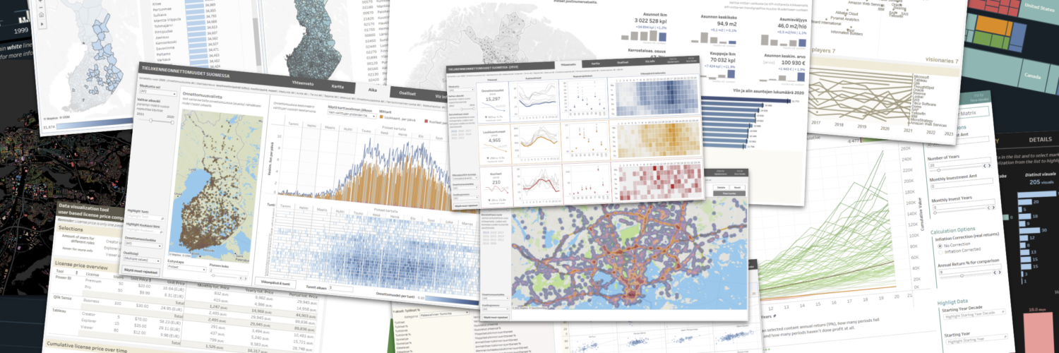
Tableau can rightly be called a pioneer of modern data visualisation and self-service BI. Founded in 2003, the company launched the first version of its visual analytics product back in 2004. The basic principles of the tool, the way it’s used to analyze data and create visualisations, have remained similar ever since. Tableau still stands out from other tools especially in the flexibility of building visualisations and interactions, as well as the versatility of out-of-the-box map visualisations and geospatial capabilities. In addition to visualisations, Tableau is a fully-fledged analytic solution – to understand and act on data.
This is the second post in the blog series about BI tools. The first post was about the evolution of business intelligence in the 21st century. This time we delve into one of the leading tools in the market. We will describe what differentiates Tableau from key competitors, what the platform consists of, what the licensing options are and much more. We will try to be as comprehensive as possible, but all the features can’t be considered or even mentioned. Describing a BI tool thoroughly in a blog post is extremely challenging. Contact us if you need a more detailed evaluation or want to see Tableau in action with real-life data contents.
This is what Tableau mentions as their mission: to help people see and understand their data. Tableau aims to be easy to use so everybody can utilize it and derive usable insights out of their data. Tableau was originally built based on data visualisation research done at Stanford University; how to optimally support people’s natural ability to think visually and to intuitively understand certain graphical presentations.
Tableau Desktop did a very good job in the era of Enterprise BI dinosaurs to make data analytics easier and even fun (read the previous blog post for reference about dinosaurs). The success and market penetration with the Tableau Desktop meant the platform needed to be expanded. Tableau Server, Online, Public, Mobile and Prep have been released since then. Nowadays the Tableau offering is a comprehensive analytical platform with a certain twist compared to competitors.
The Tableau twist
Quickly and easily to insights In general it is very fast to get from source data to valuable insights with Tableau. Analysing data and creating visuals and dashboards is mostly very easy and smooth. There are out-of-the-box time hierarchies available, drag and drop analytical templates to use and a good amount of easy to create calculations (running totals, moving averages, share of total, rank etc.). Ease of use also goes to data preparation and modeling. Both of those can be done without deep technical knowledge and coding skills. Perhaps what I’m most grateful for in this area is how new features are published and old ones deprecated: in a way it just works. For example when the new in-memory extract storage replaced the old technology in 2018 it was done with minimal effect and maintenance work to the users. Same thing happened in 2020 when a new semantic data model layer was introduced, and again, no laborious migrations from old to new, everything just worked.
Extraordinary creativity Tableau was originally a tool for data visualisation and visual analytics, and for that it remains extremely strong. Tableau uniquely enables user creativity and ingenuity when analyzing data and developing content. What does this mean? In other tools you usually first select the desired outcome you are looking for (the visualisation type e.g. line, area, bar, pie, etc.) and then assign the fields to the roles the visualisation type supports (e.g. values, legend, axis, tooltip, etc.). If the visualisation doesn’t support something you would need (e.g. size or small-multiples) then there isn’t much you can do.
Tableau works very differently: you can drag and drop fields to the canvas and Tableau will visualize the data in a suitable way. Certain properties of a field can be changed on the fly: dimensions can be changed to measures, discrete fields converted to continuous, and vice versa. Almost any field can be assigned into any role, and different types of visualisations can be combined. This approach is more flexible than in any other tool I have used. However, this can seem complicated at first. Fortunately, Tableau has a Show Me menu to help you to create different visualisations and to understand how the tool works. Once you get the hang of it, you can do powerful visual analytics like never before.
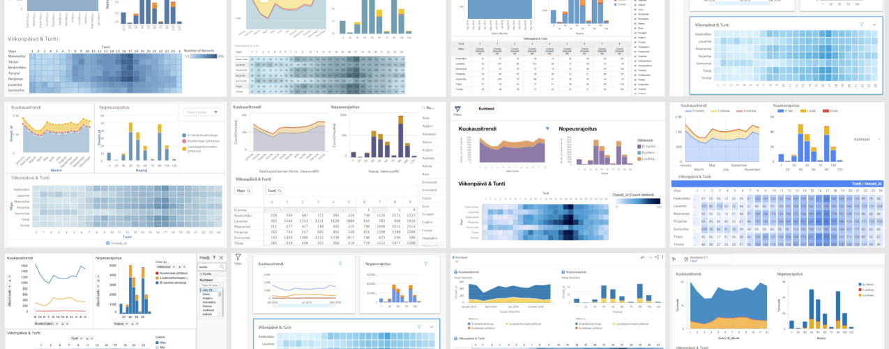
A bunch of different Tableau dashboards and visualisations. All of these are available in Tableau Public.
Maps and spatial capabilities As mentioned earlier, the different types of visualisations are very diverse and flexible in Tableau, but especially maps and spatial analytics are top notch. Here’s a short list of what makes Tableau’s spatial capabilities so great:
Tableau is able to read spatial data from many different data sources. Point, line and polygon geometries can be used directly from Snowflake, SQL Server, PostgreSQL and Oracle databases. Spatial data can also be ingested from different files, like GeoJSON, KML, TopoJSON, Esri Shapefile etc.
An unlimited number of layers can be defined to the same Tableau map. Different layers can display various kinds of data and geometries. And users can toggle layer visibility on/off.
Data on a single layer can be visualised in various ways: as points (symbols) , lines, polygons (filled areas), heatmaps, pies, paths etc.
Tableau supports geocoding (transforming location related attributes to a location on a map). Attributes that can be geocoded are for example: country, state, city and postal code.
Tableau supports spatial joins and functions. These enable location based data joins and calculations for example to make lines between points, calculate the distance between points, recognize if lines intersect or if a point is inside a polygon etc.
WMS (Web Map Service) maps and Mapbox are supported as background maps.
There is no limit to the number of data points on the maps in Tableau. Many tools can have a limit of 3500 or 10000 points, but Tableau can visualize hundreds of thousands of points with good performance.
With map tools, the user can interact with the map in many ways, e.g., zoom in/out, measure distance, calculate areas, select points, toggle layer visibility, search locations, and more.
All of this mentioned above is available out-of-the-box, no additional components required.
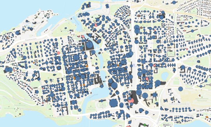
Detailed city centre map with street map as a background, building layer containing dark grey polygons on the bottom and point layer on the top showing floor area (size) & heating fuel (color).
Interactions between user and visualisations The third strength of Tableau is the abilities for the user to interact with visualisations and the ability for the developer to precisely define where and how these interactions take place. Interactions can be used, for example, to filter data, highlight data, show and hide layout objects, show tooltips, define values for parameters and set objects, drill up and down, drill through to another dashboard or to an external url. Interactions can enable especially non-technical business users who consume pre-made content to get more information and insights from a single dashboard without the need to create multiple dashboards or going full self-service mode.
Flexibility of infrastructure and governance Tableau is exactly the same tool regardless of how and where you choose to deploy it (on-premise, public cloud or SaaS). You can use Windows or Linux servers (or containers) and Windows and Mac computers for the desktop. You can use different authentication options, user directories and data sources without any mandatory dependencies to any cloud vendor whatsoever.
Same flexibility is there when creating the content. Data models can be created with exactly the same way and functionalities whether it’s in extract or live mode. And you can also combine extract and live mode contents on the same dashboard. The same scripting language is used when preparing the data and building the visualisations. And it is quite a powerful, yet easy and straightforward language to use. The flexibility carries on when publishing the content to Server/Online. You can structure the contents to folders exactly as you like and apply security policies on the detail level you need.
Active and passionate user community The Tableau user community is more active and passionate compared to other corporate tool user communities. For example, Tableau Public has more than 3.7 million published visualisations from more than 1.5 million users. Anyone can browse and use these visualisations to learn about the data and how to use Tableau. The community supports and helps with issues and problems related to the tool, but I personally appreciate the work they do to spread data understanding and share best visualisation practices and examples.
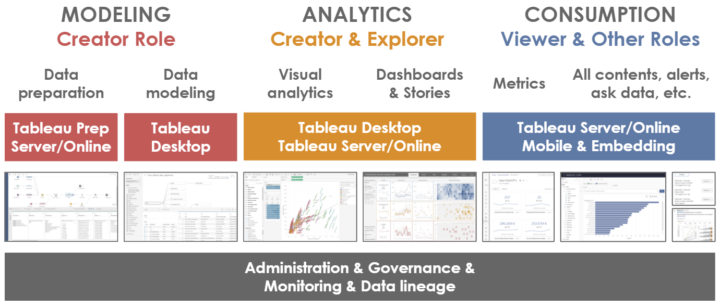
Main functionalities & workflow
Tableau contains everything that a modern analytics platform can be expected to contain. There are no major deficiencies, but obviously there are some areas for improvements especially related to the newer features. Tableau can be used to master the whole visual analytics pipeline, from the data preparation to various ways of consumption, across multiple channels. This is how Tableau workflow usually goes.
Tableau platform core functionalities, components and related user roles.
Data Preparation If you need data preparation capabilities Tableau offers this within Tableau Prep. This tool can be used as a desktop client or directly within Tableau Server or Online. Tableau Prep is built around the same easy to use mentality as the other components in the platform. Creating data manipulation steps and the whole workflow is very visual, the process is easy to understand and it’s easy to see what’s happening to the data along the way. Tableau Prep offers standard data wrangling capabilities to join, union, pivot, clean and aggregate data. You can also add new rows to the data and use custom R or Python scripts to calculate new insights. The result dataset can be pushed to a file, to a database or as a Tableau data extract. Already made data preparation workflows can be shared and reused, and the scheduling and execution can be monitored via the Prep Conductor add-on.
Data modeling Most commonly data modeling is done using the Tableau Desktop client. Exceptions are, if you use Tableau Prep or some external tool with Tableau API to create and refresh the data extracts. With Tableau Desktop you connect to the data sources, select the objects you want and define joins and relationships between the objects. Nowadays Tableau data models include two layers: physical layer and logical (semantic) layer. The separation of the two makes it possible to reuse the same Tableau data model for different purposes. Logical layer functionality was published with version 2020.2 and it is a crucial update to the data model.
While modeling the data you selected whether to use live connection or extract data to Tableau’s columnar in-memory data storage. Whatever you choose, you have the exact same functionalities and capabilities in use and you can also change the connection type later on. One possibility is also to use incremental refresh so only new rows are inserted to the data extract. The best practice is to verify and define all field’s data type, default formatting & aggregation, geographical role etc. directly when modeling the data even though these can be altered later on while doing visual analytics. Row-level security filters can also be added to the data model to define different data visibility for different groups. While doing the data model you usually create the first visualizations in parallel to better understand the data and to make sure it is what you are expecting. When the data model is ready you can publish it to Tableau Server/Online to enable reusability.
Visual analytics Then we get to the fun part, doing visual analytics. This and the following steps can be done either with Tableau Desktop or via Tableau Server/Online using the browser. There are so many ways to do this. You can drag and drop the fields to the canvas and let Tableau pick the proper visualisation type. Or drag and drop the fields to the exact roles and define the exact settings, filters and parameters you want.
When you get insights from the data and new questions arise you just modify the visualisation to also get the new questions answered. Perhaps create quick table calculations or various types of other calculations to get new insights. Sometimes it’s a good idea to try the Show Me menu to get some new perspectives. Or use the Ask Data functionality to write the questions you have and let Tableau build the vizzes. As previously mentioned, this is where Tableau truly shines. When you have individual visualisations ready you can start building a dashboard.
Dashboards If you want you can create the dashboard very quickly: just drag and drop the visualisations to the canvas, enable visual filtering, show filter selections, legends and some descriptive headers, and you are ready. On the other hand, you can also plan and finetune the layout and interactions to great detail. Create objects with conditional visibility controlled via show/hide buttons or selections in other visualisations, add multiple tabs and drill-throughs to other contents etc.
Nowadays you can even have fully customizable objects via Tableau Extensions, for example new types of visualisations, predictive analytics, interactions, write-back, etc. If the dashboard will be consumed via different devices you can define distinct layouts and contents tailored to for example tablets and phones. In addition to dashboards, users can also create stories with multiple steps/slides containing different visualisations and comments, a bit like PowerPoint presentations with interactive visuals.
Example screenshot of Tableau Dashboard Extensions offering.
Metrics (KPI’s) You can create many kinds of KPIs and metrics within a dashboard, but there is also a distinct Metrics feature in Tableau. Metrics objects can be created in Tableau Server/Online folders to view the most important figures already while navigating the contents. Metrics are a nice way to gather key figures from different dashboards to a single place in a very easy way. And if there’s a date field available in the data the metric can also contain a small trend graph.
Other ways to consume contents There are still many ways in Tableau to consume the contents that I haven’t yet written about. Dashboard users can subscribe to the content, set alarms to get notifications when thresholds are exceeded, save filter & parameter combinations as bookmarks, export data, comment and discuss about the dashboards etc. In addition to Tableau Server/Online, content can be consumed with mobile apps (also offline possibility), integrated to Slack or embedded to external services.
With Ask Data functionality Tableau data models can be queried using written questions. Someone might ask for “top 20 customers in Europe by sales in 2021”, and Tableau would show the answer as a graph. A few years ago I was very sceptical about this kind of feature, thinking it wouldn’t work. But after using it a couple of times during this year I think it is actually quite neat, although I still have my doubts for more complex use cases. Another nice automated insights type of feature is Explain Data which can show fairly basic info about the selected datapoint from statistical perspective.
Administration and Governance
One crucial part of the workflow is governance and monitoring. Most of the governance definitions are created before the development work even starts. Administrator sets up the authentication and creates appropriate user groups either manually or from the user directory. Administrators can mandate domain owners to control their contents but still have visibility to the contents in the platform. Administrators have a variety of tools to monitor and govern the environment, also to a very detailed level if needed.
There are also a few add-on components available to enhance the use of Tableau Server/Online. Tableau Data Management add-on contains Tableau Prep Conductor to orchestrate and monitor Tableau Prep workflows and Tableau Catalog to view more details about the contents, data lineage and impact analysis. Tableau Server Manager add-on gives more power managing Tableau Server environment, to enhance performance, scalability, content migration, resource usage etc.
Also several API’s are available to control and use Tableau programmatically. These include ways to manage Tableau Server environments via code, connect to data, create and use Tableau data sources, use external analytical capabilities like R and Python, create and use dashboard extensions and embed Tableau content to external services and mobile apps.
Room for improvements
Even though Tableau data models nowadays contain a semantic layer and are way more versatile than before, there is still something to improve. Better multifact support, possibility for secondary relationships and refined incremental refresh would be nice, but of course those might sometimes complicate the models quite a lot. The good thing about the current state is that models are still easy to understand and use. A bigger data model related improvement would be the ability to reuse existing data models when creating new ones, a bit of what you already can do with the data flows in Tableau Prep. This would really improve the ability to do end-to-end bimodal BI on the data model layer. Most important data models could be built centrally and then decentralised content development could add their own data to their own models without duplicating the model and the data of the centralised model.
Some augmented analytics or autoML features have been released during this year, but those still feel very basic and a bit disconnected from the core platform. This capability somewhat relies on Salesforce Einstein Analytics capabilities and is not (at least yet) fully built-in to Tableau platform. The current Explain Data feature is able to show basic details about the selected datapoint, but I would like it to emphasize the most interesting data points and related insights (anomalies & trends etc.) automatically.
The history of being originally a desktop tool is still quite visible. Contents are somewhat workbook and visualisation oriented. This is not necessarily bad, because it can help to structure the contents in a logical way, but there are few things to improve. I would really love to be able to more easily create dashboard navigation and drill through between contents in distinct workbooks. Within the same workbook it’s very easy, but among different workbooks it gets a bit clunky.
Desktop tooling can create pressure for IT or whoever needs to maintain, deliver and update the client software on a regular basis. Keeping up with major updates (4 times a year) and possible minor updates can be a hassle. Tableau is moving towards a browser based approach but for now some of the functionalities are still only available via Tableau Desktop client installed on users’ laptops.
Building the visualisation and doing visual analytics is a somewhat manual process in Tableau. After all, it wouldn’t be visual analytics if the outcome would just appear, without the journey to see different viewpoints and learning the insights along the way. Ask Data and Explain Data features are one way of making visualisations faster and in a more automated manner, but I would also like to see more code driven options to build and manage the contents. This would make it possible to use the visual power of Tableau in a more data ops oriented way. To build visualisations and dashboards on the fly already in the data pipelines and to deploy the contents automatically to different environments.
Then I have to mention the pricing, even though the importance of the licence price is commonly exaggerated over the other components affecting the total cost of ownership (TCO). What I do like about Tableau pricing is the fact there are no hidden costs to be discovered later. With the default price you get the capabilities and there rarely is a need to buy something more expensive later on. You just buy more licenses if you want to increase the number of users. And here lies the criticism I have. Normally you use per user licensing when the number of users is rather small (something like 10-300 users). With Tableau Server you can switch to core based licensing when the number of users gets bigger or you want to enable guest access etc. But when using Tableau Online there is no possibility to select core or node based licensing, you just have to stick with the user based license model. Of course Tableau might offer you some discounts if you have a lot of users within the Tableau Online, but that’s just something I really don’t know nor can’t promise.
Greetings from Gartner and Forrester
Gartner has placed Tableau as a leader already for 9 consecutive years in the Magic Quadrant for Analytics and Business Intelligence. In the latest report Gartner recognizes the analytics user experience, and the very strong community and customer’s fan-like attitude towards the product as a core strengths of Tableau. Gartner also mentions the potential with the Salesforce product family to integrate Tableau more tightly to different solutions and to easily embed Tableau visualisation with the Tableau Viz Lightning web component. As a caution, Gartner mentions Tableau’s non-cloud native history and install base as well as premium pricing and possible integration challenges with Salesforce products.
Tableau 2021 position and path in the Gartner MQ for Analytics and Business intelligence. Check out the visualisation in Tableau Public.
In the Critical Capabilities for Analytics and Business Intelligence Platform 2021 report Gartner focuses more on the actual capabilities and functionalities. In the report Gartner rates Tableau as excellent in data preparation, which is simple and visual to use and easy to publish, schedule and monitor. Also more complex tasks can be executed via R & Python scripts. Gartner also praises the Tableau governance capabilities to promote and certify contents as well as control the workflows and view data lineage to better understand data assets. Gartner says Tableau is the clear leader in the area of data visualisation, but there are things to improve in the augmented analytics area, partly because of the lack of integration with Einstein Analytics. This however has improved since the publication of the Gartner report with the Einstein Discovery Extension and other functionalities.
The Forrester Wave for Augmented BI Platforms Q3 2021 names Tableau (Salesforce in the report) as a leader. Forrester recognizes visual and geospatial analytics as core strengths. The Forrester report, being published later than the two Gartner reports, rates Tableau much better in augmented analytics. Forrester mentions the Einstein Discovery functionality and out-of-the-box ML models that significantly boost Tableau capabilities beyond descriptive and diagnostic analytics towards guided ML. Forrester sees room for improvement among business application connectors.
Infrastructure options
Tableau offers a wide variety of options in how to be deployed in organisations and Tableau doesn’t favor any cloud or infra provider. Tableau Desktop is available for both Mac and Windows. It is used to connect to data in databases, services or files and to visualise that data in charts and dashboards. Tableau also offers a web authoring mode where no software installation is required.
In order to share visualisations with a wider audience, Tableau Server is used. Tableau Server is available as a server application and a cloud service (Tableau Online). If you want to host your own server, you can do it as an on premise server, in a private cloud or house it in a public cloud such as AWS, Azure or GCP. Tableau Server can be installed on Windows or Linux operating systems and for Linux, it is also available to run inside a Linux Docker container.
In its basic form Tableau Server can be installed on a single node. For more complex solutions, the installation can be scaled out for specific scenarios such as high availability or high performance. Using your own server allows for total control over settings and customisations of the server, but then of course you have the extra effort to maintain and monitor the environment and take care of the infrastructure costs.
Tableau Online is the software-as-a-service offering for those not hosting their own servers. The Online service is divided into pods located all over the world and customers can select which pod that should house their Tableau site. Tableau Online obviously doesn’t provide so much control over the environment, but instead it’s much more straightforward to use and deploy. Accessing the portal in Tableau Server or Online can be done using all major browsers. There are also mobile viewer apps for iOS and Android.
Licensing and publicly available pricing
The default way of licensing Tableau is a per user subscription model. Additionally there is a core based licensing option available for Tableau Server (but not for Tableau Online) and possibility to license to a specific embedding use case with a discounted price. Tableau licenses can be purchased from Tableau partners, Solita can help you to find the optimal license combination, get the licenses, and everything else you might need.
Tableau licensing is divided by the usage roles for Creator, Explorer and Viewer. Capabilities depend on the role and Creators are the most capable of the lot. They can connect to data sources, prepare and model data, create visualisations and publish both visualisations and data models to Server/Online. Explorers can do visual analytics and use existing data models and reports to build and extend visualisations and dashboards. Viewers can browse and interact with content. All roles can and set up favourites, subscriptions and alerts to personalise their experience in the service.
All three roles are available for both Tableau Server and Tableau Online. Subscriptions are priced in USD per month. License fees are billed yearly. You can use the license price calculator in the Tableau Public to calculate total price for certain role combinations (notice: calculator contains only publicly available pricing information): Data Viz tool license pricing
Tableau Online (Oct/2021, per user per month)
Creator: $70
Explorer: $42
Viewer: $15
Tableau Server (Oct/2021, per user per month)
Creator: $70
Explorer: $35
Viewer: $12
Add-on modules (custom pricing from Tableau)
Data Management
Server Management
Einstein Discovery
Server licenses are also offered as license type Tableau Embedded Analytics with a 25% reduction on licenses, when organisations want to offer Tableau content as an analysis service to external parties.
For students and academic institutions there is a possibility to get a free 1-year license and access to eLearning contents.
There’s also a free version called Tableau Public. Tableau Public offers Tableau visual analytics power and possibility to save and share the results only via Tableau Public service. It is used by visualisation enthusiasts all over the world and is an excellent source to find creative ways to use Tableau. But be sure not to publish any non-public data to Tableau Public service since the contents can be found via url, even when the content is not searchable or listed within your profile.
Sometimes you might also hear about a tool called Tableau CRM. Tableau CRM is actually rebranded Salesforce Einstein Analytics. That is not originally part of Tableau platform, but Salesforce has plans to tighten the integration between the two in the future.
How to test and start with Tableau
Tableau Desktop trial: 14-days trial to try the capabilities in the Tableau Desktop.
Download and install the product from the Tableau site
Fill in your email when launching the tool for the first time
Tableau Online trial: Test the Tableau Online capabilities to share and analyse information.
Thanks for reading and scrolling down here. In the next post for the series we will take a look at what Microsoft and Power BI has to offer. If you have questions or any kind of consulting needs about Tableau, you can contact us:
Tero Honko, Senior Data Consultant, Finland
tero.honko@solita.fi
Phone +358 40 5878359
It's been interesting to follow and live the evolution of the business intelligence and data visualisation tools over the last 20 years. Leading vendors have changed, a lot of acquisitions have taken place, cloud became de-facto, big data hype came and went, self-service became possible, and the data culture & processes are evolving – little by little.
We are starting a blog series to go through the BI and data visualisation market. We will uncover each leading vendor in detail, take a look at the key challengers and anticipate where the market is going in the future. In this first post, we are going to delve into the world of business intelligence tools in the 21st century, and review the market and product changes over time.
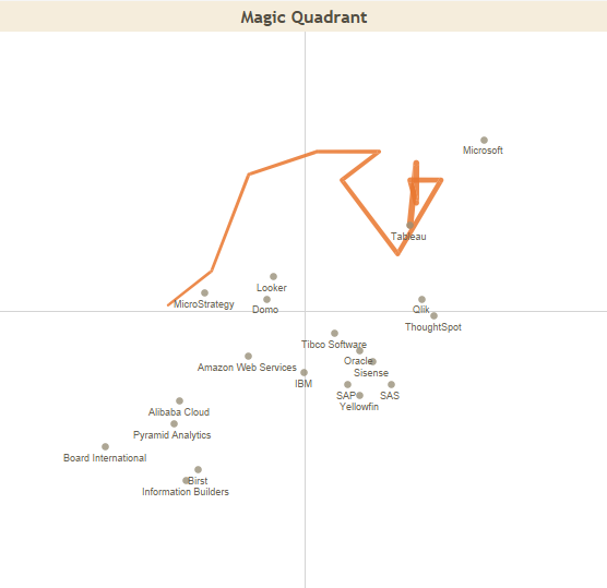
Occasionally, this blog series tackles our personal experiences and views in relation to tools. Still, the actual assessments have been made objectively and technology agnostically – just like tool assessments are supposed to. If you wish to go through the interactive visualisation based on the content of “Gartner Magic Quadrant for Analytics & BI”, from where the attached figures have been taken, you can do so at Tableau Public: Gartner MQ for Analytics & BI visualisation
Current kings of the hill
For a long time now, the leaders in the data visualisation tool market have been Tableau, Microsoft, and Qlik. These vendors entered Gartner’s Magic Quadrant Leader section in 2008 (Microsoft), 2011 (Qlik), and 2013 (Tableau). And they have held their position ever since. Tableau and Qlik have remained quite stable within a small area, whereas Microsoft has bounced around the quadrant (possibly due to their transfer from the old SSRS/SSAS stack to Power BI).
“Gartner Magic Quadrant for Analytics & BI” 2021 and the paths of current market leaders.
These tools have gained a stable market position, and each of them has their own strengths and users. Various rivals are regularly knocking on the door in the hope of attending the party, but, for the moment, they have always come away disappointed and been forced to gain new momentum in other quadrants. Before going into more detail about these kings of the hill, let’s review how the current situation has come about in terms of vendors and tool evolution.
Acquisitions and Bitcoins
Previous kings of the hill, i.e., vendors in the leaders quadrant, were IBM/Cognos, SAP/BusinessObject, Oracle/Hyperion, SAS and MicroStrategy. During the first decade of the 21st century, especially in 2007, BI reporting market was consolidating fast. The IT giants of that time acquired the long-term market leaders: Oracle announced its acquisition of Hyperion in March 2007; SAP announced its acquisition of BusinessObjects in October 2007; and IBM announced its acquisition of Cognos in November 2007. The acquired market leaders were previously themselves purchasing industry rivals and minor companies (such as Crystal Decision, Applix and Acta Technologies).
Based on Gartner’s Magic Quadrant, the leaders were still going strong about four years after these acquisitions. But then they started to slip down the slippery slope. Well, to be precise, SAP/BusinessObjects started its decline a bit earlier. Maybe the strong identification with the SAP family did not promote success. I cannot say whether the decline of the leaders was more due to the uncertainty caused by these business acquisitions: difficulty to integrate the organisations and the products, or due to the fact that renewal is always hard for market leaders. Development stalls because companies don’t want to cannibalise their own market, and when customers abandon the ship and start rooting for more innovative rivals, companies complicate their licensing model and push up the prices. And this really gets the rest of the customers going!
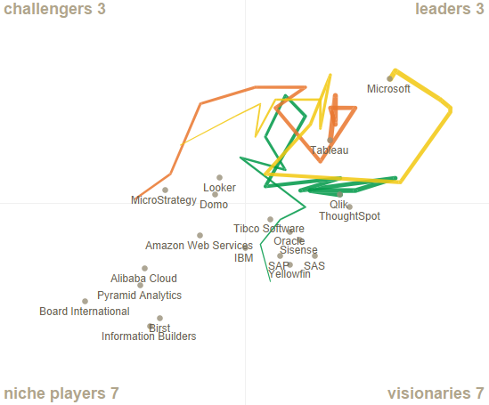
Prior market leaders positions in Gartner MQ over the years, based on Gartner Magic Quadrant for Analytics & BI data from 2006–2021.
MicroStrategy and SAS didn’t immerse themselves as much in business acquisitions, but still they shared the same fate with their rivals ruling the market at the turn of the 2010s. The offering stalled, at least in the area of data visualisation, and MicroStrategy is probably more famous today for its Bitcoins than its product offering.
OLAP-cubes
Let’s forget the vendors for a moment and start looking at product evolution. The first BI tools emerged at the end of 1980s, but they started to flourish in the 1990s. Data warehouses were rare in those days, and most BI tools included features that allowed users to obtain data directly from operative systems and download it into the tool’s own data model. One popular data storage was OLAP-cubes that were easy to use and view from different perspectives by filtering into the most interesting slice of information.
The most popular presentations were crosstabs and various pixel perfect listings, so the content was still not that visual. The users were mostly from finance departments, so for the end users, this numeric presentation was surely just the perfect one. Some example products from the 1990s worth mentioning include Cognos PowerPlay Transformer, Crystal Reports, and Oracle Discoverer. Qlikview also has its roots in the ‘90s, but let’s not go there yet.
OLAP-cube and report-centred solutions built directly on top of operative systems were often quite fragmented. Different departments could have made their own solutions in which each separate cube or report might have had its own data models and data refresh tasks straining the source database. This made the solution complex to maintain and caused unnecessary load to data sources. Partially due to these reasons, data warehouses increased in popularity and there was a demand for more centralised reporting solutions.
From a novelty to a dinosaur in 10 years
In early 21st century, comprehensive Enterprise BI systems started to emerge in the market. They enabled the creation of extensive solutions covering various departments and functions. The development work often required very specific competence, and it mostly focused on a BI competence centre under IT or finance departments. In the competence centre, or as subcontractors, BI developers tried their best to understand the needs of the end users and created metamodels, built OLAP-cubes, and produced reports. More graphs and KPI indicators started to appear in the solutions. Some even created dashboards containing the most essential data. In those times, graphic elements included speed gauge charts, 3D effects, gradient colors, pie charts, and other “fantastic” visual presentations. It’s not really surprising that users often wanted numeric data and these early graphs were not a hit.
New functionalities were added to these Enterprise BI tools as vendors acquired other companies and their products were integrated into existing systems. Existing components or functionalities were rarely discontinued and these newly integrated functionalities often seemed to be flimsy stick-and-bubble-gum contraptions. Over the years, Enterprise BI solutions became so fragmented and complicated that even experienced specialists struggled to make out what each component or “studio” was for (or maybe it was just me who didn’t always understand this).
Visual self-service
The clumsiness and difficulty of a centralised BI organisation and Enterprise tools accelerated the agile and easy-to-use self-service BI and data visualisation. At the turn of the 2010s, Tableau – established almost ten years earlier – started to gain a reputation as a new kind of visual analytics tool that could be used for data analysis even by people without much technical knowledge. Tableau wasn’t marketed to IT departments but directly to business operations. It didn’t try to replace existing Enterprise BI tools in companies but positioned itself alongside them directly in the business units, which now had the chance to create their own reporting content either without or partially with a data warehouse.
Gradually, other similar tools started to appear on the market: Microsoft Power BI, Qlik Sense, SAP Lumira, Oracle Data Visualisation Desktop etc. Also enterprise BI vendors started to include more features directed at business users in their solutions. In an evaluation of self-service BI tools I did a few years ago, already 13 different tools were included, so there were plenty of tools available at the time. However, when the tools were examined in detail, it was clear that some of them had resorted to shortcuts or had taken the easy way out. Most of these tools haven’t become hugely popular, and some might even be discontinued by now.
A glimpse to the Self-service BI tools evaluation a few years back.
New rivals
In the early 2010s, brand new start-ups were aiming to enter the data visualisation market with slightly different approaches. The big data hype brought along a bunch of Hadoop-based platforms, such as Platfora, Datameer and Zoomdata. Another trend was SaaS (Software as a Service) type reporting and visualisation services offered only in the cloud. These services included Clearstory Data, GoodData, Chartio, Domo, and Bime. The third trend was AI- and search-based solutions in which the user could analyse and retrieve data in a very automated manner, a bit like using a Google search. Some examples include Beyondcore and ThoughtSpot. Some new tools were very heavily relying on the performance of cloud databases, and they didn’t offer the possibility to extract and store data within the tool. A lighter version of this approach is Periscope Data, while a more versatile version is Looker.
Guess what has happened to most of these new rivals? Around 70% of the tools mentioned above are already acquired by another company. So again, consolidation lives strong in the market. The biggest business acquisitions in the industry in recent years have been Salesforce’s acquisition of Tableau ($15,7B) and Google’s acquisition of Looker ($2,6B). Both of these acquisitions were announced in June 2019.
A union between decentralised and centralised
Perhaps the biggest problem of self-service tools has been the limited possibilities to control and monitor the environment and the published content in a centralised manner. On several occasions, I’ve seen how a self-service environment has been filled with hundreds of data sets and thousands of reports and no one has had a clear visibility of which content is relevant and which is not. As governance is not enforced in the tools, they have to be created and implemented separately for each organisation. Luckily, the self-service BI tools of today are already offering better features to centrally control and monitor the environment and contents.
Another important aspect to consider when self-service tools and centrally controlled solutions are approaching each other is bimodal BI. This means that both centrally controlled content (often predefined and stable) and more agile self-service content (often more exploratory) can be flexibly developed and utilised in parallel. Current BI tools mostly support both of these modes but there are still gaps in how different types of contents can be infused together. A bigger challenge, however, is how to change the data culture, processes and governance practicalities to make the bimodal way of working easier and more flexible.
The death of data warehouses and dashboards
In the past ten years, it has been repeatedly predicted that data warehouses are dying. A ton of Qlikview solutions that are based on a strong internal data storage have been implemented without use of a data warehouse, and this might be well justified on a smaller scale. Virtualisation, Hadoop, data lakes and the like have been killing data warehouses in turns but it is still going strong. This is more marketing hype rather than reality. It is true that building data warehouses has changed irrevocably. The ETL tools leading the market 10 to 15 years ago as well as the manual and slow way of building data warehouses has died. There have never been as many ways to implement and use a data warehouse as today. So data warehouses are alive and kicking. But don’t get me wrong – they are not and never will be the solution for everything.
Some people are predicting a similar fate for dashboards. The most provocative example might be the ad by ThoughtSpot which proclaims: “Dashboards are dead”. Machine learning and AI based visualisation and data search solutions predict hard times for dashboards and traditional BI. Data science platforms have been implying the same. Most of this is purely a marketing gimmick. Or course the tools themselves and our ways of using them are constantly changing and developing. One direction for development is certainly machine learning and NLP (Natural Language Processing), and the convergence of different kinds of tools.
It will be interesting to see how the current market leaders will act when new functionalities are developed and diversified into tools. Will companies discontinue existing functionalities or parts of the tools when replacements are launched. Or will existing tools again turn into dinosaurs left to be trampled on by new rivals? Or will the giant vendors integrate their other offerings too tightly with their BI tools so that they won’t be viable options in environments already using competitors’ tech stack?
Thanks and stay tuned
In the following posts of this series, each of the key market-leading tools are covered one by one. A bit later we’ll also review some smaller rivals in detail. Leave us a comment or send an email if you want to read about a certain tool or aspect. We’ll also examine later where the Business Intelligence & data analysis tool market is going and what we can expect in the future. A preliminary schedule for the blog series is as follows:
Business intelligence in the 21st century (this post)
If you are interested in data visualisation solutions or tools, please feel free to contact tero.honko@solita.fi. And finally a big thank you for reading the post!
Tableau has removed minimum purchase requirement from their licenses. The change has enabled Tableau to be deployed at very low cost and with exactly the number of users needed for each organisation.
In February 2021, Tableau announced that they will remove minimum user amount restrictions from their licensing. For example, earlier the Viewer license had a minimum sales volume of 100 users. The change has enabled Tableau to be deployed at very low cost and with exactly the number of users needed for each organisation.
The Tableau Creator license is intended for individuals who prepare data for their own or others’ use and publish content. With this license, user can take advantage of all Tableau’s capabilities from preparation, analysis, visualisation and publishing.
With the Tableau Explorer license, the user can create visualisations based on ready-made data models with a browser.
With the Tableau Viewer license, you can view and use published visualisations and dashboards interactively in a variety of ways based on given permissions.
At Solita, we see Tableau as a visualisation platform that gives our customers the best visibility into their data. We are the gold level partner of Tableau and through Solita you get licenses, commissioning, training, design and implementation work at a scale that suits your needs!
We will be happy to tell you more about Tableau and together we can build a solution that is the most suitable size for your organisation!
Contact:
Suvi Korhonen, Tableau Partnership Manager in Solita Finland /
Data Consultant
suvi.korhonen@solita.fi +358503096268
Tero Honko, Data Consultant
tero.honko@solita.fi
Phone +358405878359
Jenni Linna, Data Consultant / People Lead
jenni.linna@solita.fi
Phone +358440601244


 In February 2021, Tableau announced that they will remove minimum user amount restrictions from their licensing. For example, earlier the Viewer license had a minimum sales volume of 100 users. The change has enabled Tableau to be deployed at very low cost and with exactly the number of users needed for each organisation.