Testing is always a crucial part of any Power BI development. When developing content to be embedded there are some different test angles to consider like what type of test users are needed, how RLS works in UI or what might look different after embedding. Testing is also something that needs to be done after go live and you need to have clear understanding with other stakeholders about the production release process.
In my blog seriespart 1 I described some experiences from my embed projects and issues to consider, like how to identify restrictions in Power BI to meet customer brand and functionalities not supported when content is embedded, to be prepared to manage expectations and agree what areas in the solution are developed with Power BI. The part 2 was dedicated to describe collaboration with stakeholders. This last part includes my experiences from testing and some production use considerations.
Testing, testing, testing
I am always a bit surprised how much time testing takes. When developed content to be embedded, noticed that I needed to reserve even more time for testing because testing need to be done in three different places:
Power BI desktop: data validation, functionalities, layout, performance (use also DAX Studio)
Power BI Service: gateway (if needed) and connections, monitor data refresh, Service principal access rights
UI/customer portal DEV and/or TEST environments: Same kind of testing needed as in Desktop as you might find some differences in positions or how e.g Header Icons are positioned or if there appear scroll bars need to be removed etc. If your solution will have a lot of users, then one big part of the testing is performance and load testing. Testing just mentioned requires other stakeholders input.
In “traditional” Power BI development you would do testing in the Desktop and then in the Power BI Service and maybe a bit less time is needed.
Noticed that testing needs to be done using different test users with different access rights. I asked for the different type test users and this way was able to make documentation including the information which features, reports and data each user should see. So, ensure you have all needed test users available to test different use cases.
As in traditional Power BI content development I needed to test the reports thoroughly to ensure that they work correctly and meet the user’s and brand requirements. In my projects I was able to use real production data, but of course sample test data can be used as well. With my test users I was able to simulate different scenarios and test the report’s performance under different conditions. And of course customer testers were also doing their part in the testing.
RLS testing
In my experience one of the most time consuming testing was access/visibility. Row Level Security (RLS) setup needs special attention and needs to be tested first in the Desktop and after this with many different users in the UI. This type of testing is different from the traditional Power BI Service testing/functionalities.
I also experienced that in these type solutions the RLS needs seem to change during the project. And as needs changed, I needed to do testing again for something that was already once approved.
Ways of working in testing
In my projects the Test manager/coordinator enabled a more effective adoption of testing practices. For Power BI developers working together with a Test manager/coordinator will probably mean that you are able to concentrate more on development and changes rather than sitting in testing sessions. Ensure that you have smooth communication with the Test manager/coordinator. Also consume time to show how testing should be done and what is relevant for you in test findings/notes.
Would say that consider carefully if it is useful to let the Testers do testing in Power BI Service. End user experience will not be the same in UI and testers might report wrong results. In my experience the better approach was to enable in the project a testing UI environment as soon as possible. And it is also important to get the Testers to do testing during the development phase and not just at the end of the project. This way I was able to get feedback from the tester in the early phase of the report development.
I noticed that the change and correction need to be reported in a structured way. This way I was able to see the “big picture” and plan the order and the time of the changes with other Power BI developers and UI developers. So, ensure to use clear versioning practicalities and communication channels. Otherwise you might end-up in a situation where another developer is overwriting a version and some changes are lost. The Deployment Pipeline feature could help to monitor the situation (and coming Git integration within Fabric might give even better results).
Experiences during the testing
Gathered some of my experiences from testing in my projects. Maybe these help you to tackle some obstacles beforehand.
Testing was divided into three areas: data validation, visual layout and Power BI functionalities and UI related report functionalities. I spent most of my time doing data validation like investigating source transactions and exception handling with DAX and testing different DAX solutions to meet business calculation requirements. Also gathering business logic for the calculations from different business and data owners took time.
During report development and testing, the Business owners realized there are more requirements to restrict data visibility to different types of users. RLS definitions changed many times and caused more development work and re-testing.
Noticed that the Testers needed some time to learn how testing is done and especially how to report findings. Learned that it was a good practice to have testing findings in small / many tickets rather than one huge one.
Sometimes the Testers forgot the scope of the project. So, I needed to actively ask the Business owner and Project manager what findings will be fixed and what can be added to future development lists.
The Test manager/coordinator checked frequently with the Testers and Business owner the status of test findings. We also had weekly sessions to check with the Business owner the situation and this way minimized risk of misunderstandings. Would recommend this type of way of working.
Before the Testers started the testing of a new report, we had a demo session. This way I was able to demo Power BI features/functionalities they were not so familiar with. In my experience this type of session is good to have also in the beginning of UAT testing.
Last learning for me was that having a UX Designer in the project helped to notice mistakes in layouts, colors, fonts etc.
Performance and load testing
One big part of testing might be performance testing and load testing. In many cases your reports probably work ok and the memory and CPU available within Premium capacity is enough. But if embed project reports are used by many users (thousands), data amounts are large, there are complex calculations and/or many visuals on one report page, you need to start planning the performance and load testing. Questions to the Business owner
How many users will there be?
Are there some peak moments when there are many concurrent users?
How much history data is needed on the reports?
Is it possible to reduce the amount of visuals in a report page?
Could you provide detailed level information about the business logic calculation needs?
The Business owner might not be able to answer these questions right away, but if you have heard any hints that some of the previous issues are relevant, it is best to include the performance and load testing to the project.
Production use considerations
As in all projects, you need to plan go live tasks and times. In my experience in these types of projects, it is worth considering phased production use start or if a certain pilot user group could be used. This way both customer and development team can get new improvement proposals from new users before a wide audience starts to use the reports.
You also need to discuss with the Business owner and Power BI Admin who is taking the ownership of support and alerts. If you are using e.g., dev, test and prod, maybe the support can be divided like this:
First hand support for end-users, inhouse or outsourced support team takes care
Support requests like user right problems
Owner of prod environment
Probably there is a separate tool in use within the customer to handle support tickets
“Deeper level” support where support team can contact Power BI developers
Support request requiring deep understanding about Power BI development, model, source tables etc.
Owner of dev and test environments
Probably you have your own organization support ticket tool
This is just one proposal and companies might have very different support models.
Testing in production
Another angle in production use is testing the changes and corrections. Remember to agree how future development and release is done. Consider following:
What is the timetable for releases?
Who is involved in testing? How do testers report results?
Where, how and who should be informed about the new features, reports, error corrections etc.?
How are changes documented?
Noticed that the planning of production use required many parties and many sessions. My role was more to give insights about the technical possibilities but my Project managers, Power BI admins and Business owners were dealing with other stuff like agreements.
Key takeaways
We were able to resolve complicated RLS needs where the authentication tool was not Microsoft Azure AD. This proved that Power BI is a suitable product to be used in solutions where the goal is to embed reports to your customer portal.
With ensuring enough time for testing these type of projects succeed.
Most important key takeaway was to understand how collaboration with other stakeholders ensures the best end results. Having a team around you with many skills, helps to resolve problems. Luckily in my company I was able to work with different kinds of talented people.
Development work for a customer portal is not something you can do alone. You need a project team with many skills to achieve the best result. When Power BI content is developed to be embedded, you need to collaborate with Power Service or UX designer, BI admin, Software developer, Business owner, Solution architect, Data Engineer, Project manager and Test manager.
In my blog series part 1 I described some experiences from my embed projects and issues to consider like how to identify restrictions in Power BI to meet customer brand and functionalities not supported when content is embedded, to be prepared to manage expectations and agree on what areas in the solution are developed with Power BI. This second part I dedicated to collaboration as I see it being one of the most important areas in a project where Power BI reports are embedded in a customer portal.
Tight collaboration with stakeholders
This type of development work is not done by individuals. You need to collaborate tightly with different stakeholders. Collaboration with different stakeholders can be very intensive in different phases of the project.
For example, with a UX designer, you need to use more time at the beginning of the project to plan and test layouts, json file etc. Later you will need her/his advice or opinions randomly in smaller details occurring in agile development work of individual reports. And then for example with Power BI admin your collaboration is tight in the beginning to get all accesses, connections etc. and then again at the end of the project when planning go-live and support processes.
How to make use of Service/UX designers expertise and feedback
Make sure you understand Service/UX designers’ drafts (if available) and ensure these issues are discussed:
Discuss with her/him about possible problems you recognize, like some planned layout plans are hard to accomplish in Power BI.
If a customer portal will be used via mobile phone, check and test together what is possible and what might be hard to achieve within Power BI.
Together test in Power BI different solutions to meet the brand requirements, but keep in mind also the usability and accessibility point of view.
Together use the time to create a json -theme file and test the import.
During the agile report development, I collaborated with Service/UX designer to get feedback or suggestions to resolve smaller problems in visual positions, sizes or text sizes. After I had published a report for testing, the Service/UX designer looked at it “with fresh eyes” and usually noticed something I had missed.
What insight you need from Power BI admin
Ask from customer Power BI admin the options and possible boundaries, like
How are they using Power BI Service?
What license model is in use?
Who can create gateway connections if needed?
Who can create Workspaces?
Does the customer allow custom visuals?
Is it ok to use the deployment pipeline process?
Will there be a dedicated premium tenant available?
Where should backup .pbit files be stored?
Overall make sure you inform the Power BI admin about the progress of the development and ask for help well in advance. I also included my Solution Architect in these discussions.
In the end part of the project, I involved the Power BI admin to plan and decide on go-live tasks and support processes.
How to pair work with Software Developer
As Power BI content, report page/pages or individual visuals will be embedded in a UI/customer portal you need to test and try different solutions together with Software developers doing the embedding. Consider these:
Clearly communicate the requirements for the Power BI embedded report to the software designer. Discuss the design and branding requirements, as well as any technical specifications, such as data sources and performance requirements.
Agree on the storage location for Power BI reports and visual’s IDs and ensure a clear communication process of updates.
Check how the report page fits into the UI and what is the best Page View option to be used.
Ensure you use the correct canvas size according to brand, but also verify that it is the best from the point of view of the report users.
Decide what areas are implemented in UI and what in Power BI. For example, a report header might be easier to maintain on the UI side if changes occur, Power BI page/sheet names need to be hidden in UI or some pre-selections in a date range are easier to do in UI.
If a customer portal will be used via mobile phone, check and test together the best Mobile layout for each report.
Review the report with the software designer and iterate based on testers’ feedback, both the technical and design aspects of the report.
During the testing phase, I noticed that sometimes for testers it was hard to recognize if the “bug” was related to Power BI or to UI. It helped to have weekly sessions with Business owner and testers. With the Software designer, I was able to smoothly discuss these in our daily sessions and/or in other communications tools.
How to ensure communication flow with Business owner
With the Business owner ensure the following:
You both understand report requirements and specifications are clear.
Reserve enough time and sessions with the customer to explore the old solution/customer portal.
Show the first draft of the new report version in the early phase to get feedback.
Ensure to have a communication channel open to ask questions and clarifications. Many times business owners forget to tell all the needed functionalities and during the development, you need to get more insights.
In my experience, it was a good practice to have the demo sessions for each report during the whole development phase in the project. In the testing phase, weekly sessions with the Business owner helped to keep track of the test results, “bug” reports and corrections.
Keep in mind other stakeholders
Some stakeholder cooperation is quite typical in all reporting-related development projects, so just briefly mentioning these:
Make sure you have a solid communication channel with the Customers data owner/developer, who understands the database, data source structure and business logic. If you are able to utilize a data warehouse, you have more possibilities to discuss with e.g., the Data Engineer which calculation could be done there or what to include in the source views.
If an old customer portal exists make sure you have contact persons to investigate and ask about the calculations logic done with the old tool. Sometimes contact can be a customer internal employee or another vendor’s representative.
Make sure to keep the Project manager and Solution architect aware of the technical obstacles you are facing or problems with testing resources. These stakeholders usually take care of the communication with other stakeholders like the customer’s management or testers.
Have recognized two other stakeholders, the Test manager/coordinator and Tester, but explain some insight related to them in the last part of my blog series.
I’ve collaborated with all stakeholders described above in my projects but this is not a complete list. For example, your customer organization model affects the number of stakeholders you need to collaborate with.
In the last part of my blog series I will tell you about my experiences in testing and support process planning for this type of solution.
Tableau Conference (TC23) was held last week in Las Vegas and once again it shed light on Tableau’s long term roadmap but also provided some concrete examples of features coming in the next releases. Tableau jumped on the generative AI bandwagon with Tableau GPT. Tableau Pulse redefines metrics and creates a new landing page for data consumption. VizQL Data Service is the first step towards headless BI for Tableau. The introduction of Tableau Gestures in an augmented reality context was impressive, it reminded me a bit of Tom Cruise exploring data in the film Minority Report.
TC23 keynote was started by Chief Product Officer Francois Ajenstat with the celebration of Tableau’s 20 years long journey. Francois emphasised the role of Tableau and Tableau community as a key innovator in easy-to-use self-service analytics. ”A new day for data” was used as a title for the upcoming introductions to suggest there is something big and impressive coming out.
The new CEO of Tableau, Ryan Aytay, also thanked the community, customers, partners and employees for their support. Ryan revealed Tableau success plan for all customers coming later this year to listen and support customers more closely. One of the conference highlights was once again Iron Viz visualisation competition, this year’s winner was Paul Ross with his magnificent renewable energy dashboard.
Tableau Iron Viz vibes in TC23 (photo credit Sharad Adhikari).
But what about the features? Tableau GPT is a very interesting new feature but in a way it isn’t very unique considering almost every organisation is talking about language models and generative AI. On the other hand, it doesn’t mean the feature wouldn’t be very useful, it might be quite the opposite. Tableau Pulse might be a bigger thing than you first think. It has a very appealing UI to combine metrics, visualisations, descriptive information and Tableau GPT based additional insights & interactions. The redesigned metrics layer seems to be much more flexible than before. Metrics are easier to create, more powerful and they can be used around Tableau: in Pulse, dashboards, emails, Slack and mobile.
Possibly a bit more surprising feature is the upcoming VizQL Data Service that takes Tableau towards composable analytics or headless BI. This means you can connect directly to the Tableau backend data model (hyper engine) to query the data without the need of building frontend visualisations with Tableau. This would provide a lot more flexibility when creating data-related products and solutions where you need to use data & analytics. This feature might be somewhat related to the fact that Salesforce is using Tableau hyper data models within its Data Cloud offering to boost analytics possibilities. In the future, Salesforce could use data accelerated by Tableau data engine in their Salesforce Clouds via VizQL Data Service.
From an analytics developer point of view, the most interesting single feature showcased in TC23 (originally introduced in TC22) was shared dimensions (or multi-fact models) support. Shared dimensions enable more flexible multi-fact data models where multiple fact tables can relate to shared dimension tables. This feature makes the logical data layer introduced a couple of years ago more comprehensive and very powerful. Tableau would finally fully support the creation of enterprise level data models that can be leveraged in very flexible ways and managed in a centralised manner. The user interface icon for defining the relationships looked a bit like a meatball, and because the relationships in the logical data model have been referred to as noodles, it was said that Tableau is bringing meatballs to the noodles, very clever 🙂.
Perhaps the coolest little thing was the augmented reality demo where Matthew Miller used a gesture-based user interface to interact with data and visualise it in a meeting context. The demonstration had a bit of a Minority Report vibe in it, perhaps the technology wasn’t yet as smooth as in the film, but Miller was just as convincing as Tom. Tableau gestures feature was created by the Tableau research team and it appears to be in its early stages. Most likely it won’t be released any time soon, but it might be a hint of where data interaction is going in the future.
Matthew Miller demonstrates gesture-based data analytics in TC23.
But what wasn’t mentioned in the TC23? There are a couple of features or big announcements that were highlights in TC21 and TC22, but haven’t yet been released and weren’t mentioned again in TC23. One year ago, in TC22, one of the big buzzwords was business science. It was described as business-driven data science using autoML features and scenario planning etc. But in TC23 keynote business science wasn’t mentioned at all nor were the Model builder or Scenario Planner features.
Next, I’ll go through the key features introduced in TC23 and also list functionalities presented in TC22 and TC21 to understand the big picture. These feature lists don’t contain all the features included in previous releases but the ones mentioned in earlier Tableau Conferences. More info about TC22 and TC21 introduced features can be found in our previous blog posts:
Note: All the product/feature related images are created using screenshots from the TC23 Opening Keynote / Devs on Stage session. You can watch the sessions at any time on Tableau site.
Workbook authoring & data visualisation
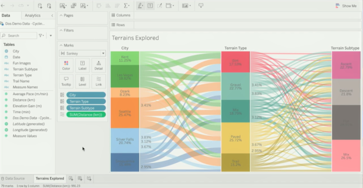
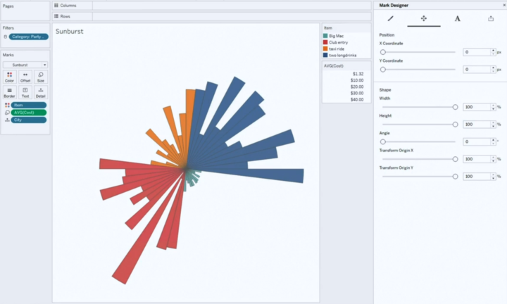
Let’s start with workbook authoring and actual data visualisation related features. The only new feature was the new Sankey and Radial charts (or mark types) that are already in pilot use in Tableau Public. It was suggested that there are also other new chart types to be released in near future. Even though I’m a bit sceptical towards too complex or hyped visualisations it’s good to have the option to easily create something a bit different. Because of Tableau’s flexibility, creating something totally crazy has always been possible but often it has required a lot of data wrangling and custom calculations.
Out-of-the-box Sankey chart type presented in TC23.
Creating custom visualisations with Visualisation Extensions was introduced in TC21 (more info here), but we haven’t heard anything about this feature since. It might be that the visualisation extensions development has been stopped or paused, but still these new Sankey and Radial chart types might have something to do with the visualisation extension development done in the past, who knows?
New in TC23
TC23 New mark types (pilot period currently in Tableau Public): Create Sankey & radial charts using specific mark types. Possibly new native mark/charts types in the future.
TC23 Improved Image role functionality: new file types (gif) & expansion to the size limit.
TC23 Edit alt text (for screen readers) directly in Data Guide
Previously introduced and already released features
TC22 Image role (2022.4): Dynamically render images in the viz based on a link field in the data.
TC21 Dynamic zone visibility (2022.3): Use parameters & field values to show/hide layout containers and visualisations.
TC21 Redesigned View Data (2022.1): View/hide columns, reorder columns, sort data, etc.
TC21 Workbook Optimizer (2022.1): Suggest performance improvements when publishing a workbook.
TC21 Multi Data Source Spatial Layers (2021.4): Use data from different data sources in different layers of a single map visualisation.
Previously introduced but not released nor mentioned in TC23
TC21 Visualisation Extensions (~2022 H2): Custom mark types, mark designer to fine-tune the visualisation details, share custom viz types.
Consume analytics & understand data
The hype (and also actual new features) around generative AI have been the number one topic for most of the tech companies this year, and it sure was also for Tableau. Tableau introduced Tableau GPT, which is a generative language model integrated to Tableau and its data with security and governance included. Tableau GPT can be useful for both consumers and analysts. It can be used to search data and find insights just by writing questions and it’ll provide answers in both written text and as a visualisation (like Ask data with steroids). Ask any question and Tableau GPT will help to 1) Find relevant data sources, 2) Analyse data, 3) Present results in text and chart with the possibility to explore more, 4) Suggest related additional questions. It was suggested that Tableau GPT will also be integrated into Data Guide and for developers/analysts to the calculation editor to help build calculations.
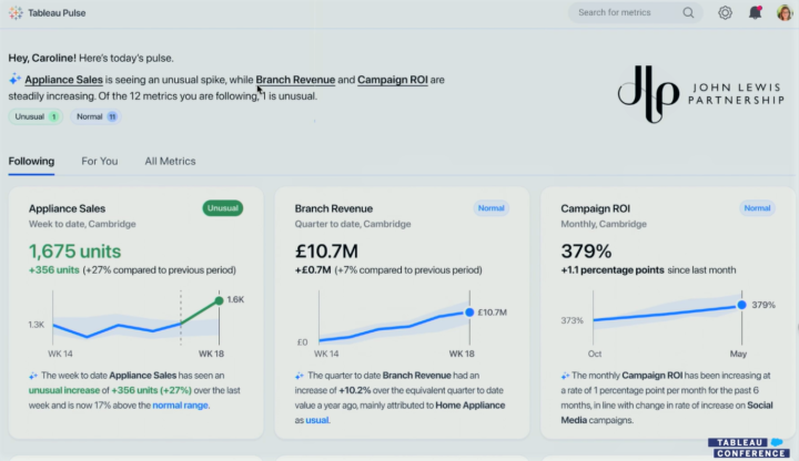
Tableau Pulse was another big announcement. It’s a completely new interface to consume analytics and insights with the ability to ask questions via Tableau GPT. It seems to be mostly intended for consumers to follow and understand key metrics and related trends, outliers and other interesting aspects. Tableau Pulse includes a redesigned metrics layer with the possibility to create embeddable metrics manually or suggested by Tableau GPT. It contains personalised metrics & contents (changes, outliers, trends, drivers) and descriptive information created by Tableau GPT.
Tableau Pulse with metrics and TableauGPT generated textual contents presented in TC23.
Unfortunately, we still need to wait to get our hands on Tableau GPT and Tableau Pulse. It might be the end half of this year or even early next year when Tableau actually gets these new features released.
New in TC23
TC23 Tableau GPT (~pilot 2023 H2): Generative AI to assist in searching, consuming and developing data & analytics in many Tableau user interfaces.
TC23 Tableau Pulse with redesigned metrics (~pilot 2023 H2): New user interface to consume analytics and create, embed & follow metrics.
TC23 Tableau Gestures & augmented analytics: Use gestures to interact with data and infuse analytics into meetings.
Previously introduced and already released features
TC22 Data Guide (2022.3): Contains information about the dashboard and fields, applied filters, data outliers and data summary, and links to external resources.
TC22 Data Stories (2022.2 & 2022.3): Dynamic and automated data story component in Tableau Dashboard. Automatically describes data contents.
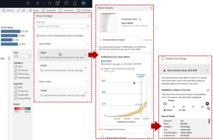
TC21 Data Change Radar (2022.3): Alert and show details about meaningful data changes, detect new outliers or anomalies, alert and explain these.
TC21 Explain the Viz (2022.3): Show outliers and anomalies in the data, explain changes, explain marks etc.
TC21 Multiple Smaller Improvements in Ask Data (2022.2 & 2022.3): Contact Lens author, Personal pinning, Lens lineage in Catalog, Embed Ask Data.
TC21 Ask Data improvements (2022.1): Phrase builder already available, phrase recommendations available later this year.
Previously introduced but not released nor mentioned in TC23
TC21 Model Builder: Use autoML to build and deploy predictive models within Tableau. Based on Salesforce’s Einstein platform.
TC21 Scenario Planner: Easy what-if-analysis. View how changes in certain variables affect target variables and how certain targets could be achieved.
Collaborate, embed and act
New features in this area related heavily to embedding and using Tableau data for building external data products and services. Especially the VizQL Data Service is Tableau’s first step towards composable analytics where the backend data layer and frontend user interface don’t need to be created with the same tool or technology. Composable analytics or headless BI is seen as a future trend in analytics. VizQL Data Service provides access to data modelling capabilities and data within Tableau to streamline building different kinds of data products with Tableau data. This means that data from Tableau could easily be used outside Tableau without actually embedding visuals, but using the data itself in different ways.
Another introduced feature was the Embedding Playground that will ease up the creation of code to embed Tableau visuals and different kinds of interactions. In the playground, you can select options from dropdowns to alter embedding settings, create interactions (eg. context menus, export, filtering, marks etc.) and get ready to be embedded in Javascript & HTML code. Ephemeral users will centralise user identity and access management and in the future usage-based licensing will be provided to make the pricing more flexible to.
TC23 Ephemeral users (~2023 H2): Centralises user identity and access management to one place. Usage-based licensing options in the future.
TC23 VizQL Data Service (~dev preview 2023 H2): Tableau’s first step is to decouple the data and presentation layer.
TC23 Grant access to a workbook when sharing
Previously introduced and already released features
TC22 Tableau External Actions (2022.4): Trigger actions outside Tableau, for example, Salesforce Flow actions. Support for other workflow engines will be added later.
TC22 Publicly share dashboards: Share content via external public facing site to give access to unauthenticated non-licenced users, only Tableau Cloud. Available via Tableau Embedded analytics usage-based licensing.
TC21 Embeddable Ask Data (2023.1)
TC21 Embeddable Web Authoring (2022.2): No need for a desktop when creating & editing embedded contents, full embedded visual analytics.
TC21 3rd party Identity & Access Providers (2022.2): Better capabilities to manage users externally outside Tableau.
TC21 Connected Apps (2021.4): More easily embed to external apps, creating a secure handshake between Tableau and other apps.
TC21 Tableau search, Explain Data and Ask Data in Slack (2021.4)
TC21 Tableau Prep notifications in Slack (2022.1)
Data preparation, modeling and management
My personal favourite, the Shared dimensions feature, which was introduced already a year ago, was demoed once again. It enables more flexible multi-fact data models with shared dimension tables to create more flexible and comprehensive data models. At least the modelling UI seemed to be rather ready, but unfortunately we didn’t get a target schedule for when this might be released.
Shared dimensions enable multi-fact data sources. Example presented in TC23.
One very welcome little feature is Address Geocoding which allows you to visualise addresses on a map without doing the geocoding beforehand. Related to data models, Tableau also emphasised how Tableau data models are used and available within Salesforce Data Cloud (Tableau Hyper-accelerated queries) and also in the future Data Cloud contents can be analysed in Tableau with a single click (Tableau Instant Analytics in SF Data Cloud).
New in TC23
TC23 Tableau Hyper-accelerated queries in SF Data Cloud (Available now): Salesforce data Cloud is at least partially based on Tableau Hyper data models, which can be used to easily analyse the data within Salesforce Data Cloud without additional modeling steps.
TC23 Tableau Instant Analytics in SF Data Cloud (~2023 H2): Analyse SF Data Cloud data with Tableau with one click.
TC23 Address Geocoding: geocode address data in Tableau to visualise addresses on a map.
TC23 Use TableauGTP in prep & modeling: ask TableauGTP to create advanced calculations, eg. extract email address from json.
TC23 Tableau Prep enhancements: spatial joins, smart suggestion to remove duplicates & easily set header and start a row.
Previously introduced and revisited in TC23
TC22 Shared dimensions / multi-fact models: Build multi-fact data models where different facts relate to multiple shared dimensions.
TC22 New AWS data sources: Amazon S3 connector. Previously mentioned also Amazon DocumentDB, Amazon OpenSearch, Amazon Neptune.
TC22 Multi-row calculations in Prep: Calculate for example running total or moving average in Tableau Prep.
Previously introduced and already released features
TC22 Insert row number and clean null values in Prep (2023.1): Easily insert row number column and clean & fill null values.
TC22 Table extensions (2022.3): Leverage python and R scripts in the data model layer.
TC22 Web data connector 3.0 (2022.3): Easily connect to web data and APIs, for example to AWS S3, Twitter etc.
TC21 Data Catalog Integration: Sync external metadata to Tableau.
TC21 Virtual Connections (2021.4): Centrally managed and reusable access points to source data with a single point to define security policy and data standards.
TC21 Centralised row-level security (2021.4): Centralised RLS and data management for virtual connections.
TC21 Parameters in Tableau Prep (2021.4): Leverage parameters in Tableau Prep workflows.
Previously introduced but not released nor mentioned in TC23
TC21 Tableau Prep Extensions: Leverage and build an extension for Tableau Prep (sentiment analysis, OCR, geocoding, feature engineering etc.).
Tableau Cloud management
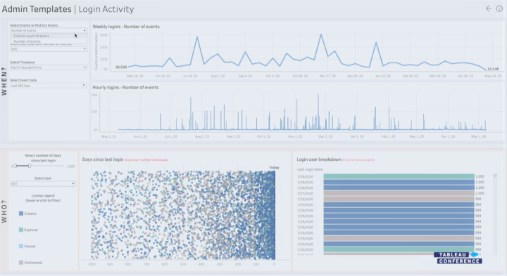
For Tableau Cloud management Tableau emphasised HIPAA compliance and improved activity logs to analyse for example login activities and attempts. Customer-managed IP filtering for Tableau Cloud will streamline cloud security management. There were also new features introduced related to access token management in the Tableau Cloud environment.
New in TC23
TC23 Improved activity logs: More data in admin templates about login activities & attempts.
TC23 Customer-managed IP filtering: Set IP address filtering to limit access to Tableau Cloud Site.
TC23 Enhanced access token management: Access token management via API, Control personal access token creation via user group and set expiration periods.
Previously introduced and revisited in TC23
TC22 Multi-site management for Tableau Cloud: Manage centrally all Tableau Cloud sites.
Previously introduced and already released features
TC22 Customer-managed encryption keys (2022.1): BYOK (Bring Your Own Keys).
TC22 Activity Log (2022.1): More insights on how people are using Tableau, permission auditing etc.
Tableau Admin Insights login activity example presented in TC23.
Tableau Server management
Again this year, there weren’t too many new specific features related to Tableau Server management. On the other hand, it was emphasised that the possibility to use an on-premise Tableau Server will be an option also in the future.
Previously introduced and already released features
TC22 Auto-scaling for Tableau Server (2022.3): Starting with backgrounder auto-scaling for container deployments.
TC21 Resource Monitoring Improvements (2022.1): Show view load requests, establish new baseline etc.
TC21 Backgrounder resource limits (2022.1): Set limits for backgrounder resource consumption.
TC21 Time Stamped log Zips (2021.4)
Tableau Ecosystem & Tableau Public
Tableau Public had a few new features introduced, like improved search. Accelerators weren’t mentioned too much in TC23, but lately their usability has improved with the ability to easily map fields when taking dashboard accelerators in use. There were some Tableau Public-related features introduced few years ago in TC21 that haven’t been released yet. Especially getting more connectors to Tableau Public would be very nice, and also the possibility to publish Prep workflows to Tableau Public would be great. Let’s see if we get these previously introduced features to use in the future.
New in TC23
TC23 Tableau Public Enhanced search with sorting & filtering, network activity feed with notifications & extra info, profile pronouns
Previously introduced and already released features
TC21 Tableau Public Custom Channels: Custom channels around certain topics.
TC21 Tableau Exchange: Search and leverage shared extensions, connectors, more than 100 accelerators. The possibility to share the dataset may be added later on.
TC21 Accelerators: Dashboard starters for certain use cases and source data (e.g. call center analysis, Marketo data, Salesforce data etc.). Can soon be used directly from Tableau.
Previously introduced but not released nor mentioned in TC23
TC21 Tableau Public Slack Integration (~2022 H1)
TC21 More connectors to Tableau Public (~2022 H1): Box, Dropbox, OneDrive.
TC21 Publish Prep flows to Tableau Public: Will there be a Public version for Tableau Prep?
Want to know more?
If you are looking for more info about Tableau, please read our previous blog posts, check out our visualisation and Tableau offering, and send a message to discuss more (via our website):
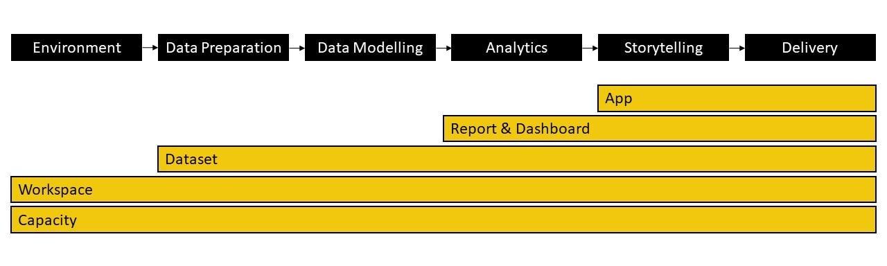
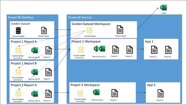
Nowadays many companies are providing services where their B2B customers can investigate and monitor their data in a customer portal. Data could be related to purchases, product quality, delivery times, invoices etc. This type of data and content can be provided to the customer portal B2B users with BI tools, one of them Power BI.
Developing content for this type of solution includes several topics to consider as with “traditional” Power BI development to be shared via Power BI Service. First you need to identify user requirements. Then you spend time understanding data and identifying the data sources, the relationships between them, and the types of data your working with. After this you’re able to clean and transform the data to ensure that it is accurate, complete, and consistent. Next you need to design a model that is optimized for performance, scalability, and usability. This involves creating the necessary tables, columns, relationships, hierarchies, and calculations to support your analysis.
When data and data model is ready, you can choose appropriate visualizations, create interactive elements such as drill-downs and filters, optimize the report layout and ensure accessibility. Finally you need to use time to test your model and visualizations to ensure that they are working correctly and meeting requirements. During the whole process you remember to document the report design, data model, and queries used in the report.
Power BI content development to embed
Power BI Premium enables report and visual embedding. In this blog series I will concentrate on the Power BI developer’s point of view on a solution using some parts from Microsoft “Embed for your customers”. These types of solutions allow developers to build an app that uses non-interactive authentication against Power BI. Usually the report users are external users, and they don’t need to sign in using Power BI credentials to view the embedded content. (If you are interested in learning more details about a software developer’s point of view, visit Microsoft’s official pagesPower BI embedded analytics Client APIs | Microsoft Learn.)
In addition to these, there are things that I needed to take into account in the development work or need my special attention. Below are my key takeaways from the Power BI development projects where the objective was to recreate the old customer portal reports. Many of these are applicable also to Qlik Sense.
Identify restrictions in Power BI to meet customer brand or other UX design requirements and contribute to the development of a good theme file (json).
Prepare to do some expectation management.
Identify functionalities not supported when Power BI content is embedded.
Agree features/functionalities development and setups done in Power BI.
Do tight collaboration with stakeholders. – Read more in the second part of my blog series.
Reserve enough time for testing. – Read more in the third part of my blog series.
Remember to plan and agree on the support process well in advance as usually there are several parties and even tools involved. – Read more in the third part of my blog series.
Power BI restrictions and UX-related requirements
Some customers’ brands might have colors not best for reports accessibility or a font type not supported by Power BI. To tackle these in my experience the development work is easiest to do with a Service/UX designer and with the person responsible for the brand. So, in the early phase of the development work make sure you identify restrictions in the tool to meet brand or other UX-related requirements
Contribute to the development of a good theme file (json). This ensures that all reports have consistent and on-brand colors, fonts, etc. Experienced later that when my customer changed brand colors, it was much easier to implement these changes to all reports. Of course, this type of thinking is relevant in “traditional” Power BI development, but when reports are published outside customer organizations, these issues tend to be even more important.
Expectation management
Prepare to do some expectation management for the customer and testers, if an old existing customer portal is recreated with a new technology. Not all functionalities of the old implementation can necessarily be implemented or they are implemented in a different way. Or the new implementation may have new features or some functionality may be better or sometimes worse compared to the old implementation. During my projects this took time as there was existing portal to be replaced.
To really understand feature and functionality requirements, reserve enough time and sessions with the Business owners or Testers to explore the old solution. In my projects I showed the first draft of the report in the early phase, to get feedback. Noticed also that sometimes the Business owner or Tester do not understand the advantages of an agile way of development. So, it did need some courage to show “not so polished” report versions.
If a totally new customer portal is created, then you probably have much more freedom to introduce visualization types and report layouts/features. But in this case, I would also prefer to demo as soon as possible the first draft version of a report.
Power BI restrictions and embedding
Ensure you know all the solution requirements and discuss them with the Solution Architect and Software developer whether they all are possible to implement. Especially some Power BI Service-related functionalities you probably need to handle outside the tool:
Export to PDF
Save favorites/bookmarks
Report Subscription
Hiding reports from certain users
Embed report size and positions in the customer portal
Functionality to move from one report to another with portal selections/dropdown lists
Agree on features/functionalities development and setups done in Power BI
These features/functionalities I needed to agree with other stakeholders if they are developed in or outside Power BI:
Report headers/titles (consider where maintenance of the name changes is easiest)
Consider if some Filter controls need to be done in the UI/customer portal. E.g., default selections in slicers.
These features/functionalities setups in Power BI need to be agreed upon and tested carefully:
The format of token values is managed outside Power BI, but need to make sure that RLS rules use the correct formats
Page view setup
Page/canvas size, Height and Width
Mobile layouts
I will continue the story about my own experiences related to tight collaboration with stakeholders, testing and support process planning in the next parts of my blog series.
Meet Johanna, Tuomas and Tero! Our Consultants, who all work with data analysis and visualizations. Let’s map out their journey at Solita and demystify the work of Analytics Consultants!
All three have had different journeys to become an Analytics Consultant. Tuomas has a business degree and Tero started his career working with telecommunications technology. Johanna however found her way to visualizations quite young: “I created my first IBM Cognos reports as a summer trainee when I was 18 and somehow, I ended up studying Information Systems Science.” It has been, however, love at first sight for all of them. Now they work at Solita’s Data Science and Analytics Cell.
What is a typical Analytics Consultant’s workday like?
The interest in versatile work tasks combines our Analytics Consultants. Tuomas describes himself as “a Power BI Expert”. His days go fast by designing Power BI phases, modelling data, and doing classical pipeline work. “Sometimes I’d say my role has been something between project or service manager.”
Tero in the other hand is focusing on report developing and visualizations. He defines backlogs, develops metadata models, and holds client workshops.
Johanna sees herself as a Data Visualization Specialist, who develops reports for her customers. She creates datasets, and defines report designs and themes. “My work also includes data governance and the occasional maintenance work,” Johanna adds.
All three agree that development work is one of their main tasks. “I could say that a third of my time goes to development,” Tuomas estimates. “In my case I would say even half of my time goes to development,” Tero states.
Power BI is the main tool that they are using. Microsoft Azure and Snowflake are also in daily use. Tools vary in projects, so Tuomas highlights that “it is important to understand the nature of different tools even though one would not work straight with them”.
What is the best part of an Analytics Consultant’s work?
The possibility to work with real-life problems and creating concrete solutions brings the most joy to our consultants. “It is really satisfying to provide user experiences, which deliver the necessary information and functionality, which the end users need to solve their business-related questions,” Johanna clarifies her thoughts.
And of course, collaborating with people keeps our consultants going! Tuomas estimates that 35% of his time is dedicated to stakeholder communications: he mentions customer meetings, but also writing documentations, and creating project defining, “specs”, with his customers.
Our consultants agree that communication skills are one of the key soft skills to master when desiring to become an Analytics Consultant! Tuomas tells, that working and communicating with end-users has always felt natural to him.
Tero is intrigued by the possibility of working with different industries: “I will learn how different industries and companies work, what kind of processes they have and how legislation affects them. This work is all about understanding the industry and being customer-oriented.”
“Each workday is different and interesting! I am dealing with many different kinds of customers and business domains every day.”
When asked, what keeps the consultants working with visualizations, they all ponder for a few seconds. “A report, which I create, will provide straight benefit for the users. That is important to me,” Tuomas sums up his thoughts. “Each workday is unique and interesting! I am dealing with many different customers and business domains every day,” Johanna answers. Tero smiles and concludes: “When my customers get excited about my visualization, that is the best feeling!”
How are our Analytics Consultants developing their careers?
After working over 10 years with reporting and visualizations, Tero feels that he has found his home: “This role feels good to me, and it suits my personality well. Of course, I am interested in getting involved with new industries and learning new tools, but now I am really contented!”
Tuomas, who is a newcomer compared to Tero, has a strong urge to learn more: “Next target is to get a deeper and more technical understanding of data engineering tools. I would say there are good opportunities at Solita to find the most suitable path for you.”
Johanna has had different roles in her Solita journey, but she keeps returning to work with visualizations: “I will develop my skills in design, and I would love to learn a new tool too! This role is all about continuous learning and that is an important capability of an Analytics Consultant!”
“I would say there are good opportunities at Solita to find the most suitable path for you.”
How to become an excellent Analytics Consultant? Here are our experts’ tips:
Johanna: “Work together with different stakeholders to produce the best solutions. Do not be afraid to challenge the customer, ask questions or make mistakes.”
Tuomas: “Be curious to try and learn new things. Don’t be afraid to fail. Ask colleagues and remember to challenge customer’s point of view when needed.”
Tero: “Be proactive! From the point of view of technical solutions and data. Customers expect us to bring them innovative ideas!”
Tableau Conference (TC22) was held last week in person in Las Vegas (with virtual participation possibility). Majority of the introduced new features and functionalities were related to data preparation & modeling, easy and automated data science (business science as Tableau calls it), and Tableau Cloud management & governance capabilities. Tableau is on its journey from a visual analytics platform to a full scale end-to-end analytics platform.
In the keynote Tableau CEO Mark Nelson emphasised the role of both Tableau and Salesforce user communities to drive change with data: there are over 1M Tableau Datafam members and over 16M Salesforce Trailblazers. Once again, the importance of data for businesses and organisations was highlighted. But the viewpoint was data skills – or lack of them – and data cultures more than technologies. Mark Nelson underlined the meaning of cloud saying 70% of new customers start their analytical journey in the cloud. One of the big announcements was rebranding Tableau Online to Tableau Cloud and introducing plenty of new features to it.
Taking account the new features introduced at TC22 Tableau platform includes good data preparation and modelling capabilities with many connectors to a variety of data sources, services and APIs. Tableau’s visual analytics and dashboarding capabilities are already one of best in the market. In TC21 last year Tableau talked a lot about Slack integration and embedding to boost collaboration and sharing of insights. At the moment, effort is put especially to democratize data analytics for everyone despite gaps in the data skills. This is done using autoML type of functionalities to automatically describe and explain data, show outliers, create predictions and help to build and act on scenarios. Also the cloud offering with better governance, security and manageability was a high priority.
Next I’ll go through the key features introduced in TC22 and also list functionalities presented in TC21 to understand the big picture. More info about TC21 released features can be found in a previous blog post: A complete list of new features introduced at the Tableau Conference 2021. These feature lists don’t contain all the features included in previous releases but the ones mentioned in TC21.
Note: All the images are created using screenshots from the TC22 Opening Keynote / Devs on Stage session and Tableau new product innovations blog post. You can watch the sessions at any time onTableau site.
In TC22 there weren’t too many features related to workbook authoring. The only bigger announcement was the new image role to enable dynamic images in visualizations. These could be for example product images or any other images that can be found via a url link in the source data. From TC21 there are still a couple of very interesting features waiting to be released, I’m especially waiting for dynamic dashboard layouts.
Introduced in TC22
Image role: Dynamically render images in the viz based on a link field in the data.
Introduced in TC21 (but not yet released)
Dynamic Dashboard Layouts (~2022 H1): Use parameters & field values to show/hide layout containers and visualizations.
Visualization Extensions (~2022 H2): Custom mark types, mark designer to fine tune the visualization details, share custom viz types.
Introduced in TC21 (and already released)
Multi Data Source Spatial Layers (2021.4): Use data from different data sources in different layers of a single map visualization.
Redesigned View Data (2022.1): View/hide columns, reorder columns, sort data, etc.
Workbook Optimizer (2022.1): Suggest performance improvements when publishing a workbook.
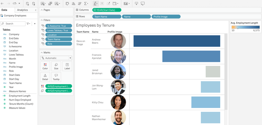
Image role example to dynamically render images presented in TC22. Side note: have to appreciate the “Loves Tableau: True” filter.
Augmented analytics & understand data
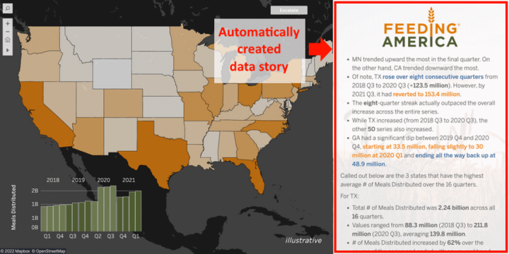
For this area there were a couple of brand new announcements and more info about a few major functionalities already unveiled in TC21. Data stories is an automated feature to create descriptive stories about data insights in a single visualization. Data stories explains what data and insights is presented in the visualization, explanation changes dynamically when data is filtered or selected in the viz. With the data orientation pane the author can partly automate the documentation of dashboard and visualizations. It shows information about data fields, applied filters, data outliers and data summary, and possible links to external documentation.
Example of automatically created descriptive data story within a dashboard presented in TC22.
Few originally in TC21 introduced features were also mentioned in TC22. Model Builder is a big step toward guided data science. It will help to build ML-model driven predictions fully integrated within Tableau. It’s based on the same technology as Salesforce’s Einstein Analytics. Scenario planner is a functionality to build what-if-analyses to understand different options and outcomes of different decisions.
Introduced in TC22
Data Stories (beta in Tableau Cloud): Dynamic and automated data story component in Tableau Dashboard. Automatically describes data contents.
Data orientation pane: Contain information about dashboard and fields, applied filters, data outliers and data summary, and links to external resources.
Model Builder: Use autoML to build and deploy predictive models within Tableau. Based on Salesforce’s Einstein platform.
Scenario Planner: Easy what-if-analysis. View how changes in certain variables affect target variables and how certain targets could be achieved.
Introduced in TC21 (but not yet released)
Data Change Radar (~2022 H1): Alert and show details about meaningful data changes, detect new outliers or anomalies, alert and explain these.
Multiple Smaller Improvements in Ask Data (~2022 H1): Contact Lens author, Personal pinning, Lens lineage in Catalog, Embed Ask Data.
Explain the Viz (~2022 H2): Show outliers and anomalies in the data, explain changes, explain mark etc.
Introduced in TC21 (and already released)
Ask Data improvements (2022.1): Phrase builder already available, phrase recommendations available later this year.
Collaborate, embed and act
In TC21 collaboration and Slack integration were one of the big development areas. In TC22 there wasn’t much new about this topic, but Tableau actions were again demonstrated as a way to build actionable dashboards. Also the possibility to share dashboards publicly for unauthenticated non-licenced users was shown again in TC22. This functionality is coming to Tableau Cloud later this year.
Introduced in TC22
Tableau Actions: Trigger actions outside Tableau, for example Salesforce Flow actions. Support for other workflow engines will be added later.
Publicly share dashboards (~2022 H2): Share content via external public facing site to give access to unauthenticated non-licenced users, only Tableau Cloud.
Introduced in TC21 (but not yet released)
3rd party Identity & Access Providers: Better capabilities to manage users externally outside Tableau.
Embeddable Web Authoring: No need for desktop when creating & editing embedded contents, full embedded visual analytics.
Embeddable Ask Data
Introduced in TC21 (and already released)
Connected Apps (2021.4): More easily embed to external apps, create secure handshake between Tableau and other apps.
Tableau search, Explain Data and Ask Data in Slack (2021.4)
Tableau Prep notifications in Slack (2022.1)
Data preparation, modeling and management
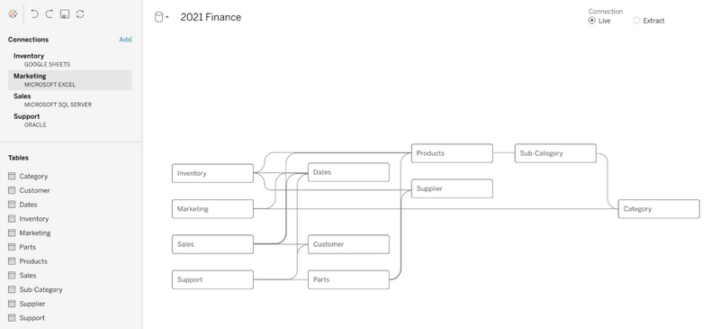
My personal favourite of the new features can be found here. Shared dimensions enable more flexible multi-fact data models where multiple fact tables can relate to shared dimension tables. This feature makes the logical data model layer introduced a couple of years ago more comprehensive and very powerful. Tableau finally supports creation of enterprise level data models that can be leveraged in very flexible ways and managed in a centralized manner. Another data model related new feature was Table extensions that enable use of Python and R scripts directly in the data model layer.
Shared dimensions enabled multi-fact data source example presented in TC22.
There are also features to boost data source connectivity. Web Data Connector 3.0 makes it easier to connect different web data sources, services and API’s. One important new data source is AWS S3 that will enable connection directly to the data lake layer. Also Tableau Prep is getting few new functionalities. Row number column and null value cleaning are rather small features. Multi-row calculations instead are a bit bigger thing, although the examples Tableau mentioned (running totals and moving averages) might not very relevant in data prep cause these usually must take into account filters and row level security and therefore these calculations must often be done at runtime.
Introduced in TC22
Shared dimensions: Build multi-fact data models where facts relate to many shared dimensions,
Web data connector 3.0: Easily connect to web data and APIs, for example to AWS S3, Twitter etc.
Table extensions: Leverage python and R scripts in the data model layer.
Insert row number and clean null values in Prep: Easily insert row number column and clean & fill null values.
Multi-row calculations in Prep: Calculate for example running total or moving average in Tableau Prep.
New AWS data sources: Amazon S3, Amazon DocumentDB, Amazon OpenSearch, Amazon Neptune.
Introduced in TC21 (but not yet released)
Data Catalog Integration: Sync external metadata to Tableau (from Collibra, Alation, & Informatica).
Tableau Prep Extensions: Leverage and build extension for Tableau Prep (sentiment analysis, OCR, geocoding, feature engineering etc.).
Introduced in TC21 (and already released)
Virtual Connections (2021.4): Centrally managed and reusable access points to source data with single point to define security policy and data standards.
Centralized row level security (2021.4): Centralized RLS and data management for virtual connections.
Parameters in Tableau Prep (2021.4): Leverage parameters in Tableau Prep workflows.
Tableau Cloud management
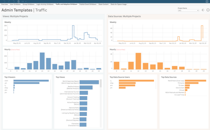
Rebranding Tableau Online to Tableau Cloud and a bunch of new management and governance features in it was one important area of TC22. Tableau Cloud can now be managed as a whole with multi-site management. Security has already been a key area when moving to cloud and now Tableau finally supports customer managed encryption keys (BYOK). From a monitoring point of view both activity log and admin insights provide information how Tableau Cloud and contents in it are used.
Introduced in TC22
Multi-site management for Tableau Cloud: Manage centrally all Tableau Cloud sites.
Customer managed encryption keys (later 2022): BYOK (Bring Your Own Keys).
Activity Log: More insights on how people are using Tableau, permission auditing etc.
Admin Insights: Maximise performance, boost adoption, and manage contents.
Tableau Cloud Admin Insights example presented in TC22.
Tableau Server management
There weren’t too many new features in Tableau Server management, I guess partly because of the effort put into Tableau Cloud Management instead. However, Tableau Server auto-scaling was mentioned again and it will be coming soon starting with backgrounder auto-scaling.
Introduced in TC22
Auto-scaling for Tableau Server (2022 H1): Starting with backgrounder auto-scaling for container deployments.
Introduced in TC21 (but not yet released)
Resource Monitoring Improvements (~2022 H1): Show view load requests, establish new baseline etc.
Backgrounder resource limits (~2022 H1): Set limits for backgrounder resource consumption.
Introduced in TC21 (and already released)
Time Stamped log Zips (2021.4)
Tableau ecosystem & Tableau Public
Last year in the TC21 Tableau ecosystem and upcoming Tableau Public features had a big role. This year there wasn’t much new in this area but still the Tableau exchange and accelerators were mentioned and shown in the demos a couple of times.
Introduced in TC21 (but not yet released)
Tableau Public Slack Integration (~2022 H1)
More connectors to Tableau Public (~2022 H1): Box, Dropbox, OneDrive.
Publish Prep flows to Tableau Public: Will there be a Public version for Tableau Prep?
Tableau Public custom Channels (~2022 H1): Custom channels around certain topics.
Introduced in TC21 (and already released)
Tableau exchange: Search and leverage shared extensions, connectors, more than 100 accelerators. Possibility to share dataset may be added later on.
Accelerators: Dashboard starters for certain use cases and source data (e.g. call center analysis, Marketo data, Salesforce data etc.). Can soon be used directly from Tableau.
Want to know more?
If you are looking for more info about Tableau read our previous blog posts:
Industries have resorted to use AI partner services to fuel their AI aspirations and quickly bring their product and services to market. Choosing the right partner is challenging and this blog lists a few pointers that industries can utilize in their decision making process.
Large investments in AI clearly indicate industries have embraced the value of AI. Such a high AI adoption rate has induced a severe lack of talented data scientists, data engineers and machine learning engineers. Moreover, with the availability of alternative options, high paying jobs and numerous benefits, it is clearly an employee’s market.
Market has a plethora of AI consulting companies ready to fill in the role of AI partners with leading industries. Among such companies, on one end are the traditional IT services companies, who have evolved to provide AI services and on the other end are the AI start-up companies who have backgrounds from academia with a research focus striving to deliver the top specialists to industries.
Considering that a company is willing to venture into AI with an AI partner. In this blog I shall enumerate what are the essentials that one can look for before deciding to pick their preferred AI partner.
AI knowledge and experience: AI is evolving fast with new technologies developed by both industries and academia. Use cases in AI also span multiple areas within a single company. Most cases usually fall in following domains: Computer vision, Computer audition, Natural language processing, Interpersonally intelligent machines, routing, and motion and robotics. It is natural to look for AI partners with specialists in the above areas.
It is worth remembering that most AI use cases do not require AI specialists or super specialists and generalists with wide AI experience could well handle the cases.
Also specialising in AI alone does not suffice to successfully bring the case to production. The art of handling industrial AI use cases is not trivial and novice AI specialists and those that are freshly out of University need oversight. Hence companies have to be careful with such AI specialists with only academic experience or little industrial experience.
Domain experience: Many AI techniques are applicable across cases in multiple domains. Hence it is not always necessary to seek such consultants with domain expertise and often it is an overkill with additional expert costs. Additionally, too much domain knowledge can also restrict our thinking in some ways. However, there are exceptions when domain knowledge might be helpful, especially when limited data are available.
A domain agnostic AI consultant can create and deliver AI models in multiple domains in collaboration with company domain experts.
Thus making them available for such projects would be important for the company.
Problem solving approach This is probably the most important attribute when evaluating an AI partner. Company cases can be categorised in one of the following silo’s:
Open sea: Though uncommon, it is possible to see few such scenarios, when the companies are at an early stage of their AI strategy. This is attractive for many AI consultants who have the freedom to carve out an AI strategy and succeeding steps to boost the AI capabilities for their clients. With such freedom comes great responsibility and AI partners for such scenarios must be carefully chosen who have a long standing position within the industry as a trusted partner.
Straits: This is most common when the use case is at least coarsely defined and suitable ML technologies are to be chosen and take the AI use case to production. Such cases often don’t need high grade AI researchers/scientists but any generalist data scientist and engineer with the experience of working in an agile way can be a perfect match.
Stormy seas: This is possibly the hardest case, where the use case is not clearly defined and also no ready solution is available. The use case definition is easy to be defined with data and AI strategists, but research and development of new technologies requires AI specialists/scientists. Hence special emphasis should be focused on checking the presence of such specialists. It is worth noting that AI specialists availability alone does not guarantee that there is a guaranteed conversion to production.
Data security: Data is the fuel for growth for many companies. It is quite natural that companies are extremely careful with safeguarding the data and their use. Thus when choosing an AI partner it is important to look and ask for data security measures that are currently practised with the AI partner candidate organisation. In my experience it is quite common that AI specialists do not have data security training. If the company does not emphasise on ethics and security the data is most likely stored by partners all over the internet, (i.e. personal dropbox and onedrive accounts) including their private laptops.
Data platform skills: AI technologies are usually built on data. It is quite common that companies have multiple databases and do not have a clear data strategy. AI partners with inbuilt experience in data engineering shall go well, else a separate partner would be needed.
Design thinking: Design thinking is rarely considered a priority expertise when it comes to AI partnering and development. However this is probably the hidden gem beyond every successful deployment of AI use case. AI design thinking adopts a human centric approach, where the user is at the centre of the entire development process and her/his wishes are the most important. The adoption of the AI products would significantly increase when the users problems are accounted for, including AI ethics.
Blowed marketing: Usually AI partner marketing slides boast about successful AI projects. Companies must be careful interpreting this number, as often major portions of these projects are just proof of concepts which have not seen the light of day for various reasons. Companies should ask for the percentage of those projects that have entered into production or at least entered a minimum viable product stage.
Above we highlight a few points that one must look for in an AI partner, however what is important over all the above is the market perception of the candidate partner, and as a buyer you believe there is a culture fit, they understand your values, terms of cooperation, and their ability to co-define the value proposition of the AI case. Also AI consultants should stand up for their choices and not shy away from pointing to the infeasibility and lack of technologies/data to achieve desired goals set for AI use cases fearing the collapse of their sales.
Finding the right partner is not that difficult, if you wish to understand Solita’s position on the above pointers and looking for an AI partner don’t hesitate to contact us.
Author: Karthik Sindhya, PhD, AI strategist, Data Science, AI & Analytics,
Tel. +358 40 5020418, karthik.sindhya@solita.fi
The Tableau Conference 2021 is over and yet again it was a lot of fun with all the not-so-serious music performances, great informative sessions, excellent Iron Viz competition, and of course demonstrations of many new features coming in the future releases. In general my first thoughts about the new capabilities revealed in TC21 are very positive. Obviously some of the details are still a bit blurry but the overall topics seem to be in a good balance: There are very interesting improvements coming for visual analytics, data management and content consumption in different channels, but in my opinion the most interesting area was augmented analytics and capabilities for citizen data scientists.
It’s been 2 years since Salesforce announced the acquisition of Tableau. After acquisitions and mergers, it’s always interesting to see how it affects the product roadmap and development. Now I really feel the pace for Tableau is getting faster and also the scope is getting more extensive. Tableau is not only fine tuning the current offering, but creating a more comprehensive analytics platform with autoML, easier collaboration & embedding, and action triggers that extend beyond the Tableau.
Note: All the pictures are created using screenshots from the TC21 Devs on Stage and TC21 Opening Keynote sessions. You can watch the sessions at any time on Tableau site.
Let’s dive into workbook authoring first. It is still the core of Tableau and I’m very pleased to see there is still room for improvement. For the workbook authoring the biggest announcement was thevisualization extensions. This means you can more easily develop and use new custom visualization types (for example sunburst and flower). The feature makes it possible to adjust visualization details with mark designer and to share these custom visualizations with others. Another very nice feature was dynamic dashboard layouts, you can use parameters and field values to dynamically toggle the visibility of dashboard components (visualizations and containers). This gives so much more power to flexibly show and hide visualizations on the dashboard.
There is also a redesigned UI to view underlying data with options to select the desired columns, reorder columns and sort data, export data etc. For map analysis the possibility to use data from multiple data sources in spatial layers is a very nice feature. Using workbook optimizer you can view tips to improve performance when publishing the workbook. In general it also seems the full web authoring for both data source and visualization authoring isn’t very far away anymore.
Visualization Extensions (2022 H2): Custom mark types, mark designer to fine tune the visualization details, share custom viz types.
Dynamic Dashboard Layouts (2022 H1): Use parameters & field values to show/hide layout containers and visualizations.
Multi Data Source Spatial Layers (2021.4): Use data from different data sources in different layers of a single map visualization.
Redesigned View Data (2022 H1): View/hide columns, reorder columns, sort data, etc.
Workbook Optimizer (2021.4): Suggest performance improvements when publishing a workbook.
Visualization Extensions. Create more complex visualizations (like sunburst) with ease.
Augmented Analytics & Citizen Data Science
This topic has been in the Gartner’s hype cycle for some time. In Tableau we have already seen the first capabilities related to augmented analytics and autoML, but this area is really getting a lot more power in the future. Data change radar will automatically detect new outliers or anomalies in the data, and alert and visualize those to the user. Then users can apply the explain data feature to automatically get insights and explanations about the data, what has happened and why. Explain the viz feature will not explain only one data point but the whole visualization or dashboard and show descriptive information about the data. All this happens automatically behind the scenes and it can really speed up the analysis to get these insights out-of-the-box. There were also a bunch of smaller improvements in the Ask Data feature for example to adjust the behavior and to embed the ask data functionality.
One of the biggest new upcoming features was the possibility to create and deploy predictive models within Tableau with Tableau Model Builder. This means citizen data scientists can create autoML type of predictive models and deploy those inside Tableau to get new insights about the data. The user interface for this seemed to be a lot like Tableau Prep. Another very interesting feature was Scenario Planning, which is currently under development in Tableau Labs. This feature gives the possibility to view how changes in certain variables would affect defined target variables and compare different scenarios to each other. Another use case for scenarios would be finding different ways to achieve a certain target. For me the scenario planning seemed to be a bit disconnected from the core capabilities of Tableau, but it is under development and for sure there could be some very nice use cases for this type of functionality.
Data Change Radar (2022 H1): Alert and show details about meaningful data changes, detect new outliers or anomalies, alert and explain these.
Explain the Viz (2022 H2): Show outliers and anomalies in the data, explain changes, explain mark etc.
Multiple Smaller Improvements in Ask Data (2022 H1): Contact Lens author, Personal pinning, Phrase builder, Lens lineage in Catalog, Embed Ask Data.
Tableau Model Builder: Use autoML to build and deploy predictive models within Tableau.
Scenario Planning: View how changes in certain variables affect target variables and how certain targets could be achieved.
Explain Data side pane with data changes and explain change drill down path.
Collaborate, embed and act
The Tableau Slack integration is getting better and more versatile. With the 2021.4 version you can use Tableau search, Explain Data and Ask Data features directly in Slack. As it was said in the event: “it’s like having data as your Slack member“. In the future also Tableau Prep notifications can be viewed via Slack. It was also suggested that later on similar integration will be possible for example with MS Teams.
There were many new capabilities related to embedding contents to external services. With Connected Apps feature admins can define trusted applications (secure handshake) to make embedding more easy. Tableau Broadcast can be used in Tableau Online to share content via external public facing sites for everyone (for unauthenticated users). There was also a mention about 3rd party identity and access provider support which was not very precise but in my opinion it suggests the possibility to more easily leverage identities and access management from outside Tableau. Embeddable web authoring makes it possible to create and edit contents directly within the service where contents are embedded using the web edit, so no need to use Tableau Desktop.
One big announcement was the Tableau Actions. Tableau dashboards already have great actions to create interactions between the user and the data, but this is something more. With Tableau Actions you can trigger actions outside Tableau directly from a dashboard. You could for example trigger Salesforce Flow tasks by clicking a button in the dashboard. And in the future also other workflow engines will be supported. This will provide much more powerful interactivity options for the user.
Tableau search, Explain Data and Ask Data in Slack (2021.4)
Tableau Prep notifications in Slack (2022 H1)
Connected Apps (2021.4): More easily embed to external apps, create secure handshake between Tableau and other apps.
Tableau Broadcast (2022 H2): Share contest via external public facing site to give access to unauthenticated users, only Tableau Online.
3rd party Identity & Access Providers: Better capabilities to manage users externally outside Tableau.
Embeddable Web Authoring: No need for desktop when creating & editing embedded contents, full embedded visual analytics.
Embeddable Ask Data
Tableau Actions: Trigger actions outside Tableau, for example Salesforce Flow actions, later on support for other workflow engines.
Creating new Tableau Action to trigger Salesforce Flow to escalate case.
Data management & data preparation
Virtual Connections have already been introduced earlier and those seem to be very powerful functionality to centrally manage data connections and create centralized row level security rules. These functionalities and possible new future features build around them can really boost end-to-end self-service analytics in the future. The only downside is that this is part of the data management add-on. Data Catalog Integration will bring the possibility to sync metadata from external data catalog services, like Collibra and Alation.
Related to the data preparation there will be new Tableau Prep Extensions so you can get more power to the prep workflows as a custom step. These new steps can be for example sentiment analysis, geocoding, feature engineering etc. Other new functionality in Tableau Prep is the possibility to use parameters in the Prep workflows. It was also said that in the future you can use Tableau Public to publish and share Tableau Prep flows. This might mean there is also a Public version coming for Tableau Prep. It wasn’t mentioned in the event, but it would be great.
Virtual Connections (2021.4): Centrally managed and reusable access points to source data with single point to define security policy and data standards.
Centralized row level security (2021.4): Centralized RLS and data management for virtual connections.
Data Catalog Integration: Sync external metadata to Tableau (from Collibra, Alation, & Informatica).
Tableau Prep Extensions: Leverage and build extension for Tableau Prep (sentiment analysis, OCR, geocoding, feature engineering etc.).
Parameters in Tableau Prep (2021.4): Leverage parameters in Tableau Prep workflows.
Content of a virtual connection and related security policies.
Server Management
Even though SaaS options like Tableau Online are getting more popular all the time there was still a bunch of new Tableau Server specific features. New improved resource monitoring capabilities as well as time stamped log file zip generation were mentioned. Backgrounder resource limits can limit the amount of resources consumed by backgrounder processes and auto-scaling for backgrounders for containerized deployments can help the environment to adjust for different workloads during different times of the day.
Resource Monitoring Improvements (2022 H1): Show view load requests, establish new baseline etc.
Time Stamped log Zips (2021.4)
Backgrounder resource limits (2022 H1): Set limits for backgrounder resource consumption.
Auto-scaling for backgrounder (2022 H1): Set backgrounder auto-scaling for container deployments.
Tableau Ecosystem & Tableau Public
Tableau is building Tableau Public to better serve the data family in different ways. There is already a possibility to create visualizations in Tableau Public using the web edit. There is also redesigned search and better general user interface to structure and view contents as channels. Tableau Public will also have Slack integration and more data connectors for example to Dropbox and OneDrive. As already mentioned, Tableau Prep flows can be published to Tableau Public in the future and that might also mean a release of Tableau Prep Public, who knows.
In the keynote there was also mention that Tableau exchange would contain all the different kinds of extensions, connectors, datasets and accelerators in the future. The other contents are already there but the datasets will be a very interesting addition. This would mean companies could publish, use and possibly sell and buy analysis ready data contents. The accelerators are dashboard starters for certain use cases or source data.
Tableau Public Slack Integration (2022 H1)
More connectors to Tableau Public (2022 H1): Box, Dropbox, OneDrive.
Publish Prep flows to Tableau Public: Will there be a Public version for Tableau Prep?
Tableau Public custom Channels (2022 H1): Custom channels around certain topics.
Tableau exchange: Search and leverage shared extensions, connectors, datasets and accelerators.
Accelerators: Dashboard starters for certain use cases and source data (e.g. call center analysis, Marketo data, Salesforce data etc.).
Power BI is the self-service business intelligence platform of Microsoft. Power BI Service came to life in 2015 with an ambitious vision: to bring analytics to the business, where the data is. Since then, Power BI has not stopped bringing new reporting capabilities to both users and developers. Today there are plenty of new visuals, connections, AI features, licensing options or infrastructure solutions and indeed, one of the preferred platforms in the market.
This is the third post in our Solita’s blog series about self-service business intelligence (BI). Our first post, “Business Intelligence in the 21st century”, describes the evolution of BI for the last 20 years. This first blog introduces us to the modern BI world. More than ever, business talks about data. And although the discussions are generally dominated by big data, AI and machine learning, modern BI still has a lot to say. Thus, we aim to do a deep dive into all main BI solutions in the market. You can already find our blogpost about Tableau. Tableau is one of the leader platforms and can be considered the pioneer of the modern self-service BI.
This blogpost will focus on Power BI. We will deep into its history, functionalities, components, licensing, and more. We don’t aim to rewrite Microsoft’s own documentation. Most probably we are missing to mention specific Power BI components, features and other facts. But we aim to awaken your interest in learning about this passionate area of self-service reporting and Power BI. If this is the case, please contact us for more detailed evaluation or a demo.
From SSRS to self-service BI
Pointing out an exact date for the launch of Power BI might be rather difficult and somewhat daring. Power BI is not a single BI tool but the combination of multiple reporting and data warehousing solutions. Most probably Power BI developers can notice the legacy from 15 years of continuous development. Thus, Power BI was born with each of those independent solutions.
Some of these components are from 2004. In this year, Microsoft launched Reporting Services as an add-on of SQL Server 2000. This developed further into SQL Server Reporting Services (SSRS), a server-based reporting solution today part of the suite of Microsoft SQL Server Services. Within this decade, development projects Gemini and Crescent would lead to Power Pivot and Power View. Power Pivot was available as an Excel add-in in 2009. Power View was released in 2012 as part of SharePoint. And Data Explorer, which was launched in 2013, set the start of Power Query. This same year, all these components and Power Map, a 3D data visualization tool, were combined under the umbrella name of Power BI. Power BI became part of the Office 365 package.
Each component was performing very different tasks within the BI domain. But all of them had in common one to fulfil a big business need: ”Data is where the business lives so data definitely has a story to tell about it”. These tools were born with this idea in mind, at times when Tableau was the novelty among the business users of the 2010s. In 2015 Power BI Service was finally launched. This enabled Power BI users to share their reports and to add the first steps towards a complete self-service analytics solution.
What does Power BI mean?
Power BI was born with the goal of eliminating obstacles for business users to do data analysis and visualization. It is clearly targeted to the business world, which is becoming more data driven. For those non-technical fellows manipulating data might be rather intimidating. Power BI makes easy connecting to data sources and is a playground for business to give shape and meaning to data.
Power BI can be defined as a collection of tools that connects unrelated sources of data and brings insights through dynamic and interactive visualizations. For several reasons, Power BI is one of the leader self-service reporting products.
Ready available connections: Power BI supports data connections of all kinds, Whether data is On-Premise or Cloud, structured or unstructured datasets, within a Microsoft data warehouse or any other from top industry leaders, IoT and real time data streams, your favourite services…
Beautiful visualizations: Since visualization is the core of Power BI, users can find multiple plug & play types of visuals such as Line chart, Bar chart, Scatter chart, Pie chart, Matrix table, and so on. For the most exigent users, Microsoft platform provides third parties visualizations. And for the brave ones, Power BI provides the options to build your own visuals with Python or R.
Storytelling: Developers can build their own stories. Power BI brings flexibility with dashboards that combine tiles and reports, built on same or different datasets. The canvas and pages support pixel-based designs. All are integrated to deliver wonderful stories with buttons, tooltips and drill-through features.
Share it: Share reports and dashboards with people from inside and outside the organization. This is administered through a Power BI portal and Azure Active Directory. The range of possibilities is very wide, from sharing within workspaces, to sharing through power BI apps or embedding reports in a company’s website.
DAX & M: Data Analysis Expressions (DAX) is a language developed by Microsoft for data processing not only in Power BI but also PowerPivot and SSAS tabular models. It supports more than 200 functions, many having similarities to the well known Excel formulas. M is the language used in Power Query. This functional language is very powerful when transforming and loading the data so that it is ready for business analysts.
Backed by Azure: The BI platform is built on top of Azure. Thus, all security and performance concerns rely on azure capabilities. This is no small feat, considering that Azure is one of the most reliable and extended cloud computing solutions in the world. But Power BI benefits from Azure don’t end here. Power BI developers can enjoy a broad range of functionalities such as Azure Machine Learning and Cognitive service.
Be ready for some challenges
Power BI is continuously evolving. Its users are probably already familiar with its strict monthly releases. Actually, users can vote for improvements to be included in future releases. Despite being a market leader, the users have observed areas where Microsoft could put some development efforts.
One commonly criticized aspect is that product functionality depends on many factors. For instance, the Power BI SaaS options include functions not available in On-premises solutions, and vice versa. Developers might encounter that reporting is limited to some functionalities depending on the connection mode, or the data source. Or even different scripting languages (M and DAX) might be used for different purposes. Thus the starting point might result in being slightly overwhelming for new developers. Additionally, these wide variability of options might add complexity for developers to decide about how to build their very specific use cases.
Another common discussion is the strong dependency on Azure. There are specific tools functionality such as user admin, building data flows or security that are integrated partially to Azure. This can cause some problems to companies not using Azure as their cloud platform. To fully deploy a new Power BI platform would force them to add Azure competencies to their teams.
When talking about Power BI challenges, it is impossible to avoid talking about DAX. Although it clearly is a very powerful analytical language, it is also hard to learn. New developers usually avoid getting fluent on it because it is still possible to build nice reports using Power BI implicit measures (automatic calculations). However, sooner or later, developers will need to master DAX to deploy more complex requests from the consumers of the reports.
In addition, challenges might be found in content governance. This is quite a challenge in self-service reporting platforms in general. It is common to find datasets growing out of control, poor utilization of licensing and capacity, or the lack of strategy for designing workspaces, apps and templates. Managing this platform requires data expertise. This complexity is sometimes underestimated by adopters since Power BI announces to be a self-service reporting platform.
The Power BI family
The main components
Power BI mainly consists of 3 components: Power BI Desktop, Power BI Service and Power BI Mobile. A typical workflow would start with Power BI Desktop, which is a desktop application dedicated specifically to data modelling and report development. This is the main tool for Power BI developers, since it enables building queries with Power Query, modelling relationships between those queries and calculating measures for visuals.
Once the report is built, next step on the workflow is to publish it into Power BI Service, which is Microsoft online SaaS offering for Power BI. Power BI Service adds a collaboration layer where both report developers and consumers interact. Power BI Service is organized mainly in workspaces where both report developers and consumers share, test, develop further and consume reports, dashboards, and datasets.
The last of the components is Power BI Mobile. With the mobile app, consumers can be always connected to their favourite reports and dashboards.
In addition to these core 3 components, Power BI features 2 other ones: Power BI Report Builder and Power BI Report Server. The first one is a desktop app to design and deploy paginated reports. These reports are different from the ones developers can build with Power BI Desktop. The main difference is that paginated reports are usually designed to be printed and formatted to fit on an A4 page. So for instance, all the rows in a table are fully displayed independently of its length.
The second component, Power BI Report Server, is an on-premises report server with its own web portal. It offers reporting features similar to Power BI Services and server management similar to what users can achieve with SQL Server Reporting Services. This is what Microsoft has to offer to those who must keep their BI platform within their own infrastructure.
Building blocks
The already mentioned Power BI components are built around 3 major blocks: datasets, reports, and dashboards. These blocks are all organized by workspaces, which at the same time are created on shared or dedicated capacities. Let’s talk about all of these important Power BI elements more in depth.
Building blocks in Power BI and common workflow
Capacities are the resources that host and deliver Power BI content. They can be either shared or dedicated. By default workspaces are created on shared capacity. This means that your Power BI content shares the capacity provided by Microsoft with other Power BI customers. On the other hand, a dedicated capacity is fully reserved to a specific customer. This will require special licensing.
Workspaces are collaboration spaces that contain, among others, dashboards, reports, and datasets. As a workspace admin, you can add new co-workers and set roles to define how they can interact with the workspace content. There is one requirement: all the members need at least a Power BI Pro license, or the workspace must be placed to a dedicated Premium capacity.
Closely related to workspaces are apps. Apps are containerized within workspaces so that an app makes use of the workspace content. This is the most common and recommended way to share information at an enterprise level. Its consumers can interact with its visuals but cannot edit the content. Apps are also the best medium to share dashboards and reports outside the limits of your organization.
When describing Power BI it is important to write about datasets. A dataset is a collection of data (from a single or multiple sources) associated with one workspace. The dataset not only includes the data but also the tables, relationships, measures and connections to the data source.
Connecting to data sources can happen on three different connectivity modes depending on the data source. The most common one is import mode. Importing data means to load a copy of data to Power BI. This mode allows users to utilize full functionality of Power BI and to achieve maximum calculation speed. However, loads are limited by hardware. Another connectivity mode is DirectQuery. In this mode data remains within the data source and Power BI only stores metadata. A third mode is available: Live Connection. This is a similar connection than DirectQuery with the advantage of using the engine of SQL Server Analysis Services Tabular.
In recent years, Power BI has enabled connection to streaming datasets for real-time reporting. There are several options on how to connect to data streams but they all have their own limitations: some restricts the size of the query, others suffer from limited visual functionality. As a particularity, connecting to streaming dataset is only possible at a dashboard level, so developers need to use Power BI Service.
Independently of the connection mode, the user needs to use source credentials to create the connection. If data is located on-premises or behind a firewall in general, Power BI Gateway can be used to create a connection between the data and Power BI Service without creating any inbound rules to the firewall.
Nowadays these connection modes can be combined within the same dataset. These recent development have had a big impact on BI since companies can share standardized datasets between workspaces. Reports can connect to multiple type of source and to existing Power BI datasets.
A Power BI report is probably the most well known building block by both readers and editors. It consists of pages where data comes to live through all kinds of charts, maps and interactive buttons. All these visualizations are called visuals and their size and location can be defined at a pixel level. The reports can be created from scratch with Power BI Desktop. But also you can import them from shared reports or to bring them from other platforms such as Excel. Reports have two view modes: Reading and Editing view. You might have access to both modes of the reports, depending on what role has been assigned to you when sharing it. By default, reports always open in reading mode.
But reports are not the only way to communicate your insights. In Power BI we can do that also through dashboards. These are canvas in which to find tiles and widgets. Tiles are the main visuals. They can connect to real time stream dataset, visuals in a report, other dashboards or Q&A reports. Compared to reports, dashboards are commonly used to monitor, at glance, the most relevant KPIs for a business, and they can only be built directly in Power BI Service. By linking them to reports, the dashboard gives flexibility in storytelling of your data.
According to Gartner and Forrester
Market and technology advisors such as Gartner and Forrester agree that Microsoft Power BI is a leader player among the BI platforms. In 2021 Gartner published “Critical Capabilities for analytics and BI” report and rated Power BI above average in 11 out of 12 critical BI capabilities. Gartner recognizes Power BI as a Magic Quadrant leader once more in 2021, repeating position for the last 14 consecutive years. The same result is obtained from the Forrester Wave: Augmented BI Platforms (Q3 2021)
Both organizations have clear what are the strengths of Power BI in the current market. Its leader position is the result of the large market reach of Microsoft and Power BI’s ambitious roadmap. Power BI inclusion in O365 E5 SKUs and integrations with Microsoft Teams enable Power BI access to tens of millions of users around the world. Thus it becomes a clear option for those companies that choose Azure as their preferred cloud platform.
Additionally, Gartner suggests that Power BI has impacted the price of its competitors, reducing the price of BI tools without limiting its own capabilities. Actually, as Gartner mentions, the Power BI new releases happen every month. Among the latest releases, both technical advisors appreciate Microsoft’s efforts and ambition towards increasing augmented BI capabilities with new AI services such as smart narratives and anomaly detection capabilities. Also Power BI is supporting developers with guided ML and new ML-driven automatic optimization to autotune query performance.
However, Gartner’s and Forrester’s report make a call for actions around not as popular aspects of the solution. Both organizations find functional gaps in on-premises versions of Power BI. Some of the functionalities of Power BI Service such as streaming analytics and natural language Q&A (question and answer) are still not available for on-premises offerings. The lack of flexibility for customers to use a different IaaS than Azure is also spotted by both technology advisors despite Azure’s wide reach globally. Finally, Gartner highlights what many users have complained about: self-service reporting governance capabilities. Power BI’s investment has not yet brought the result of better management for Power BI environments. And the catalog capability is still behind the market offering. Forrester also gives voice to consumers who complain about the inconsistency of Q&A features.
An Infrastructure for Security
Security is at the forefront of data concerns. Microsoft has built solutions trying to cover the security needs of its customers. As we have mentioned, Power BI can be offered as SaaS with both shared and dedicated capacity, but also as an on-premises solution for companies to govern its own IaaS.
Power BI Service is SaaS built on Azure. For security reasons, its architecture is divided into 2 clusters: the web front end (WFE) and the back-end. The WFE cluster manages the connections and authentication to Power BI Service. Authentication is managed by Azure Active Directory (AAD). And connection set with Azure Traffic Manager (ATM) and Azure Content Delivery Network (CDN). Once the client is authenticated and connected, the back-end cluster handles all user interactions. This cluster manages the data storage using Azure BLOB, and metadata using Azure SQL Database.
For those with higher security restrictions, Microsoft offers an on-premise BI platform alternative. Companies can build their BI capabilities on top of an on-premise report server branded as Power BI Report Server. The main developer tool is still Power BI Desktop. But the platform governance and report visualization resides in Power BI Report Server. Power BI Report Server is a web portal that recalls SSRS with additional functionalities for hosting .pbix files. The reports are published into folders and consumed through the web or across mobile devices.
In this case the company has total control over the IaaS. And consequently the security depends on the companies decisions. You will need to configure the web service, the database, the web portal, the connections…and manage security. Power BI Report Server supports this aspect enabling 3 different security layers. The first one is the portal itself, where you can define who has access to the web service. The next security layer you can configure consists of folders. And finally security can be managed at report level.
Licensing Options – A Hard Decision
Independently of the licensing options, Power BI Desktop is always free. You can connect to any data (when given right access), compute analysis, build your own datasets, use available visuals and format your reports for free. The limitations come in the next step, when sharing your reports with the rest of the world. You can always send the .pbix file by email, but you cannot use the Power BI Service to share it and build a company BI platform.
Once you have decided that Power BI is the right platform for your company, it is time to decide about how to roll it out for your users. Microsoft licensing is very flexible offering a large range of possibilities. But this sometimes makes the decision rather complicated. All licensing options can be bought through Microsoft 365 Admin Portal. The Power BI admin assigns them either to users or to capacities.
User-based Licensing
We can find three licensing options that are assigned directly to users. From the most standard option to the most comprehensive, we can find Power BI Free licenses, then Power BI Pro license and finally Power BI Premium Per User license. Every user within an organization can own a free license unless the organization disables this possibility. Free license gives you just access to Power BI Service but no sharing capabilities. However this becomes relevant when consuming reports running on Power BI Premium capacity.
The next step would be Power BI Pro license. This license is relevant for both developers and consumers. Developers can create workspaces in Power BI Service and to share their reports with small audiences or for other collaborative practices. At the same time, consumers need the license to read the reports either directly from the workspace or from a workspace app. Additionally, the pro license has multiple features such as Analysis with Excel, use of dataflows, 1GB dataset, 8 automatic refreshes per day, App sharing, and more. Power BI Pro is included with Microsoft 365 E5 enterprise license. For those with other Microsoft 365 plans, Power BI Pro licensing can be bought for 8,40 €. This license mode is crucial when deciding to build a self-service BI platform in your organization.
If you wish to increase the reporting capabilities with features such as paginated reports, AI, higher refresh rate and model size limit, application lifecycle management, and others, then you need Power BI Premium Per User. Same way than with Power BI Pro, both developers and content consumers need to have the same licensing options. And in contrast to Power BI Pro, the licensing is also assigned to a specific workspace. This is the lowest entry-point for Power BI Premium features.
Capacity-based licensing
Next step would require from you to buy capacity-based license options, so Power BI Premium or Power BI Embedded. With these licensing options developers, consumers and admins have access to the same features as Power BI Premium Per User and more. They benefit from dedicated capacity for a greater scale and more steady performance of the BI platform. And this option enables on-premises BI with the use of Power BI Report Server.
Power BI Premium includes features that your data engineers and data scientists will enjoy such as enhanced dataflows, broader range of storage solutions and AI cognitive services. Power BI Premium is available in two SKU (Stock-Keeping Unit) families: P SKUs and EM SKUs. The first one is for embedding and enterprise features, and requires monthly or yearly commitment. EM SKU is for organizational embedding, so to enable access to the through internal collaboration tools such as SharePoint or Teams. EM SKUs require yearly commitment. Pricing depends on the selected SKU and it starts at around 4.200 € per month (price by October 2021).
Power BI Embedded is a capacity-based licensing option too. This licensing option is designed for those developers who want to embed visuals into their applications. This is shipped with an A SKU, which doesn’t require any commitment and can be billed hourly. This introduces flexibility for scaling up or down as well as to pause or resume your solutions. Pricing depends on the selected SKU. You can find more details in the following table.
Now that you know all the licensing possibilities, you might have clear what license to buy. Or most probably you just have more doubts. This is a quite criticized aspect on the adoption of Power BI, especially when deciding what premium capacity license to buy. Estimating what SKU is the most suitable for the solution you have in mind is very hard. There is no other way than testing. Thus, now that you have a basic idea of licensing, our recommendation is always the same: start with small PoCs and keep on upgrading until finding the right SKU for your report.
So, How do we start?
If you have already made the decision and Power BI is your BI companion, how do you start? Start testing! And Power BI makes it easy because Power BI Desktop is free. You just need to download the last version and install it on your machine. Build your first reports. There are plenty of things to learn at this stage. Go through Power BI basic documentations. Why not try some Power BI paths and modules from Microsoft Learn. And learn the power of DAX!
Next natural step would be to start setting up your own Power BI platform. At this stage you will probably need to buy your first Power BI Pro licenses, create workspaces and start sharing your reports. Solita can help you take these first steps. We can give you support with the roll out of your new platform, provide licensing consulting and training at different levels. Our specialist can help you design your first use cases and implement them. And for those first successes, we can offer maintenance and further support. In short, we are happy to be your companion on this trip towards building your own enterprise Power BI platform.
Tableau can rightly be called a pioneer of modern data visualisation and self-service BI. Founded in 2003, the company launched the first version of its visual analytics product back in 2004. The basic principles of the tool, the way it’s used to analyze data and create visualisations, have remained similar ever since. Tableau still stands out from other tools especially in the flexibility of building visualisations and interactions, as well as the versatility of out-of-the-box map visualisations and geospatial capabilities. In addition to visualisations, Tableau is a fully-fledged analytic solution – to understand and act on data.
This is the second post in the blog series about BI tools. The first post was about the evolution of business intelligence in the 21st century. This time we delve into one of the leading tools in the market. We will describe what differentiates Tableau from key competitors, what the platform consists of, what the licensing options are and much more. We will try to be as comprehensive as possible, but all the features can’t be considered or even mentioned. Describing a BI tool thoroughly in a blog post is extremely challenging. Contact us if you need a more detailed evaluation or want to see Tableau in action with real-life data contents.
This is what Tableau mentions as their mission: to help people see and understand their data. Tableau aims to be easy to use so everybody can utilize it and derive usable insights out of their data. Tableau was originally built based on data visualisation research done at Stanford University; how to optimally support people’s natural ability to think visually and to intuitively understand certain graphical presentations.
Tableau Desktop did a very good job in the era of Enterprise BI dinosaurs to make data analytics easier and even fun (read the previous blog post for reference about dinosaurs). The success and market penetration with the Tableau Desktop meant the platform needed to be expanded. Tableau Server, Online, Public, Mobile and Prep have been released since then. Nowadays the Tableau offering is a comprehensive analytical platform with a certain twist compared to competitors.
The Tableau twist
Quickly and easily to insights In general it is very fast to get from source data to valuable insights with Tableau. Analysing data and creating visuals and dashboards is mostly very easy and smooth. There are out-of-the-box time hierarchies available, drag and drop analytical templates to use and a good amount of easy to create calculations (running totals, moving averages, share of total, rank etc.). Ease of use also goes to data preparation and modeling. Both of those can be done without deep technical knowledge and coding skills. Perhaps what I’m most grateful for in this area is how new features are published and old ones deprecated: in a way it just works. For example when the new in-memory extract storage replaced the old technology in 2018 it was done with minimal effect and maintenance work to the users. Same thing happened in 2020 when a new semantic data model layer was introduced, and again, no laborious migrations from old to new, everything just worked.
Extraordinary creativity Tableau was originally a tool for data visualisation and visual analytics, and for that it remains extremely strong. Tableau uniquely enables user creativity and ingenuity when analyzing data and developing content. What does this mean? In other tools you usually first select the desired outcome you are looking for (the visualisation type e.g. line, area, bar, pie, etc.) and then assign the fields to the roles the visualisation type supports (e.g. values, legend, axis, tooltip, etc.). If the visualisation doesn’t support something you would need (e.g. size or small-multiples) then there isn’t much you can do.
Tableau works very differently: you can drag and drop fields to the canvas and Tableau will visualize the data in a suitable way. Certain properties of a field can be changed on the fly: dimensions can be changed to measures, discrete fields converted to continuous, and vice versa. Almost any field can be assigned into any role, and different types of visualisations can be combined. This approach is more flexible than in any other tool I have used. However, this can seem complicated at first. Fortunately, Tableau has a Show Me menu to help you to create different visualisations and to understand how the tool works. Once you get the hang of it, you can do powerful visual analytics like never before.
A bunch of different Tableau dashboards and visualisations. All of these are available in Tableau Public.
Maps and spatial capabilities As mentioned earlier, the different types of visualisations are very diverse and flexible in Tableau, but especially maps and spatial analytics are top notch. Here’s a short list of what makes Tableau’s spatial capabilities so great:
Tableau is able to read spatial data from many different data sources. Point, line and polygon geometries can be used directly from Snowflake, SQL Server, PostgreSQL and Oracle databases. Spatial data can also be ingested from different files, like GeoJSON, KML, TopoJSON, Esri Shapefile etc.
An unlimited number of layers can be defined to the same Tableau map. Different layers can display various kinds of data and geometries. And users can toggle layer visibility on/off.
Data on a single layer can be visualised in various ways: as points (symbols) , lines, polygons (filled areas), heatmaps, pies, paths etc.
Tableau supports geocoding (transforming location related attributes to a location on a map). Attributes that can be geocoded are for example: country, state, city and postal code.
Tableau supports spatial joins and functions. These enable location based data joins and calculations for example to make lines between points, calculate the distance between points, recognize if lines intersect or if a point is inside a polygon etc.
WMS (Web Map Service) maps and Mapbox are supported as background maps.
There is no limit to the number of data points on the maps in Tableau. Many tools can have a limit of 3500 or 10000 points, but Tableau can visualize hundreds of thousands of points with good performance.
With map tools, the user can interact with the map in many ways, e.g., zoom in/out, measure distance, calculate areas, select points, toggle layer visibility, search locations, and more.
All of this mentioned above is available out-of-the-box, no additional components required.
Detailed city centre map with street map as a background, building layer containing dark grey polygons on the bottom and point layer on the top showing floor area (size) & heating fuel (color).
Interactions between user and visualisations The third strength of Tableau is the abilities for the user to interact with visualisations and the ability for the developer to precisely define where and how these interactions take place. Interactions can be used, for example, to filter data, highlight data, show and hide layout objects, show tooltips, define values for parameters and set objects, drill up and down, drill through to another dashboard or to an external url. Interactions can enable especially non-technical business users who consume pre-made content to get more information and insights from a single dashboard without the need to create multiple dashboards or going full self-service mode.
Flexibility of infrastructure and governance Tableau is exactly the same tool regardless of how and where you choose to deploy it (on-premise, public cloud or SaaS). You can use Windows or Linux servers (or containers) and Windows and Mac computers for the desktop. You can use different authentication options, user directories and data sources without any mandatory dependencies to any cloud vendor whatsoever.
Same flexibility is there when creating the content. Data models can be created with exactly the same way and functionalities whether it’s in extract or live mode. And you can also combine extract and live mode contents on the same dashboard. The same scripting language is used when preparing the data and building the visualisations. And it is quite a powerful, yet easy and straightforward language to use. The flexibility carries on when publishing the content to Server/Online. You can structure the contents to folders exactly as you like and apply security policies on the detail level you need.
Active and passionate user community The Tableau user community is more active and passionate compared to other corporate tool user communities. For example, Tableau Public has more than 3.7 million published visualisations from more than 1.5 million users. Anyone can browse and use these visualisations to learn about the data and how to use Tableau. The community supports and helps with issues and problems related to the tool, but I personally appreciate the work they do to spread data understanding and share best visualisation practices and examples.
Main functionalities & workflow
Tableau contains everything that a modern analytics platform can be expected to contain. There are no major deficiencies, but obviously there are some areas for improvements especially related to the newer features. Tableau can be used to master the whole visual analytics pipeline, from the data preparation to various ways of consumption, across multiple channels. This is how Tableau workflow usually goes.
Tableau platform core functionalities, components and related user roles.
Data Preparation If you need data preparation capabilities Tableau offers this within Tableau Prep. This tool can be used as a desktop client or directly within Tableau Server or Online. Tableau Prep is built around the same easy to use mentality as the other components in the platform. Creating data manipulation steps and the whole workflow is very visual, the process is easy to understand and it’s easy to see what’s happening to the data along the way. Tableau Prep offers standard data wrangling capabilities to join, union, pivot, clean and aggregate data. You can also add new rows to the data and use custom R or Python scripts to calculate new insights. The result dataset can be pushed to a file, to a database or as a Tableau data extract. Already made data preparation workflows can be shared and reused, and the scheduling and execution can be monitored via the Prep Conductor add-on.
Data modeling Most commonly data modeling is done using the Tableau Desktop client. Exceptions are, if you use Tableau Prep or some external tool with Tableau API to create and refresh the data extracts. With Tableau Desktop you connect to the data sources, select the objects you want and define joins and relationships between the objects. Nowadays Tableau data models include two layers: physical layer and logical (semantic) layer. The separation of the two makes it possible to reuse the same Tableau data model for different purposes. Logical layer functionality was published with version 2020.2 and it is a crucial update to the data model.
While modeling the data you selected whether to use live connection or extract data to Tableau’s columnar in-memory data storage. Whatever you choose, you have the exact same functionalities and capabilities in use and you can also change the connection type later on. One possibility is also to use incremental refresh so only new rows are inserted to the data extract. The best practice is to verify and define all field’s data type, default formatting & aggregation, geographical role etc. directly when modeling the data even though these can be altered later on while doing visual analytics. Row-level security filters can also be added to the data model to define different data visibility for different groups. While doing the data model you usually create the first visualizations in parallel to better understand the data and to make sure it is what you are expecting. When the data model is ready you can publish it to Tableau Server/Online to enable reusability.
Visual analytics Then we get to the fun part, doing visual analytics. This and the following steps can be done either with Tableau Desktop or via Tableau Server/Online using the browser. There are so many ways to do this. You can drag and drop the fields to the canvas and let Tableau pick the proper visualisation type. Or drag and drop the fields to the exact roles and define the exact settings, filters and parameters you want.
When you get insights from the data and new questions arise you just modify the visualisation to also get the new questions answered. Perhaps create quick table calculations or various types of other calculations to get new insights. Sometimes it’s a good idea to try the Show Me menu to get some new perspectives. Or use the Ask Data functionality to write the questions you have and let Tableau build the vizzes. As previously mentioned, this is where Tableau truly shines. When you have individual visualisations ready you can start building a dashboard.
Dashboards If you want you can create the dashboard very quickly: just drag and drop the visualisations to the canvas, enable visual filtering, show filter selections, legends and some descriptive headers, and you are ready. On the other hand, you can also plan and finetune the layout and interactions to great detail. Create objects with conditional visibility controlled via show/hide buttons or selections in other visualisations, add multiple tabs and drill-throughs to other contents etc.
Nowadays you can even have fully customizable objects via Tableau Extensions, for example new types of visualisations, predictive analytics, interactions, write-back, etc. If the dashboard will be consumed via different devices you can define distinct layouts and contents tailored to for example tablets and phones. In addition to dashboards, users can also create stories with multiple steps/slides containing different visualisations and comments, a bit like PowerPoint presentations with interactive visuals.
Example screenshot of Tableau Dashboard Extensions offering.
Metrics (KPI’s) You can create many kinds of KPIs and metrics within a dashboard, but there is also a distinct Metrics feature in Tableau. Metrics objects can be created in Tableau Server/Online folders to view the most important figures already while navigating the contents. Metrics are a nice way to gather key figures from different dashboards to a single place in a very easy way. And if there’s a date field available in the data the metric can also contain a small trend graph.
Other ways to consume contents There are still many ways in Tableau to consume the contents that I haven’t yet written about. Dashboard users can subscribe to the content, set alarms to get notifications when thresholds are exceeded, save filter & parameter combinations as bookmarks, export data, comment and discuss about the dashboards etc. In addition to Tableau Server/Online, content can be consumed with mobile apps (also offline possibility), integrated to Slack or embedded to external services.
With Ask Data functionality Tableau data models can be queried using written questions. Someone might ask for “top 20 customers in Europe by sales in 2021”, and Tableau would show the answer as a graph. A few years ago I was very sceptical about this kind of feature, thinking it wouldn’t work. But after using it a couple of times during this year I think it is actually quite neat, although I still have my doubts for more complex use cases. Another nice automated insights type of feature is Explain Data which can show fairly basic info about the selected datapoint from statistical perspective.
Administration and Governance
One crucial part of the workflow is governance and monitoring. Most of the governance definitions are created before the development work even starts. Administrator sets up the authentication and creates appropriate user groups either manually or from the user directory. Administrators can mandate domain owners to control their contents but still have visibility to the contents in the platform. Administrators have a variety of tools to monitor and govern the environment, also to a very detailed level if needed.
There are also a few add-on components available to enhance the use of Tableau Server/Online. Tableau Data Management add-on contains Tableau Prep Conductor to orchestrate and monitor Tableau Prep workflows and Tableau Catalog to view more details about the contents, data lineage and impact analysis. Tableau Server Manager add-on gives more power managing Tableau Server environment, to enhance performance, scalability, content migration, resource usage etc.
Also several API’s are available to control and use Tableau programmatically. These include ways to manage Tableau Server environments via code, connect to data, create and use Tableau data sources, use external analytical capabilities like R and Python, create and use dashboard extensions and embed Tableau content to external services and mobile apps.
Room for improvements
Even though Tableau data models nowadays contain a semantic layer and are way more versatile than before, there is still something to improve. Better multifact support, possibility for secondary relationships and refined incremental refresh would be nice, but of course those might sometimes complicate the models quite a lot. The good thing about the current state is that models are still easy to understand and use. A bigger data model related improvement would be the ability to reuse existing data models when creating new ones, a bit of what you already can do with the data flows in Tableau Prep. This would really improve the ability to do end-to-end bimodal BI on the data model layer. Most important data models could be built centrally and then decentralised content development could add their own data to their own models without duplicating the model and the data of the centralised model.
Some augmented analytics or autoML features have been released during this year, but those still feel very basic and a bit disconnected from the core platform. This capability somewhat relies on Salesforce Einstein Analytics capabilities and is not (at least yet) fully built-in to Tableau platform. The current Explain Data feature is able to show basic details about the selected datapoint, but I would like it to emphasize the most interesting data points and related insights (anomalies & trends etc.) automatically.
The history of being originally a desktop tool is still quite visible. Contents are somewhat workbook and visualisation oriented. This is not necessarily bad, because it can help to structure the contents in a logical way, but there are few things to improve. I would really love to be able to more easily create dashboard navigation and drill through between contents in distinct workbooks. Within the same workbook it’s very easy, but among different workbooks it gets a bit clunky.
Desktop tooling can create pressure for IT or whoever needs to maintain, deliver and update the client software on a regular basis. Keeping up with major updates (4 times a year) and possible minor updates can be a hassle. Tableau is moving towards a browser based approach but for now some of the functionalities are still only available via Tableau Desktop client installed on users’ laptops.
Building the visualisation and doing visual analytics is a somewhat manual process in Tableau. After all, it wouldn’t be visual analytics if the outcome would just appear, without the journey to see different viewpoints and learning the insights along the way. Ask Data and Explain Data features are one way of making visualisations faster and in a more automated manner, but I would also like to see more code driven options to build and manage the contents. This would make it possible to use the visual power of Tableau in a more data ops oriented way. To build visualisations and dashboards on the fly already in the data pipelines and to deploy the contents automatically to different environments.
Then I have to mention the pricing, even though the importance of the licence price is commonly exaggerated over the other components affecting the total cost of ownership (TCO). What I do like about Tableau pricing is the fact there are no hidden costs to be discovered later. With the default price you get the capabilities and there rarely is a need to buy something more expensive later on. You just buy more licenses if you want to increase the number of users. And here lies the criticism I have. Normally you use per user licensing when the number of users is rather small (something like 10-300 users). With Tableau Server you can switch to core based licensing when the number of users gets bigger or you want to enable guest access etc. But when using Tableau Online there is no possibility to select core or node based licensing, you just have to stick with the user based license model. Of course Tableau might offer you some discounts if you have a lot of users within the Tableau Online, but that’s just something I really don’t know nor can’t promise.
Greetings from Gartner and Forrester
Gartner has placed Tableau as a leader already for 9 consecutive years in the Magic Quadrant for Analytics and Business Intelligence. In the latest report Gartner recognizes the analytics user experience, and the very strong community and customer’s fan-like attitude towards the product as a core strengths of Tableau. Gartner also mentions the potential with the Salesforce product family to integrate Tableau more tightly to different solutions and to easily embed Tableau visualisation with the Tableau Viz Lightning web component. As a caution, Gartner mentions Tableau’s non-cloud native history and install base as well as premium pricing and possible integration challenges with Salesforce products.
Tableau 2021 position and path in the Gartner MQ for Analytics and Business intelligence. Check out the visualisation in Tableau Public.
In the Critical Capabilities for Analytics and Business Intelligence Platform 2021 report Gartner focuses more on the actual capabilities and functionalities. In the report Gartner rates Tableau as excellent in data preparation, which is simple and visual to use and easy to publish, schedule and monitor. Also more complex tasks can be executed via R & Python scripts. Gartner also praises the Tableau governance capabilities to promote and certify contents as well as control the workflows and view data lineage to better understand data assets. Gartner says Tableau is the clear leader in the area of data visualisation, but there are things to improve in the augmented analytics area, partly because of the lack of integration with Einstein Analytics. This however has improved since the publication of the Gartner report with the Einstein Discovery Extension and other functionalities.
The Forrester Wave for Augmented BI Platforms Q3 2021 names Tableau (Salesforce in the report) as a leader. Forrester recognizes visual and geospatial analytics as core strengths. The Forrester report, being published later than the two Gartner reports, rates Tableau much better in augmented analytics. Forrester mentions the Einstein Discovery functionality and out-of-the-box ML models that significantly boost Tableau capabilities beyond descriptive and diagnostic analytics towards guided ML. Forrester sees room for improvement among business application connectors.
Infrastructure options
Tableau offers a wide variety of options in how to be deployed in organisations and Tableau doesn’t favor any cloud or infra provider. Tableau Desktop is available for both Mac and Windows. It is used to connect to data in databases, services or files and to visualise that data in charts and dashboards. Tableau also offers a web authoring mode where no software installation is required.
In order to share visualisations with a wider audience, Tableau Server is used. Tableau Server is available as a server application and a cloud service (Tableau Online). If you want to host your own server, you can do it as an on premise server, in a private cloud or house it in a public cloud such as AWS, Azure or GCP. Tableau Server can be installed on Windows or Linux operating systems and for Linux, it is also available to run inside a Linux Docker container.
In its basic form Tableau Server can be installed on a single node. For more complex solutions, the installation can be scaled out for specific scenarios such as high availability or high performance. Using your own server allows for total control over settings and customisations of the server, but then of course you have the extra effort to maintain and monitor the environment and take care of the infrastructure costs.
Tableau Online is the software-as-a-service offering for those not hosting their own servers. The Online service is divided into pods located all over the world and customers can select which pod that should house their Tableau site. Tableau Online obviously doesn’t provide so much control over the environment, but instead it’s much more straightforward to use and deploy. Accessing the portal in Tableau Server or Online can be done using all major browsers. There are also mobile viewer apps for iOS and Android.
Licensing and publicly available pricing
The default way of licensing Tableau is a per user subscription model. Additionally there is a core based licensing option available for Tableau Server (but not for Tableau Online) and possibility to license to a specific embedding use case with a discounted price. Tableau licenses can be purchased from Tableau partners, Solita can help you to find the optimal license combination, get the licenses, and everything else you might need.
Tableau licensing is divided by the usage roles for Creator, Explorer and Viewer. Capabilities depend on the role and Creators are the most capable of the lot. They can connect to data sources, prepare and model data, create visualisations and publish both visualisations and data models to Server/Online. Explorers can do visual analytics and use existing data models and reports to build and extend visualisations and dashboards. Viewers can browse and interact with content. All roles can and set up favourites, subscriptions and alerts to personalise their experience in the service.
All three roles are available for both Tableau Server and Tableau Online. Subscriptions are priced in USD per month. License fees are billed yearly. You can use the license price calculator in the Tableau Public to calculate total price for certain role combinations (notice: calculator contains only publicly available pricing information): Data Viz tool license pricing
Tableau Online (Oct/2021, per user per month)
Creator: $70
Explorer: $42
Viewer: $15
Tableau Server (Oct/2021, per user per month)
Creator: $70
Explorer: $35
Viewer: $12
Add-on modules (custom pricing from Tableau)
Data Management
Server Management
Einstein Discovery
Server licenses are also offered as license type Tableau Embedded Analytics with a 25% reduction on licenses, when organisations want to offer Tableau content as an analysis service to external parties.
For students and academic institutions there is a possibility to get a free 1-year license and access to eLearning contents.
There’s also a free version called Tableau Public. Tableau Public offers Tableau visual analytics power and possibility to save and share the results only via Tableau Public service. It is used by visualisation enthusiasts all over the world and is an excellent source to find creative ways to use Tableau. But be sure not to publish any non-public data to Tableau Public service since the contents can be found via url, even when the content is not searchable or listed within your profile.
Sometimes you might also hear about a tool called Tableau CRM. Tableau CRM is actually rebranded Salesforce Einstein Analytics. That is not originally part of Tableau platform, but Salesforce has plans to tighten the integration between the two in the future.
How to test and start with Tableau
Tableau Desktop trial: 14-days trial to try the capabilities in the Tableau Desktop.
Download and install the product from the Tableau site
Fill in your email when launching the tool for the first time
Tableau Online trial: Test the Tableau Online capabilities to share and analyse information.
Thanks for reading and scrolling down here. In the next post for the series we will take a look at what Microsoft and Power BI has to offer. If you have questions or any kind of consulting needs about Tableau, you can contact us:
Tero Honko, Senior Data Consultant, Finland
tero.honko@solita.fi
Phone +358 40 5878359
It's been interesting to follow and live the evolution of the business intelligence and data visualisation tools over the last 20 years. Leading vendors have changed, a lot of acquisitions have taken place, cloud became de-facto, big data hype came and went, self-service became possible, and the data culture & processes are evolving – little by little.
We are starting a blog series to go through the BI and data visualisation market. We will uncover each leading vendor in detail, take a look at the key challengers and anticipate where the market is going in the future. In this first post, we are going to delve into the world of business intelligence tools in the 21st century, and review the market and product changes over time.
Occasionally, this blog series tackles our personal experiences and views in relation to tools. Still, the actual assessments have been made objectively and technology agnostically – just like tool assessments are supposed to. If you wish to go through the interactive visualisation based on the content of “Gartner Magic Quadrant for Analytics & BI”, from where the attached figures have been taken, you can do so at Tableau Public: Gartner MQ for Analytics & BI visualisation
Current kings of the hill
For a long time now, the leaders in the data visualisation tool market have been Tableau, Microsoft, and Qlik. These vendors entered Gartner’s Magic Quadrant Leader section in 2008 (Microsoft), 2011 (Qlik), and 2013 (Tableau). And they have held their position ever since. Tableau and Qlik have remained quite stable within a small area, whereas Microsoft has bounced around the quadrant (possibly due to their transfer from the old SSRS/SSAS stack to Power BI).
“Gartner Magic Quadrant for Analytics & BI” 2021 and the paths of current market leaders.
These tools have gained a stable market position, and each of them has their own strengths and users. Various rivals are regularly knocking on the door in the hope of attending the party, but, for the moment, they have always come away disappointed and been forced to gain new momentum in other quadrants. Before going into more detail about these kings of the hill, let’s review how the current situation has come about in terms of vendors and tool evolution.
Acquisitions and Bitcoins
Previous kings of the hill, i.e., vendors in the leaders quadrant, were IBM/Cognos, SAP/BusinessObject, Oracle/Hyperion, SAS and MicroStrategy. During the first decade of the 21st century, especially in 2007, BI reporting market was consolidating fast. The IT giants of that time acquired the long-term market leaders: Oracle announced its acquisition of Hyperion in March 2007; SAP announced its acquisition of BusinessObjects in October 2007; and IBM announced its acquisition of Cognos in November 2007. The acquired market leaders were previously themselves purchasing industry rivals and minor companies (such as Crystal Decision, Applix and Acta Technologies).
Based on Gartner’s Magic Quadrant, the leaders were still going strong about four years after these acquisitions. But then they started to slip down the slippery slope. Well, to be precise, SAP/BusinessObjects started its decline a bit earlier. Maybe the strong identification with the SAP family did not promote success. I cannot say whether the decline of the leaders was more due to the uncertainty caused by these business acquisitions: difficulty to integrate the organisations and the products, or due to the fact that renewal is always hard for market leaders. Development stalls because companies don’t want to cannibalise their own market, and when customers abandon the ship and start rooting for more innovative rivals, companies complicate their licensing model and push up the prices. And this really gets the rest of the customers going!
Prior market leaders positions in Gartner MQ over the years, based on Gartner Magic Quadrant for Analytics & BI data from 2006–2021.
MicroStrategy and SAS didn’t immerse themselves as much in business acquisitions, but still they shared the same fate with their rivals ruling the market at the turn of the 2010s. The offering stalled, at least in the area of data visualisation, and MicroStrategy is probably more famous today for its Bitcoins than its product offering.
OLAP-cubes
Let’s forget the vendors for a moment and start looking at product evolution. The first BI tools emerged at the end of 1980s, but they started to flourish in the 1990s. Data warehouses were rare in those days, and most BI tools included features that allowed users to obtain data directly from operative systems and download it into the tool’s own data model. One popular data storage was OLAP-cubes that were easy to use and view from different perspectives by filtering into the most interesting slice of information.
The most popular presentations were crosstabs and various pixel perfect listings, so the content was still not that visual. The users were mostly from finance departments, so for the end users, this numeric presentation was surely just the perfect one. Some example products from the 1990s worth mentioning include Cognos PowerPlay Transformer, Crystal Reports, and Oracle Discoverer. Qlikview also has its roots in the ‘90s, but let’s not go there yet.
OLAP-cube and report-centred solutions built directly on top of operative systems were often quite fragmented. Different departments could have made their own solutions in which each separate cube or report might have had its own data models and data refresh tasks straining the source database. This made the solution complex to maintain and caused unnecessary load to data sources. Partially due to these reasons, data warehouses increased in popularity and there was a demand for more centralised reporting solutions.
From a novelty to a dinosaur in 10 years
In early 21st century, comprehensive Enterprise BI systems started to emerge in the market. They enabled the creation of extensive solutions covering various departments and functions. The development work often required very specific competence, and it mostly focused on a BI competence centre under IT or finance departments. In the competence centre, or as subcontractors, BI developers tried their best to understand the needs of the end users and created metamodels, built OLAP-cubes, and produced reports. More graphs and KPI indicators started to appear in the solutions. Some even created dashboards containing the most essential data. In those times, graphic elements included speed gauge charts, 3D effects, gradient colors, pie charts, and other “fantastic” visual presentations. It’s not really surprising that users often wanted numeric data and these early graphs were not a hit.
New functionalities were added to these Enterprise BI tools as vendors acquired other companies and their products were integrated into existing systems. Existing components or functionalities were rarely discontinued and these newly integrated functionalities often seemed to be flimsy stick-and-bubble-gum contraptions. Over the years, Enterprise BI solutions became so fragmented and complicated that even experienced specialists struggled to make out what each component or “studio” was for (or maybe it was just me who didn’t always understand this).
Visual self-service
The clumsiness and difficulty of a centralised BI organisation and Enterprise tools accelerated the agile and easy-to-use self-service BI and data visualisation. At the turn of the 2010s, Tableau – established almost ten years earlier – started to gain a reputation as a new kind of visual analytics tool that could be used for data analysis even by people without much technical knowledge. Tableau wasn’t marketed to IT departments but directly to business operations. It didn’t try to replace existing Enterprise BI tools in companies but positioned itself alongside them directly in the business units, which now had the chance to create their own reporting content either without or partially with a data warehouse.
Gradually, other similar tools started to appear on the market: Microsoft Power BI, Qlik Sense, SAP Lumira, Oracle Data Visualisation Desktop etc. Also enterprise BI vendors started to include more features directed at business users in their solutions. In an evaluation of self-service BI tools I did a few years ago, already 13 different tools were included, so there were plenty of tools available at the time. However, when the tools were examined in detail, it was clear that some of them had resorted to shortcuts or had taken the easy way out. Most of these tools haven’t become hugely popular, and some might even be discontinued by now.
A glimpse to the Self-service BI tools evaluation a few years back.
New rivals
In the early 2010s, brand new start-ups were aiming to enter the data visualisation market with slightly different approaches. The big data hype brought along a bunch of Hadoop-based platforms, such as Platfora, Datameer and Zoomdata. Another trend was SaaS (Software as a Service) type reporting and visualisation services offered only in the cloud. These services included Clearstory Data, GoodData, Chartio, Domo, and Bime. The third trend was AI- and search-based solutions in which the user could analyse and retrieve data in a very automated manner, a bit like using a Google search. Some examples include Beyondcore and ThoughtSpot. Some new tools were very heavily relying on the performance of cloud databases, and they didn’t offer the possibility to extract and store data within the tool. A lighter version of this approach is Periscope Data, while a more versatile version is Looker.
Guess what has happened to most of these new rivals? Around 70% of the tools mentioned above are already acquired by another company. So again, consolidation lives strong in the market. The biggest business acquisitions in the industry in recent years have been Salesforce’s acquisition of Tableau ($15,7B) and Google’s acquisition of Looker ($2,6B). Both of these acquisitions were announced in June 2019.
A union between decentralised and centralised
Perhaps the biggest problem of self-service tools has been the limited possibilities to control and monitor the environment and the published content in a centralised manner. On several occasions, I’ve seen how a self-service environment has been filled with hundreds of data sets and thousands of reports and no one has had a clear visibility of which content is relevant and which is not. As governance is not enforced in the tools, they have to be created and implemented separately for each organisation. Luckily, the self-service BI tools of today are already offering better features to centrally control and monitor the environment and contents.
Another important aspect to consider when self-service tools and centrally controlled solutions are approaching each other is bimodal BI. This means that both centrally controlled content (often predefined and stable) and more agile self-service content (often more exploratory) can be flexibly developed and utilised in parallel. Current BI tools mostly support both of these modes but there are still gaps in how different types of contents can be infused together. A bigger challenge, however, is how to change the data culture, processes and governance practicalities to make the bimodal way of working easier and more flexible.
The death of data warehouses and dashboards
In the past ten years, it has been repeatedly predicted that data warehouses are dying. A ton of Qlikview solutions that are based on a strong internal data storage have been implemented without use of a data warehouse, and this might be well justified on a smaller scale. Virtualisation, Hadoop, data lakes and the like have been killing data warehouses in turns but it is still going strong. This is more marketing hype rather than reality. It is true that building data warehouses has changed irrevocably. The ETL tools leading the market 10 to 15 years ago as well as the manual and slow way of building data warehouses has died. There have never been as many ways to implement and use a data warehouse as today. So data warehouses are alive and kicking. But don’t get me wrong – they are not and never will be the solution for everything.
Some people are predicting a similar fate for dashboards. The most provocative example might be the ad by ThoughtSpot which proclaims: “Dashboards are dead”. Machine learning and AI based visualisation and data search solutions predict hard times for dashboards and traditional BI. Data science platforms have been implying the same. Most of this is purely a marketing gimmick. Or course the tools themselves and our ways of using them are constantly changing and developing. One direction for development is certainly machine learning and NLP (Natural Language Processing), and the convergence of different kinds of tools.
It will be interesting to see how the current market leaders will act when new functionalities are developed and diversified into tools. Will companies discontinue existing functionalities or parts of the tools when replacements are launched. Or will existing tools again turn into dinosaurs left to be trampled on by new rivals? Or will the giant vendors integrate their other offerings too tightly with their BI tools so that they won’t be viable options in environments already using competitors’ tech stack?
Thanks and stay tuned
In the following posts of this series, each of the key market-leading tools are covered one by one. A bit later we’ll also review some smaller rivals in detail. Leave us a comment or send an email if you want to read about a certain tool or aspect. We’ll also examine later where the Business Intelligence & data analysis tool market is going and what we can expect in the future. A preliminary schedule for the blog series is as follows:
Business intelligence in the 21st century (this post)
If you are interested in data visualisation solutions or tools, please feel free to contact tero.honko@solita.fi. And finally a big thank you for reading the post!
New composite models capability is not just an ordinary monthly Power BI update. It is the beginning of new ways to do self-service reporting. In this blog post we explore a real-time BI solution using Excel as a dancing partner of Power BI.
Most Power BI users probably know how to get data in from Excel. This is usually how everyone starts using Power BI and possibly the most used connection for building self-service reports. However, you might not be all familiar to the reversed process: getting data in Excel from a Power BI dataset. This sounds like a trip back to the 90’s of BI. Why would I dare to write about it?
Excel is perhaps the most well-known self-service analytical tool. Its success resides on the simplicity of getting value out of data even for non-technical fellows. After the release of Power BI, some of us thought it came to replace the king of the analytical tools. I might accept I was wrong. Excel can still do something that Power BI can’t: to act on data.
Surprisingly, this is a very common request by Power BI users. They often might ask for changing a forecasted value in a report to see its impact on the results. There are some new solutions in Microsoft for solving this type of requests, such as Power Apps. But these tools are still not that well known, and their implementation requires developers to acquire specific training. Hence, I believe that these two, Power BI and Excel, are still going to be dancing together for some time.
A New Era after Composite Models
Not only they are good dancers, now the music sounds fantastic too. Good tunes are played since December 2020, when Microsoft announced Power BI composite models. This seems to be a great achievement in the BI world. Sincerely, I am just a beginner, so I did not see this to come. But if Alberto Ferrari says it publicly, then we must believe that this is the beginning of new BI era.
“We got used to monthly updates with Power BI, but not all the months are the same. Guys, the December 2020 version of Power BI is an historical milestone in the development of Business Intelligence. Historical. Milestone. I am not saying this lightly; I am old enough to have seen many things happen in the Business Intelligence world. Some were nice, some were cool… this is neither nice nor cool: this is huge: finally, can seal the marriage between self-service and corporate BI” – Alberto Ferrari
With composite models, Power Bi developers connect datasets located in the cloud with new datasets saved locally in their computer. Datasets define the analytical power of our reports. But now with composite models, developers expand the limits of their data models, and consequently their analytical power too. As Alberto said, this is a great opportunity for making self-service BI more self-service and to start doing real-time analysis. Indeed, we, as modelers, are now the obstacle for this transformation to happen.
Hints on Analysing Power BI Datasets in Excel
Accordingly, I believe that a brief refresh on how to bring data from Power BI to Excel would be beneficial.
Copy table. As easy as it reads. The user copies data from Power BI Desktop to Excel with a right click on the desired table. This method might be useful for a quick analysis and only if the user has access to the .pbix file.
Export data. This is a fast way to get data from a specific visual in Power BI. You might export data to Excel when performing own analysis on numerical values behind a visual. These are usually one-use type of analysis. The data is not connected to the Power BI dataset and any new update requires of manual work. For detailed description of the feature, visit the link https://docs.microsoft.com/en-us/power-bi/visuals/power-bi-visualization-export-data
Analyse in Excel. This option creates a pivot table connected to the Power BI dataset. Due to the existing live connection, Excel has access to the full Power BI data set, without row limitations, secured by Microsoft account credentials and row level security. For the same result, only available with some specific Office SKUs, Excel users click Get Data feature to connect to their available Power BI datasets. For more specific info, check Microsoft documentation in https://docs.microsoft.com/en-gb/power-bi/collaborate-share/service-analyze-in-excel
All these possibilities might be considered in your future use case. However, among all of them, I find the last option very relevant when seeking for real-time BI. Featured tables and Data Types allow developers to combine manually input and Power BI data in the same Excel table. Together with composite models, companies can enrich existing enterprise data models. I would rather show you how with a current customer use case.
Use Case: Leveraging CMDB in M&A Projects
The Business Case
Company A is large and international enterprise and as such, it is involved in several mergers and acquisitions (M&A) cases at a time. It seeks for leveraging the utilization of their existing configuration management database (CMDB) in their M&A projects. They aim to build a resilient virtual data room (VDR) and vendor due diligence (VDD) process. So, the company needs up-to-date reporting and multiple sources connections.
The lifecycle of the reports is long enough to fulfil the needs of the M&A project, from several months to few years. During this time, project scope and IT entities (i.e applications and workstations) change continuously. And these changes are not shown in the spreadsheets that product managers and analyst work with. Currently, these Excel files are manually updated every now and then. In addition to CMDB data, the Power BI reports include the manually input data from these Excel files. With the existing capabilities, data changes pass unnoticed, analysis are never 100% certain, and manual work slows down processes.
Company A wants to increase their capacity to do analysis on actual data while speeding up the process. This way, the company aims not only to report about individual projects, but to unify the analysis and get overall conclusions from all ongoing M&A projects.
Solution architecture
Step 1: Golden Dataset
The first step has been to build a golden dataset with all available data from an on-premises database. Generally, direct access to the on-premises data has required specific IT knowledge and skill, only available in the IT department. With golden datasets, Company A lowers the barriers for business departments to have access to relevant and secured enterprise data. To build a working architecture, we have followed Matt Allington’s fabulous post https://exceleratorbi.com.au/new-power-bi-reports-golden-dataset/
Step 2: Export to Excel
The second step is to facilitate project managers with tools to set up the project scope. Within the golden dataset workspace, project managers have now reports to support project scoping. Project managers don’t have rights to modify the on-premises data. So they need always to communicate their changes to IT department for database updates. They use Excel to export a list of the IT elements in scope. For this, they use the Export to Excel feature actionable through the visuals in the reports.
Step 3: Setting the Workspace
Next step is about setting a new workspace for the new project. This way we restrict access to project information only to the project contributors. Only them has access to this specific workspace, which uses Teams as a collaboration environment. In this workspace, they can save their analysis tools such as Excel workbooks with their standardize tables. Additionally, they can find ready-made reports connected to the golden dataset.
Step 4: Power BI Reports
The last step is to build the Power BI reports. The reports combine data from the golden dataset and manually input data in Excel files. This is only possible due to composite models capability. The developer uses Get Data to connect to the golden dataset (Power BI dataset). And the same way to connect to the Excel shared in Teams (SharePoint folder). Power BI does the rest to establish a live and secured connection. Now the reports are ready, but not automatically up-to-date.
Bonus Step: Featured Table and Excel Data Type
For an optimally automated solution, we need to make use of Power BI featured tables. The team needs up-to-date data from the golden dataset. They want to perform their analysis without having to open many windows. Consequently they want to have the actual data available in their standardized Excel tables. Here is when new Data Type feature of Excel comes to use. They just need to include the row ID from the featured table. Finally, the rest of the data automatically appears on the dedicated columns within the Excel table.
Now always up-to-date reports are ready. The project contributors can conduct their analysis, modify the values in the Excel and see the real-time impact in the Power BI reports.
Main Take Away
As Alberto Ferrari has mentioned, composite models enable the future of real time analysis in BI. Additionally, connecting Excel tables to golden datasets brings companies enormous flexibility for building future self-service BI reports. Although not necessary, the new Power BI featured table capability was missing to obtain automated end-to-end processes. This is key to increase the speed and, more importantly, the integrity of the data.
This real case includes many new features, still in preview, so we must be still careful about their impact. But do not hesitate, try it and let’s keep learning.
And why not learning together. Have you tried to build something similar? Dis you find a better solution? What did work to you? Is there a step you wish to know more about? Please, feel free to contact us.