Solita has received the Microsoft Azure Data, Analytics and AI Partner of Year award two times in a row, holds several Microsoft competencies, is Azure Expert MSP and has advanced specialization in Analytics on Microsoft Azure. These recognitions are granted by Microsoft and are based on the hard work Solitans have done in our projects. Let's find out what kind of services our Microsoft Azure practice offers and what it means in our daily work.
According to this study made by Solita’s Cloud unit, the most popular cloud services used by large Finnish companies are Microsoft Azure (82 %), Amazon Web Services (34 %) and Google Cloud Platform (27 %). Significant part of the respondents (43 %) are operating in multi-cloud environments, meaning they are using services from more than one provider.
Why is Azure so popular? From data services point of view, Azure offers mature services to create complex data platforms that can meet any requirement. Many organizations already utilize the Microsoft 365 and Dynamics 365 ecosystems and for them Azure is a justified technology choice for the cloud journey. In addition to these services, the Microsoft ecosystem includes Power Platform making it a comprehensive and mature platform for any kind of needs. It’s not surprising that during the last few years, we have seen a significant increase in the popularity of Azure services in the Nordics and in demand for Azure experts.
What kind of Azure-based deliveries has Solita done?
Combining data, tech and human insights is the bread and butter of our offering. When it comes to Azure-based data analytics solutions, we are proud of our works like this data platform that combines modern cloud technology and the on-premises world in a unique way, the IoT edge computing solution (video!) for forest harvesting, the streaming data solution to support operational decision-making in metro traffic, and this machine learning based real-time dashboard running on the Azure platform. Technologies cover Azure capabilities widely including e.g. Synapse Analytics, Azure Stream Analytics, Azure Databricks, Azure ML and Power BI.
In addition to the strong offering with Azure data services, our Cloud unit helps companies with the implementation of Azure cloud platforms. We have received the rare Microsoft Azure Expert Managed Services Provider certification. Check out also Solita CloudBlox, our modern managed cloud service.
What makes Solita the best Azure consultancy in northern Europe?
We put focus on finding the best solutions for our customers. Our approach is to look at the overall architecture, find suitable tools for different business use cases and build well-integrated solutions. We focus on the business objectives. We are not afraid of talking business and participating in refining the requirements with the customer. We have a strong emphasis on developing the skills of our people so that we have extensive knowledge of the solutions offered in the market and what works in different situations.
From an employee point of view we make a promise that at Solita you get to work with state of the art technology and delivery methods. In our projects we use agile practices and apply DataOps principles. What this means in practice is that we support project teams with standardized ways of working, utilize automation always when applicable, build solutions for continuous delivery and are adaptive to change when needed.
Solita has a strong culture of competence development
Solitans hold hundreds of Microsoft recognitions for passed certifications. Through our partnership with Microsoft we have access to Microsoft’s Enterprise Skills Initiative that offers interactive courses, certification preparation sessions and practice exams so we can improve our Azure skills and earn certifications. We encourage everyone to spend time on competence development to keep our skills up-to-date. In leading-edge technology projects we also have the possibility to collaborate and investigate solutions with Microsoft’s Black Belt professionals who have the deepest technology knowledge in these specific areas.
In addition, Solita has an internal program called Growth Academy that offers learning opportunities and competence development for all Solitans. Growth Academy makes learning more visible and we encourage everyone to develop their skills, learn and grow. Through Growth Academy we offer learning content for Azure for different certifications and learning paths for different roles. We also have active Slack communities where people share knowledge and ask questions.
Meet Johanna, Tuomas and Tero! Our Consultants, who all work with data analysis and visualizations. Let’s map out their journey at Solita and demystify the work of Analytics Consultants!
All three have had different journeys to become an Analytics Consultant. Tuomas has a business degree and Tero started his career working with telecommunications technology. Johanna however found her way to visualizations quite young: “I created my first IBM Cognos reports as a summer trainee when I was 18 and somehow, I ended up studying Information Systems Science.” It has been, however, love at first sight for all of them. Now they work at Solita’s Data Science and Analytics Cell.
What is a typical Analytics Consultant’s workday like?
The interest in versatile work tasks combines our Analytics Consultants. Tuomas describes himself as “a Power BI Expert”. His days go fast by designing Power BI phases, modelling data, and doing classical pipeline work. “Sometimes I’d say my role has been something between project or service manager.”
Tero in the other hand is focusing on report developing and visualizations. He defines backlogs, develops metadata models, and holds client workshops.
Johanna sees herself as a Data Visualization Specialist, who develops reports for her customers. She creates datasets, and defines report designs and themes. “My work also includes data governance and the occasional maintenance work,” Johanna adds.
All three agree that development work is one of their main tasks. “I could say that a third of my time goes to development,” Tuomas estimates. “In my case I would say even half of my time goes to development,” Tero states.
Power BI is the main tool that they are using. Microsoft Azure and Snowflake are also in daily use. Tools vary in projects, so Tuomas highlights that “it is important to understand the nature of different tools even though one would not work straight with them”.
What is the best part of an Analytics Consultant’s work?
The possibility to work with real-life problems and creating concrete solutions brings the most joy to our consultants. “It is really satisfying to provide user experiences, which deliver the necessary information and functionality, which the end users need to solve their business-related questions,” Johanna clarifies her thoughts.
And of course, collaborating with people keeps our consultants going! Tuomas estimates that 35% of his time is dedicated to stakeholder communications: he mentions customer meetings, but also writing documentations, and creating project defining, “specs”, with his customers.
Our consultants agree that communication skills are one of the key soft skills to master when desiring to become an Analytics Consultant! Tuomas tells, that working and communicating with end-users has always felt natural to him.
Tero is intrigued by the possibility of working with different industries: “I will learn how different industries and companies work, what kind of processes they have and how legislation affects them. This work is all about understanding the industry and being customer-oriented.”
“Each workday is different and interesting! I am dealing with many different kinds of customers and business domains every day.”
When asked, what keeps the consultants working with visualizations, they all ponder for a few seconds. “A report, which I create, will provide straight benefit for the users. That is important to me,” Tuomas sums up his thoughts. “Each workday is unique and interesting! I am dealing with many different customers and business domains every day,” Johanna answers. Tero smiles and concludes: “When my customers get excited about my visualization, that is the best feeling!”
How are our Analytics Consultants developing their careers?
After working over 10 years with reporting and visualizations, Tero feels that he has found his home: “This role feels good to me, and it suits my personality well. Of course, I am interested in getting involved with new industries and learning new tools, but now I am really contented!”
Tuomas, who is a newcomer compared to Tero, has a strong urge to learn more: “Next target is to get a deeper and more technical understanding of data engineering tools. I would say there are good opportunities at Solita to find the most suitable path for you.”
Johanna has had different roles in her Solita journey, but she keeps returning to work with visualizations: “I will develop my skills in design, and I would love to learn a new tool too! This role is all about continuous learning and that is an important capability of an Analytics Consultant!”
“I would say there are good opportunities at Solita to find the most suitable path for you.”
How to become an excellent Analytics Consultant? Here are our experts’ tips:
Johanna: “Work together with different stakeholders to produce the best solutions. Do not be afraid to challenge the customer, ask questions or make mistakes.”
Tuomas: “Be curious to try and learn new things. Don’t be afraid to fail. Ask colleagues and remember to challenge customer’s point of view when needed.”
Tero: “Be proactive! From the point of view of technical solutions and data. Customers expect us to bring them innovative ideas!”
Data classification is an important process in enterprise data governance and cybersecurity risk management. Data is categorized into security and sensitivity levels to make it easier to keep the data safe, managed and accessible. The risks for poor data classification are relevant for any business. By not following the data confidentiality policies and also preferably automation, an enterprise can expose its trusted data to unwanted visitors by a simple human error or accident. Besides the governance and availability points of view, proper data classification policies provide security and coherent data life cycles. They are also a good way to prove that your organization follows compliance standards (e.g. GDPR) to promote trust and integrity.
In the process of data classification, data is initially organized into categories based on type, contents and other metadata. Afterwards, these categories are used to determine the proper level of controls for the confidentiality, integrity, and availability of data based on the risk to the organization. It also implies likely outcomes if the data is compromised, lost or misused, such as the loss of trust or reputational damage.
Though there are multiple ways and labels for classifying company data, the standard way is to use high risk, medium risk and low/no risk levels. Based on specific data governance needs and the data itself, organizations can select their own descriptive labels for these levels. For this blog, I will label the levels confidential (high risk), sensitive (medium risk) and public (low/no risk). The risk levels are always mutually exclusive.
Confidential (high risk) data is the most critical level of data. If not properly controlled, it can cause the most significant harm to the organization if compromised. Examples: financial records, IP, authentication data
Sensitive (medium risk) data is intended for internal use only. If medium risk data is breached, the results are not disastrous but not desirable either. Examples: strategy documents, anonymous employee data or financial statements
Public (low risk or no risk) data does not require any security or access measures. Examples: publicly available information such as contact information, job or position postings or this blog post.
High risk can be divided into confidential and restricted levels. Medium risk is sometimes split into private data and internal data. Because a three-level design may not fit every organization, it is important to remember that the main goal of data classification is to assess a fitting policy level that works with your company or your use case. For example, governments or public organizations with sensitive data may have multiple levels of data classification but for a smaller entity, two or three levels can be enough. Guidelines and recommendations for data classification can be found from standards organizations such as International Standards Organization (ISO 27001) and National Institute of Standards and Technology (NIST SP 800-53).
Besides standards and recommendations, the process of data classification itself should be tangible. AWS (Amazon Web Services) offers a five-step framework for developing company data classification policies. The steps are:
Establishing a data catalog
Assessing business critical functions and conduct an impact assessment
Labeling information
Handling of assets
Continuous monitoring
These steps are based on general good practices for data classification. First, a catalog for various data types is established and the data types are grouped based on the organization’s own classification levels.
The security level of data is also determined by its criticality to the business. Each data type should be assessed by its impact. Labeling the information is recommended for quality assurance purposes.
AWS uses services like Amazon SageMaker (SageMaker provides tools for building, training and deploying machine learning models in AWS) and AWS Glue (AWS Glue is an ETL event-driven service that is used for e.g. data identification and categorization) to provide insight and support for data labels. After this step, the data sets are handled according to their security level. Specific security and access controls are provided here. After this, continuous monitoring kicks in. Automation handles monitoring, identifies external threats and maintains normal functions.
Automating the process
The data classification process is fairly complex work and takes a lot of effort. Managing it manually every single time is time-consuming and prone for errors. Automating the classification and identification of data can help control the process and reduce the risk of human error and breach of high risk data. There are plenty of tools available for automating this task. AWS uses Amazon Macie for machine learning based automation. Macie uses machine learning to discover, classify and protect confidential and sensitive data in AWS. Macie recognizes sensitive data and provides dashboards and alerts for visual presentation of how this data is being used and accessed.
Amazon Macie dashboard shows enabled S3 bucket and policy findings
After selecting the S3 buckets the user wants to enable for Macie, different options can be enabled. In addition to the frequency of object checks and filtering objects by tags, the user can use custom data identification. Custom data identifiers are a set of criteria that is defined to detect sensitive data. The user can define regular expressions, keywords and a maximum match distance to target specific data for analysis purposes.
As a case example, Edmunds, a car shopping website, promotes Macie and data classification as an “automated magnifying glass” into critical data that would be difficult to notice otherwise. For Edmunds, the main benefits of Macie are better visibility into business-critical data, identification of shared access credentials and protection of user data.
Though Amazon Macie is useful for AWS and S3 buckets, it is not the only option for automating data classification. A simple Google search offers tens of alternative tools for both small and large scale companies. Data classification is needed almost everywhere and the business benefit is well-recognized.
For more information about this subject, please contact Solita Industrial.
Is your data management like a messy dinner table, where birds took “data silverware” to their nests? More technically, is your data split to organizational silos and applications with uncontrolled connections all around? This causes many problems for operations and reporting in all companies. Better data management alone won’t solve the challenges, but it has a huge impact.
Kirjoittaja:Pauliina Mäkilä Data Engineer, Data Platforms
Kirjoittaja:Anttoni TukiaData Engineer, Master Data Management
While the challenges may seem like a nightmare, beginning to tackle them is easier than you think. Let our Data Academians, Anttoni and Pauliina, share their experiences and learnings. Though they’ve only worked at Solita for a short time, they’ve already got a hang of data management.
What does data management mean?
Anttoni: Good data management means taking care of your organization’s know-how and distributing it to employees. Imagine your data and AI being almost as person, who can answer questions like “how is our sales doing?” and “what are the current market trends?”. You probably would like to have the answer in a language you understand and with terms that everyone is familiar with. Most importantly, you want the answer to be trustworthy. With proper data management, your data could be this person.
Pauliina: For me data management compares to taking care of your closet, with socks, shirts and jeans being your data. You have a designated spot for each clothing type in your closet and you know how to wash and care for them. Imagine you’re searching for that one nice shirt you wore last summer when it could be hidden under your jeans. Or better yet, lost in your spouse or children’s closet! And when you finally find the shirt, someone washed it so that it shrank two sizes – it’s ruined. The data you need is that shirt and with data management you make sure it’s located where it should be, and it’s been taken care of so that it’s useful.
How do challenges manifest?
Anttoni: Bad data management costs money and wastes valuable resources in businesses. As an example of a data quality related issue from my experience: if employees are maybe not allowed, but technically able, to enter poor data into a system, like CRM or WMS, they will most likely do that at some point. This leads to poor data quality, which causes operational and sometimes technical issues. The result is hours and hours of cleaning and interpretation work that the business could have avoided with a few technical fixes.
Pauliina: The most profound problem I’ve seen bad data management cause is the hindering of a data-driven culture. This happened in real life when presenters collected material for a company’s management meeting from different sources and calculated key KPI’s differently. Suddenly, the management team had three contradicting numbers for e.g. marketing and sales performance. Each one of them came from a different system and had different filtering and calculation applied. In conclusion, decision making was delayed because no-one trusted each other’s numbers. Additionally, I had to check and validate them all. This wouldn’t happen if the company properly manages data.
Bringing the data silverware from silos to one place and modelling and storing it appropriately will clean the dinner table. This contributes towards meeting the strategic challenges around data – though might not solve them fully. The following actions will move you towards a better data management and thus your goals.
How to improve your data management?
Pauliina & Anttoni:
We could fill all five bullets with communication. Improving your company’s data management is a change in organization culture. The whole organization will need to commit to the change. Therefore, take enough time to explain why data management is important.
Start with analyzing the current state of your data. Pick one or two areas that contribute to one or two of your company or department KPIs. After that, find out what data you have in your chosen area: what are the sources, what data is stored there, who creates, edits, and uses the data, how is it used in reporting, where, and by whom.
Stop entering bad data. Uncontrolled data input is one of the biggest causes of poor data quality. Although you can instruct users on how they should enter data to the system, it would be smart to make it impossible to enter bad data. Also pay attention to who creates and edits the data – not everyone needs the rights to create and edit.
Establish a single source of truth, SSOT. This is often a data platform solution, and your official reporting is built on top of it. In addition, have an owner for your solution even when it requires a new hire.
Often you can name a department responsible for each of your source system’s data. Better yet, you can name a person from each department to own the data and be a link between the technical data people and department employees.
About the writers:
My name is Anttoni, and I am a Data Engineer/4th year Information and Knowledge Management student from Tampere, Finland. After Data Academy, I’ll be joining the MDM-team. I got interested in data when I saw how much trouble bad data management causes in businesses. Consequently, I gained a desire to fix those problems.
I’m Pauliina, MSc in Industrial Engineering and Management. I work at Solita as a Data Engineer. While I don’t have education in data, I’ve worked in data projects for a few years in SMB sector. Most of my work circled around building official reporting for the business.
A digital twin is a virtual model of a physical object or process. Such as production lines and buildings. When sensors collect data from a device, the sensor data can be used to update a “digital twin” copy of the device’s state in real time. So it can be used for things like monitoring and diagnostics.
There are different types of digital twins for designing and testing parts or products, but let’s focus more on system and process related twins.
For a simple example, you have a water heater connected to a radiator. Your virtual model gets data from the heater’s sensors and knows the temperature of the heater. The radiator on the other hand has no sensor attached to it. But the link between the heater and radiator is in your digital model. Now you can see virtually that when the heater is malfunctioning, your radiator gets colder. Not only sensors are connected to your digital twin, but manuals and other documents are also. So you can view the heater’s manual right there in the dashboard.
Industrial point of view benefits
We are living in an age when everything is connected to the internet and industrial devices are no different. Huge amounts of data is flowing from devices to different endpoints. That’s where digital twins will show its strengths by connecting all those dots to form a bigger picture about process and assets. Making it easier to understand complex structures. It’s also a two-way street, so digital twins can generate more useful data or update existing data.
Many times industrial processes consist of other processes that aren’t connected to each other. Like that lonely motor spinning without real connection to other parts of the process. Those are easily forgotten, even if it is a crucial part of the process. When complexity grows there will be even more loose ends that aren’t connected to each other.
Predictive maintenance lowers maintenance costs.
Productivity will improve, because reduced downtime and improved performance via optimization.
Testing in the digital world before real world applications.
Allows you to make more informed decisions at the beginning of the process.
Continuous improvement through simulations.
Digital twins offer great potential for predicting the future instead of analyzing the past. Real world experiments aren’t a cost effective way to test ideas. With a digital counterpart you can cost effectively test ideas and see if you missed something important.
Quick overview of creating digital twins with AWS IoT Twinmaker
In workspace you create entities that are digital versions of devices. Those entities are connected with components that will handle data connections. Components can connect to AWS Sitewise or other data source via AWS lambda. When creating a component you define it in JSON format and it can inherit other components.
Next step is to get your CAD models uploaded to the Twinmaker. When you have your models uploaded, you can start creating 3D scenes that will visualize your digital twin. Adding visual rules like tags that change their appearance can be done in this phase.
Now digital twin is almost ready and the only thing to do is connect Grafana with Twinmaker and create a dashboard in Grafana. Grafana has a plugin for Twinmaker that helps with connecting 3D scenes and data.
There are many other tools for creating digital twins and what to use, depends on the needs.
In the spirit of Valentine’s Day this post is to celebrate my love of Data Governance, and it is also a teaser to a future series of Data Governance related blog posts by me and other members of Solita data Governance team.
I will be copying the trend of using sports analogies, but rather than focusing on explaining the basics I want to explain what Data Governance brings to the game – why Data Governance is something for organisations to embrace, not to fear.
Data Governance can seem scary and to be all about oversight and control, but the aim of governance is never to be constricting without a purpose!
Data Governance is established for the people and is done by people.
Think about the football players on field during the game, they should all be aware of the goal, and their individual roles. But can they also pass the ball to each other efficiently? Do they even know why they are playing all the games, and are they running around without a plan?
Data Governance as the Backroom staff
In football it is rarely the case that players would run around aimlessly, because the team spends a lot of time not just playing, but training, strategizing, going through tactics, game plays etc. All that work done outside the actual game is just as important. Team has a manager, a coach, trainers – the Backroom staff. The staff and players work together as a team to achieve progress.
In organisations Data Management should have Data Governance as their Backroom staff to help get their “game” better.
A playbook exists to make sure the players have guidance needed to perform to their optimal level. In the playbook there are stated the rules that need to be followed. Some might be the general laws from outside, then there are the game rules and there are detail level rules for the team itself. Players need to learn their playbook, and understand it.
The Playing field
Before getting to the roles and playbook, think about: Who needs a playbook? Where to start? Did you think “from the area where there are most issues“? Unfortunately that is the road most are forced take, because the wake up call to start building governance is when big issues already appear.
Don’t wait for trouble and take the easy road first.
Instead of getting yourself into trouble by choosing the problematic areas, think about a team or function of which you can already say: These are the players on that field. This is the common goal for them. And even better if you know the owner of the team and the captain of the team, since then you already have the people who can already start working on the playbook.
If you are now thinking about the players as the people just in IT and data functions – think again! Data management is done also by people in Business processes who handle, modify, add to the data.Once there is a running governance in at least part of the organisation, you can take that as an example, and take the lessons learned to start widening the scope to problematic areas.
Conclusion
Organisations are doing data management and perhaps already doing data governance, but how good is their Data Management depends on their governance.
Data Management without governance is like playing in the minors not in the major leagues.
In the next posts on this theme, we will dive into figuring out who is the coach, and other members of the Backroom staff, and what are their responsibilities. We will have a closer look on the content of the playbook, and how you can start building a playbook, that is the right fit for your organisation. Let the journey to the major leagues begin!
We have seen how cloud based manufacturing has taken a huge step forward and you can find insights listed in our blog post The Industrial Revolution 6.0. Cloud based manufacturing is already here and extends IoT to the production floor. You could define a connected factory as a manufacturing facility that uses digital technology to allow seamless sharing of information between people, machines, and sensors.
if you haven’t read it yet there is great articleGlobalisation and digitalisation converge to transform the industrial landscape.
There is still much more than factories. Looking around you will notice a lot of smart products such as smart TVs, elevators, traffic light control systems, fitness trackers, smart waste bins and electric bikes. In order to control and monitor the fleet of devices we need rock solid fleet management capabilities that we will cover in another blog post.
This movement towards digital technologies, autonomous systems and robotics will require the most advanced semiconductors to come up with even more high-performance, low power consumption, low-cost, microcontrollers in order to carry complicated actions and operations at Edge. Rise in the Internet of Things and growing demand for automation across end-user industries is fueling growth in the global microcontroller market.
As Software has eaten the world and every product is a data product there will only be SaaS Companies.
Devices at the field must be robust to connectivity issues, in some cases withdraw -30 ~ 70°C operating temperatures, build on resilience and be able to work in isolation most of the time. Data is secured on device, it stays there and only relevant information is ingested to other systems. Machine-to-machine is a crucial part of the solutions and it’s nothing new like explained in blog post M2M has been here for decades.
Microchip powered smart products
Very fine example of world class engineering is Oura Ring. On this scale it’s typical to have Dual-core arm-processor: ARM Cortex based ultra low power MCU with limited memory to store data up to 6 weeks. Even at this size it’s packed with sensors such as infrared PPG (Photoplethysmography) sensor, body temperature sensor, 3D accelerometer and gyroscope.
Smart watches are using e.g. Exynos W920, a wearable processor made with the 5nm node, will pack two Arm Cortex-A55 cores and an Arm Mali-G68 GPU. Even on this small size it includes 4G LTE modem and a GNSS L1 sensor to track speed, distance, and elevation when watch wearers are outdoors.
Taking a mobile phone from your pocket it can be powered by the Qualcomm Snapdragon 888 capable of producing 1.8 – 3 GHz 8 cores with 3 MB Cortex-X1.
Another example is Tesla famous of having Self-Driving Chip for autonomous driving chip designed by Tesla the FSD Chip incorporates 3 quad-core Cortex-A72 clusters for a total of 12 CPUs operating at 2.2 GHz, a Mali G71 MP12 GPU operating 1 GHz, 2 neural processing units operating at 2 GHz, and various other hardware accelerators. infotainment systems can be built on the seriously powerful AMD Ryzen APU powered by RDNA2 graphics so you play The Witcher 3 and Cyberpunk 2077 when waiting inside of your car.
Artificial Intelligence – where machines are smarter
Just a few years ago, to be able to execute machine learning models at Edge on a fleet of devices was a tricky job due to lack of processing power, hardware restrictions and just pure amount of software work to be done. Very often the imitation is the amount of flash and ram available to store more complex models on a particular device. Running AI algorithms locally on a hardware device using edge computing where the AI algorithms are based on the data that are created on the device without requiring any connection is a clear bonus. This allows you to process data with the device in less than a few milliseconds which gives you real-time information.
Figure 1. Illustrative comparison how many ‘cycles’ a microprocessor can do (MHz)
The pure power of computing power is always a factor of many things like the Apple M1 demonstrated how to make it much cheaper and still gain the same performance compared to other choices. So far, it’s the most powerful mobile CPU in existence so long as your software runs natively on its ARM-based architecture. Depending on the AI application and device category, there are various hardware options for performing AI edge processing like CPUs, GPUs, ASICs, FPGAs and SoC accelerators.
Price range for microcontroller board with flexible digital interfaces will start around 4$ with very limited ML cabalities . Nowadays mobile phones are actually very powerful to run heavy compute operations thanks to purpose designed super boosted microchips.
GPU-Accelerated Cloud Services
Amazon Elastic Cloud Compute (EC2) is a great example where P4d instances AWS is paving the way for another bold decade of accelerated computing powered with the latest NVIDIA A100 Tensor Core GPU. The p4d comes with dual socket Intel Cascade Lake 8275CL processors totaling 96 vCPUs at 3.0 GHz with 1.1 TB of RAM and 8 TB of NVMe local storage. P4d also comes with 8 x 40 GB NVIDIA Tesla A100 GPUs with NVSwitch and 400 Gbps Elastic Fabric Adapter (EFA) enabled networking. In practice this means you do not have to take coffee breaks so much and wait for nothing when executing Machine Learning (ML), High Performance Computing (HPC), and analytics. You can find more on P4d from AWS.
Top 3 benefits of using Edge for computing
There are clear benefits why you should be aware of Edge computing:
1. Reduced costs where costs for data communication and bandwidth costs will be reduced as fewer data will be transmitted.
2. Improved security when you are processing data locally, the problem can be avoided with streaming without uploading a lot of data to the cloud.
3. Highly responsive where devices are able to process data really fast compared to centralized IoT models.
Convergence of AI and Industrial IoT Solutions
According to a Gartner report, “By 2027, machine learning in the form of deep learning will be included in over 65 percent of edge use cases, up from less than 10 percent in 2021.” Typically these solutions have not fallen into Enterprise IT – at least not yet. It’s expected Edge Management becomes an IT focus by utilizing IT resources to optimize cost.
Take a look on Solita AI Masterclass for Executives how we can help you to bring business cases in life and you might be interested taking control of your fleet with our kickstart. Let’s stay fresh minded !
The European Commission has taken a very active role to define Industry 5.0 and it complements Industry 4.0 for transformation of sustainable, human-centric and resilient European industry.
Finnish industry is affected by the pandemic, the fragmentation global supply chains and dependency of suppliers all around the world. Finnish have something called “sisu”. It’s a Finnish term that can be roughly translated into English as strength of will, determination, perseverance, and acting rationally in the face of adversity. That might be one reason why in Finland group of people are already defining Industry 6.0 and also one of the reasons we wanted to share our ideas using blog posts such as:
It’s not well defined where the boundaries on each industrial revolution really are. We can argue that first Industry 1.0 was around 1760 when transition to new manufacturing processes using water and steam was happening. Roughly 1840 the second industrial revolution was referred to as “The Technological Revolution” where one component was superior electrical technology which allowed for even greater production. Industry 3.0 introduced more automated systems onto the assembly line to perform human tasks, i.e. using Programmable Logic Controllers (PLC).
Present
The Fourth Industrial Revolution (Industry 4.0) will incorporate storage systems and production facilities that can autonomously exchange information. How to deliverer and purchase any service or product will have on these 3 dimensions two categories: physical and digital.
IoT has a bit of inflation as a word and the few biggest hype cycles are past life- which is a good thing. The Internet of things (IoT) plays very important role to enable smart connected devices and extend the possibility to Cloud computing. Companies are already creating cyber-physical systems where machine learning (ML) is built into product-centered thinking. Few of the companies have a digital twin that serves as the real-time digital counterpart of a physical object or process.
In Finland with a long history of factory, process and manufacturing companies this is reality and bigger companies are targeting for faster time to market, quality and efficiency. Rigid SAP processes combined with yearly budgets are not blocking future looking products and services – we are past that time. There are great initiatives for sensor networks and edge computing for environment analysis. Software enabled intelligent products, new better offerings based on real usage and how to differentiate on market is everyday business to many of us in the industrial domain.
Future
“When something is important enough, you do it even if the odds are not in your favor.” – Elon Musk
World events have pushed industry to rethink how to build and grow business in a sustainable manner. Industry 5.0 is being said to be the revolution in which man and machine reconcile and find ways to work together to improve the means and efficiency of production. Being on stage or watching your fellow colleagues you can hear words like human-machine co-creative resilience, mass-customization, sustainability and circular economy. Product complexity is increasing at the same time with ever-increasing customer expectations.
Industry 6.0 exists only in whitepapers but that does not mean that “customer driven virtualized antifragile manufacturing” could be real some day. Hyperconnected factories and dynamic supply chains would most probably benefit all of us. Some are referring to industrial change same way as hyperscalers such as AWS are doing for selling cloud capacity. There are challenges for sure like “Lot Size One” to be economically feasible. One thing is for sure that all models and things will merge, blur and convergence.
Building the builders
“My biggest mistake is probably weighing too much on someone’s talent and not someone’s personality. I think it matters whether someone has a good heart.” – Elon Musk
One fact is that industrial life is not super interesting for millennials. It looks old fashioned so to have a future professional is a must have. Factory floor might not be as interesting as it was a few decades ago. Technology possibilities and cloud computing will boost to have more different people to have interest towards industrial solutions. A lot of ecosystems exist with little collaboration and we think it’s time to change that by reinventing business models, solutions and onboarding more fresh minded people for industrial solutions.
That is one reason we have packaged kickstarts to our customers and anyone interested can grow with us.
Real-time business intelligence is a concept describing the process of delivering business intelligence or information about business operations as they occur. Real time means near to zero latency and access to information whenever it is required.
We all remember those nightly batch loads and preprocessing data – waiting a few hours before data is ready for reports. Someone is looking if sales numbers are dropped and the manager will ask quality reports from production. Report is evidence to some other team what is happening in our business.
Let’s go back to the definition that says “information whenever it is required” so actually for some of the team(s) even one week or day can be realtime. Business processes and humans are not software robots so taking action based on any data will take more than a few milliseconds so where is this real time requirement coming from ?
Marko had a nice article related to OT systems and Factory Floor and Edge computing. Any factory issue can be a major pain and downtime is not an option and explained how most of the data assets like metrics and logs must be available immediately in order to recover and understand the root cause.
Hyperscalers and real time computing
In March 2005, Google acquired the web statistics analysis program Urchin, later known as Google Analytics. That was one of the customer facing solutions to gather massive amount of data. Industrial protocols like Modbus from 1970 was designed to work real time on that time and era. Generally speaking real time computing has three categories:
Hard – missing a deadline is a total system failure.
Firm – infrequent deadline misses are tolerable, but may degrade the system’s quality of service. The usefulness of a result is zero after its deadline.
Soft – the usefulness of a result degrades after its deadline, thereby degrading the system’s quality of service.
So it’s easy to understand that airplane turbine and rolling 12 months sales forecast have different requirements. .
What is the cost of (data) delay ?
“A small boat that sails the river is better than a large ship that sinks in the sea.”― Matshona Dhliwayo
We can simply estimate the value a specific feature would bring in after its launch and multiply this value with the time it will take to build. That will tell the economic impact that postponing a task will have.
High performing teams can do cost of delay estimation to understand which task should take first. Can we calculate and understand the cost of delayed data? How much that will cost to your organization if service or product must be postponed because you are missing data or you can not use it.
Start defining real-time
You can easily start discussing what kind of data is needed to improve customer experience. Real time requirements might be different for each use case and that is totally fine. It’s a good practice to specify near real time requirements in factual numbers and few examples. It’s good to remember that end to end can have totally different meanings. Working with OT systems for example the term First Mile is used when protect and connect OT systems with IT.
Any equipment failure must be visible to technicians at site in less than 60 seconds. ― Customer requirement
Understand team topologies
Incorrect team topology can block any near real time use cases. That means that adding each component and team deliverable to work together might end up having unexpected data delays. Or in the worst case scenario a team is built too much around one product / feature that will have come a bottleneck later when building more new services.
Data as a product refers to an idea where the job of the data team is to provide the data that the company needs. Data as a Service team partners with stakeholders and have more functional experience and are responsible for providing insight as opposed to rows and columns. Data Mesh is about the logical and physical interconnections of the data from producers through to consumers.
Team topologies will have a huge impact on how data driven services are built and can data land to business case purposes just on the right time.
Enable Edge streaming and APIs capabilities
On cloud services like AWS Kinesis is great, it is a scalable and durable real-time data streaming service that can continuously capture gigabytes of data per second. Apache Kafka is a framework implementation of a software bus using stream-processing. Apache Spark is an open-source unified analytics engine for large-scale data processing.
I am sure that at least one of these you are already familiar with. In order to control data flow we have two parameters: amount of messages and time. Which will come first will se served.
Is your data solution idempotent and able to handle data delays ? ― Customer requirement
Modern purpose-built databases have capability to process streaming data. Any extra layer of data modeling will add a delay for data consumption. On Edge we typically run purpose-built robust database services in order to capture all factory floor events with industry standard data models.
Site and Cloud API is a contact between different parties and will improve connectivity and collaboration. API calls on Edge works nicely and you can have data available in less than 70-300ms from Cloud endpoint (example below). Same data is available on Edge endpoint where client response is even faster so building factory floor applications is easy.
Quite many databases has built-in Data API. It’s still good to remember that underlying engine, data model and many factors will determine how scalable solution really is.
AWS GreenGrass StreamManager is a component that enables you to process data streams to transfer to the AWS Cloud from Greengrass core devices. Other services like Firehose is supported using specific aws.greengrass.KinesisFirehose component. These components will support also building Machine Learning (ML) features on Edge as well.
Conclusion
Business case will define the requirement of real time. Build your near real time capabilities according to your future proof architecture – adding real time capabilities later might come almost impossible.
One of the first cloud services was S3 launched in 2006. AWS Hadoop based Amazon SimpleDB was released in 2007 and after that there have been many nice cloud database products from multiple cloud hyperscalers. Database as a service (DBaaS) has been a prominent service when customers are looking for scaling, simplicity and taking advantage of the ecosystem. It has been estimated that the Cloud database and DBaaS market was estimated to be USD 12,540 Million by 2020, so no wonder there is a lot of activity. Looking from a customer point of view this is excellent news when the cloud database service race is on and new features are popping up and same time usage costs are getting lower. I can not remember the time when creating a global solution backed by a database would be so cost efficient as it is now.
Why should I move data assets to the Cloud ?
There are few obvious reasons like rapid setup, cost efficiency, scaling solutions and integration to other Cloud services. That will give nice security enforcement in many cases where old school username and password is not used like in some on premises systems still do.
“No need to maintain private data centers”, “No need to guess capacity”
Cloud computing instead typical on premises setup is distributed by nature, so computing and storage are separated. Data replication to other regions is supported out of the box in many solutions, so data can be stored as close as possible to end users for best in class user experience.
In the last few years even more database service can work seamlessly with on premises and cloud. Almost all data related cases have aspects of machine learning nowadays and Cloud empowers teams to enable machine learning in several different ways: in built into database services, purpose-built services or using native integrations. Just using the same development environment and using industry standard SQL you can do all ML phases easily. Database integrated AutoML aims to empower developers to create sophisticated ML models without having to deal with all the phases of ML – that is a great opportunity for any Citizen data scientist !
Purpose build databases to support diverse data models
Beauty of cloud comes rapidly with flexibility and pay as you go model with very real time cost monitoring. You can cherry pick the best purpose-built database (relational, key-value, document, in-memory, graph, time series, wide column, and ledger databases.) to suit your use case, data models and avoid building one big monolithic solution.
Snowflake is one of the few enterprise-ready cloud data warehouses that brings simplicity without sacrificing features and can be operated on any major cloud platform. Amazon Relational Database Service (Amazon RDS) makes it easy to set up, operate, and scale to any relational database in the cloud. Amazon Timestream is a nice option for serverless, super fast time series processing and near real time solutions. You might have a Hadoop system or running a non-scalable relational database on premises and think about how to get started on a journey for improved customer experience and digital services?
Success for your cloud data migration
We have worked with our customers to build a Data Migration strategy. That will help in understanding the migration options, create a plan and also validate future proof architecture.
Today we share with you here a few tips that might help you when planning data migrations.
Employee experience – embrace your team, new possibilities and replace pure technical approach to include commitment from your team developers. Domain knowledge of data assets and applications is very important and building a trust to new solutions from day one.
Challenge your partner of choice. There is more than lift and shift or creating all from scratch options. It might be that all data assets are not needed or useful anymore. Our team is working on a vertical slicing approach where the elephant is splitted to manageable pieces. Using state of the art accelerator solutions we can make an inventory using real life metrics. Let’s make sure that you can avoid the big bang and current systems can operate without impact even when building new systems.
Bad design and technical debt of legacy systems. It’s very typical that old systems’ performance and design can be broken already. That is something which is not visible to all stakeholders and when doing the first Cloud transformation all that will come visible will pop up. Prepare yourself for surprises – take that as an opportunity to build more robust architecture. Do not try to fix all problems at once !
Automation to the bones. In order to be able to try and replay data make sure everything is fully automated including database, data loading and integrations. So, making a change is fun and not something to be careful of. It’s very hard to build DataOps to on premises systems because of the nature of operating models, contracts and hardware limitations. In Cloud those are not the blockers anymore.
Define workloads and scope ( no low hanging fruits only) . Taking one database and moving that to the Cloud can not be used as any baseline when you have hundreds of databases. Metrics from the first one should not be used as a matrix multiplied by the amount of databases when thinking about the whole project scope. Take a variety of different workloads and solutions, some even the hard one to first sprint. It’s better to start immediately and not wait for any target systems because on Cloud that is totally redundant.
Welcome Ops model improvement. On Cloud database metrics of performance (and any other kind) and audit trails are all visible so creating a more proactive and risk free ops model is at your fingertips. My advice is not to copy the existing Ops model with the current SLA as it is. High availability and recovery are different things – so do not mix those.
Going for meta driven DW. In some cases choosing state of the art automated warehouse like Solita Agile Data Engine (ADE) will boost your business goals when you are ready to take a next step.
Let’s kick the Cloud Data transformation ongoing !
My colleague and good friend Marko had interesting thought on Smart and Connected factories and how to get data out of the complex factory floor systems and enable machine learning capabilities on Edge and Cloud . In this blog post I will try to open a bit more on data modeling and how to overcome a few typical pitfalls – that are not always only data related.
Creating super powers
Research and development (R&D) include activities that companies undertake to innovate and introduce new products and services. In many cases if company is big enough R&D is separate from other units and in some cases R is separated from D as well. We could call this as separation of concerns – so every unit can 100% focus on their goals.
What separates R&D and Business unit ? Let’s first pause and think about what business is doing. A business unit is an organizational structure such as a department or team that produces revenues and is responsible for costs. Perfect so now we have company wide functions (R&D, business) to support being innovative and produce revenue.
Hmmm, something is still missing – how to scale digital solutions in a cost efficient way so we can have profit (row80) in good shape ? Way back in 1978 information technology (IT) was used first time. The Merriam-Webster Dictionary defines information technology as “the technology involving the development, maintenance, and use of computer systems, software, and networks for the processing and distribution of data.” One the IT functions is to provide services with cost efficiency on global scale.
Combine these super powers: business, R&D and IT we should produce revenue, be innovative and have the latest IT systems up and running to support company goals – in real life this is much more complex, welcome to the era of data driven product and services.
Understanding your organization structure
To be data driven, the first thing is to actually look around in which maturity level my team and company is. There are so many nice models to choose from: functional, divisional, matrix, team, and networking. Organizational structure can easily become a blocker in how to get new ideas to market quickly enough. Quite many times Conway’s law kicks in and software or automated systems end up “shaped like” the organizational structure they are designed in or designed for.
One example of Conway’s law in action, identified back in 1999 by UX expert Nigel Bevan, is corporate website design: Companies tend to create websites with structure and content that mirror the company’s internal concerns
When you look at your car dashboard, company web sites or circuit board of embedded systems, quite many times you can see Conway’s law in action. Feature teams, tribes, platform teams, enabler team or a component team – I am sure you have at least one of these to somehow try to tackle the problem of how an organization should be able to produce good enough products and services to market on time. Calling same thing with Squad(s) will not solve the core issue. Neither to copy one top-down driven model from Netflix to your industrial landscape.
Why does data contextualization matter?
Based on facts mentioned above, creating industrial data driven services is not easy. Imagine you push a product out to the market that is not able to gather data from usage. Other team is building a subscription based service for the same customers. Maybe someone already started to sell that to customers. This solution will not work because now we have a product out and not able to invoice customers from usage. Refactoring of organizations, code and platforms is needed to accomplish common goals together. A new Data Platform as such is not improving the speed of development automatically or making customers more engaged.
Contextualization means adding related information to any data in order to make it more useful. That does not mean data lake, our new CRM or MES. Industrial data is not just another data source on slides, creating contextual data enables to have the same language between different parties such as business and IT.
A great solution will help you understand better what we have or how things work, it’s like a car you have never driven and still you feel that this is exactly how it should be even if it’s not close to your old vehicle at all. Industrial data assets are modeled in a certain way and that will enable common data models from floor to cloud, enabling scalable machine learning without varying data schema changes.
Our industrial AWS SiteWise data models for example are 100% compatible with modern data warehousing platforms like Solita Agile Data Engine out of the box. General blueprints of data models have failed in this industry many times, so please always look at your use case also from bottom up and not only the other way round.
Curiosity and open minded
I have been working on data for the last 20 years and on the industrial landscape half of that time. Now it’s great to see how Nordics companies are embracing company culture change, talking about competence based organization, asking from consultants more than just a pair of hands and creating teams of superpowers.
How to get started on data contextualization ?
Gather your team and check how much of time it will take to have one idea to customer (production) – is our current organization model supporting it ?
Look models and approach that you might find useful like intro for data mesh or a deep dive – the new paradigm you might want to mess with (and remember that what works for someone else might not be perfect to you)
We can help with with AWS SiteWise for data contextualization. That specific service is used to create virtual representations of your industrial operation with AWS IoT SiteWise assets.
I have been working on all major cloud platforms and focusing on AWS. Stay tuned for the next Blog post explaining how SiteWise is used for data contextualization. Let’s keep in touch and stay fresh minded.
Our Industrial data contextualization at scale Kickstart
It’s another morning. Senior Developer Taavi wakes up and tears the sleep out of his eyes. Long-lasting own project was finished by late night. “What a python god I am”, he thinks. Taavi makes coffee, puts his old seedy college pants on and starts a new work day. Half-eaten frozen pizza lies on the desk. Smell of empty energy drink cans wafts on his nose. Fatigue hits, but no can do. Same old tool set is opened: DevOps, Git, VSCode, terminal, CI/CD. First meeting begins. Proudly he showcases his project to colleagues and all current topics are discussed. A new junior software developer Ville has just started in the project, and Taavi is forced to be his mentor. He doesn’t really bother helping Ville. “I’d do that in a couple hours, as for Ville it takes a week”, Taavi angers and opens up a new can of energy drink. There seems to be no end to the day as Ville’s is making new problems all the time and those need to be solved. Deployment to production is in a week. “Why we gotta have those juniors, it just causes costs, deadlines aren’t met, customer satisfaction decreases and quality sinks”, Taavi thinks.
Young and fresh minds to boost culture
Sounds familiar? Well, luckily that is not the case in Solita. We want to break those prejudices related to people working in the IT industry. At Solita, we think that the young and fresh minds have the ability to become industry-leading gurus and develop new work methods while also taking care of others in its various aspects: mentally, technically, physically. No one is ready in their early years, we admit that, nor will they ever be. Life is continuous learning and developing. We fail, we learn, we iterate. Until certain goals are met.
Well-being and motivation
Each Solitan also commits to our core values, and even within project team members we develop our co-operation, interaction and soft skills. One team can quarterly organize team days where focus is on mental development and well-being in and outside work life. Ways to handle tough situations and recover. Another team can have a different model so we are very flexible to try out and find what works best for you, for the team and for the company.
Now we would like to invite YOU to join us in our team day! Yes, you read correctly. Forget the letters of application, CVs, transcripts of records and come along with us to have discussions about motivation, development and self-leading what, and find out what kind of a company Solita is and how we work. If you are interested in joining our growing team, join us in an event organized by Solita in Toijala on Friday 19.11.2021 15:00-17:00 . Maybe you are passionate about data, or you have already been the employee of the month, and willing to face new meaningful challenges? Or you are a former Taavi, and you have a fresh attitude towards new success?
Just fill up your contact information and we will be in touch! Only 5 people will get a place at the event where you meet a few Solita seniors and youngsters as well. Location and agenda will be informed to participants by email.
Rough event agenda
Introduction and welcoming
Training and sweating together to get our brains working (60 min)
Small break and snacks
Individuals in the work community – Motivation – Growth attitude – Self-management – Focus (60 min)
We offer you a different approach to the IT industry and are keen to hear what would make your time in Solita the best time of your life! Check out some stuff about what our team is doing currently with connected factories. Making this story no senior or junior developers were harmed.
Power BI is the self-service business intelligence platform of Microsoft. Power BI Service came to life in 2015 with an ambitious vision: to bring analytics to the business, where the data is. Since then, Power BI has not stopped bringing new reporting capabilities to both users and developers. Today there are plenty of new visuals, connections, AI features, licensing options or infrastructure solutions and indeed, one of the preferred platforms in the market.
This is the third post in our Solita’s blog series about self-service business intelligence (BI). Our first post, “Business Intelligence in the 21st century”, describes the evolution of BI for the last 20 years. This first blog introduces us to the modern BI world. More than ever, business talks about data. And although the discussions are generally dominated by big data, AI and machine learning, modern BI still has a lot to say. Thus, we aim to do a deep dive into all main BI solutions in the market. You can already find our blogpost about Tableau. Tableau is one of the leader platforms and can be considered the pioneer of the modern self-service BI.
This blogpost will focus on Power BI. We will deep into its history, functionalities, components, licensing, and more. We don’t aim to rewrite Microsoft’s own documentation. Most probably we are missing to mention specific Power BI components, features and other facts. But we aim to awaken your interest in learning about this passionate area of self-service reporting and Power BI. If this is the case, please contact us for more detailed evaluation or a demo.
From SSRS to self-service BI
Pointing out an exact date for the launch of Power BI might be rather difficult and somewhat daring. Power BI is not a single BI tool but the combination of multiple reporting and data warehousing solutions. Most probably Power BI developers can notice the legacy from 15 years of continuous development. Thus, Power BI was born with each of those independent solutions.
Some of these components are from 2004. In this year, Microsoft launched Reporting Services as an add-on of SQL Server 2000. This developed further into SQL Server Reporting Services (SSRS), a server-based reporting solution today part of the suite of Microsoft SQL Server Services. Within this decade, development projects Gemini and Crescent would lead to Power Pivot and Power View. Power Pivot was available as an Excel add-in in 2009. Power View was released in 2012 as part of SharePoint. And Data Explorer, which was launched in 2013, set the start of Power Query. This same year, all these components and Power Map, a 3D data visualization tool, were combined under the umbrella name of Power BI. Power BI became part of the Office 365 package.
Each component was performing very different tasks within the BI domain. But all of them had in common one to fulfil a big business need: ”Data is where the business lives so data definitely has a story to tell about it”. These tools were born with this idea in mind, at times when Tableau was the novelty among the business users of the 2010s. In 2015 Power BI Service was finally launched. This enabled Power BI users to share their reports and to add the first steps towards a complete self-service analytics solution.
What does Power BI mean?
Power BI was born with the goal of eliminating obstacles for business users to do data analysis and visualization. It is clearly targeted to the business world, which is becoming more data driven. For those non-technical fellows manipulating data might be rather intimidating. Power BI makes easy connecting to data sources and is a playground for business to give shape and meaning to data.
Power BI can be defined as a collection of tools that connects unrelated sources of data and brings insights through dynamic and interactive visualizations. For several reasons, Power BI is one of the leader self-service reporting products.
Ready available connections: Power BI supports data connections of all kinds, Whether data is On-Premise or Cloud, structured or unstructured datasets, within a Microsoft data warehouse or any other from top industry leaders, IoT and real time data streams, your favourite services…
Beautiful visualizations: Since visualization is the core of Power BI, users can find multiple plug & play types of visuals such as Line chart, Bar chart, Scatter chart, Pie chart, Matrix table, and so on. For the most exigent users, Microsoft platform provides third parties visualizations. And for the brave ones, Power BI provides the options to build your own visuals with Python or R.
Storytelling: Developers can build their own stories. Power BI brings flexibility with dashboards that combine tiles and reports, built on same or different datasets. The canvas and pages support pixel-based designs. All are integrated to deliver wonderful stories with buttons, tooltips and drill-through features.
Share it: Share reports and dashboards with people from inside and outside the organization. This is administered through a Power BI portal and Azure Active Directory. The range of possibilities is very wide, from sharing within workspaces, to sharing through power BI apps or embedding reports in a company’s website.
DAX & M: Data Analysis Expressions (DAX) is a language developed by Microsoft for data processing not only in Power BI but also PowerPivot and SSAS tabular models. It supports more than 200 functions, many having similarities to the well known Excel formulas. M is the language used in Power Query. This functional language is very powerful when transforming and loading the data so that it is ready for business analysts.
Backed by Azure: The BI platform is built on top of Azure. Thus, all security and performance concerns rely on azure capabilities. This is no small feat, considering that Azure is one of the most reliable and extended cloud computing solutions in the world. But Power BI benefits from Azure don’t end here. Power BI developers can enjoy a broad range of functionalities such as Azure Machine Learning and Cognitive service.
Be ready for some challenges
Power BI is continuously evolving. Its users are probably already familiar with its strict monthly releases. Actually, users can vote for improvements to be included in future releases. Despite being a market leader, the users have observed areas where Microsoft could put some development efforts.
One commonly criticized aspect is that product functionality depends on many factors. For instance, the Power BI SaaS options include functions not available in On-premises solutions, and vice versa. Developers might encounter that reporting is limited to some functionalities depending on the connection mode, or the data source. Or even different scripting languages (M and DAX) might be used for different purposes. Thus the starting point might result in being slightly overwhelming for new developers. Additionally, these wide variability of options might add complexity for developers to decide about how to build their very specific use cases.
Another common discussion is the strong dependency on Azure. There are specific tools functionality such as user admin, building data flows or security that are integrated partially to Azure. This can cause some problems to companies not using Azure as their cloud platform. To fully deploy a new Power BI platform would force them to add Azure competencies to their teams.
When talking about Power BI challenges, it is impossible to avoid talking about DAX. Although it clearly is a very powerful analytical language, it is also hard to learn. New developers usually avoid getting fluent on it because it is still possible to build nice reports using Power BI implicit measures (automatic calculations). However, sooner or later, developers will need to master DAX to deploy more complex requests from the consumers of the reports.
In addition, challenges might be found in content governance. This is quite a challenge in self-service reporting platforms in general. It is common to find datasets growing out of control, poor utilization of licensing and capacity, or the lack of strategy for designing workspaces, apps and templates. Managing this platform requires data expertise. This complexity is sometimes underestimated by adopters since Power BI announces to be a self-service reporting platform.
The Power BI family
The main components
Power BI mainly consists of 3 components: Power BI Desktop, Power BI Service and Power BI Mobile. A typical workflow would start with Power BI Desktop, which is a desktop application dedicated specifically to data modelling and report development. This is the main tool for Power BI developers, since it enables building queries with Power Query, modelling relationships between those queries and calculating measures for visuals.
Once the report is built, next step on the workflow is to publish it into Power BI Service, which is Microsoft online SaaS offering for Power BI. Power BI Service adds a collaboration layer where both report developers and consumers interact. Power BI Service is organized mainly in workspaces where both report developers and consumers share, test, develop further and consume reports, dashboards, and datasets.
The last of the components is Power BI Mobile. With the mobile app, consumers can be always connected to their favourite reports and dashboards.
In addition to these core 3 components, Power BI features 2 other ones: Power BI Report Builder and Power BI Report Server. The first one is a desktop app to design and deploy paginated reports. These reports are different from the ones developers can build with Power BI Desktop. The main difference is that paginated reports are usually designed to be printed and formatted to fit on an A4 page. So for instance, all the rows in a table are fully displayed independently of its length.
The second component, Power BI Report Server, is an on-premises report server with its own web portal. It offers reporting features similar to Power BI Services and server management similar to what users can achieve with SQL Server Reporting Services. This is what Microsoft has to offer to those who must keep their BI platform within their own infrastructure.
Building blocks
The already mentioned Power BI components are built around 3 major blocks: datasets, reports, and dashboards. These blocks are all organized by workspaces, which at the same time are created on shared or dedicated capacities. Let’s talk about all of these important Power BI elements more in depth.
Building blocks in Power BI and common workflow
Capacities are the resources that host and deliver Power BI content. They can be either shared or dedicated. By default workspaces are created on shared capacity. This means that your Power BI content shares the capacity provided by Microsoft with other Power BI customers. On the other hand, a dedicated capacity is fully reserved to a specific customer. This will require special licensing.
Workspaces are collaboration spaces that contain, among others, dashboards, reports, and datasets. As a workspace admin, you can add new co-workers and set roles to define how they can interact with the workspace content. There is one requirement: all the members need at least a Power BI Pro license, or the workspace must be placed to a dedicated Premium capacity.
Closely related to workspaces are apps. Apps are containerized within workspaces so that an app makes use of the workspace content. This is the most common and recommended way to share information at an enterprise level. Its consumers can interact with its visuals but cannot edit the content. Apps are also the best medium to share dashboards and reports outside the limits of your organization.
When describing Power BI it is important to write about datasets. A dataset is a collection of data (from a single or multiple sources) associated with one workspace. The dataset not only includes the data but also the tables, relationships, measures and connections to the data source.
Connecting to data sources can happen on three different connectivity modes depending on the data source. The most common one is import mode. Importing data means to load a copy of data to Power BI. This mode allows users to utilize full functionality of Power BI and to achieve maximum calculation speed. However, loads are limited by hardware. Another connectivity mode is DirectQuery. In this mode data remains within the data source and Power BI only stores metadata. A third mode is available: Live Connection. This is a similar connection than DirectQuery with the advantage of using the engine of SQL Server Analysis Services Tabular.
In recent years, Power BI has enabled connection to streaming datasets for real-time reporting. There are several options on how to connect to data streams but they all have their own limitations: some restricts the size of the query, others suffer from limited visual functionality. As a particularity, connecting to streaming dataset is only possible at a dashboard level, so developers need to use Power BI Service.
Independently of the connection mode, the user needs to use source credentials to create the connection. If data is located on-premises or behind a firewall in general, Power BI Gateway can be used to create a connection between the data and Power BI Service without creating any inbound rules to the firewall.
Nowadays these connection modes can be combined within the same dataset. These recent development have had a big impact on BI since companies can share standardized datasets between workspaces. Reports can connect to multiple type of source and to existing Power BI datasets.
A Power BI report is probably the most well known building block by both readers and editors. It consists of pages where data comes to live through all kinds of charts, maps and interactive buttons. All these visualizations are called visuals and their size and location can be defined at a pixel level. The reports can be created from scratch with Power BI Desktop. But also you can import them from shared reports or to bring them from other platforms such as Excel. Reports have two view modes: Reading and Editing view. You might have access to both modes of the reports, depending on what role has been assigned to you when sharing it. By default, reports always open in reading mode.
But reports are not the only way to communicate your insights. In Power BI we can do that also through dashboards. These are canvas in which to find tiles and widgets. Tiles are the main visuals. They can connect to real time stream dataset, visuals in a report, other dashboards or Q&A reports. Compared to reports, dashboards are commonly used to monitor, at glance, the most relevant KPIs for a business, and they can only be built directly in Power BI Service. By linking them to reports, the dashboard gives flexibility in storytelling of your data.
According to Gartner and Forrester
Market and technology advisors such as Gartner and Forrester agree that Microsoft Power BI is a leader player among the BI platforms. In 2021 Gartner published “Critical Capabilities for analytics and BI” report and rated Power BI above average in 11 out of 12 critical BI capabilities. Gartner recognizes Power BI as a Magic Quadrant leader once more in 2021, repeating position for the last 14 consecutive years. The same result is obtained from the Forrester Wave: Augmented BI Platforms (Q3 2021)
Both organizations have clear what are the strengths of Power BI in the current market. Its leader position is the result of the large market reach of Microsoft and Power BI’s ambitious roadmap. Power BI inclusion in O365 E5 SKUs and integrations with Microsoft Teams enable Power BI access to tens of millions of users around the world. Thus it becomes a clear option for those companies that choose Azure as their preferred cloud platform.
Additionally, Gartner suggests that Power BI has impacted the price of its competitors, reducing the price of BI tools without limiting its own capabilities. Actually, as Gartner mentions, the Power BI new releases happen every month. Among the latest releases, both technical advisors appreciate Microsoft’s efforts and ambition towards increasing augmented BI capabilities with new AI services such as smart narratives and anomaly detection capabilities. Also Power BI is supporting developers with guided ML and new ML-driven automatic optimization to autotune query performance.
However, Gartner’s and Forrester’s report make a call for actions around not as popular aspects of the solution. Both organizations find functional gaps in on-premises versions of Power BI. Some of the functionalities of Power BI Service such as streaming analytics and natural language Q&A (question and answer) are still not available for on-premises offerings. The lack of flexibility for customers to use a different IaaS than Azure is also spotted by both technology advisors despite Azure’s wide reach globally. Finally, Gartner highlights what many users have complained about: self-service reporting governance capabilities. Power BI’s investment has not yet brought the result of better management for Power BI environments. And the catalog capability is still behind the market offering. Forrester also gives voice to consumers who complain about the inconsistency of Q&A features.
An Infrastructure for Security
Security is at the forefront of data concerns. Microsoft has built solutions trying to cover the security needs of its customers. As we have mentioned, Power BI can be offered as SaaS with both shared and dedicated capacity, but also as an on-premises solution for companies to govern its own IaaS.
Power BI Service is SaaS built on Azure. For security reasons, its architecture is divided into 2 clusters: the web front end (WFE) and the back-end. The WFE cluster manages the connections and authentication to Power BI Service. Authentication is managed by Azure Active Directory (AAD). And connection set with Azure Traffic Manager (ATM) and Azure Content Delivery Network (CDN). Once the client is authenticated and connected, the back-end cluster handles all user interactions. This cluster manages the data storage using Azure BLOB, and metadata using Azure SQL Database.
For those with higher security restrictions, Microsoft offers an on-premise BI platform alternative. Companies can build their BI capabilities on top of an on-premise report server branded as Power BI Report Server. The main developer tool is still Power BI Desktop. But the platform governance and report visualization resides in Power BI Report Server. Power BI Report Server is a web portal that recalls SSRS with additional functionalities for hosting .pbix files. The reports are published into folders and consumed through the web or across mobile devices.
In this case the company has total control over the IaaS. And consequently the security depends on the companies decisions. You will need to configure the web service, the database, the web portal, the connections…and manage security. Power BI Report Server supports this aspect enabling 3 different security layers. The first one is the portal itself, where you can define who has access to the web service. The next security layer you can configure consists of folders. And finally security can be managed at report level.
Licensing Options – A Hard Decision
Independently of the licensing options, Power BI Desktop is always free. You can connect to any data (when given right access), compute analysis, build your own datasets, use available visuals and format your reports for free. The limitations come in the next step, when sharing your reports with the rest of the world. You can always send the .pbix file by email, but you cannot use the Power BI Service to share it and build a company BI platform.
Once you have decided that Power BI is the right platform for your company, it is time to decide about how to roll it out for your users. Microsoft licensing is very flexible offering a large range of possibilities. But this sometimes makes the decision rather complicated. All licensing options can be bought through Microsoft 365 Admin Portal. The Power BI admin assigns them either to users or to capacities.
User-based Licensing
We can find three licensing options that are assigned directly to users. From the most standard option to the most comprehensive, we can find Power BI Free licenses, then Power BI Pro license and finally Power BI Premium Per User license. Every user within an organization can own a free license unless the organization disables this possibility. Free license gives you just access to Power BI Service but no sharing capabilities. However this becomes relevant when consuming reports running on Power BI Premium capacity.
The next step would be Power BI Pro license. This license is relevant for both developers and consumers. Developers can create workspaces in Power BI Service and to share their reports with small audiences or for other collaborative practices. At the same time, consumers need the license to read the reports either directly from the workspace or from a workspace app. Additionally, the pro license has multiple features such as Analysis with Excel, use of dataflows, 1GB dataset, 8 automatic refreshes per day, App sharing, and more. Power BI Pro is included with Microsoft 365 E5 enterprise license. For those with other Microsoft 365 plans, Power BI Pro licensing can be bought for 8,40 €. This license mode is crucial when deciding to build a self-service BI platform in your organization.
If you wish to increase the reporting capabilities with features such as paginated reports, AI, higher refresh rate and model size limit, application lifecycle management, and others, then you need Power BI Premium Per User. Same way than with Power BI Pro, both developers and content consumers need to have the same licensing options. And in contrast to Power BI Pro, the licensing is also assigned to a specific workspace. This is the lowest entry-point for Power BI Premium features.
Capacity-based licensing
Next step would require from you to buy capacity-based license options, so Power BI Premium or Power BI Embedded. With these licensing options developers, consumers and admins have access to the same features as Power BI Premium Per User and more. They benefit from dedicated capacity for a greater scale and more steady performance of the BI platform. And this option enables on-premises BI with the use of Power BI Report Server.
Power BI Premium includes features that your data engineers and data scientists will enjoy such as enhanced dataflows, broader range of storage solutions and AI cognitive services. Power BI Premium is available in two SKU (Stock-Keeping Unit) families: P SKUs and EM SKUs. The first one is for embedding and enterprise features, and requires monthly or yearly commitment. EM SKU is for organizational embedding, so to enable access to the through internal collaboration tools such as SharePoint or Teams. EM SKUs require yearly commitment. Pricing depends on the selected SKU and it starts at around 4.200 € per month (price by October 2021).
Power BI Embedded is a capacity-based licensing option too. This licensing option is designed for those developers who want to embed visuals into their applications. This is shipped with an A SKU, which doesn’t require any commitment and can be billed hourly. This introduces flexibility for scaling up or down as well as to pause or resume your solutions. Pricing depends on the selected SKU. You can find more details in the following table.
Now that you know all the licensing possibilities, you might have clear what license to buy. Or most probably you just have more doubts. This is a quite criticized aspect on the adoption of Power BI, especially when deciding what premium capacity license to buy. Estimating what SKU is the most suitable for the solution you have in mind is very hard. There is no other way than testing. Thus, now that you have a basic idea of licensing, our recommendation is always the same: start with small PoCs and keep on upgrading until finding the right SKU for your report.
So, How do we start?
If you have already made the decision and Power BI is your BI companion, how do you start? Start testing! And Power BI makes it easy because Power BI Desktop is free. You just need to download the last version and install it on your machine. Build your first reports. There are plenty of things to learn at this stage. Go through Power BI basic documentations. Why not try some Power BI paths and modules from Microsoft Learn. And learn the power of DAX!
Next natural step would be to start setting up your own Power BI platform. At this stage you will probably need to buy your first Power BI Pro licenses, create workspaces and start sharing your reports. Solita can help you take these first steps. We can give you support with the roll out of your new platform, provide licensing consulting and training at different levels. Our specialist can help you design your first use cases and implement them. And for those first successes, we can offer maintenance and further support. In short, we are happy to be your companion on this trip towards building your own enterprise Power BI platform.
Transforming to a successful data-driven enterprise remains as one of the key strategic goals for modern companies. Data mesh entered the data industry as a paradigm shift to manage analytical data more efficiently. In this blog post, we explore data mesh through a case study.
We dove into the rapidly developing world of data engineering and dug a little deeper into a trendy topic called data mesh. For the first time, data mesh was introduced in 2019 by Zhamak Dehghani on a highly appreciated blog site by Martin Fowler.
Data lakes and similar monolithic data architectures have been the most common place for organizations to store data. Over time, these have demonstrated their limitations when it comes to scalability and cost [1]. Data engineering usually comes few years after its bigger brother – software engineering. It may just be that the data industry follows the path to abandon monolithic architectures, thus creating new decentralized data architectures to scale with.
Figure 1: Data Mesh is about recognizing and defining data domains in an organization.
To break the ice, we will briefly go through the basic concept around data mesh. Data mesh builds its existence on four principles, and these principles aim to explain the core standpoint. These principles gather together domain-oriented data ownership and architecture, data as a product thinking, data as platform capabilities in a self-service solution, and federated computational governance model keeping decision making as domain specified as possible. These principles embrace the change towards distributed data architecture, where domain teams can scale while developing services and data products. It is important to understand that data mesh is not a technological transformation [1]. Data mesh challenges the organizational and cultural operating models.
Tackling the issues:
Data mesh consists in the implementation of an architecture where data is intentionally distributed among several mesh nodes, in such a way that there are no chaos or data silos to block rapid scaling. Figure 2 shows us the basic concept of a distributed architecture, similar to the popular microservices represented in the software world. However, this requires high data literacy, clear domain definitions, and a good understanding of data ownership to scale your data business even further. We took a closer look at our case organizations and their capabilities to apply the decentralized model.
Figure 2. Data Mesh as a Software Architecture. Adapted, Zhamak Dehghani, 2020.
Data mesh and its almost revolutionary suggestions towards data management and monolithic solutions challenge the traditional standpoints. Professionals who have worked within data management, analytics, and data systems may find these suggestions bold. Highlighting the distributed camp, hear me out first, and then decide which camp is for you, or maybe even something between them.
A social technical approach that interests me
Writing a thesis together with an organization is a massive opportunity.
I personally learned a lot and grew as a professional during our research journey. Thanks to my supervisors, this research was tackled with a courageous attitude and a passion for new things in the world of data.
The research itself:
Data mesh is a new thing, based on many battle-tested concepts from the development world, but it’s not studied in any formal context. We wanted to understand to what kind of organizations it is a good fit for and what could be blocking its adaptation. We did this by interviewing 7 different size companies from different domains and backgrounds.
A total of seven interviews were conducted for the implementation of the research. These case companies represent a wide scale of different industries that have a significant impact in Finland. Case organizations represent the following industries: Wood/Forest industry, Telecommunications, Oil refining & Renewable products, Energy generation, Waste recycling, and Construction industry. The variety of different industries and data management solutions formed a strong scheme to create insights on the suitability of the data mesh framework.
These major Finnish companies with a great view into their own industry and data-driven thinking were chosen for the theme interview process. They all are challenging their industry to develop further, as well as their own ways of working with data. All these companies have a specific way of demanding, producing, and consuming the available data. Case organizations were asked a set of questions including topics such as domain definition, ways of working, maturity level, data ownership, and data as a product.
Now we can dive a little deeper into the interviews. Two out of seven organizations already had decentralized data architecture and they described their journey with distribution in the following fashion:
“We are currently fully decentralized. A common so-called “data handbook” is required for multiple data teams across domains. Business areas have benefitted directly from having decentralized teams. There must be an opportunity to make creative solutions”. (Case Organization 3).
“Decentralization has brought data closer to business. As a result, responsibility is given to business data experts. Our operations are more streamlined, and you don’t have to ask every single thing from a centralized data unit.” (Case Organization 5).
These answers tie up some evidence that distributed data teams and architecture benefits organizations throughout their journey to more efficient data utilization. All seven organizations agreed that distributed architecture would increase their maturity level across the organization, and they would be able to create more straightforward processes for data product development. In most case organizations, data ownership seemed to be a common question mark and data mesh could be one solution for more explicit ownership across all the domains.
Distribution isn’t a new thing for enterprises to optimize their functions. Human resources and IT departments are classic instances of commonly distributed units. Data teams are overall very agile and adaptive towards new trends and features to advance ways of working.
“Data mesh is not a new model; it is now rebranded” (Case Organization 3).
While reading articles, blogs, or whitepapers about data mesh and distributed architecture, you can always see someone saying that their organization has done things this way and adapted certain methods years ago. Organizations doing this previously might be true, but data mesh includes precisely designed patterns that must match.
According to this research, organizations struggle with different data management challenges. Bottlenecks are a typical way to describe a part of the process which slows down the production line. Different bottlenecks pointed out during our interviews were: Slow development, amount of data sources (or lack of them), data teams, the complexity of substance systems, huge amount of raw data, data quality, and workload (backlog challenges). These bottlenecks are a good example of organizations having a variety of different roadblocks. Data mesh aims to solve at least a few of them [2].
Graph 1 ties together key points that challenge the use of data mesh. Having a clear domain definition ended up being one of the most important aspects of this research. All of the case organizations recognized the importance of a clear domain definition. Ambiguous domain understanding can block the distribution that data mesh requires.
Graph 1: Factors blocking data mesh adaptation.
Key takeaways
Overall, multidimensional organization models and higher complexity of data domains seem to create a better breathing ground for data mesh principles and implementation.
Even before this research, we had some insight that larger organizations with complex domains would fit data mesh better. Our results most definitely support this finding, and we can safely say that data mesh has certain organizational standards it requires to be completely efficient. However, data mesh is still looking for its litmus test to prove the full potential behind it [2].
Although, this doesn’t prevent organizations with a few questions marks lying around to be unsuitable for data mesh principles. This research gathered together a few points that should be taken into consideration before moving towards data mesh.
Hence, we can state that data mesh has a stormy future ahead, and it should not be disregarded by any organization willing to scale with data. This new data paradigm shift could just be the one for your organization.
Lastly, I would like to express my greatest appreciations to the wonderful people from Solita I had the privilege to work with during my master’s thesis journey, Vesa Hammarberg, Antti Loukiala, and Lasse Girs.
If you are interested in data mesh solutions in Solita, please feel free to contact simo.hokkanen@solita.fi.
References:
[1] Dehghani Zhamak, Data Mesh principles and Logical Architecture. Martin Fowler’s Blog, 2020 https://martinfowler.com/articles/data-mesh-principles.html as of February 15th, 2021.
[2] Hokkanen Simo, Utilization of Data Mesh Framework as a Part of Organization’s Data Management. University of Eastern Finland, Master’s Thesis, 2021.
There are more than 117000 unique Twitch users following at least one of four Finnish esports channels: ElisaViihdeSport, Pelaajatcom, TES_csgo, or yleeurheilu. In this series of blog posts, I'm studying these channels and their users using data gained from Twitch API.
In the first part of this blog series, we discovered how many followers four Finnish esports channels share on Twitch. We also learned about Twitch as a platform and esports as a growing industry. If you haven’t read it, I recommend you to at least check the quick summary at the end of it, before reading this one.
In this part, we use Twitch API data to find out which Twitch channels “the average Finnish esports viewers” are following. Also, which esports channels were followed first before others were found and followed. Finally, we’ll see some top days for gaining new followers for Finnish esports channels.
Finnish esports channels that were studied in this series. Follower data fetched 2.8.2021.
Channel
Owner
Created
Followers
ElisaViihdeSport
Elisa Oyj
5.4.2018
69456
Pelaajatcom
Pelaajatcom esports Oy
17.9.2018
67973
TES_csgo
Telia Finland Oyj
29.3.2019
32879
yleeurheilu
Yleisradio
16.1.2019
20325
At the time of the last post (data fetched 22.6.2021), four Finnish esports channels (ElisaViihdeSport, Pelaajatcom, TES_csgo, and yleeurheilu) had a total of 117049 unique followers. In this post, we are using a little bit more updated dataset, as data was fetched 2.8.2021. Just like last time, I’ll refer to channels as following: ElisaViihdeSport as Elisa, Pelaajatcom as Pelaajat, TES_csgo as Telia, and yleeurheilu as YLE.
Numbers didn’t change much during the summer as there were little to no broadcasts for any studied channels. This time we’re studying 117285 Twitch users, meaning that the dataset is practically the same.
Distribution of follows per studied channels among 117285 users following at least 1 of 4 of them. Users following only one channel (so called “dedicated followers”) were studied more in the previous part.
The average user among this group still follows only 1.62 of the four studied channels. As mentioned in the previous blog post, Finnish esports broadcasters compete more with international broadcasts instead of their Finnish competitors. Therefore, it would benefit them if they managed to share their followers, boosting everyone’s numbers.
Widening the scope
Using Twitch API, we can find out which are the most popular Twitch channels among our esports follower group of 117000 Twitch users. With that knowledge, we can draw a bigger picture of interests they might have. Of course, a follow doesn’t necessarily mean that they are intensely watching that channel, but at least they want to know if the channel is live.
For our broadcasters, it’s important to know their audience and recognize potential channels for marketing campaigns and other types of co-operations. Influencer marketing can be an effective tool to gain new followers and data helps to find the most suitable influencers.
Top 10 channels for our Finnish esports follower group
#
Channel
Followers
% of 117285
1
ElisaViihdeSport
69424
59.2
2
pelaajatcom
67860
57.9
3
ESL_CSGO
61827
52.7
4
OfficialAndyPyro
41860
35.7
5
shroud
35156
30.0
6
Aleeksi
34198
29.2
7
DreamHackCS
33308
28.4
8
TES_csgo
32864
28.0
9
BLASTPremier
31513
26.9
10
ESL_CSGOb
30883
26.3
Top 20 most followed channels by followers of Elisa, Pelaajat, Telia, and YLE. YLE placed #21 with 20317 followers (17.3 % portion). Dark blue represents international CS:GO broadcasters, pink represents active professional esports players and yellow represents influencers.
As we already knew, followers of these accounts are – obviously, duh – interested in esports content, especially around CS:GO. The most popular channels feature international CS:GO tournament organizers such as ESL (ESL_CSGO and ESL_CSGOb), DreamHack (DreamHackCS), and BLAST (BLASTPremier). At the same time, there are a lot of active esports professionals, for example Aleksi “Aleksib” Virolainen (Aleeksi), Elias “Jamppi” Olkkonen (superjamppi) and Oleksandr “s1mple” Kostyliev (s1mple).
While it might be difficult to get these esports superstars to promote other Twitch channels than their own, the list contains many Finnish influencers, who could help to reach new audiences. There are already good examples, as Anssi “AndyPyro” Huovinen (OfficialAndyPyro) was part of Pelaajat.com bingo broadcast and Joonas-Peter “Lärvinen” Järvinen (Larvinen12) played Telia’s “aim challenge map” on his stream.
🎈 Osallistu Vappubingoon ja voita pelikone! – Lähetyksessä mukana AndyPyro 🎉
And why do these matter? Because as we take a closer look at channels that Pelaajat followers are following, we’ll see that AndyPyro’s channel is the third most popular channel with more than 30000 shared followers. Staggering 45 % of Pelaajat followers follow his channel too.
Top 10 channels for Pelaajat followers
#
Channel
Followers
% of 67860
1
ESL_CSGO
41593
61.3
2
ElisaViihdeSport
32076
47.3
3
OfficialAndyPyro
30564
45.0
4
Aleeksi
28123
41.4
5
DreamHackCS
23104
34.0
6
TES_csgo
22495
33.1
7
superjamppi
22387
33.0
8
BLASTPremier
21995
32.4
9
ESL_CSGOb
21810
32.1
10
shroud
20897
30.8
Top followed channels for followers of Pelaajat. Dark blue represents international CS:GO broadcasters, pink represents active professional esports players and yellow represents influencers.
There are only two channels with more “related followers”. Both of them are their competitors, as ESL_CSGO is the main channel of tournament organizer ESL and ElisaViihdeSport is, as you already know, a Finnish competitor. The content of AndyPyro resonates with followers of Pelaajat, meaning that his follower base contains potential followers for them.
Telia’s co-operation with Mr. Lärvinen isn’t just about numbers, as he has been a part of their other esports broadcasts as a commentator. But the numbers should be a major factor as well. He is one of the most followed influencers among Telia followers, which we can see from this top 15 list:
Top 15 channels for Telia followers
#
Channel
Followers
% of 32864
1
pelaajatcom
22497
68.4
2
ElisaViihdeSport
21300
64.8
3
ESL_CSGO
20967
63.8
4
Aleeksi
16335
49.7
5
OfficialAndyPyro
15750
47.9
6
superjamppi
14202
43.2
7
DreamHackCS
11854
36.1
8
ESL_CSGOb
11599
35.3
9
BLASTPremier
11447
34.8
10
eeddspeaks
11142
33.9
11
allub
10465
31.8
12
yleeurheilu
10261
31.2
13
Larvinen12
10181
31.0
14
TeliaEsportsFI
9625
29.3
15
StarLadder_cs_en
9219
28.0
Top followed channels for followers of Telia. Dark blue represents international CS:GO broadcasters, pink represents active professional esports players and yellow represents influencers.
If we dug deeper within the realms of Twitch API, we could make some kind of estimations of how many follows were influenced by these co-operations. Unfortunately, that’s something we have to leave out of this scope. The data is available for free, so broadcasting companies should take a look to find potential channels for campaigns like these and check how well they worked.
Has there been “following influence” from one esports channel to another?
Before we can check who followed who first, we should take a look at how many followers these channels share. As we learned from the previous post, “dedicated followers” are the biggest chunk with more than 70000 followers, but luckily for us, there are still more than 40000 Twitch users following 2-4 Finnish esports channels we’re studying here.
It was important to have no more than four channels to study because now we can check all the possible combinations – six pairs, four trios, and one quartet – of shared followers.
Important reminder: Twitch API numbers aren’t the absolute truth, as a follow gets wiped out of history books when user unfollows the channel. For example: If someone has found and followed a channel three years ago, unfollowed later and followed again two weeks ago, only the latter follow is in the books.
All the possible pairs of channels and their shared followers
Elisa and Pelaajat created their channels one year earlier and have way more followers than Telia and YLE, so it was expected that their followers would have followed other channels more than the other way around. The following orders between their shared followers were pretty close, as the split went 51-49 in favor of Elisa.
All the possible trios of channels and their shared followers
No surprises there either, as Elisa and Pelaajat have been the most common “gateways” to follow other channels. Finally, all 24 combinations of how 8907 users have ended up following all four channels:
Five users have followed some channels simultaneously, which causes them to be excluded from this graphic.
There are 24 different possibilities of how a user might have followed all four channels. If we check how 8907 four-channel-followers have ended in their positions, 46 % of them have had Elisa and Pelaajat as their first and second channels. Only 22 % had neither Elisa nor Pelaajat as the first channel they followed out of these four.
Twitch has established some kinds of channel recommendations for its new users during the account creation phase as some users have followed two or more of these channels at the same second. For existing users, Twitch has algorithms to recommend new channels at all times. These recommendations can be seen automatically and they can be browsed manually too.
Twitch Android app has a separate Discover section for recommended channels. Following section shows some recommendations too.
Whether it happens through these algorithms or by other social media channels, Twitch broadcasters can and will find new followers from other channels with similar content. Even if Elisa and Pelaajat have gained significantly fewer followers from Telia and YLE than the other way around, it’s still important to “convert” all the potential followers they can. Compared to international numbers, the Finnish esports audience is relatively small, and as we’ll see in the next chapter, one-dimensional.
Finding recipes for success
Follower numbers have been great for all these channels, especially Elisa and Pelaajat. However, it’s important to remember that those numbers were reached with free-to-watch content. Pelaajat has hundreds of monthly subscribers on Twitch, but it’s a completely optional supporting fee. They need advertisement revenue too.
🎮 “Arvotaan avoauto” – Katso Pelaajatcom SUBGOAL palkinnot ja tue uutta studiota! 🤩
Tutustu aiheeseen tarkemmin Pelaajatcomin sivuilla 💬
There’s a long way to go to make esports broadcasts sustainable, let alone profitable. YLE is the only one without any financial pressure to grow, as it’s funded by the government. Of course, usage of taxpayers’ money needs to be justified now and then, so healthy follower numbers are useful for them too.
As it was shown, all these channels can grow whether or not they can attract completely new viewers to watch their esports content. Co-operation with different influencers is one way to gain more followers, but finding the right content is the most important one. One thing is certain, you can’t just buy these followers to yourself, you’ll need some luck too.
That luck could be described as “having broadcasting rights for a tournament with a CS:GO team that draws interest from Finnish followers”.
All four channels have gained most of their “new follower spikes” by broadcasting CS:GO tournaments. It’s no coincidence that the biggest gains have happened during CS:GO matches featuring Finnish teams of Finnish esports organizations ENCE and HAVU Gaming. Starting from the beginning of 2019, all broadcasters have benefited a lot from successful periods of Finnish Counter-Strike teams.
Top days for gaining new followers according to Twitch API data 2.8.2021. Exceptions for “the ENCE CS:GO rule”: 1377 new followers for ElisaViihdeSport during 2020 April 27 were influenced by a PUBG tournament instead of CS:GO. ENCE’s PUBG team was part of that tournament though. All the other Top 15 days had ENCE CS:GO playing. Both days of 2021 (March 12 and March 28) featured ENCE vs. HAVU match-up. Telia’s best day brought them 1015 new followers on 29th of August 2019.
Conclusions
Finnish esports channels have grown their numbers during the last few years, and hopefully, they keep on growing. As broadcasts are free and rarely done simultaneously, it’s possible to get followers from competitors without hurting their business. It would be a whole new ball game if broadcasters had to constantly fight for the same concurrent viewers. It’s bound to happen sometimes with some open qualifiers, but it’s not that common because of exclusive broadcasting rights.
Different channels have different styles and it’s impossible to please everyone. Nevertheless, it’s possible to find followers from competitors, and as you saw from the previous chapters, it has already happened a lot. As their average Twitch follower follows tens of other channels, Finnish esports broadcasters compete for attention against international broadcasts and other Twitch streamers rather than each other.
If esports broadcasts weren’t free to watch, would their Twitch followers watch other, more casual Twitch streamers instead of “buying the ticket” for esports tournaments? Even if someone follows a channel, how likely is it that they watch it regularly, instead of all the other 40+ different channels on their list? Even if they watch, are they really watching and paying attention to advertised products?
Getting lots of followers is only the beginning. Hopefully, this series provided some insights on that part. Monetizing esports followers is for someone else to figure out.
Thank you for reading, I’ll gladly answer questions on Twitter or LinkedIn if anything comes to your mind!
(Cover photo: Unsplashed)
Summary of this post
For those of you in a hurry, I’ll try to sum up key points of this post:
Which channels Finnish esports audience follow on Twitch
International tournament organizers
Active and retired esports professionals
Finnish and international influencers
Following patterns for “shared followers” of Finnish esports channels
Most have followed either Elisa or Pelaajat first, before following others
The content that produces the biggest “new follower spikes”
CSGO tournaments featuring a team that draws interest for Finnish audience, especially ENCE
Summary of the series
In this series, Finnish esports channels were used as examples of Twitch channels with similar content and follower base. While we learned about 117000 Twitch users following them, we learned about different Twitch API data use cases along the way.
Different use cases for Twitch API data:
Finding how many followers are “shared” between channels of similar content to define the potential size of follower base
Discovering other interests of current followers
Determining the most suitable influencers to do marketing campaigns
Studying patterns in how users have followed different channels of similar content
Identifying which types of content produce the most new followers
There are more than 117000 unique Twitch users following at least one of four Finnish esports channels: ElisaViihdeSport, Pelaajatcom, TES_csgo, or yleeurheilu. In this series of blog posts, I'm studying these channels and their users using data gained from Twitch API.
Twitch, also known as “Twitch.tv”, is a live streaming platform where anyone can stream their live content to a worldwide audience. It’s mostly known for different types of gaming content, although non-gaming content has also gained a whole lot of popularity during the last few years. This series of blog posts focuses on gaming content – more specifically esports content – by analyzing the four biggest Finnish esports broadcasting channels on the platform: ElisaViihdeSport, Pelaajatcom, TES_csgo and yleeurheilu.
“Oh geez, that’s a lot of stuff to go through, why should I bother reading all of it?”
In this series, I’m trying to make interesting points about the most popular Finnish esports channels and their follower base. I’ll show that all those channels have a lot of room to grow, whether they keep broadcasting for a Finnish audience or expand to an international audience, which is naturally a lot bigger.
Hopefully, you’ll learn something new about esports and the broadcasting side of it, whether you have prior knowledge or not. I can assure you that I found things that I didn’t expect, even though I’m a former professional in the field. In any case, you’ll get to watch some numbers and graphs, not just a wall of text. Enjoy!
As an important disclaimer, I’ve had the pleasure to work with many of these broadcasters during my few years as an esports journalist. These channels were chosen because they consist of four different companies, they have more than 20000 followers and – to be frank – I had to narrow it down somewhere, so I ended up with these four channels. I have no strings attached to these channels and/or companies anymore, and they have not influenced anything in this text, except for doing esports broadcasts for the Finnish audience.
Before jumping to Finnish esports, it’s important to understand some things about Twitch and esports in general. This first post of the series focuses more on introducing these topics to someone, who hasn’t been that familiar with them.
What is Twitch and why should I care about it?
Twitch is one of the most popular live streaming platforms. According to them, seven million Twitch streamers go live every month, and there are users from over 230 countries. TwitchTracker data states that the all-time maximum number of concurrent viewers on Twitch was more than 6.5 million in January 2021. It’s a huge platform globally, but it’s really popular for Finnish viewers and Finnish content too. Twitchtracker data states that there are thousands of Finnish channels broadcasting every month.
Metaphorically speaking, it has replaced television for younger generations. While browsing Twitch at any time of day, there’s always live content to watch. You can switch effortlessly between different channels, but since the vast majority of content is completely free, you need to watch advertisements in between changing channels and sometimes during broadcasts.
Just like many other social media platforms, users of Twitch can “follow” other users, to get notified when their broadcast begins. At the moment, every Twitch user can follow 0-2000 channels. In addition to getting notifications, users can check manually which of their followed channels are live.
Screenshot of Twitch Android application. Live channels are sorted by concurrent viewers.
The more followers, the more people see that channel is live, hopefully luring them to watch it. The more concurrent viewers, the better for the broadcaster, because they appear higher in their followers’ list of live channels. The competition for viewers is fierce, and bigger channels tend to gain more views.
As expected, Twitch users are mostly just watching and chatting, instead of streaming to their channel. There are three types of accounts in Twitch:
Regular: Every account is a regular account at first.
Affiliate: First upgrade from a regular account after reaching specific milestones of streamed content and viewing numbers. Can receive money from monthly subscriptions and donations made using Twitch’s own “Bits” currency.
Partner: The most wanted account status. Upgrade from Affiliate status, as the user gets “Verified” status and more perks than an affiliated user.
Analyzing user types and view counts of approximately 117000 Twitch users, that follow 1-4 channels of ElisaViihdeSport, Pelaajatcom, tes_csgo and yleeurheilu.
As a glance to 117000 Twitch users following ElisaViihdeSport, Pelaajatcom, TES_csgo or yleeurheilu: more than 95 % are regular users, about 4 % are affiliates and less than 0.5 % are partners. Nevertheless, if we sum the view counts of all their channels, more than 80 % consist of partners’ views, 14.5 % of affiliate channel views, and less than 4 % of the views were for regular accounts.
View count isn’t the best and most accurate metric for measuring a channel’s success, but it’s the only view-specific metric you’ll find from Twitch API. Luckily, it’s good enough to prove that views are heavily condensed towards partner accounts on Twitch, at least for this sample of users we are studying.
And why do we concentrate on just Twitch instead of Youtube or other live streaming platforms? Because Twitch is so popular for esports content, it’s almost like it has a monopoly of being “the esports broadcasting platform”.
What is esports and why should I care about it?
Finnish esports scene has grown a lot during the last few years. Photo: Tubecon 2019, SEUL ry / Arttu Kokkonen
As a short introduction, esports is the concept of playing video games competitively. To add more details, esports consists of video games of all types, but the most important ones are competitive multiplayer games played with personal computers, gaming consoles and mobile devices.
Just like in traditional sports, some games are played individually (one versus one), some as teams of different sizes. The most popular esports titles like League of Legends and Counter-Strike: Global Offensive are team sports, played as five versus five, similarly to many traditional ball games. Esports tournaments and leagues are broadcasted like traditional sports, as they share many competitive aspects.
As a spectator sport, esports has huge business potential. According to Sponsor Insight, in the Spring of 2019 esports was “the most interesting sport” among Finnish men between ages of 18 and 29. In my opinion, the result might be a bit too flattering, because all different esports titles were combined and compared to single sports titles like football and ice hockey, but it’s still a sign of growing interest. Esports has a lot of potential, but there is still one huge puzzle to solve: monetization.
In traditional sports – at least for the most popular ones – viewers usually have some kind of monthly subscription to be able to watch live broadcasts. They are used to paying about tens of euros per month for watching their favorite sport. As it’s a monthly subscription, they watch when they have the time for it.
Even if they can’t watch everything, they are still paying customers. The viewing statistics aren’t neglected by broadcasting companies, but at the end of the day, the amount of paying customers is more important than the highest number of concurrent viewers. Of course, traditional sports need advertisement money too, but compared to esports, it’s a whole different ball game.
Esports section of Twitch.
For esports broadcasts, the viewer numbers are everything, because all broadcasts are free to watch, and there are no signs for that to change in the future. Just like mentioned in the previous chapter, the more followers, the more concurrent viewers. The more concurrent viewers, the more money to be made from advertisements.
Some channels accept different types of optional donations (Twitch terms: “Subscriptions” and “Bits”), but at the moment they are not used as mandatory payments. Therefore, broadcasts are usually funded by partner companies who want attention for their products and services. There’s a long way to go to monetize esports broadcasts, but this blog series isn’t about that, so let’s not dig too deep into it.
One more thing to note about the competition between esports broadcasters. One could think that broadcasting companies of the same nationality would be the biggest competitors for each other. However, in the esports context, national channels battle most with the main broadcast of a tournament. As opposed to traditional sports, viewers can choose between multiple broadcasts and languages of the same tournament, even if the broadcasting company has bought exclusive rights for country or language.
Main channels – ESL_CSGO, BLASTPremier and DreamHackCS to name a few for a video game called Counter-Strike: Global Offensive or CS:GO – have more or less one million followers, and they tend to be highlighted on Twitch during their tournaments. None of the Finnish esports channels have reached even the milestone of 100,000 followers, meaning that many potential Finnish Twitch users might select English broadcasts purely because they are recommended, while Finnish channels need to be searched manually.
This blog series analyzes data about followers of the four biggest broadcasters of Finnish esports: Elisa, Pelaajatcom, Telia and YLE. Only one Twitch channel was analyzed for each of them, even though some of them have more than 10000 followers for their secondary channels too.
Honorable mentions that weren’t in the mix, but who would deserve some analyzing: Finnish Esports League, PUBG Finland and Kanaliiga.
The major players of Finnish esports broadcasting
First of all, it’s not just these four esports channels that have had remarkable Twitch numbers in Finland, but these four are the most interesting ones in my opinion. All of them have built most of their follower base using the success and popularity of Finnish CS:GO teams, especially ENCE during 2019-2020.
Three of four channels – ElisaViihdeSport, Pelaajatcom and TES_csgo – are owned by commercial companies, while yleeurheilu is run by Finland’s national public service media company Yleisradio Oy.
Pelaajatcom ownership is under a consulting company called North Empire Oy. ElisaViihdeSport and TES_csgo are in another league, as their owners are telecommunication giants Elisa Oyj and Telia Finland Oyj.
Channel
Owner
Created
Followers
ElisaViihdeSport
Elisa Oyj
5.4.2018
69341
Pelaajatcom
North Empire Oy
17.9.2018
67819
TES_csgo
Telia Finland Oyj
29.3.2019
32684
yleeurheilu
Yleisradio
16.1.2019
20377
Data for all graphs in this post was fetched from Twitch API 22.6.2021.
To make the text more readable, I’ll ignore the actual and factual channel names and refer to ElisaViihdeSport as Elisa, pelaajatcom as Pelaajat, TES_csgo as Telia and yleeurheilu as YLE.
All the numbers in this series have been fetched from Twitch API, if not presented otherwise. It’s a public API that allows registered users to make 800 requests per minute for their endpoints. It’s important to note that a “follow” is wiped out of the Twitch database – or at least API – if a user unfollows a channel. What this means is that historical Twitch API data might be missing some follows here or there, because some followers have unfollowed the channel afterward.
Twitch API data is not the absolute truth about follower statistics, but it provides good insights about the content that makes Finnish Twitch users press that purple Follow button.
Glossary
Quick little glossary to clear up some of these terms:
User: Twitch account made for a person or company.
Can stream on own channel, follow other users and chat during Twitch broadcasts. In this post, users aren’t considered as broadcasters or channels, even if they technically are those too.
Channel: Twitch account of a broadcasting company
Technically every user is also a channel and vice versa. In this text, I’ll present four broadcaster users as channels, while users that are following them, are presented as followers.
Follower: In the context of this post: Twitch User that follows 1-4 of esports channels that are studied. Not all users are followers, but all followers are users. One user can follow up to 2000 channels on Twitch but usually follows less than 50 channels.
Dedicated follower: A completely made-up term by myself. It represents a user, who follows only one of four channels that are studied in this blog post. In other words, a dedicated follower might follow up to 2000 channels on Twitch, but only one of them is either Elisa, Pelaajat, Telia or YLE. In other words, no “dedication” needed, might be just pure coincidence.
Digging into user data – looking for new followers
Firstly, an important note to remember with all these numbers flying around: This chapter studies the following numbers of Twitch users that follow one to four Finnish esports channels. All other Twitch users are excluded, and on the other hand, all those four specific channels are studied, not just followers of one or two.
There are 117049 Twitch users that have followed at least one of these four channels. And most of them have followed only one. On average, these users follow 1.62 channels out of four.
In total, these channels had 117049 unique Twitch users as their followers, when data was fetched from Twitch API 22.6.2021. Less than 9000 users (7.6 %) followed all four channels. Almost two thirds, 74783 users (63.9 %), followed only one of these four channels.
These numbers surprised me a lot. After all, at least in my perspective, all these channels have broadcasted similar esports content. In other words, all these channels have broadcasted both Finnish and international CS:GO tournaments featuring Finnish top teams.
Counter-Strike: Global Offensive is one of the most popular first-person shooter video games in the world. Teams of five players try to win rounds by either eliminating the enemy team or finishing their objective. Photo: Seul ry / Pekka Nummela, Vectorama 2019
If we take a closer look at this huge chunk of users following only one of four channels, we’ll find that they are mostly following either Elisa or Pelaajat. For the sake of clarity, I’ll call these users “dedicated followers”, since they aren’t following any of the other three channels that are inspected.
Distribution of “dedicated” followers and users who follow other studied channels as well. For example: 36000 followers of Elisa are also following Pelaajat, Telia or YLE. However, more than 33000 Elisa followers aren’t following any of those three.
Not only Finnish CS:GO content draws followers
Some growth has been made with other than Finnish CSGO teams’ success. For Elisa, part of their dedicated followers seems to be gained through their broadcasts of PUBG esports tournaments.
Playerunknown’s Battlegrounds, PUBG, is a first-person shooter battle royale game. In esports tournaments, it’s played with 16 teams fielding four players. Photo: PUBG
Almost none of these followers have followed Pelaajat, Telia or YLE in addition to Elisa, which is most likely influenced by these two things:
They followed during a PUBG tournament. Other channels aren’t broadcasting this video game that much.
They followed the channel when the broadcast was made in English instead of Finnish. Other broadcasters have their productions only in Finnish.
Top 10 days for gaining dedicated followers for Elisa. Two days with significantly more non-dedicated followers (30.4.2020 and 11.5.2019) were CSGO broadcasts that featured ENCE. All other days were PUBG broadcasts with English-speaking production.
Day
New dedicated followers
New other followers
New followers (Total)
Share of dedicated (%)
27/04/20
1361
20
1381
98.6
14/05/20
703
16
719
97.8
12/05/20
703
18
721
97.5
30/04/20
700
1237
1937
36.1
19/05/20
698
16
714
97.8
11/05/19
614
987
1601
38.4
20/05/20
576
13
589
97.8
21/05/20
476
14
490
97.1
20/04/20
410
31
441
93.0
20/09/20
390
8
398
98.0
Of course, the definition of “English-speaking esports broadcasts” is not that simple when we take a look at history books of Finnish esports broadcasting. If you’ve been following the scene for a while, you’re probably already asking: “But what about the 2019 Berlin Major rally English broadcasts by Pelaajat.com?”.
And that is definitely something we should inspect more closely.
Hämmentävä episodi CS-majorissa: Suomalainen selostus vaiennettiin, tilalle rallienglanti – siitä vasta riemu repesi https://t.co/onIErC58BM#esportsfi
Pelaajat couldn’t do their broadcasts in Finnish, because Telia owned exclusive rights for the Berlin Major 2019 tournament’s Finnish production. Pelaajat found a loophole around the exclusive broadcasting rights by making their broadcasts using broken English, as English broadcasts were not controlled as strictly as Finnish. They became a viral hit during the tournament and “rally English” made them known outside of Finland too.
Yes, Pelaajat gained thousands of followers during ‘rally English broadcasts, but not just dedicated followers. Almost 5000 followers of those 12 days have stayed as dedicated followers, but in addition to them, more than 4000 new followers have followed other Finnish esports channels as well.
Pelaajat grew its follower count massively during Berlin Major 2019 tournament. About half of these “Rally English” followers have followed other Finnish esports channels as well. Off-days of the tournament (2-4.9.2021) were left out of this graph, but Pelaajat gained more than 200 new followers during those days too, thanks to social media hype.
Day
New dedicated followers
New other followers
New followers (Total)
Share of dedicated (%)
28/08/19
534
628
1162
46.0
29/08/19
1200
1162
2362
50.8
30/08/19
888
747
1635
54.3
31/08/19
691
448
1139
60.7
01/09/19
476
348
824
57.8
02/09/19
45
36
81
55.6
03/09/19
63
73
136
46.3
04/09/19
17
20
37
45.9
05/09/19
744
681
1425
52.2
06/09/19
74
62
136
54.4
07/09/19
86
59
145
59.3
08/09/19
92
61
153
60.1
Total
4910
4325
9235
53.2
For comparison, here are the all-time top 10 days for gaining new dedicated followers for Pelaajat. Rally English was part of four top 10 broadcasts, but most of their top-follower-gaining broadcasts were made in Finnish, and approximately half of these new followers have found other Finnish esports channels as well.
Top 10 new dedicated followers per day for Pelaajat. The battle between CS:GO teams ENCE and HAVU on 12.3.2021 broke all kinds of records for Finnish esports broadcasting, new followers per day being one of them.
Day
New dedicated followers
New other followers
New followers (Total)
Share of dedicated (%)
12/03/21
1835
1411
3246
56.5
29/08/19
1200
1162
2362
50.8
01/02/20
1119
1597
2716
41.2
03/03/19
1077
600
1677
64.2
28/02/19
911
812
1723
52.9
30/08/19
888
747
1635
54.3
02/03/19
873
654
1527
57.2
05/09/19
744
681
1425
52.2
31/08/19
691
448
1139
60.7
23/02/19
615
792
1407
43.7
Certainly, some dedicated users won’t be following other Finnish esports channels in the future. If one follows a channel for PUBG content spoken in English, it’s not going to happen for any other channel than Elisa. However, a lot of potential followers can be found from dedicated users who have followed because of “traditional” Finnish CSGO broadcasts.
Plenty of space for follows
Twitch users can follow a maximum of 2000 channels with their accounts. If we take a look at how many channels these dedicated users are currently following, we’ll find that there is a lot of room left. Half of them follow less than 40 Twitch channels. Not following any other than one of four Finnish esports channels is not about the limits of Twitch, it’s about something else.
When we widen our sights to all 117049 users following 1-4 Finnish Esports channels, the median mark is at 46 followed channels. In other words, half of the users (50.1 % and 58688 users to be precise) follow 46 channels or less, while the other half is following 47 to 2000 channels. More than one third (39286 users, 34 %) of all users follow less than 25 channels.
Followed channels per user, grouped. For most of the users studied in this research, there’s plenty of room to follow more channels, as 2000 is the limit. The amount of users following less than 50 channels is bigger than all the other groups combined.
The average number of followed channels is 87.3, but that is heavily influenced by users following more than 1000 channels. There are only 386 users (0.3 %) with that amount of followed channels. One could (and probably should) question if these are legitimate users at all, but with this sample size, their impact is irrelevant.
Fun fact: Six users have somehow managed to break the barrier of 2000 followed channels by getting to 2001, 2002 or even 2003.
The “following amount numbers” could be a study of its own. I’m part of this group of 117000 Twitch users and I’m currently following 231 channels on Twitch. It sounds like a big number after studying these numbers, but somehow it’s still possible that the only live channel on my Twitch is a rerun of some random ESL tournament.
Conclusions
This was the first blog post about Twitch API data of Finnish esports broadcasters and I hope you learned something new. In the next part, I’ll dig deeper into the follower data of these four channels.
If you somehow managed to skip all the content and stop right here, I’ll try to summarize the key points and findings of this first part:
Twitch is one of the most popular platforms for live streaming, especially for esports tournaments.
Esports is a growing industry that needs to figure out its monetization.
Esports broadcasters need good follower numbers on Twitch to even have a chance to succeed financially.
These four studied Twitch channels (ElisaViihdeSport, Pelaajatcom, TES_csgo and yleeurheilu) have about 117000 unique followers in total
Almost two thirds of these Twitch users follow only one of these four channels that were studied
They are (usually) potential followers for other channels.
Most of them follow either Elisa or Pelaajat.
Half of these users follow 1-46 channels on Twitch, so it’s not about the limits of Twitch, which is 2000 followed channels per Twitch user.
The second part will be published after the summer holidays. If you have any questions about anything in this post, you can drop me a DM on Twitter or LinkedIn!
You are looking at your data platform user adaptation rate, and it is not what you expected. Are you puzzled why aren’t people jumping on board the new, more efficient data tool and ready to leave the legacy system behind?
To know where you are at, ask yourself these questions:
When this project was started, did I spend time on getting to know my users?
Am I able to tell what is their skill level and how it matches the platform capabilities
Do I know what are the problems the users are trying to solve with their data tools?
Do I understand what motivates them?
If you don’t know the answers and have a clear picture of your potential crowd, there might be something you have left undone. No worries! Read on, as we present one tool to help you to drill into these questions.
Data development is too often based on presumptions
Back in the day, web services were often designed by developers, people writing the actual code. End-user needs were typically gathered from product specialists, sales or customer service. These people brought their presumptions of the end-users to the design. User insight driven UI design was only lifting its head.
Today, the situation is somewhat different. User insight and service design have been quite well internalized in digital service development. When designing a customer facing web service, no designer wants to lean on best guesses about the end-user’s needs. Designers want to understand and experience themselves what are the motivations and underlying needs of the user.
Data projects shouldn’t really differ from digital development but in their user approach, however, they are at the same level as web design was more than ten years back.
In data projects, what is under the hood counts often more than the surface. The projects tend to rely on assumptions on the users and to some very old organizational hearsay, instead of taking a systematic approach to user insight and service design.
The reasons for this vary. First, modern data platform development projects are a relatively new phenomena, data used to be in the hands of a smaller crowd before (typically skilled specialists from finance). Now that self-service analytics have become popular, also the users are becoming more diverse. Second, the data end-users are generally internal users. The same emphasis is not put in their user experience as for services facing an external customer. This should of course not be the case since you are also trying to convert them – to change their behavior towards being data driven in their decision-making.
This is where service design tools could really help you out. With some quite basic user insight you can make some very relevant findings and change the priorities of your project to ensure maximum adoption by the end users.
How can your data project benefit from a service design approach?
To give you some food for thought on how to benefit from service design, we have drafted you something based on our work on various data projects. This is only one example of what service design tools can do for you.
Our experience and discussions from different organizations have led us to believe that there are universal data personas that apply to most data organizations. They differ in how motivated they are to change their ways of working with data and how well they master modern data development and skills. These personas are meant to inspire you to turn your eyes upon your users.
User personas are a tool widely used in service design to make the users come alive and facilitate discussion about their needs.
So, we proudly present: The Wannabe, The Enabler, The Mastermind and The Skeptic.
THE WANNABE
The Wannabe is very excited about data and craves to learn more. Is a visionary but doesn’t really quite know how to get there. Has basic data skills but is eager to learn more and be more data driven in work.
Give this user support and in return, make them your data community builder. Let them spread their enthusiasm!
THE ENABLER
The Enabler is both capable and motivated. This user is well connected in the data community and sees the advantage of collaboration and shared ways of working brings.
Keep this user close. They are the change makers due to their position in the organization as well as their attitude. Allow them to help others to grow.
THE MASTERMIND
The Mastermind is the user who doesn’t reply to your emails or show up in your workshops. This user doesn’t really need anyone’s help with data, as they have the tools and the skills already. Not very motivated to share expertise either or get connected.
Make them need you by providing help to routine work. This user requires much effort but can result in significant value in return when you can channel their exceptional skills to serve your vision. To get to the Mastermind user, use the Enabler.
THE SKEPTIC
The Skeptic knows all the things that have been tried out in the past and also how many of these have failed. Is an organizational expert and has a long history with data but feels left out.
Use some empathy, spend time with this user and listen closely. If you tackle their problem, you have a strong spokesperson and an ally, because they know everyone and everything in the organization.
As said, sketching these user personas is just one example of using design tools to change your approach. There might be people who don’t fit these descriptions and people who act in different personas depending on the project in question. The idea is to make generalizations in order to make it possible to “jump into the users’ shoes” and make different point of views more concrete.
Make the data personas work for you
So, besides changing your approach to get to different data personas, what else can you do? How can you utilize the information the personas provide you?
First of all, you can start by mapping your services and tools to the needs, skills and expectations of the users. You might be surprised. How many of your users are skilled to use the services you provide? Five? Is this enough? What is the relevance of their work? Does their work serve a wider group of people?
Try out this matrix below for your data services. How does the potential for your services look now?
When building data platforms, you’re actually building services
It’s about time we twist our minds into thinking about people first in data projects; what is the change you wish to see in people’s behavior. To create value, your data platform needs the users as badly as your sales need customers buying their products.
So, stop thinking about data development projects technology first. Start thinking about them as a collection of services. Find out about the users and their needs and prioritize your development accordingly. In the end of the day, people performing better by making better decisions is what you’re after, not a shining data platform that sees no usage.
The data personas are a starting point for discussion. Link this post to your colleague and ask if they identify themselves. And how about you, are you the Wannabe, the Enabler, the Mastermind or the Skeptic?
Authors of this blog post are two work colleagues, who share the same interest in looking at data services from the user perspective. At least once, they have laughed out loud at the office in such volume, that it almost disturbed co-workers in the common space. They take business seriously and life lightly.
You can contact Tuuli Tyrväinen and Kirsi-Marja Kaurala via e-mail (firstname.lastname@solita.fi) for further discussion.
Snowflake and Salesforce going live with their strategic partnership, Salesforce connectors coming to Snowflake, external functions, data masking support. New Web UI's going live. The list goes on. Read the following article for a curated list of new features released on Snowflake Summit 2020 a.k.a. virtual "Say Hello To The Data Cloud" -event.
Kirjoittaja:Mika Heino Data Architect, Snowflake Tech Lead
Trying to go through for all the announcements for a product can be sometimes overwhelming. It takes time as you need to go through for all the individual press announcements. To ease the pain, I’ve gathered a curated list of new Snowflake features released at the second annual Snowflake Summit or as it was this year branded as “Say Hello To The Data Cloud” -event due to the event being virtual. Snowflake Summit will be held in 2021 at Caesars Forum, Las Vegas at June 7-10th.
So let’s begin.
Snowflake released new features which can be split down into to following categories: Salesforce partnership, Core Database features and UI features. I’ll list the features by categories and give a more precise description of the features released (if possible).
Salesforce strategic partnership
Most significant news this year was the announced Salesforce partnership. Snowflake CEO Frank Slootman announced together with Salesforce COO and President Bret Taylor the partnership which has been under the works for a while. The first results of this partnerships are the better integration between Salesforce and Snowflake.
Salesforce connectors
The first two visibles feature from Salesforce partnership are now released Einstein Analytics connectors will enable you to use Snowflake data directly at Einstein Analytics and the Einstein Analytics Outbound Connector for Snowflake for loading data into Snowflake.
Core Database functions
External functions
This function is going to unlock so much potential when used with DataOps tools (for example Agile Data Engine). At first sight, external functions might sound that they just add something to existing functions functionality. In reality, external functions enable you to trigger anything in Azure, AWS or Google Cloud if it’s reachable through their API Gateways. To be more precise, you can, for example, create function into Snowflake which will trigger Power BI dataset refresh through Azure API Gateway. This will mean that you can create a data pipeline which will refresh your Power BI reports right after your publish tables have been refreshed using only SQL and DataOps tool or in Snowflake – streams and tasks.
More information: https://docs.snowflake.com/en/sql-reference/external-functions.html
Search optimization service
You could call search optimization service as Snowflake’s answer to indexes. Basically you can define table-by-table basis when you want to Snowflake to pre-compute table information to used and enable faster queries for smaller dataset with smaller warehouses. More information: https://docs.snowflake.com/en/user-guide/search-optimization-service.html
Support for SQL in stored procedures
As the title says, support for SQL procedures is finally coming. JavaScript has been the chosen language for Snowflake stored procedures, but honestly, we’ve been missing SQL.
Geospatial support
As the title says, Geospatial support is now coming to Snowflake. More information: https://docs.snowflake.com/en/sql-reference/data-types-geospatial.html
Richer resource monitoring alerts to Slack and Teams
Resource Monitoring is getting richer and more useful as you can create richer resource monitoring rules and you can finally direct those alerts to Slack and Teams natively.
Programming language extensibility
You can use in the future your chosen language in the user-defined functions. The first language to be supported is going to be Java and Python support is coming. Snowflake is going also to support popular coding paradigms, in this case, Snowflake is going to support data frames with Python.
Dynamic data masking support
Data masking is nothing unusual, but finally, Snowflake has built-in support for data masking internally and with tokenization through external functions. You can now mask columns which include for example social security numbers and you can trust that to numbers are hidden from admins as well. In the age of GDPR – the possibility reduce the footprint of personal data within your databases has become a vital asset in your data toolset.
UI features
New UI’s going live and also new admin view
The Numeracy acquisition was released at March 2019 https://www.snowflake.com/blog/numeracy-investing-in-our-query-ui/ and on last year Summit we got a glimpse of the new UI and it’s now been rolled out to Snowflake customers. New Query UI will enhance the user experience with predictive typing and live data charts. The Admin UI will, for example, give more insights about Snowflake credits costs. Sadly, we will not yet get the possibility to see how much pre-bought credits have been used.
Data Marketplace
Snowflake Data Marketplace which was announced last year is now live. You can now make your data available for other to consume and data consumers can use that data as part of their data pipelines as they would use normal SQL tables. More information: https://www.snowflake.com/data-marketplace/
Hopefully, this list helps you to get a grasp on things to come on Snowflake landscape.
More information by Christian Kleinerman:
https://www.snowflake.com/blog/snowflakes-product-innovations-for-2020/
MLOps refers to the concept of automating the lifecycle of machine learning models from data preparation and model building to production deployment and maintenance. MLOps is not only some machine learning platform or technology, but instead it requires an entire change in the mindset of developing machine learning models towards best practises of software development. In this blog post we introduce this concept and its benefits for anyone having or planning to have machine learning models running in production.
Operationalizing data platforms, DataOps, has been among the hottest topics during the past few years. Recently, also MLOps has become one of the hottest topics in the field of data science and machine learning. Building operational data platforms has made data available for analytics purposes and enabled development of machine learning models in a completely new scale. While development of machine learning models has expanded, the processes of maintaining and managing the models have not followed in the same pace. This is where the concept of MLOps becomes relevant.
What is MLOps?
Machine learning operations, or MLOps, is a similar concept as DevOps (or DataOps), but specifically tailored to needs of data science and more specifically machine learning. DevOps was introduced to software development over a decade ago. DevOps practices aim to improve application delivery by combining the entire life cycle of the application – development, testing and delivery – to one process, instead of having a separate development team handing over the developed solution for the operations team to deploy. The definite benefits of DevOps are shorter development cycles, increased deployment velocity, and dependable releases.
Similarly as DevOps aims to improve application delivery, MLOps aims to productionalize machine learning models in a simple and automated way.
As for any software service running in production, automating the build and deployment of ML models is equally important. Additionally, machine learning models benefit from versioning and monitoring, and the ability to retrain and deploy new versions of the model, not only to be more reliable when data is updated but also from the transparency and AI ethics perspective.
Why do you need MLOps?
Data scientists’ work is research and development, and requires essentially skills from statistics and mathematics, as well as programming. It is iterative work of building and training to generate various models. Many teams have data scientists who can build state-of-the-art models, but their process for building and deploying those models can be entirely manual. It might happen locally, on a personal laptop with copies of data and the end product might be a csv file or powerpoint slides. These types of experiments don’t usually create much business value if they never go live to production. And that’s where data scientists in many cases struggle the most, since engineering and operations skills are not often data scientists’ core competences.
In the best case scenario in this type of development the model ends up in production by a data scientist handing over the trained model artifacts to the ops team to deploy, whereas the ops team might lack knowledge on how to best integrate machine learning models into their existing systems. After deployment, the model’s predictions and actions might not be tracked, and model performance degradation and other model behavioral drifts can not be detected. In the best case scenario your data scientist monitors model performance manually and manually retrains the model with new data, with always a manual handover again in deployment.
The described process might work for a short time when you only have a few models and a few data scientists, but it is not scalable in the long term. The disconnection between development and operations is what DevOps originally was developed to solve, and the lack of monitoring and re-deployment is where MLOps comes in.
How can MLOps help?
Instead of going back-and-forth between the data scientists and operations team, by integrating MLOps into the development process one could enable quicker cycles of deployment and optimization of algorithms, without always requiring a huge effort when adding new algorithms to production or updating existing ones.
MLOps can be divided into multiple practices: automated infrastructure building, versioning important parts of data science experiments and models, deployments (packaging, continuous integration and continuous delivery), security and monitoring.
Versioning
In software development projects it is typical that source code, its configurations and also infrastructure code are versioned. Tracking and controlling changes to the code enables roll-backs to previous versions in case of failures and helps developers to understand the evolution of the solution. In data science projects source code and infrastructure are important to version as well, but in addition to them, there are other parts that need to be versioned, too.
Typically a data scientist runs training jobs multiple times with different setups. For example hyperparameters and used features may vary between different runs and they affect the accuracy of the model. If the information about training data, hyperparameters, model itself and model accuracy with different combinations are not saved anywhere it might be hard to compare the models and choose the best one to deploy to production.
Templates and shared libraries
Data scientists might lack knowledge on infrastructure development or networking, but if there is a ready template and framework, they only need to adapt the steps of a process. Templating and using shared libraries frees time from data scientists so they can focus on their core expertise.
Existing templates and shared libraries that abstract underlying infrastructure, platforms and databases, will speed up building new machine learning models but will also help in on-boarding any new data scientists.
Project templates can automate the creation of infrastructure that is needed for running the preprocessing or training code. When for example building infrastructure is automated with Infrastructure as a code, it is easier to build different environments and be sure they’re similar. This usually means also infrastructure security practices are automated and they don’t vary from project to project.
Templates can also have scripts for packaging and deploying code. When the libraries used are mostly the same in different projects, those scripts very rarely need to be changed and data scientists don’t have to write them separately for every project.
Shared libraries mean less duplicate code and smaller chance of bugs in repeating tasks. They can also hide details about the database and platform from data scientists, when they can use ready made functions for, for instance, reading from and writing to database or saving the model. Versioning can be written into shared libraries and functions as well, which means it’s not up to the data scientist to remember which things need to be versioned.
Deployment pipeline
When deploying either a more traditional software solution or ML solution, the steps in the process are highly repetitive, but also error-prone. An automated deployment pipeline in CI/CD service can take care of packaging the code, running automated tests and deployment of the package to a selected environment. This will not only reduce the risk of errors in deployment but also free time from the deployment tasks to actual development work.
Tests are needed in deployment of machine learning models as in any software, including typical unit and integration tests of the system. In addition to those, you need to validate data and the model, and evaluate the quality of the trained model. Adding the necessary validation creates a bit more complexity and requires automation of steps that are manually done before deployment by data scientists to train and validate new models. You might need to deploy a multi-step pipeline to automatically retrain and deploy models, depending on your solution.
Monitoring
After the model is deployed to production some people might think it remains functional and decays like any traditional software system. In fact, machine learning models can decay in more ways than traditional software systems. In addition to monitoring the performance of the system, the performance of models themselves needs to be monitored as well. Because machine learning models make assumptions of real-world based on the data used for training the models, when the surrounding world changes, accuracy of the model may decrease. This is especially true for the models that try to model human behavior. Decreasing model accuracy means that the model needs to be retrained to reflect the surrounding world better and with monitoring the retraining is not done too seldom or often. By tracking summary statistics of your data and monitoring the performance of your model, you can send notifications or roll back when values deviate from the expectations made in the time of last model training.
Applying MLOps
Bringing MLOps thinking to the machine learning model development enables you to actually get your models to production if you are not there yet, makes your deployment cycles faster and more reliable, reduces manual effort and errors, and frees time from your data scientists from tasks that are not their core competences to actual model development work. Cloud providers (such as AWS, Azure or GCP) are especially good places to start implementing MLOps in small steps, with ready made software components you can use. Moreover, all the CPU / GPU that is needed for model training with pay as you go model.
If the maturity of your AI journey is still in early phase (PoCs don’t need heavy processes like this), robust development framework and pipeline infra might not be the highest priority. However, any effort invested in automating the development process from the early phase will pay back later and reduce the machine learning technical debt in the long run. Start small and change the way you develop ML models towards MLOps by at least moving the development work on top of version control, and automating the steps for retraining and deployment.
DevOps was born as a reaction to systematic organization needed around rapidly expanding software development, and now the same problems are faced in the field of machine learning. Take the needed steps towards MLOps, like done successfully with DevOps before.
Snowflake extends the idea of traditional relational database by having the possibility to store and handle semi-structured data types. As shown in this post, semi-structured data types have effects on query performance and results of numerical operations.
On top of the traditional relational data, Snowflake also has support for semi-structured data with flexible schema. This can be utilized with for example following data formats: JSON and XML. Inside Snowflake, these are stored as either variant, array or object data types. Let us take a closer look what these mean.
Variant is a tagged universal type that can hold up to 16 MB of any data type supported by Snowflake. Variants are stored as columns in relational tables. Array is a list-like indexed data type that consists of variant values. Object, on the other hand, is a data type that consist of key-value pairs, where key is a not-null string and value is variant type data.
Snowflake provides guidelines on handling semi-structured data on their documentation. As a baseline, they recommend to store semi-structured data as variant data type, if usage for data is unsure. However, it is stated that when the usage is known, recommendation is to perform test cases to find solution with the best performance. Let us take a look what kind of differences might occur.
Test setup
For testing purposes, we create three different tables:
Table with 500 million rows
Table with variant column having 500 million values
Table with array column having 500 million values
The traditional table includes user identifier, which is a random field between values 1 and 5 million and amount field, which is integer value between values 1 and 500 million. Variant and array tables are both grouped tables. These are created with the traditional table as their source. Schema has user identifier and variant or array typed value field, which has aggregated list of the values for certain user identity. The tables are created with following queries:
CREATE TABLE T_500M (
user_id INT,
amount INT);INSERT INTO T_500M
SELECT UNIFORM (1, 5000000, random())
, UNIFORM (1, 500000000, random())
FROM TABLE ( GENERATOR ( ROWCOUNT => 50000000 ));CREATE TABLE T_500M_VARIANT AS
SELECT user_id,
, CAST(ARRAY_AGG(amount) AS VARIANT) AS variant_field
FROM T_500M
GROUP BY user_id;CREATE TABLE T_500M_ARRAY AS
SELECT user_id
, ARRAY_AGG(amount) AS array_field
FROM T_500M
GROUP BY user_id;
Evaluating performance
Storing values as variant or array might seem like a good idea, if we want to aggregate sums on amount field for every user identity. As a query result, we want to show user identifier, count number of occurrences for that user and aggregated sum for the amount field. We can achieve it for each table with following queries:
SELECT user_id
, COUNT(*) AS value_count
, SUM(amount) AS sum
FROM T_500MGROUP BY user_id;SELECT user_id , COUNT(flat_variant.value) AS value_count , SUM(flat_variant.value::INTEGER) AS sumFROM T_500M_VARIANT , lateral flatten(INPUT => variant_field) flat_variantGROUP BY user_id;SELECT user_id , COUNT(flat_array.value) AS value_count , SUM(flat_array.value::INTEGER) AS sum
FROM T_500M_ARRAY , lateral flatten(INPUT => array_field) flat_arrayGROUP BY user_id;
Select-clause takes 15.6 seconds for the traditional relational table, 22.1 seconds with variant table and 21.9 seconds with array table. The difference is significant with the queries being over 40 % slower for semi-structured tables.
Another thing to consider with semi-structured formats is that queries on semi-structured data will not use result cache. We can notice this by running the queries again. The traditional table query takes only 0.2 seconds thanks to Snowflake’s persisted query results, but the queries to other tables take the same circa 22 seconds as earlier to complete.
The tested difference in our query time between structured data table and table with semi-structured data type exists, but it is still acceptable in some cases, where loading semi-structured data is a lot easier to variant or array columns. However, it needs to be noted, as stated in Snowflake documentation, query performance for data types that are not native for JSON are even worse for tables using variant or array. Shown test included only native JSON data types, but including for example datetime as variant would make the difference even bigger.
Explicit data type conversion
It is important to pay attention to the data types when accessing array or variant data. Consider the following example, where we query total sum of the amount-field with following select-statement on the variant table:
SELECT COUNT (*) AS row_count , SUM(flat_variant.value) AS sum_without_cast , SUM(flat_variant.value)::INTEGER AS cast_after_sum , SUM(flat_variant.value::INTEGER) AS cast_before_sumFROM T_500M_VARIANT , lateral flatten(INPUT => variant_field) flat_variant;
For query results, we get three different sums: No specified casting: 1.24998423949572e+17 Casting before sum: 124998423949572384 Casting after sum: 124998423949572368
The same sum amounts are received when running the above query for the array table. Difference comes from Snowflake’s calculations, where variant and array are handled using JavaScript. JavaScript language uses Float as data type for numeric values. As shown in the earlier blog post using floating-point numeric data types, may lead to imprecise values. Even though the table only has fixed-point numeric values, using variant or array converts them to floating points unless determined explicitly when querying data.
Conclusion
Possibility to store semi-structured data in relational tables on Snowflake comes in handy for many business needs that do not have traditional relational source data. It enables loading semi-structured data straight to Snowflake and parsing data onwards from there. Even though this is possible, it should be tested per use case whether it is the best solution.
When evaluating query performance we noticed that querying tables with semi-structured data types, the select-clauses resulted in being 40 % slower compared to similar table with structured data types. This is with JavaScript native data types, while non-native types will result in even bigger difference for execution time. Semi-structured data types can’t utilize result cache, so re-running the queries will take similar time as the initial one.
Best practice is converting data types explicitly, when accessing variant or arrays. Snowflake engine uses JavaScript to handle these data types, so as was shown, numeric values may suffer from rounding.
In June 2018, AWS Lambda added Amazon Simple Queue Service (SQS) to supported event sources, removing a lot of heavy lifting of running a polling service or creating extra SQS to SNS mappings. In a recent project we utilized this functionality and configured our data pipelines to use AWS Lambda functions for processing the incoming data items and SQS queues for buffering them. The built-in functionality of SQS and Lambda provided us serverless, scalable and fault-tolerant basis, but while running the solution we also learned some important lessons. In this blog post I will discuss the issue of valid messages ending up in dead-letter queues (DLQ) and correctly configuring your DLQ to catch only erroneous messages from your source SQS queue.
In brief, Amazon SQS is a lightweight, fully managed message queueing service, that enables decoupling and scaling microservices, distributed systems and serverless applications. With SQS, it is easy to send, store, and receive messages between software components, without losing messages.
AWS Lambda is a fully managed, automatically scaling service that lets you run code in multiple different languages in a serverless manner, without having to provision any servers. You can configure a Lambda function to execute on response to various events or orchestrate the invocations. Your code runs in parallel and processes each invocation individually, scaling with the size of the workload.
When you configure an SQS queue as an event source for your Lambda, Lambda functions are automatically triggered when messages arrive to the SQS queue. The Lambda service automatically scales up and down based on the number of inflight messages in the queue. The polling, reading and removing of messages from the queue will be thus automatically handled by the built-in functionality. Successfully processed messages will be removed and the failed ones will be returned to the queue or forwarded to the DLQ, without needing to explicitly configure these steps inside your Lambda function code.
Problems with valid messages ending up in DLQ
In the recent project we needed to process data that would be coming in daily as well as in larger batches with historical data loadings through the same data processing pipeline. In order to handle changing data loads, SQS decouples the source system from processing and balances the load for both use cases. We used SQS for queueing metadata of new data files and Lambda function for processing the messages and passing on metadata to next steps in the pipeline. When testing our solution with pushing thousands of messages rapidly to the queue, we observed many of the messages ending up in a dead-letter queue, even though they were not erroneous.
From the CloudWatch metrics, we found no execution errors during the given period, but instead there was a peak in the Lambda throttling metric. We had configured a DLQ to catch erroneous messages, but ended up having completely valid and unprocessed messages in the DLQ. How does this happen? To understand this, let’s dive deeper into how Lambda functions are triggered and scaled when they have SQS configured as the event source.
Lambda scales automatically with the number of messages arriving to SQS – up to a limit
Let’s first introduce briefly the parameters of SQS and Lambda that are relevant to this problem.
SQS
ReceiveMessageWaitTimeSeconds: Time that the poller waits for new messages before returning a response. Your messages might be arriving to the SQS queue unevenly, sometimes in bursts and sometimes there might be no messages arriving at all. The default value is 0, which equals constant polling of messages. If the queue is empty and your solution allows some lag time, it might be beneficial not to poll the queue all the time and return empty responses. Instead of polling for messages constantly, you can specify a wait time between 1 and 20 seconds.
VisibilityTimeout: The length of time during which a message will be invisible to consumers after the message is read from the queue. When a poller reads a message from the SQS queue, that message still stays in the queue but becomes invisible for the period of VisibilityTimeout. During this time the read message will be unavailable for any other poller trying to read the same message and gives the initial component time to process and delete the message from the queue.
maxReceiveCount: Defines the number of times a message can be delivered back to being visible in the source queue before moving it to the DLQ. If the processing of the message is successful, the consumer will delete it from the queue. When ever an error occurs in processing of a message and it cannot be deleted from the queue, the message will become visible again in the queue with an increased ReceiveCount. When the ReceiveCount for a message exceeds the maxReceiveCount for a queue, message is moved to a dead-letter queue.
Lambda
Reserved concurrency limit: The number of executions of the Lambda function that can run simultaneously. There is an account specific limit how many executions of Lambda functions can run simultaneously (by default 1,000) and it is shared between all your Lambda functions. By reserving part of it for one function, other functions running at the same time can’t prevent your function from scaling.
BatchSize:The maximum number of messages that Lambda retrieves from the SQS queue in a single batch. Batchsize is related to the Lambda event source mapping, which defines what triggers the Lambda functions. In this case they are triggered from SQS.
In the Figure 1 below, it is illustrated how Lambda actually scales when messages arrive in bursts to the SQS queue. Lambda uses long polling to poll messages in the queue, which means that it does not poll the queue all the time but instead on an interval between 1 to 20 seconds, depending on what you have configured to be your queue’s ReceiveMessageWaitTimeSeconds. Lambda service’s internal poller reads messages as batches from the queue and invokes the Lambda function synchronously with an event that contains a batch of messages. The number of messages in a batch is defined by the BatchSize that is configured in the Lambda event source mapping.
When messages start arriving to the queue, Lambda reads first up to 5 batches and invokes a function for each. If there are messages still available, the number of processes reading the batches are increased by up to 60 more instances per minute (Figure 2), until it reaches the 1) reserved concurrency limit configured for the Lambda function in question or 2) the account’s limit of total concurrent Lambda executions (by default 1,000), whichever is lower (N in the figure).
By setting up a reserved concurrency limit for your Lambda, you guarantee that it will get part of the account’s Lambda resources at any time, but at the same time you also limit your function from scaling over that limit, even though there would be Lambda resources available for your account to use. When that limit is reached and there are still messages available in the queue, one might assume that those messages will stay visible in the queue, waiting until there’s free Lambda capacity available to handle those messages. Instead, the internal poller still tries to invoke new Lambda functions for all the new messages and therefore causes throttling of the Lambda invokes (figure 2). Why are some messages ending up in DLQ then?
Let’s look at how the workflow goes for an individual message batch if it succeeds or fails (figure 3). First, the Lambda internal poller reads a message batch from the queue and those messages stay in the queue but become invisible for the length of the configured VisibilityTimeout. Then it invokes a function synchronously, meaning that it will wait for a response that indicates a successful processing or an error, that can be caused by e.g. function code error, function timeout or throttling. In the case of a successful processing, the message batch is deleted from the queue. In the case of failure, however, the message becomes visible again.
The SQS queue is not aware of what happens beyond the event source mapping, if the invocations are failed or throttled. It keeps the messages in the queue invisible, until they get either deleted or turned back to visible after the length of VisibilityTimeout has passed. Effectually this means that throttled messages are treated as any other failed messages, so their ReceiveCount is increased every time they are made visible in the queue. If there is a huge burst of messages coming in, some of the messages might get throttled, retried, throttled again, and retried again, until they reach the limit of maxReceiveCount and then moved to the DLQ.
The automatic scaling and concurrency achieved with SQS and Lambda sounds promising, but unfortunately like all AWS services, this combination has its limits as well. Throttling of valid messages can be avoided with the following considerations:
Be careful when configuring a reserved concurrency to your Lambda function: the smaller the concurrency, the greater the chance that the messages get throttled. AWS suggests the reserved concurrency for a Lambda function to be 5 or greater.
Set the maxReceiveCount big enough in your SQS queue’s properties, so that the throttled messages will eventually get processed after the burst of messages. AWS suggest you set it to 5 or greater.
By increasing message VisibilityTimeout of the source queue, you can give more time for your Lambda to retry the messages in the case of message bursts. AWS suggests this to be set to at least 6 times the timeout you configure to your Lambda function.
Of course, tuning these parameters is an act of balancing with what best suits the purpose of your application.
Configuring DLQ to your SQS and Lambda combination
If you don’t configure a DLQ, you will lose all the erroneous (or valid and throttled) messages. If you are familiar with the topic this seems obvious, but it’s worth stating since it is quite important. What is confusing now in this combo, is that you can configure a dead-letter queue to both SQS and Lambda. The AWS documentation states:
“Make sure that you configure the dead-letter queue on the source queue, not on the Lambda function. The dead-letter queue that you configure on a function is used for the function’s asynchronous invocation queue, not for event source queues.“
To understand this one needs to dive into the difference between synchronous and asynchronous invocation of Lambda functions.
When you invoke a function synchronously Lambda runs the function and waits for a response from it. The function code returns the response, and Lambda returns you this response with some additional data, including e.g. the function version. In the case of asynchronous invocation, however, Lambda sends the invocation event to an internal queue. If the event is successfully sent to the internal queue, Lambda returns success response without waiting for any response from the function execution, unlike in synchronous invocation. Lambda manages the internal queue and attempts to retry failed events automatically with its own logic. If the execution of the function is failing after retries as well, the event is sent to the DLQ configured to the Lambda function. With event source mapping to SQS, Lambda is invoked synchronously, therefore there are no retries like in asynchronous invocation and the DLQ on Lambda is useless.
Recently, AWS launched Lambda Destinations, that makes it possible to route asynchronous function results to a destination resource that can be either SQS, SNS, another Lambda function or EventBridge. With DLQs you can handle asynchronous failure situations and catch the failing events, but with Destinations you can actually get more detailed information on function execution in both success and failure, such as code exception stack traces. Although, Destinations and DLQs can be used together and at the same time, AWS suggests Destinations should be considered a more preferred solution.
Conclusions
The described problems are all stated and deductible from the AWS documentation, but still not completely obvious. With carefully tuning the parameters of our SQS queue, mainly by increasing the maxReceiveCount and VisibilityTimeOut, we were able to overcome the problems with Lambda functions throttling. With configuring the DLQ to the source SQS queue instead of configuring it to Lambda, we were able to catch erroneous or throttled messages. Although adding a DLQ to your source SQS does not solve anything by itself, but you also need to handle the failing messages in some way. We configured a Lambda function also to the DLQ to write the erroneous messages to DynamoDB. This way we have a log of the unhandled messages in DynamoDB and the messages can be resubmitted or investigated further from there.
Of course, there are always several kinds of architectural options to solve these kind of problems in AWS environment. Amazon Kinesis, for example, is a real-time stream processing service, but designed to ingest large volumes of continuous streaming data. Our data, however, comes in uneven bursts, and SQS acts better for that scenario as a message broker and decoupling mechanism. One just needs to be careful with setting up the parameters correctly, as well as be sure that the actions intended for the Lambda function will execute within Lambda limits (including 15 minutes timeout and 3,008 MB maximum memory allocation). The built-in logic with Lambda and SQS enabled the minimal infrastructure to manage and monitor as well as high concurrency capabilities within the given limits.
Fixed-point numerical data types should be the default choice when designing Snowflake relational tables. Using floating-point data types has multiple downsides, which are important to understand. The effect of choosing different numerical data type can be easily tested.
Snowflake numeric data types can be split in two main categories: fixed-point numbers and floating-point numbers. In this blog post we are going to look at what these mean from Snowflake database design point of view, and especially should you use floating type when dealing with numeric data?
Fixed-point numbers are exact numeric values, which include data types such as number, integer and decimal. For these data types, developer can determine precision (allowed number of digits in column) and scale (number of digits right of the decimal point). In Snowflake, all fixed-point numeric data types are actually type decimal with precision 38 and scale 0, if not specified differently. Typical use cases for fixed-point data types are natural numbers and exact decimal values, such as monetary figures, where they need to be stored precisely.
On the other side of the spectrum are floating-point numbers, which are approximate representations of numeric values. In Snowflake, floating-point columns can be created with key-words float, double, double precision or real. However, as the Snowflake documentationstates, all of these data types are actually stored as double and they do not have difference in precision, but displayed as floats. Floating-point data types are mainly used in mathematics and science to simplify the calculations with scientific notation. Storing numbers with major differences in magnitude is their advantage in databases too, because zeros trailing or following the decimal sign does not consume memory as it does for decimal format. In traditional computing, floats are considered faster for computation, but is that really the case in modern database design?
Floating-point precision
First, let us explore inserting data on Snowflake into table with float as numeric data type. We create a table and insert 500 million rows of generated dummy data to the table with following query:
CREATE TABLE T_FLOAT_500M ( id INT, float_field FLOAT );INSERT INTO T_FLOAT_500M SELECT SEQ8() , UNIFORM(1, 500000000, RANDOM())::FLOAT FROM TABLE ( GENERATOR ( ROWCOUNT => 500000000 ) );
To see the effect of using float as the data type for big numeric values, we can run the following query:
SELECT SUM(float_field) AS NO_CONVERSION, SUM(float_field::INT) AS CONVERT_VALUES_SEPARATELY , SUM(float_field)::INT AS CONVERT_SUM_VALUEFROM T_FLOAT_500M;
Sum without the conversion produces us a rounded number with scientific notation: 1.24997318579082e+17 Separately converted values sum produces result: 124997318579081654 Conversion made after the calculation produces sum value: 124997318579081664
From the sum results, we will notice the accuracy problem related to storing numeric values as floats as the sum results differ from each other. When dealing with large or extremely accurate numeric values, floats may cause differentiation in results due to their nature of being approximate representations. Same effect can be seen when using WHERE clauses as the approximate representations may not work as designed with conditions that point to exact numeric values.
Storage size of float
Next, we create a similar table as earlier, but with the second field being type integer and populate it without converting random figures to floats.
CREATE TABLE T_INT_500M ( id INT, int_field INT);INSERT INTO T_INT_500M SELECT SEQ8() , UNIFORM(1, 500000000, RANDOM())::INT FROM TABLE ( GENERATOR ( ROWCOUNT => 500000000 ) );SHOW TABLES LIKE '%_500M';
Looking at the Snowflake table statistics, we will notice integer table is smaller (3.37 GB) compared to the float table (5.50 GB). The difference in table sizes is significant with the float table being 63 % bigger. This can be explained by Snowflake reserving 64 bits of memory for every float value. Integer values on the other hand are stored in compressed format and take only the necessary amount of memory.
This difference is seen also on SELECT queries, where querying all rows with X-Small warehouse takes only 85 seconds for integer type table compared to the 160 seconds with the float type table. Difference is once again major.
Summary
Floats still have their use cases with numbers that have majorly different magnitudes. But from the presented test cases, we can draw a conclusion that using floating-point data types will lead to bigger storage sizes and longer query times, which result as an increase to data warehousing costs. Another thing to consider is the possibility of imprecise values, when dealing with extremely accurate data. Whenever possible, it is recommended not to use float as a type for numeric data without a specific reason. Especially precise and whole numbers are not meant to be stored as floats and should be given appropriate data types.
Machine learning continues to grow on AWS and they are putting serious effort on paving the way for customers’ machine learning development journey on AWS cloud. The Andy Jassy keynote in AWS Re:Invent was a fiesta for data scientists with the newly launched Amazon SageMaker features, including Experiments, Debugger, Model Monitor, AutoPilot and Studio.
AWS really aims to make the whole development life cycle of machine learning models as simple as possible for data scientists. With the newly launched features, they are addressing common, effort demanding problems: monitoring your data validity from your model’s perspective and monitoring your model performance (Model Monitor), experimenting multiple machine learning approaches in parallel for your problem (Experiments), enable cost efficiency of heavy model training with automatic rules (Debugger) and following these processes in a visual interface (Studio). These processes can even be orchestrated for you with AutoPilot, that unlike many services is not a black box machine learning solution but provides all the generated code for you. Announced features also included a SSO integrated login to SageMaker Studio and SageMaker Notebooks, a possibility to share notebooks with one click to other data scientists including the needed runtime dependencies and libraries (preview).
Compare and try out different models with SageMaker Experiments
Building a model is an iterative process of trials with different hyperparameters and how they affect the performance of the model. SageMaker Experiments aim to simplify this process. With Experiments, one can create trial runs with different parameters and compare those. It provides information about the hyperparameters and performance for each trial run, regardless of whether a data scientist has run training multiple times, has used automated hyperparameter tuning or has used AutoPilot. It is especially helpful in the case of automating some steps or the whole process, because the amount of training jobs run is typically much higher than with traditional approach.
Experiments makes it easy to compare trials, see what kind of hyperparameters was used and monitor the performance of the models, without having to set up the versioning manually. It makes it easy to choose and deploy the best model to production, but you can also always come back and look at the artifacts of your model when facing problems in production. It also provides more transparency for example to automated hyperparameter tuning and also for new SageMaker AutoPilot. Additionally, SageMaker Experiments has Experiments SDK so it is possible call the API with Python to get the best model programmatically and deploy endpoint for it.
Track issues in model training with SageMaker Debugger
During the training process of your model, many issues may occur that might prevent your model from correctly finishing or learning patterns. You might have, for example, initialized parameters inappropriately or used un efficient hyperparameters during the training process. SageMaker Debugger aims to help tracking issues related to your model training (unlike the name indicates, SageMaker Debugger does not debug your code semantics).
When you enable debugger in your training job, it starts to save the internal model state into S3 bucket during the training process. A state consists of for example weights for neural network, accuracies and losses, output of each layer and optimization parameters. These debug outputs will be analyzed against a collection of rules while the training job is executed. When you enable Debugger while running your training job in SageMaker, will start two jobs: a training job, and a debug processing job (powered by Amazon SageMaker Processing Jobs), which will run in parallel and analyze state data to check if the rule conditions are met. If you have, for example, an expensive and time consuming training job, you can set up a debugger rule and configure a CloudWatch alarm to it that kills the job once your rules trigger, e.g. loss has converged enough.
For now, the debugging framework of saving internal model states supports only TensorFlow, Keras, Apache MXNet, PyTorch and XGBoost. You can also configure your own rules that analyse model states during the training, or some preconfigured ones such as loss not changing or exploding/vanishing gradients. You can use the debug feature visually through the SageMaker Studio or alternatively through SDK and configure everything to it yourself.
Keep your model up-to-date with SageMaker Model Monitor
Drifts in data might have big impact on your model performance in production, if your training data and validation data start to have different statistical properties. Detecting those drifts requires efforts, like setting up jobs that calculate statistical properties of your data and also updating those, so that your model does not get outdated. SageMaker Model Monitor aims to solve this problem by tracking the statistics of incoming data and aims to ensure that machine learning models age well.
The Model Monitor forms a baseline from the training data used for creating a model. Baseline information includes statistics of the data and basic information like name and datatype of features in data. Baseline is formed automatically, but automatically generated baseline can be changed if needed. Model Monitor then continuously collects input data from deployed endpoint and puts it into a S3 bucket. Data scientists can then create own rules or use ready-made validations for the data and schedule validation jobs. They can also configure alarms if there are deviations from the baseline. These alarms and validations can indicate that the model deployed is actually outdated and should be re-trained.
SageMaker Model Monitor makes monitoring the model quality very easy but at the same time data scientists have the control and they can customize the rules, scheduling and alarms. The monitoring is attached to an endpoint deployed with SageMaker, so if inference is implemented in some other way, Model Monitor cannot be used. SageMaker endpoints are always on, so they can be expensive solution for cases when predictions are not needed continuously.
Start from scratch with SageMaker AutoPilot
SageMaker AutoPilot is an autoML solution for SageMaker. SageMaker has had automatic hyperparameter tuning already earlier, but in addition to that, AutoPilot takes care of preprocessing data and selecting appropriate algorithm for the problem. This saves a lot of time of preprocessing the data and enables building models even if you’re not sure which algorithm to use. AutoPilot supports linear learner, factorization machines, KNN and XGBboost at first, but other algorithms will be added later.
Running an AutoPilot job is as easy as just specifying a csv-file and response variable present in the file. AWS considers that models trained by SageMaker AutoPilot are white box models instead of black box, because it provides generated source code for training the model and with Experiments it is easy to view the trials AutoPilot has run.
SageMaker AutoPilot automates machine learning model development completely. It is yet to be seen if it improves the models, but it is a good sign that it provides information about the process. Unfortunately, the description of the process can only be viewed in SageMaker Studio (only available in Ohio at the moment). Supported algorithms are currently quite limited as well, so the AutoPilot might not provide the best performance possible for some problems. In practice running AutoPilot jobs takes a long time, so the costs of using AutoPilot might be quite high. That time is of course saved from data scientist’s working time. One possibility is, for example, when approaching a completely new data set and problem, one might start by launching AutoPilot and get a few models and all the codes as template. That could serve as a kick start to iterating your problem by starting from tuning the generated code and continuing development from there, saving time from initial setup.
SageMaker Studio – IDE for data science development
The launched SageMaker Studio (available in Ohio) is a fully integrated development environment (IDE) for ML, built on top of Jupyter lab. It pulls together the ML workflow steps in a visual interface, with it’s goal being to simplify the iterative nature of ML development. In Studio one can move between steps, compare results and adjust inputs and parameters. It also simplifies the comparison of models and runs side by side in one visual interface.
Studio seems to nicely tie the newly launched features (Experiments, Debugger, Model Monitor and Autopilot) into a single web page user interface. While these new features are all usable through SDKs, using them through the visual interface will be more insightful for a data scientist.
Conclusion
These new features enable more organized development of machine learning models, moving from notebooks to controlled monitoring and deployment and transparent workflows. Of course several actions enabled by these features could be implemented elsewhere (e.g. training job debugging, or data quality control with some scheduled smoke tests), but it requires again more coding and setting up infrastructure. The whole public cloud journey of AWS has been aiming to simplify development and take load away by providing reusable components and libraries, and these launches go well with that agenda.
AWS Redshift is the world’s most popular data warehouse, but has faced some tough competition from the market. AWS Redshift has the compute and storage coupled, meaning that with the specific amount of instance you get set of storage that sometimes can be limiting. At the Andy Jassy keynote AWS released a new managed storage model for Redshift that allows you to scale the compute decoupled from the storage.
The storage model uses SSDs and S3 for the storage behind the scenes and is utilising architectural improvements of the infrastructure. This allows to users to keep the hot data in SSD and also query historical data stored in S3 seamlessly from Redshift. On top of this, you only pay for the SSD you use. It also comes with a new Nitro based compute instances. In Ireland RA3 instance has price of $15.578 per node/hour, but you get 48 vCPUs and 384 GB of memory and up to 64 TB of storage. You can cluster these up to 128 instances. AWS promises to give 3x the performance of any other cloud data warehouse service and Redshift Dense Storage (DS2) users are promised to get twice the performance and twice the storage at the same cost. RA3 is available now in Europe in EU (Frankfurt), EU (Ireland), and EU (London).
Related to the decoupling of the compute and storage, AWS released AWS AQUA. Advanced Query Accelerator promises 10 times better query performance. AQUA sits on top of S3 and is Redshift compatible. For this feature we have to wait for mid 2020 to get hands on.
While AWS Redshift is the world’s most popular data warehouse, it is not practical to load all kind of data there. Sometimes data lakes are more suitable places for data, especially for unstructured data. Amazon S3 is the most popular choice for cloud data lakes. New Redshift features help to tie structured and unstructured data together to enable even better and more comprehensive insight.
With Federated Query feature (preview), it is now possible to query data in Amazon RDS PostgreSQL, and Amazon Aurora PostgreSQL from a Redshift cluster. The queried data can then be combined with data in the Redshift cluster, and Amazon S3. Federated queries allows data ingestion into Redshift, without any other ETL tool, by extracting data from above-mentioned data sources, transforming it on the fly, and loading data into Redshift. Data can also be uploaded from Redshift to S3 in Apache Parquet format using Data Lake Export feature. With this feature you are able to build some nice lifecycle features into your design.
“One should use the best tool for the job”, reminded Andy Jassy at the keynote. With long awaited decoupling of storage and compute and big improvements to the core, Redshifts took a huge leap forward. It is extremely interesting to start designing new solutions with these features.
AWS Glue is a serverless ETL tool in cloud. In brief ETL means extracting data from a source system, transforming it for analysis and other applications and then loading back to data warehouse for example.
In this blog post I will introduce the basic idea behind AWS Glue and present potential use cases.
The emphasis is in the big data processing. You can read more about Glue catalogs here and data catalogs in general here.
Why to use AWS Glue?
Replacing Hadoop. Hadoop can be expensive and a pain to configure. AWS Glue is simple. Some say that Glue is expensive, but it depends where you compare. Because of on demand pricing you only pay for what you use. This fact might make AWS Glue significantly cheaper than a fixed size on-premise Hadoop cluster.
AWS Lambda can not be used. A wise man said, use lambda functions in AWS whenever possible. Lambdas are simple, scalable and cost efficient. They can also be triggered by events. For big data lambda functions are not suitable because of the 3 GB memory limitation and 15 minute timeout. AWS Glue is specifically built to process large datasets.
Apply DataOps practices. Drag and drop ETL tools are easy for users, but from the DataOps perspective code based development is a superior approach. With AWS Glue both code and configuration can be stored in version control. The data development becomes similar to any other software development. For example the data transformation scripts written by scala or python are not limited to AWS cloud. Environment setup is easy to automate and parameterize when the code is scripted.
An example use case for AWS Glue
Now a practical example about how AWS Glue would work in practice.
A production machine in a factory produces multiple data files daily. Each file is a size of 10 GB. The server in the factory pushes the files to AWS S3 once a day.
The factory data is needed to predict machine breakdowns. For that, the raw data should be pre-processed for the data science team.
Lambda is not an option for the pre-processing because of the memory and timeout limitation. Glue seems to be reasonable option when work hours and costs are compared to alternative tools.
The simplest way of get started with the ETL process is to create a new Glue job and write code to the editor. The script can be either in scala or python programming language.
Extract. The script first reads all the files from the specified S3 bucket to a single data frame. You can think a data frame as a table in Excel. The reading can be just a one-liner.
Transform. This is the most of the code. Let’s say that the original data had 100 records per second. The data science team wants the data to be aggregated per each 1 minute with a specific logic. This could be just tens of code lines if the logic is simple.
Load. Write data back to another S3 bucket for the data science team. It’s possible that a single line of code will do.
The code runs on top of the spark framework which is configured automatically in Glue. Thanks to spark, data will be divided to small chunks and processed in parallel on multiple machines simultaneously.
What makes AWS Glue serverless?
Serverless means you don’t have machines to configure. AWS provisions and allocates the resources automatically.
The processing power is adjusted by the number of data processing units (DPU). You can do additional configuration, but it’s likely that a proof of concept works out of the box.
In an on-premise environment you would have to make a decision about the computation cluster size. A big cluster is expensive but fast. A small cluster would be cheaper but slow to run.
With AWS Glue your bill is the result the following equation:
[ETL job price] = [Processing time] * [Number of DPUs]
The on demand pricing means that the increase in processing power does not compromise with the price of the ETL job. At least in theory, as too many DPUs might cause overhead in processing time.
When is AWS Glue a wrong choice?
This is not an advertisement, so let’s give some critique for Glue as well.
Lots of small ETL jobs. Glue has a minimum billing of 10 minutes and 2 DPUs. With the price of 0.44$ per DPU hour, the minimum cost for a run becomes around 0.15$. The starting price makes Glue unappealing alternative to process small amount of data often.
Specific networking requirements. If you spin up a standard EC2 virtual machine, an IP address will be attached to it. The serverless nature of Glue means you have to put more effort on network planning in some cases. One such scenario would be whitelisting a Glue job in a firewall to extract data from an external system.
Summary about AWS Glue
The most common argument against Glue is “It’s expensive”. True, in a sense that the first few test runs can already cost a few dollars. In a nutshell, Glue is cost efficient for infrequent big data workloads.
In the big picture AWS Glue saves a lot of time and unnecessary hardware engineering. The costs should be compared against alternative options such as on-premise Hadoop cluster or development hours required for a custom solution.
As Glue pricing model is predictable, the business cases are straightforward to calculate. It might be enough to test just the critical parts of the ETL pipeline to become confident about the performance and costs.
I feel that optimizing the code for distributed computing has been more of a challenge than the Glue service itself. The next blog post will focus on how data developers get started with Glue using python and spark.
Snowflake coming to Google Cloud, Data Replication, Snowflake Organizations, external tables, Data Pipelines, Data Exchange. The list goes on. Read following article for a curated list of new features released on Snowflake Summit keynote at San Francisco.
Kirjoittaja:Mika Heino Data Architect, Snowflake Tech Lead
Trying to go through for all the announcements for a product can be sometimes overwhelming. It takes time as you need to go through for all the individual press announcements. To ease the pain, I’ve gathered a curated list of new Snowflake features released at the first annual Snowflake Summit at sunny California at Hotel Hilton.
So let’s begin.
Snowflake released new features which can be broken down into to following categories: Core Data Warehouse, Data Pipelines, Global Snowflake and Secure Data Sharing. I’ll list the features and give a more precise description of the feature (if possible).
Core Data Warehouse
Core Data Warehouse features are the bread and butter of Snowflake. Everybody is already familiar with Snowflake features such as virtual warehouses, separation of storage and compute so Snowflake didn’t release any announcements on those. They though said that they are working on decreasing concurrency latency and making large ad-hoc queries to work even better. In larger scale this means that the boundaries of operational databases and operational data platforms are narrowing down.
On the security side, Snowflake told that they are working with multiple vendors on enabling identity passing from BI -tools to Snowflake. Basically this means that your user id which you use to log on to for example to Tableau, is passed straight to Snowflake. This will enable even better row-level security and secure views possibilities. As of today, Snowflake reminded, that Snowflake already supports OAuth 2.0 as an authentication method.
Under the hood, JavaScript Stored Procedures support was reminded and the possibility of Geospatial capability was spoken (nothing released, rather teased).
Guys and gals at Snowflake are also keen on providing a richer experience for the end users. They told that they had gathered information from the end users, to provide better worksheets, Worksheet 3.0 so to speak. The end result of that was that during the investigation phase they encountered company called Numeracy and eventually decided to make their first acquisition as Numeracy was working on creating even better UI for Snowflake. Now the features of Numeracy UI are being ported into Snowflake UI. Numecary UI provides better editor suggestions, visualizations and provides worksheet sharing. On text this doesn’t sound anything new, but my colleague took a video of the new UI and it is awesome.
Data Pipelines
Data Pipelines is a new feature coming into Snowflake. Basically Snowflake has now the capability to auto-ingest data coming into the cloud storage layer and the possibility to do a data transformation for the data based on user-defined tasks. This means that you no longer need any external scheduler to trigger the small ELT or scheduled jobs.
This is possible due to the following new features:
– Auto-Ingest
– Streams and Tasks
During the Data Pipelines presentation a Snowflake Connector for the Kafka was also announced.
Under the Data Pipelines headline, the concept of Snowflake as a Data Lake was introduced more in detail because Snowflake will now support external tables and SQL over external tables, which means that you don’t need to load the data into Snowflake to get the insight of the data (and data structure). To make things interesting, Snowflake will now also support materialized views on external tables.
As a surprise effect, all the features which were were listed above are available today in public preview.
Global Snowflake
Under the title of Global Snowflake the new regions were introduced. AWS got Canada Central, US-Central (Ohio) and Japan. For Azure, new regions will open in US-West-2, Canada Central, Government and Singapore.
The most anticipated release was the release of Google Cloud version of Snowflake, which will be on preview at Q3 at 2019. Google Cloud supported stages are though possible already, as noted earlier.
Snowflake Organizations was published as a new way to control your Snowflake instances within a large corporation. Now you have the possibility to deploy Snowflake instances in your chosen cloud and region through Snowflake UI and you can act as organization admin. Organizations will provide a dashboard of warehouse and storage costs of all your accounts. So, if your company has multiple Snowflake accounts, this the new way to go.
Finally, Database Replication was announced. Database replication offers the possibility to replicate your data, per database level, to another Snowflake account regardless whether the account is Azure, AWS or Google Cloud. It doesn’t even matter on which region you’re planning to replicate your data as database replication supports cross-region replications.
Database replication is a point-and-click version of the traditional Oracle Data Guard or Microsoft SQL Server AlwaysOn Cluster where you define database which you want to replicate to a different location for business continuity purposes or just to provide read-only data nearer to the end users. The difference to the Oracle and Microsoft versions is that Snowflake implementation works out-of-the-box without any hassle. Database replication also supports failover and failback for client application end user point, meaning that if you have Tableau Server connected to Snowflake and you do a failover the database, Tableau Server will reconnect to the new location.
Secure Data Sharing
On Secure Data Sharing field, Snowflake introduced their concept of a data marketplace, called Data Exchange. Basically, Data Exchange is a marketplace for data that can be used through Snowflake Data Sharing. You can buy data shares (for example consumer travel data, weather data etc.) through Data Exchange and use them straight away in your SQL queries.
There are two options for this, Standard and Personalized. Standard -data is your normal data set, available for everybody. Personalized -data requires authentication between you and the data provider, but it will grant you the possibility to ingest your own data (if possible) straight from the provider using Data Sharing -functionality.
If that’s not all, Snowflake even advertised in mid-sentence, a simpler way to deploy Tableau into AWS and configure it to use Snowflake, now in 30 minutes.
Hopefully, this list helps you to get a grasp on things to come on Snowflake landscape. I will update this list if new features will be launched tomorrow or Thursday.


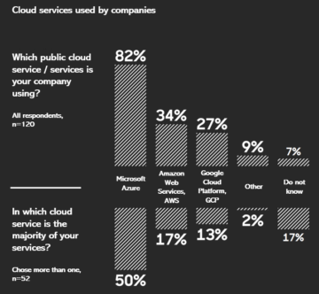


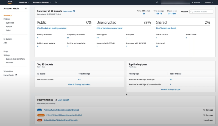


 radiator is in your digital model. Now you can see virtually that when the heater is malfunctioning, your radiator gets colder. Not only sensors are connected to your digital twin, but manuals and other documents are also. So you can view the heater’s manual right there in the dashboard.


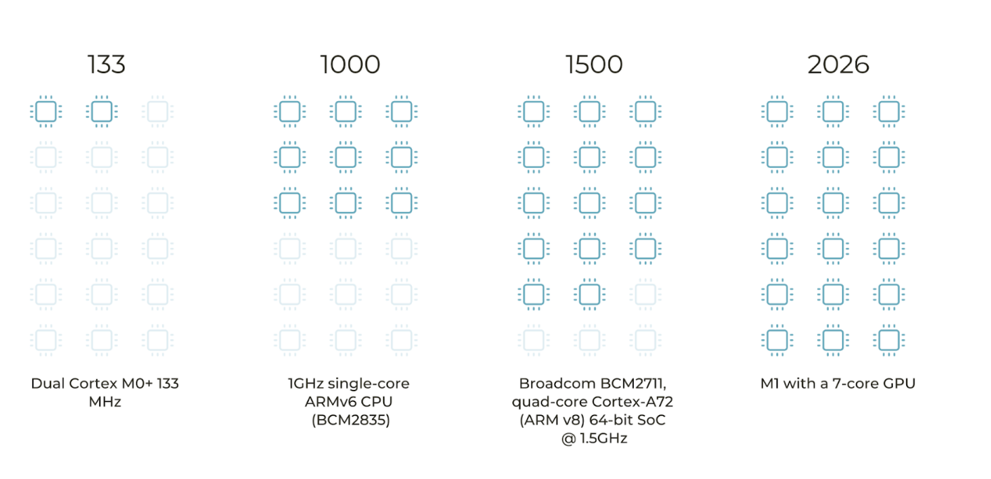


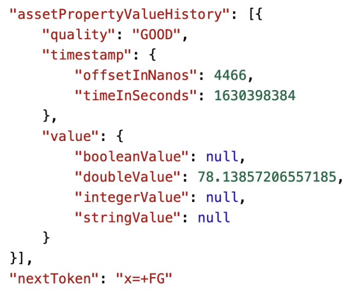


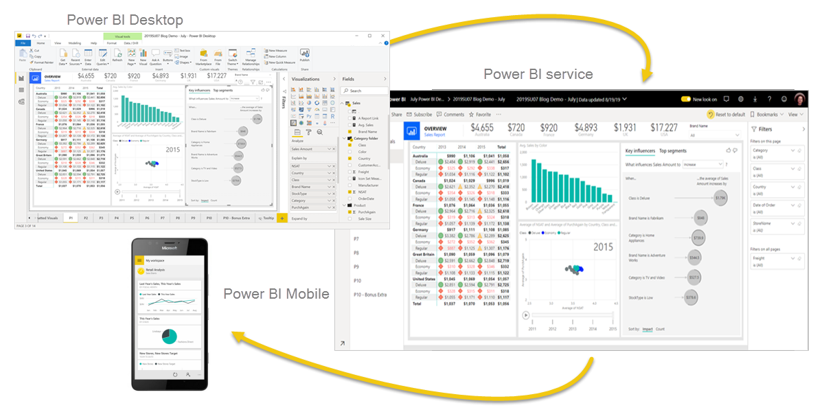
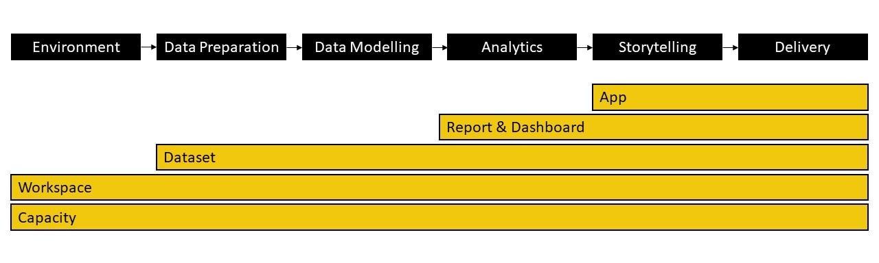
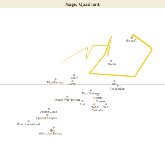
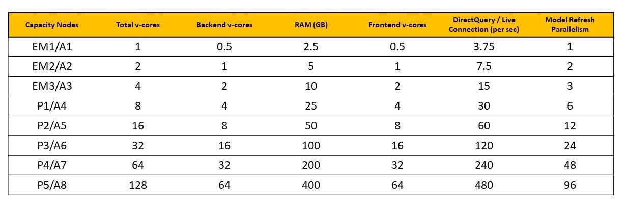


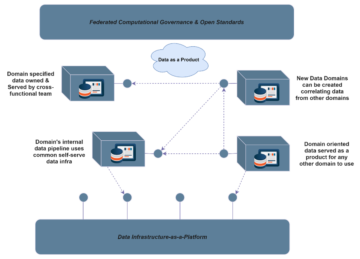
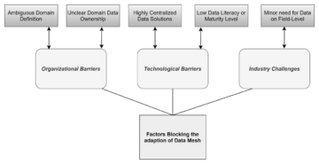


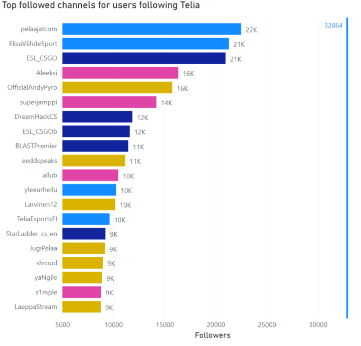
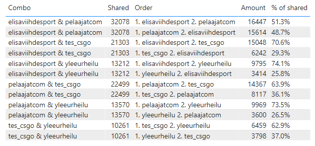
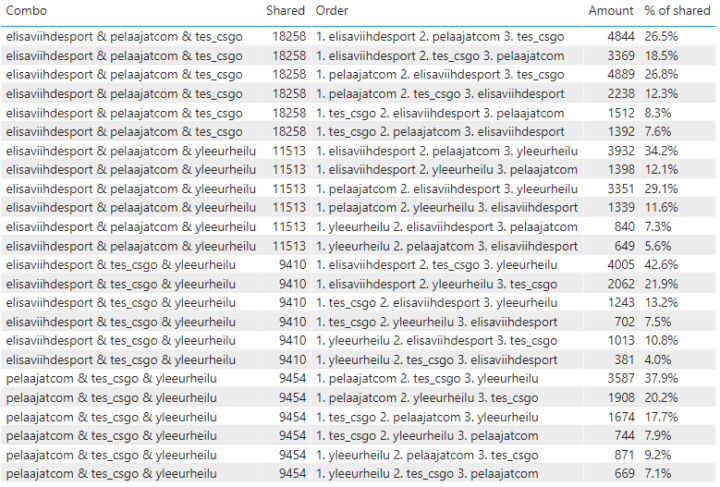
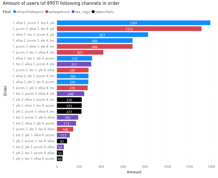

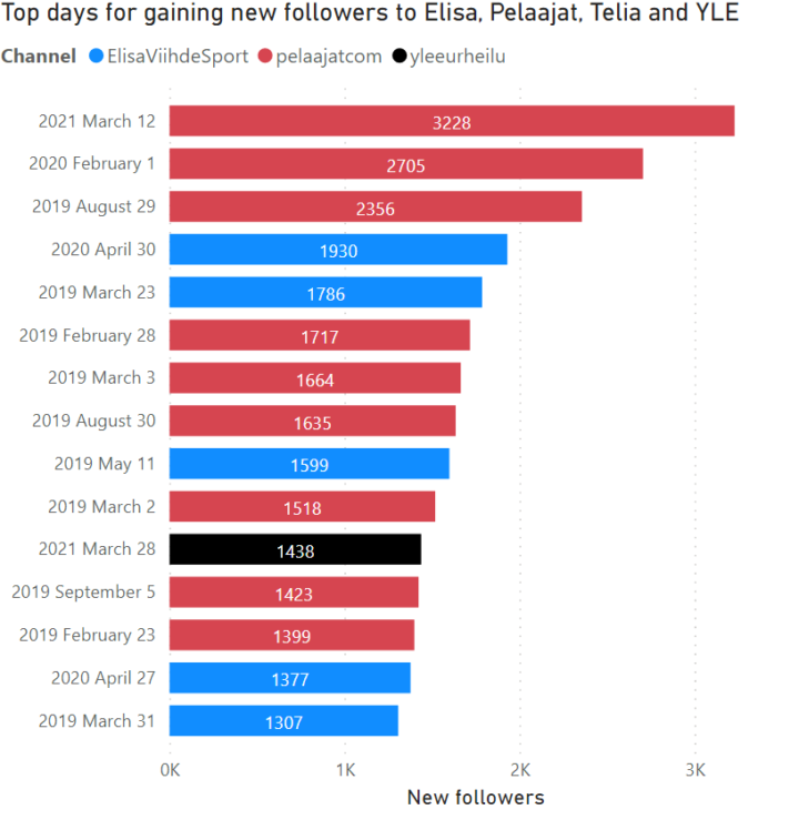


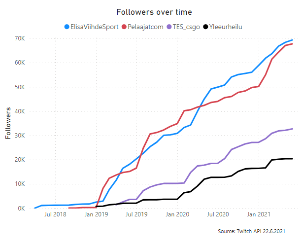
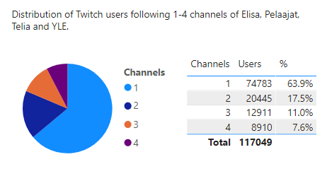

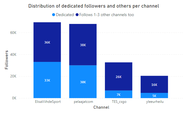

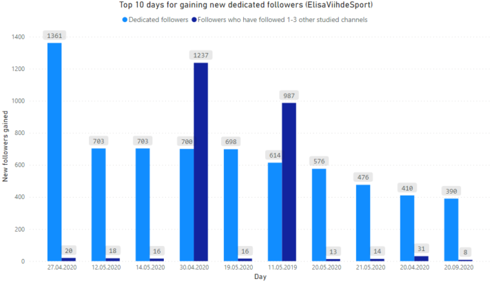
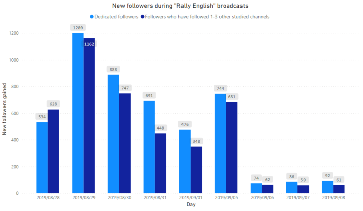


 More information: https://docs.snowflake.com/en/sql-reference/external-functions.html