Power BI Deep Dive
This is the third post in our Solita’s blog series about self-service business intelligence (BI). Our first post, “Business Intelligence in the 21st century”, describes the evolution of BI for the last 20 years. This first blog introduces us to the modern BI world. More than ever, business talks about data. And although the discussions are generally dominated by big data, AI and machine learning, modern BI still has a lot to say. Thus, we aim to do a deep dive into all main BI solutions in the market. You can already find our blogpost about Tableau. Tableau is one of the leader platforms and can be considered the pioneer of the modern self-service BI.
This blogpost will focus on Power BI. We will deep into its history, functionalities, components, licensing, and more. We don’t aim to rewrite Microsoft’s own documentation. Most probably we are missing to mention specific Power BI components, features and other facts. But we aim to awaken your interest in learning about this passionate area of self-service reporting and Power BI. If this is the case, please contact us for more detailed evaluation or a demo.
From SSRS to self-service BI
Pointing out an exact date for the launch of Power BI might be rather difficult and somewhat daring. Power BI is not a single BI tool but the combination of multiple reporting and data warehousing solutions. Most probably Power BI developers can notice the legacy from 15 years of continuous development. Thus, Power BI was born with each of those independent solutions.
Some of these components are from 2004. In this year, Microsoft launched Reporting Services as an add-on of SQL Server 2000. This developed further into SQL Server Reporting Services (SSRS), a server-based reporting solution today part of the suite of Microsoft SQL Server Services. Within this decade, development projects Gemini and Crescent would lead to Power Pivot and Power View. Power Pivot was available as an Excel add-in in 2009. Power View was released in 2012 as part of SharePoint. And Data Explorer, which was launched in 2013, set the start of Power Query. This same year, all these components and Power Map, a 3D data visualization tool, were combined under the umbrella name of Power BI. Power BI became part of the Office 365 package.
Each component was performing very different tasks within the BI domain. But all of them had in common one to fulfil a big business need: ”Data is where the business lives so data definitely has a story to tell about it”. These tools were born with this idea in mind, at times when Tableau was the novelty among the business users of the 2010s. In 2015 Power BI Service was finally launched. This enabled Power BI users to share their reports and to add the first steps towards a complete self-service analytics solution.
What does Power BI mean?
Power BI was born with the goal of eliminating obstacles for business users to do data analysis and visualization. It is clearly targeted to the business world, which is becoming more data driven. For those non-technical fellows manipulating data might be rather intimidating. Power BI makes easy connecting to data sources and is a playground for business to give shape and meaning to data.
Power BI can be defined as a collection of tools that connects unrelated sources of data and brings insights through dynamic and interactive visualizations. For several reasons, Power BI is one of the leader self-service reporting products.
Ready available connections: Power BI supports data connections of all kinds, Whether data is On-Premise or Cloud, structured or unstructured datasets, within a Microsoft data warehouse or any other from top industry leaders, IoT and real time data streams, your favourite services…
Beautiful visualizations: Since visualization is the core of Power BI, users can find multiple plug & play types of visuals such as Line chart, Bar chart, Scatter chart, Pie chart, Matrix table, and so on. For the most exigent users, Microsoft platform provides third parties visualizations. And for the brave ones, Power BI provides the options to build your own visuals with Python or R.
Storytelling: Developers can build their own stories. Power BI brings flexibility with dashboards that combine tiles and reports, built on same or different datasets. The canvas and pages support pixel-based designs. All are integrated to deliver wonderful stories with buttons, tooltips and drill-through features.
Share it: Share reports and dashboards with people from inside and outside the organization. This is administered through a Power BI portal and Azure Active Directory. The range of possibilities is very wide, from sharing within workspaces, to sharing through power BI apps or embedding reports in a company’s website.
DAX & M: Data Analysis Expressions (DAX) is a language developed by Microsoft for data processing not only in Power BI but also PowerPivot and SSAS tabular models. It supports more than 200 functions, many having similarities to the well known Excel formulas. M is the language used in Power Query. This functional language is very powerful when transforming and loading the data so that it is ready for business analysts.
Backed by Azure: The BI platform is built on top of Azure. Thus, all security and performance concerns rely on azure capabilities. This is no small feat, considering that Azure is one of the most reliable and extended cloud computing solutions in the world. But Power BI benefits from Azure don’t end here. Power BI developers can enjoy a broad range of functionalities such as Azure Machine Learning and Cognitive service.
Be ready for some challenges
Power BI is continuously evolving. Its users are probably already familiar with its strict monthly releases. Actually, users can vote for improvements to be included in future releases. Despite being a market leader, the users have observed areas where Microsoft could put some development efforts.
One commonly criticized aspect is that product functionality depends on many factors. For instance, the Power BI SaaS options include functions not available in On-premises solutions, and vice versa. Developers might encounter that reporting is limited to some functionalities depending on the connection mode, or the data source. Or even different scripting languages (M and DAX) might be used for different purposes. Thus the starting point might result in being slightly overwhelming for new developers. Additionally, these wide variability of options might add complexity for developers to decide about how to build their very specific use cases.
Another common discussion is the strong dependency on Azure. There are specific tools functionality such as user admin, building data flows or security that are integrated partially to Azure. This can cause some problems to companies not using Azure as their cloud platform. To fully deploy a new Power BI platform would force them to add Azure competencies to their teams.
When talking about Power BI challenges, it is impossible to avoid talking about DAX. Although it clearly is a very powerful analytical language, it is also hard to learn. New developers usually avoid getting fluent on it because it is still possible to build nice reports using Power BI implicit measures (automatic calculations). However, sooner or later, developers will need to master DAX to deploy more complex requests from the consumers of the reports.
In addition, challenges might be found in content governance. This is quite a challenge in self-service reporting platforms in general. It is common to find datasets growing out of control, poor utilization of licensing and capacity, or the lack of strategy for designing workspaces, apps and templates. Managing this platform requires data expertise. This complexity is sometimes underestimated by adopters since Power BI announces to be a self-service reporting platform.
The Power BI family
The main components
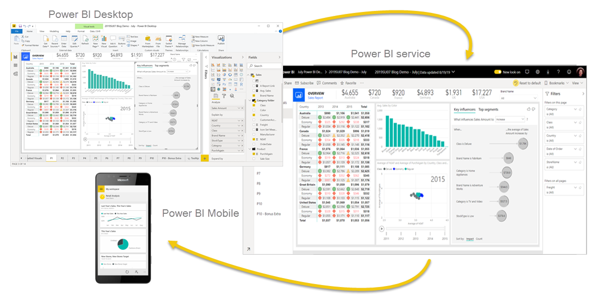
Power BI mainly consists of 3 components: Power BI Desktop, Power BI Service and Power BI Mobile. A typical workflow would start with Power BI Desktop, which is a desktop application dedicated specifically to data modelling and report development. This is the main tool for Power BI developers, since it enables building queries with Power Query, modelling relationships between those queries and calculating measures for visuals.
Once the report is built, next step on the workflow is to publish it into Power BI Service, which is Microsoft online SaaS offering for Power BI. Power BI Service adds a collaboration layer where both report developers and consumers interact. Power BI Service is organized mainly in workspaces where both report developers and consumers share, test, develop further and consume reports, dashboards, and datasets.
The last of the components is Power BI Mobile. With the mobile app, consumers can be always connected to their favourite reports and dashboards.
In addition to these core 3 components, Power BI features 2 other ones: Power BI Report Builder and Power BI Report Server. The first one is a desktop app to design and deploy paginated reports. These reports are different from the ones developers can build with Power BI Desktop. The main difference is that paginated reports are usually designed to be printed and formatted to fit on an A4 page. So for instance, all the rows in a table are fully displayed independently of its length.
The second component, Power BI Report Server, is an on-premises report server with its own web portal. It offers reporting features similar to Power BI Services and server management similar to what users can achieve with SQL Server Reporting Services. This is what Microsoft has to offer to those who must keep their BI platform within their own infrastructure.
Building blocks
The already mentioned Power BI components are built around 3 major blocks: datasets, reports, and dashboards. These blocks are all organized by workspaces, which at the same time are created on shared or dedicated capacities. Let’s talk about all of these important Power BI elements more in depth.
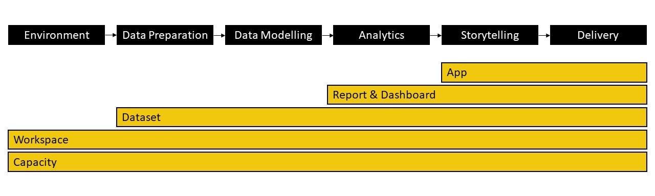
Capacities are the resources that host and deliver Power BI content. They can be either shared or dedicated. By default workspaces are created on shared capacity. This means that your Power BI content shares the capacity provided by Microsoft with other Power BI customers. On the other hand, a dedicated capacity is fully reserved to a specific customer. This will require special licensing.
Workspaces are collaboration spaces that contain, among others, dashboards, reports, and datasets. As a workspace admin, you can add new co-workers and set roles to define how they can interact with the workspace content. There is one requirement: all the members need at least a Power BI Pro license, or the workspace must be placed to a dedicated Premium capacity.
Closely related to workspaces are apps. Apps are containerized within workspaces so that an app makes use of the workspace content. This is the most common and recommended way to share information at an enterprise level. Its consumers can interact with its visuals but cannot edit the content. Apps are also the best medium to share dashboards and reports outside the limits of your organization.
When describing Power BI it is important to write about datasets. A dataset is a collection of data (from a single or multiple sources) associated with one workspace. The dataset not only includes the data but also the tables, relationships, measures and connections to the data source.
Connecting to data sources can happen on three different connectivity modes depending on the data source. The most common one is import mode. Importing data means to load a copy of data to Power BI. This mode allows users to utilize full functionality of Power BI and to achieve maximum calculation speed. However, loads are limited by hardware. Another connectivity mode is DirectQuery. In this mode data remains within the data source and Power BI only stores metadata. A third mode is available: Live Connection. This is a similar connection than DirectQuery with the advantage of using the engine of SQL Server Analysis Services Tabular.
In recent years, Power BI has enabled connection to streaming datasets for real-time reporting. There are several options on how to connect to data streams but they all have their own limitations: some restricts the size of the query, others suffer from limited visual functionality. As a particularity, connecting to streaming dataset is only possible at a dashboard level, so developers need to use Power BI Service.
Independently of the connection mode, the user needs to use source credentials to create the connection. If data is located on-premises or behind a firewall in general, Power BI Gateway can be used to create a connection between the data and Power BI Service without creating any inbound rules to the firewall.
Nowadays these connection modes can be combined within the same dataset. These recent development have had a big impact on BI since companies can share standardized datasets between workspaces. Reports can connect to multiple type of source and to existing Power BI datasets.
A Power BI report is probably the most well known building block by both readers and editors. It consists of pages where data comes to live through all kinds of charts, maps and interactive buttons. All these visualizations are called visuals and their size and location can be defined at a pixel level. The reports can be created from scratch with Power BI Desktop. But also you can import them from shared reports or to bring them from other platforms such as Excel. Reports have two view modes: Reading and Editing view. You might have access to both modes of the reports, depending on what role has been assigned to you when sharing it. By default, reports always open in reading mode.
But reports are not the only way to communicate your insights. In Power BI we can do that also through dashboards. These are canvas in which to find tiles and widgets. Tiles are the main visuals. They can connect to real time stream dataset, visuals in a report, other dashboards or Q&A reports. Compared to reports, dashboards are commonly used to monitor, at glance, the most relevant KPIs for a business, and they can only be built directly in Power BI Service. By linking them to reports, the dashboard gives flexibility in storytelling of your data.
According to Gartner and Forrester
Market and technology advisors such as Gartner and Forrester agree that Microsoft Power BI is a leader player among the BI platforms. In 2021 Gartner published “Critical Capabilities for analytics and BI” report and rated Power BI above average in 11 out of 12 critical BI capabilities. Gartner recognizes Power BI as a Magic Quadrant leader once more in 2021, repeating position for the last 14 consecutive years. The same result is obtained from the Forrester Wave: Augmented BI Platforms (Q3 2021)
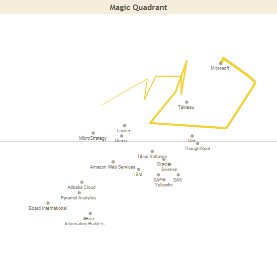
Source: Tero Honko’s report in Tableau Public
Both organizations have clear what are the strengths of Power BI in the current market. Its leader position is the result of the large market reach of Microsoft and Power BI’s ambitious roadmap. Power BI inclusion in O365 E5 SKUs and integrations with Microsoft Teams enable Power BI access to tens of millions of users around the world. Thus it becomes a clear option for those companies that choose Azure as their preferred cloud platform.
Additionally, Gartner suggests that Power BI has impacted the price of its competitors, reducing the price of BI tools without limiting its own capabilities. Actually, as Gartner mentions, the Power BI new releases happen every month. Among the latest releases, both technical advisors appreciate Microsoft’s efforts and ambition towards increasing augmented BI capabilities with new AI services such as smart narratives and anomaly detection capabilities. Also Power BI is supporting developers with guided ML and new ML-driven automatic optimization to autotune query performance.
However, Gartner’s and Forrester’s report make a call for actions around not as popular aspects of the solution. Both organizations find functional gaps in on-premises versions of Power BI. Some of the functionalities of Power BI Service such as streaming analytics and natural language Q&A (question and answer) are still not available for on-premises offerings. The lack of flexibility for customers to use a different IaaS than Azure is also spotted by both technology advisors despite Azure’s wide reach globally. Finally, Gartner highlights what many users have complained about: self-service reporting governance capabilities. Power BI’s investment has not yet brought the result of better management for Power BI environments. And the catalog capability is still behind the market offering. Forrester also gives voice to consumers who complain about the inconsistency of Q&A features.
An Infrastructure for Security
Security is at the forefront of data concerns. Microsoft has built solutions trying to cover the security needs of its customers. As we have mentioned, Power BI can be offered as SaaS with both shared and dedicated capacity, but also as an on-premises solution for companies to govern its own IaaS.
Power BI Service is SaaS built on Azure. For security reasons, its architecture is divided into 2 clusters: the web front end (WFE) and the back-end. The WFE cluster manages the connections and authentication to Power BI Service. Authentication is managed by Azure Active Directory (AAD). And connection set with Azure Traffic Manager (ATM) and Azure Content Delivery Network (CDN). Once the client is authenticated and connected, the back-end cluster handles all user interactions. This cluster manages the data storage using Azure BLOB, and metadata using Azure SQL Database.
For those with higher security restrictions, Microsoft offers an on-premise BI platform alternative. Companies can build their BI capabilities on top of an on-premise report server branded as Power BI Report Server. The main developer tool is still Power BI Desktop. But the platform governance and report visualization resides in Power BI Report Server. Power BI Report Server is a web portal that recalls SSRS with additional functionalities for hosting .pbix files. The reports are published into folders and consumed through the web or across mobile devices.
In this case the company has total control over the IaaS. And consequently the security depends on the companies decisions. You will need to configure the web service, the database, the web portal, the connections…and manage security. Power BI Report Server supports this aspect enabling 3 different security layers. The first one is the portal itself, where you can define who has access to the web service. The next security layer you can configure consists of folders. And finally security can be managed at report level.
Licensing Options – A Hard Decision
Independently of the licensing options, Power BI Desktop is always free. You can connect to any data (when given right access), compute analysis, build your own datasets, use available visuals and format your reports for free. The limitations come in the next step, when sharing your reports with the rest of the world. You can always send the .pbix file by email, but you cannot use the Power BI Service to share it and build a company BI platform.
Once you have decided that Power BI is the right platform for your company, it is time to decide about how to roll it out for your users. Microsoft licensing is very flexible offering a large range of possibilities. But this sometimes makes the decision rather complicated. All licensing options can be bought through Microsoft 365 Admin Portal. The Power BI admin assigns them either to users or to capacities.
User-based Licensing
We can find three licensing options that are assigned directly to users. From the most standard option to the most comprehensive, we can find Power BI Free licenses, then Power BI Pro license and finally Power BI Premium Per User license. Every user within an organization can own a free license unless the organization disables this possibility. Free license gives you just access to Power BI Service but no sharing capabilities. However this becomes relevant when consuming reports running on Power BI Premium capacity.
The next step would be Power BI Pro license. This license is relevant for both developers and consumers. Developers can create workspaces in Power BI Service and to share their reports with small audiences or for other collaborative practices. At the same time, consumers need the license to read the reports either directly from the workspace or from a workspace app. Additionally, the pro license has multiple features such as Analysis with Excel, use of dataflows, 1GB dataset, 8 automatic refreshes per day, App sharing, and more. Power BI Pro is included with Microsoft 365 E5 enterprise license. For those with other Microsoft 365 plans, Power BI Pro licensing can be bought for 8,40 €. This license mode is crucial when deciding to build a self-service BI platform in your organization.
If you wish to increase the reporting capabilities with features such as paginated reports, AI, higher refresh rate and model size limit, application lifecycle management, and others, then you need Power BI Premium Per User. Same way than with Power BI Pro, both developers and content consumers need to have the same licensing options. And in contrast to Power BI Pro, the licensing is also assigned to a specific workspace. This is the lowest entry-point for Power BI Premium features.
Capacity-based licensing
Next step would require from you to buy capacity-based license options, so Power BI Premium or Power BI Embedded. With these licensing options developers, consumers and admins have access to the same features as Power BI Premium Per User and more. They benefit from dedicated capacity for a greater scale and more steady performance of the BI platform. And this option enables on-premises BI with the use of Power BI Report Server.
Power BI Premium includes features that your data engineers and data scientists will enjoy such as enhanced dataflows, broader range of storage solutions and AI cognitive services. Power BI Premium is available in two SKU (Stock-Keeping Unit) families: P SKUs and EM SKUs. The first one is for embedding and enterprise features, and requires monthly or yearly commitment. EM SKU is for organizational embedding, so to enable access to the through internal collaboration tools such as SharePoint or Teams. EM SKUs require yearly commitment. Pricing depends on the selected SKU and it starts at around 4.200 € per month (price by October 2021).
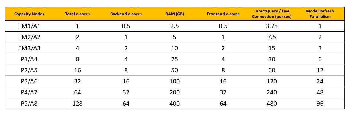
Power BI Embedded is a capacity-based licensing option too. This licensing option is designed for those developers who want to embed visuals into their applications. This is shipped with an A SKU, which doesn’t require any commitment and can be billed hourly. This introduces flexibility for scaling up or down as well as to pause or resume your solutions. Pricing depends on the selected SKU. You can find more details in the following table.

Now that you know all the licensing possibilities, you might have clear what license to buy. Or most probably you just have more doubts. This is a quite criticized aspect on the adoption of Power BI, especially when deciding what premium capacity license to buy. Estimating what SKU is the most suitable for the solution you have in mind is very hard. There is no other way than testing. Thus, now that you have a basic idea of licensing, our recommendation is always the same: start with small PoCs and keep on upgrading until finding the right SKU for your report.
So, How do we start?
If you have already made the decision and Power BI is your BI companion, how do you start? Start testing! And Power BI makes it easy because Power BI Desktop is free. You just need to download the last version and install it on your machine. Build your first reports. There are plenty of things to learn at this stage. Go through Power BI basic documentations. Why not try some Power BI paths and modules from Microsoft Learn. And learn the power of DAX!
Next natural step would be to start setting up your own Power BI platform. At this stage you will probably need to buy your first Power BI Pro licenses, create workspaces and start sharing your reports. Solita can help you take these first steps. We can give you support with the roll out of your new platform, provide licensing consulting and training at different levels. Our specialist can help you design your first use cases and implement them. And for those first successes, we can offer maintenance and further support. In short, we are happy to be your companion on this trip towards building your own enterprise Power BI platform.
Some interesting links
- About Security: https://docs.microsoft.com/en-us/power-bi/guidance/whitepaper-powerbi-security
- Documentation: https://docs.microsoft.com/en-us/power-bi/
- Microsoft Learn: https://docs.microsoft.com/en-us/learn/powerplatform/power-bi?WT.mc_id=sitertzn_learntab_guidedlearning-card-powerbi
- Tero Honko’s visuals of Gartner BI & Analytics Magic Quadrant report: https://public.tableau.com/app/profile/tero/viz/GartnerBIAnalyticsMagicQuadrantViz/GatnerBIMQAnalysisHome


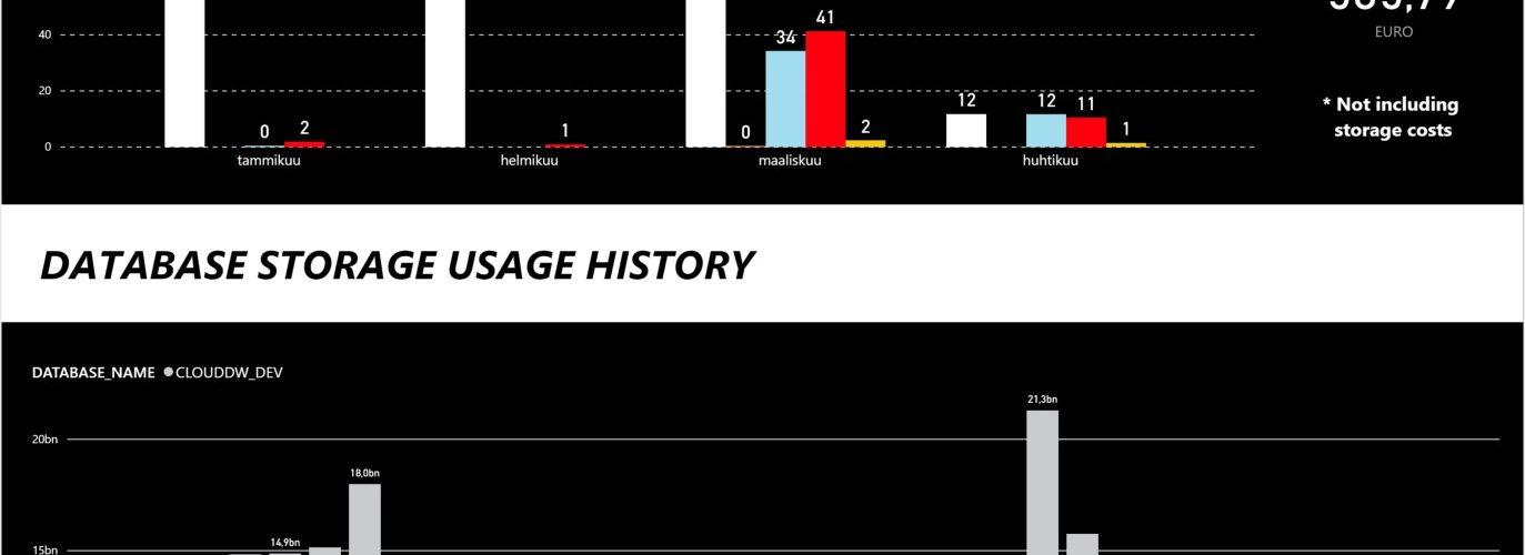

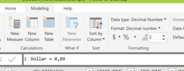
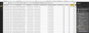
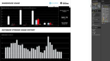
 The cost of warehouses are stored inside WAREHOUSE_METERING_HISTORY -table in CREDITS_USED column, but the Snowflake credits need to be converted into dollars and euro’s and grouped accordingly.