

Tableau goes Minority Report in TC23 – takes direction towards augmented reality, generative AI and headless BI
TC23 keynote was started by Chief Product Officer Francois Ajenstat with the celebration of Tableau’s 20 years long journey. Francois emphasised the role of Tableau and Tableau community as a key innovator in easy-to-use self-service analytics. ”A new day for data” was used as a title for the upcoming introductions to suggest there is something big and impressive coming out.
The new CEO of Tableau, Ryan Aytay, also thanked the community, customers, partners and employees for their support. Ryan revealed Tableau success plan for all customers coming later this year to listen and support customers more closely. One of the conference highlights was once again Iron Viz visualisation competition, this year’s winner was Paul Ross with his magnificent renewable energy dashboard.

But what about the features? Tableau GPT is a very interesting new feature but in a way it isn’t very unique considering almost every organisation is talking about language models and generative AI. On the other hand, it doesn’t mean the feature wouldn’t be very useful, it might be quite the opposite. Tableau Pulse might be a bigger thing than you first think. It has a very appealing UI to combine metrics, visualisations, descriptive information and Tableau GPT based additional insights & interactions. The redesigned metrics layer seems to be much more flexible than before. Metrics are easier to create, more powerful and they can be used around Tableau: in Pulse, dashboards, emails, Slack and mobile.
Possibly a bit more surprising feature is the upcoming VizQL Data Service that takes Tableau towards composable analytics or headless BI. This means you can connect directly to the Tableau backend data model (hyper engine) to query the data without the need of building frontend visualisations with Tableau. This would provide a lot more flexibility when creating data-related products and solutions where you need to use data & analytics. This feature might be somewhat related to the fact that Salesforce is using Tableau hyper data models within its Data Cloud offering to boost analytics possibilities. In the future, Salesforce could use data accelerated by Tableau data engine in their Salesforce Clouds via VizQL Data Service.
From an analytics developer point of view, the most interesting single feature showcased in TC23 (originally introduced in TC22) was shared dimensions (or multi-fact models) support. Shared dimensions enable more flexible multi-fact data models where multiple fact tables can relate to shared dimension tables. This feature makes the logical data layer introduced a couple of years ago more comprehensive and very powerful. Tableau would finally fully support the creation of enterprise level data models that can be leveraged in very flexible ways and managed in a centralised manner. The user interface icon for defining the relationships looked a bit like a meatball, and because the relationships in the logical data model have been referred to as noodles, it was said that Tableau is bringing meatballs to the noodles, very clever 🙂.
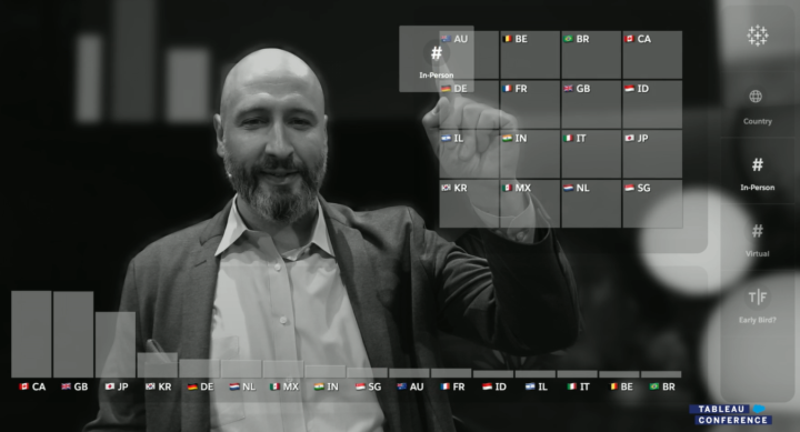
Perhaps the coolest little thing was the augmented reality demo where Matthew Miller used a gesture-based user interface to interact with data and visualise it in a meeting context. The demonstration had a bit of a Minority Report vibe in it, perhaps the technology wasn’t yet as smooth as in the film, but Miller was just as convincing as Tom. Tableau gestures feature was created by the Tableau research team and it appears to be in its early stages. Most likely it won’t be released any time soon, but it might be a hint of where data interaction is going in the future.
But what wasn’t mentioned in the TC23? There are a couple of features or big announcements that were highlights in TC21 and TC22, but haven’t yet been released and weren’t mentioned again in TC23. One year ago, in TC22, one of the big buzzwords was business science. It was described as business-driven data science using autoML features and scenario planning etc. But in TC23 keynote business science wasn’t mentioned at all nor were the Model builder or Scenario Planner features.
Next, I’ll go through the key features introduced in TC23 and also list functionalities presented in TC22 and TC21 to understand the big picture. These feature lists don’t contain all the features included in previous releases but the ones mentioned in earlier Tableau Conferences. More info about TC22 and TC21 introduced features can be found in our previous blog posts:
- A complete list of new features introduced at the Tableau Conference 2021
- Overview of the Tableau product roadmap based on TC22 and TC21
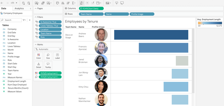
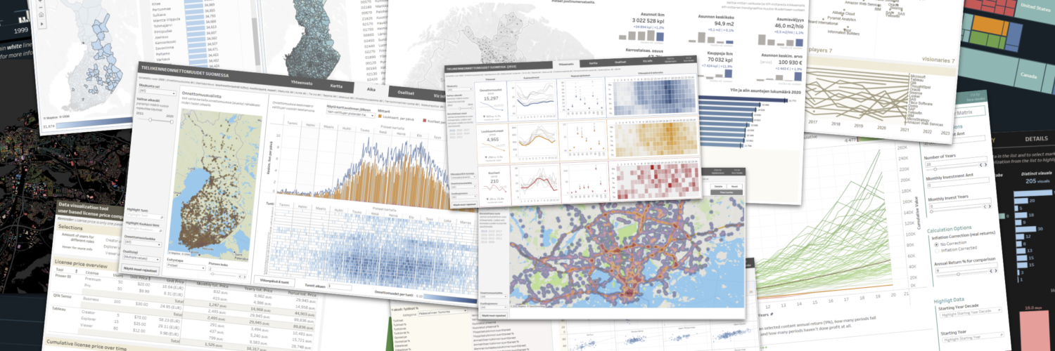
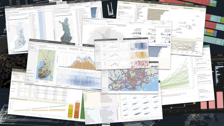
Note: All the product/feature related images are created using screenshots from the TC23 Opening Keynote / Devs on Stage session. You can watch the sessions at any time on Tableau site.
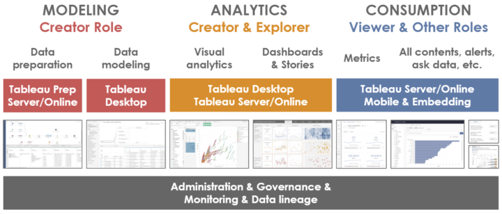
Workbook authoring & data visualisation
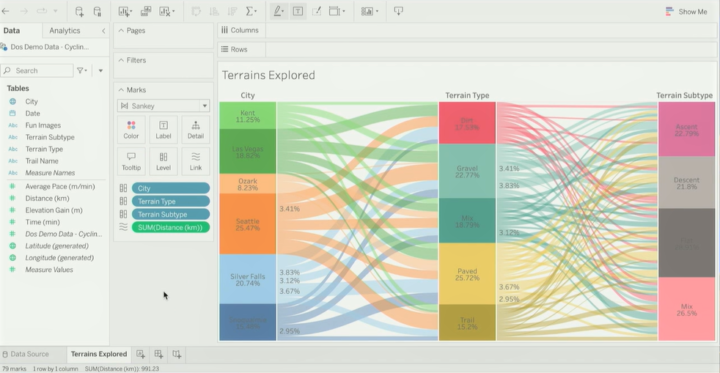
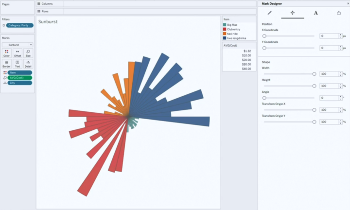
Let’s start with workbook authoring and actual data visualisation related features. The only new feature was the new Sankey and Radial charts (or mark types) that are already in pilot use in Tableau Public. It was suggested that there are also other new chart types to be released in near future. Even though I’m a bit sceptical towards too complex or hyped visualisations it’s good to have the option to easily create something a bit different. Because of Tableau’s flexibility, creating something totally crazy has always been possible but often it has required a lot of data wrangling and custom calculations.
Creating custom visualisations with Visualisation Extensions was introduced in TC21 (more info here), but we haven’t heard anything about this feature since. It might be that the visualisation extensions development has been stopped or paused, but still these new Sankey and Radial chart types might have something to do with the visualisation extension development done in the past, who knows?
- New in TC23
- TC23 New mark types (pilot period currently in Tableau Public): Create Sankey & radial charts using specific mark types. Possibly new native mark/charts types in the future.
- TC23 Improved Image role functionality: new file types (gif) & expansion to the size limit.
- TC23 Edit alt text (for screen readers) directly in Data Guide
- Previously introduced and already released features
- TC22 Image role (2022.4): Dynamically render images in the viz based on a link field in the data.
- TC21 Dynamic zone visibility (2022.3): Use parameters & field values to show/hide layout containers and visualisations.
- TC21 Redesigned View Data (2022.1): View/hide columns, reorder columns, sort data, etc.
- TC21 Workbook Optimizer (2022.1): Suggest performance improvements when publishing a workbook.
- TC21 Multi Data Source Spatial Layers (2021.4): Use data from different data sources in different layers of a single map visualisation.
- Previously introduced but not released nor mentioned in TC23
- TC21 Visualisation Extensions (~2022 H2): Custom mark types, mark designer to fine-tune the visualisation details, share custom viz types.
Consume analytics & understand data
The hype (and also actual new features) around generative AI have been the number one topic for most of the tech companies this year, and it sure was also for Tableau. Tableau introduced Tableau GPT, which is a generative language model integrated to Tableau and its data with security and governance included. Tableau GPT can be useful for both consumers and analysts. It can be used to search data and find insights just by writing questions and it’ll provide answers in both written text and as a visualisation (like Ask data with steroids). Ask any question and Tableau GPT will help to 1) Find relevant data sources, 2) Analyse data, 3) Present results in text and chart with the possibility to explore more, 4) Suggest related additional questions. It was suggested that Tableau GPT will also be integrated into Data Guide and for developers/analysts to the calculation editor to help build calculations.
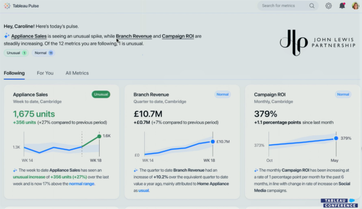
Tableau Pulse was another big announcement. It’s a completely new interface to consume analytics and insights with the ability to ask questions via Tableau GPT. It seems to be mostly intended for consumers to follow and understand key metrics and related trends, outliers and other interesting aspects. Tableau Pulse includes a redesigned metrics layer with the possibility to create embeddable metrics manually or suggested by Tableau GPT. It contains personalised metrics & contents (changes, outliers, trends, drivers) and descriptive information created by Tableau GPT.
Unfortunately, we still need to wait to get our hands on Tableau GPT and Tableau Pulse. It might be the end half of this year or even early next year when Tableau actually gets these new features released.
- New in TC23
- TC23 Tableau GPT (~pilot 2023 H2): Generative AI to assist in searching, consuming and developing data & analytics in many Tableau user interfaces.
- TC23 Tableau Pulse with redesigned metrics (~pilot 2023 H2): New user interface to consume analytics and create, embed & follow metrics.
- TC23 Tableau Gestures & augmented analytics: Use gestures to interact with data and infuse analytics into meetings.
- Previously introduced and already released features
- TC22 Data Guide (2022.3): Contains information about the dashboard and fields, applied filters, data outliers and data summary, and links to external resources.
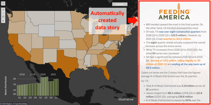
- TC22 Data Stories (2022.2 & 2022.3): Dynamic and automated data story component in Tableau Dashboard. Automatically describes data contents.
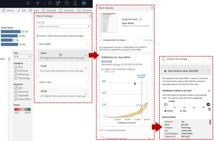
- TC21 Data Change Radar (2022.3): Alert and show details about meaningful data changes, detect new outliers or anomalies, alert and explain these.
- TC21 Explain the Viz (2022.3): Show outliers and anomalies in the data, explain changes, explain marks etc.
- TC21 Multiple Smaller Improvements in Ask Data (2022.2 & 2022.3): Contact Lens author, Personal pinning, Lens lineage in Catalog, Embed Ask Data.
- TC21 Ask Data improvements (2022.1): Phrase builder already available, phrase recommendations available later this year.
- Previously introduced but not released nor mentioned in TC23
- TC21 Model Builder: Use autoML to build and deploy predictive models within Tableau. Based on Salesforce’s Einstein platform.
- TC21 Scenario Planner: Easy what-if-analysis. View how changes in certain variables affect target variables and how certain targets could be achieved.
Collaborate, embed and act
New features in this area related heavily to embedding and using Tableau data for building external data products and services. Especially the VizQL Data Service is Tableau’s first step towards composable analytics where the backend data layer and frontend user interface don’t need to be created with the same tool or technology. Composable analytics or headless BI is seen as a future trend in analytics. VizQL Data Service provides access to data modelling capabilities and data within Tableau to streamline building different kinds of data products with Tableau data. This means that data from Tableau could easily be used outside Tableau without actually embedding visuals, but using the data itself in different ways.
Another introduced feature was the Embedding Playground that will ease up the creation of code to embed Tableau visuals and different kinds of interactions. In the playground, you can select options from dropdowns to alter embedding settings, create interactions (eg. context menus, export, filtering, marks etc.) and get ready to be embedded in Javascript & HTML code. Ephemeral users will centralise user identity and access management and in the future usage-based licensing will be provided to make the pricing more flexible to.
- New in TC23
- TC23 Tableau Embedding Playground (dev preview now): Configure embedding options without coding.
- TC23 Ephemeral users (~2023 H2): Centralises user identity and access management to one place. Usage-based licensing options in the future.
- TC23 VizQL Data Service (~dev preview 2023 H2): Tableau’s first step is to decouple the data and presentation layer.
- TC23 Grant access to a workbook when sharing
- Previously introduced and already released features
- TC22 Tableau External Actions (2022.4): Trigger actions outside Tableau, for example, Salesforce Flow actions. Support for other workflow engines will be added later.
- TC22 Publicly share dashboards: Share content via external public facing site to give access to unauthenticated non-licenced users, only Tableau Cloud. Available via Tableau Embedded analytics usage-based licensing.
- TC21 Embeddable Ask Data (2023.1)
- TC21 Embeddable Web Authoring (2022.2): No need for a desktop when creating & editing embedded contents, full embedded visual analytics.
- TC21 3rd party Identity & Access Providers (2022.2): Better capabilities to manage users externally outside Tableau.
- TC21 Connected Apps (2021.4): More easily embed to external apps, creating a secure handshake between Tableau and other apps.
- TC21 Tableau search, Explain Data and Ask Data in Slack (2021.4)
- TC21 Tableau Prep notifications in Slack (2022.1)
Data preparation, modeling and management
My personal favourite, the Shared dimensions feature, which was introduced already a year ago, was demoed once again. It enables more flexible multi-fact data models with shared dimension tables to create more flexible and comprehensive data models. At least the modelling UI seemed to be rather ready, but unfortunately we didn’t get a target schedule for when this might be released.
One very welcome little feature is Address Geocoding which allows you to visualise addresses on a map without doing the geocoding beforehand. Related to data models, Tableau also emphasised how Tableau data models are used and available within Salesforce Data Cloud (Tableau Hyper-accelerated queries) and also in the future Data Cloud contents can be analysed in Tableau with a single click (Tableau Instant Analytics in SF Data Cloud).
- New in TC23
- TC23 Tableau Hyper-accelerated queries in SF Data Cloud (Available now): Salesforce data Cloud is at least partially based on Tableau Hyper data models, which can be used to easily analyse the data within Salesforce Data Cloud without additional modeling steps.
- TC23 Tableau Instant Analytics in SF Data Cloud (~2023 H2): Analyse SF Data Cloud data with Tableau with one click.
- TC23 Address Geocoding: geocode address data in Tableau to visualise addresses on a map.
- TC23 Use TableauGTP in prep & modeling: ask TableauGTP to create advanced calculations, eg. extract email address from json.
- TC23 Tableau Prep enhancements: spatial joins, smart suggestion to remove duplicates & easily set header and start a row.
- Previously introduced and revisited in TC23
- TC22 Shared dimensions / multi-fact models: Build multi-fact data models where different facts relate to multiple shared dimensions.
- TC22 New AWS data sources: Amazon S3 connector. Previously mentioned also Amazon DocumentDB, Amazon OpenSearch, Amazon Neptune.
- TC22 Multi-row calculations in Prep: Calculate for example running total or moving average in Tableau Prep.
- Previously introduced and already released features
- TC22 Insert row number and clean null values in Prep (2023.1): Easily insert row number column and clean & fill null values.
- TC22 Table extensions (2022.3): Leverage python and R scripts in the data model layer.
- TC22 Web data connector 3.0 (2022.3): Easily connect to web data and APIs, for example to AWS S3, Twitter etc.
- TC21 Data Catalog Integration: Sync external metadata to Tableau.
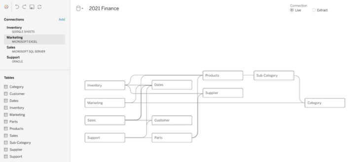
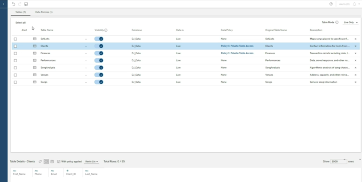
- TC21 Virtual Connections (2021.4): Centrally managed and reusable access points to source data with a single point to define security policy and data standards.
- TC21 Centralised row-level security (2021.4): Centralised RLS and data management for virtual connections.
- TC21 Parameters in Tableau Prep (2021.4): Leverage parameters in Tableau Prep workflows.
- Previously introduced but not released nor mentioned in TC23
- TC21 Tableau Prep Extensions: Leverage and build an extension for Tableau Prep (sentiment analysis, OCR, geocoding, feature engineering etc.).
Tableau Cloud management
For Tableau Cloud management Tableau emphasised HIPAA compliance and improved activity logs to analyse for example login activities and attempts. Customer-managed IP filtering for Tableau Cloud will streamline cloud security management. There were also new features introduced related to access token management in the Tableau Cloud environment.
- New in TC23
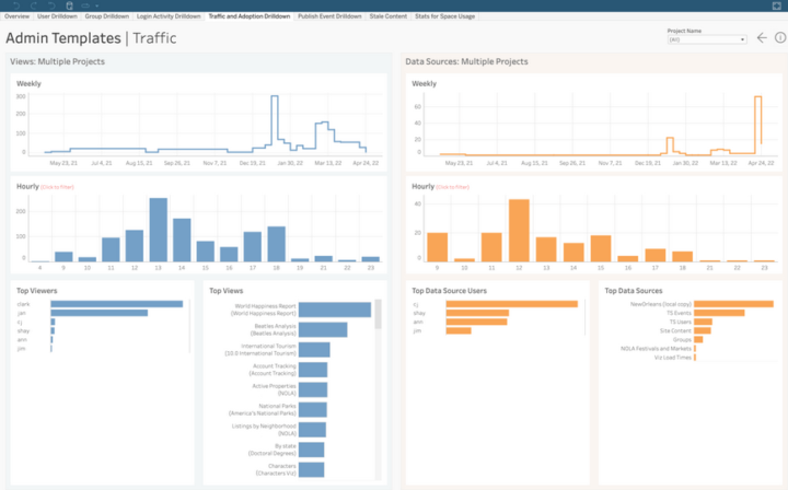
- TC23 Improved activity logs: More data in admin templates about login activities & attempts.
- TC23 Customer-managed IP filtering: Set IP address filtering to limit access to Tableau Cloud Site.
- TC23 Enhanced access token management: Access token management via API, Control personal access token creation via user group and set expiration periods.
- Previously introduced and revisited in TC23
- TC22 Multi-site management for Tableau Cloud: Manage centrally all Tableau Cloud sites.
- Previously introduced and already released features
- TC22 Customer-managed encryption keys (2022.1): BYOK (Bring Your Own Keys).
- TC22 Activity Log (2022.1): More insights on how people are using Tableau, permission auditing etc.
- TC22 Admin Insights (2022.1): Maximise performance, boost adoption, and manage content.
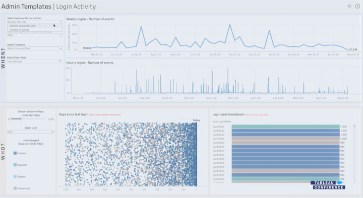
Tableau Server management
Again this year, there weren’t too many new specific features related to Tableau Server management. On the other hand, it was emphasised that the possibility to use an on-premise Tableau Server will be an option also in the future.
- Previously introduced and already released features
- TC22 Auto-scaling for Tableau Server (2022.3): Starting with backgrounder auto-scaling for container deployments.
- TC21 Resource Monitoring Improvements (2022.1): Show view load requests, establish new baseline etc.
- TC21 Backgrounder resource limits (2022.1): Set limits for backgrounder resource consumption.
- TC21 Time Stamped log Zips (2021.4)
Tableau Ecosystem & Tableau Public
Tableau Public had a few new features introduced, like improved search. Accelerators weren’t mentioned too much in TC23, but lately their usability has improved with the ability to easily map fields when taking dashboard accelerators in use. There were some Tableau Public-related features introduced few years ago in TC21 that haven’t been released yet. Especially getting more connectors to Tableau Public would be very nice, and also the possibility to publish Prep workflows to Tableau Public would be great. Let’s see if we get these previously introduced features to use in the future.
- New in TC23
- TC23 Tableau Public Enhanced search with sorting & filtering, network activity feed with notifications & extra info, profile pronouns
- Previously introduced and already released features
- TC21 Tableau Public Custom Channels: Custom channels around certain topics.
- TC21 Tableau Exchange: Search and leverage shared extensions, connectors, more than 100 accelerators. The possibility to share the dataset may be added later on.
- TC21 Accelerators: Dashboard starters for certain use cases and source data (e.g. call center analysis, Marketo data, Salesforce data etc.). Can soon be used directly from Tableau.
- Previously introduced but not released nor mentioned in TC23
- TC21 Tableau Public Slack Integration (~2022 H1)
- TC21 More connectors to Tableau Public (~2022 H1): Box, Dropbox, OneDrive.
- TC21 Publish Prep flows to Tableau Public: Will there be a Public version for Tableau Prep?
Want to know more?
If you are looking for more info about Tableau, please read our previous blog posts, check out our visualisation and Tableau offering, and send a message to discuss more (via our website):
- Solita – Visual analytics
- Solita – Tableau offering
- Overview of the Tableau product roadmap based on TC22 and TC21
- A complete list of new features introduced at the Tableau Conference 2021
- Tableau – a pioneer of modern self-service business intelligence
More info about the upcoming features on the Tableau coming soon page.


 In February 2021, Tableau announced that they will remove minimum user amount restrictions from their licensing. For example, earlier the Viewer license had a minimum sales volume of 100 users. The change has enabled Tableau to be deployed at very low cost and with exactly the number of users needed for each organisation.